How to Build a Change Request Form in 5 Steps
It’s a fact of life that projects don’t always play out 100% the way we expect them to. Circumstances, budgets, priorities, and requirements can all change on a dime. Therefore, it’s vital to have an effective way to gather and manage information when this happens.
That’s where change request forms come in.
See, we need a systematic way to deal with new requirements or amendments to projects. This ensures that we have a centralized record of all of the relevant information, as well as improving decision-making and communications between stakeholders.
Today, we’re showing how Budibase can be used to build advanced, custom forms - in a fraction of the time it would take with traditional development tools.
Even better, you won’t have to write a single line of code.
But before we dive into that, let’s check out a bit of background.
What is a change request form?
At the most basic level, a change request form is a simple UI for submitting information in a defined format. So, we have the form itself - and then whatever table or database we’re using to store submissions.
However, request forms can also be so much more than just data collection tools.
See, request forms are most effective when they also support the related processes around reviewing, approving, and actioning requests.
So, we might have additional UIs for managing submissions - or automations, stored procedures, and other process-level tools for handling request data.
After all, receiving change requests is only part of the story.
Let’s take a look at the change request form solution we’re going to build.
What are we building?
Our change request form app consists of two parts. First, we have a multi-step form where users can submit change requests. Second, there’s an admin screen where responsible users can search, view, edit, upstate, and approve change requests - using additional form UIs.
Budibase gives us the ability to build advanced forms on top of just about any data source. But, to demonstrate the ease with which we can output forms with a custom schema, we’re using our internal database today.
We’re also going to use Budibase’s role-based access control tools to ensure our app accurately maps to internal processes - while providing tailored experiences to distinct groups of users.
Finally, we’ll use Budibase’s intuitive yet powerful design tools to create a professional, polished UI for handling all aspects of change requests.
And all that without a single line of custom code.
Even better, you can sign up to Budibase today and use our change request form template .
Let’s jump in.
How to build a change request form in 5 steps
If you haven’t already, start by creating a free Budibase account.
1. Building our data layer
When we create a new Budibase application, we can start with a template or by importing an existing app dump. Today, though, we’re starting from scratch.
When we choose this option, the first thing we’ll be prompted to do is enter a name for our new app. This will also be used to generate a URL extension:

Next, we’re asked to choose which data source we want to connect to. We’ll also be able to add additional data sources later if we need to.
Budibase offers dedicated connectors for a market-leading range of SQL and NoSQL databases alongside REST APIs, Google Sheets, Airtable, and more.
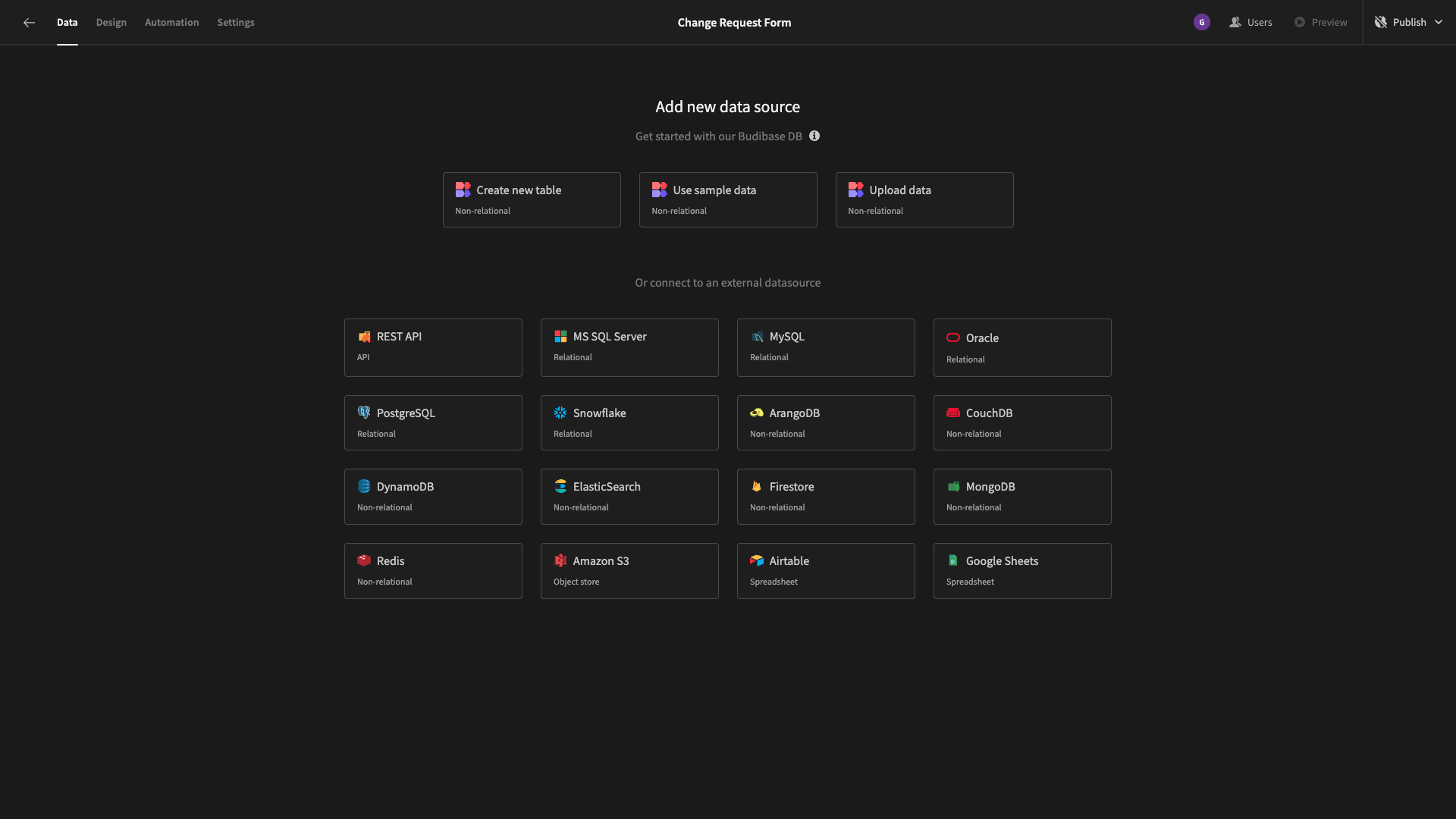
But as we say, we’re going to use our built-in low-code database for our change request form. So, hit ‘create new table’. We’ll see a modal where we can input a name for our new table - as well as an option to upload a CSV.
We’ll call ours Change Requests:
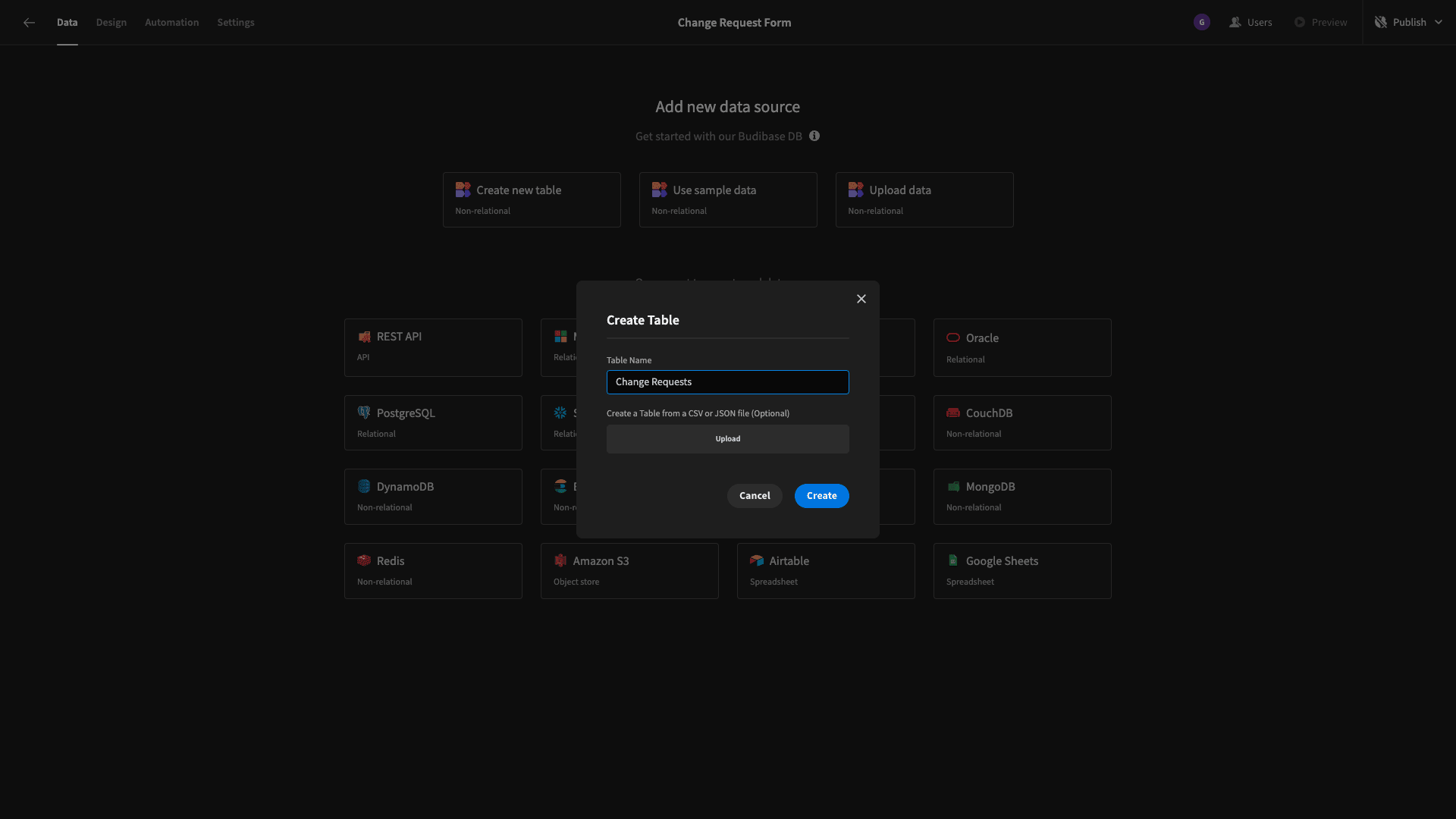
Here’s what this will look like:
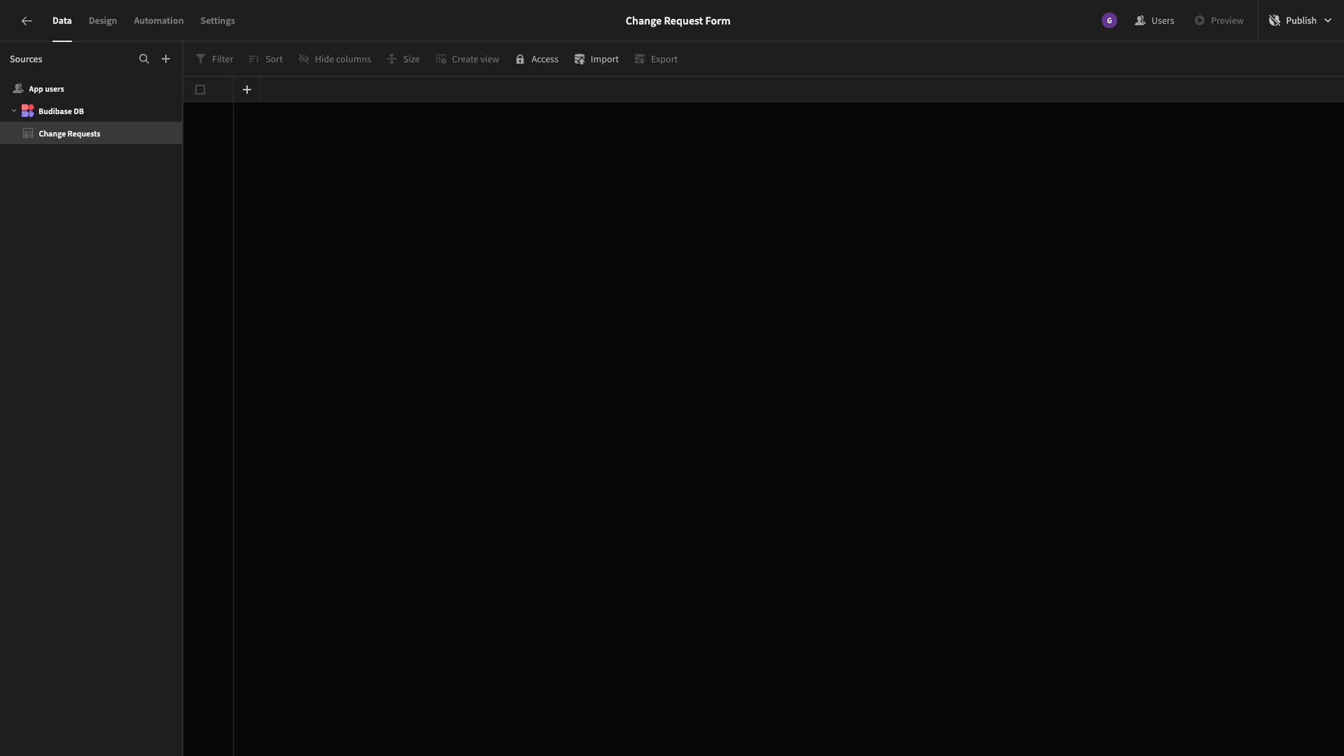
Obviously, our table doesn’t have any columns or stored data yet.
We can hit the plus icon to add new columns to our data schema, by choosing a name and a data type:
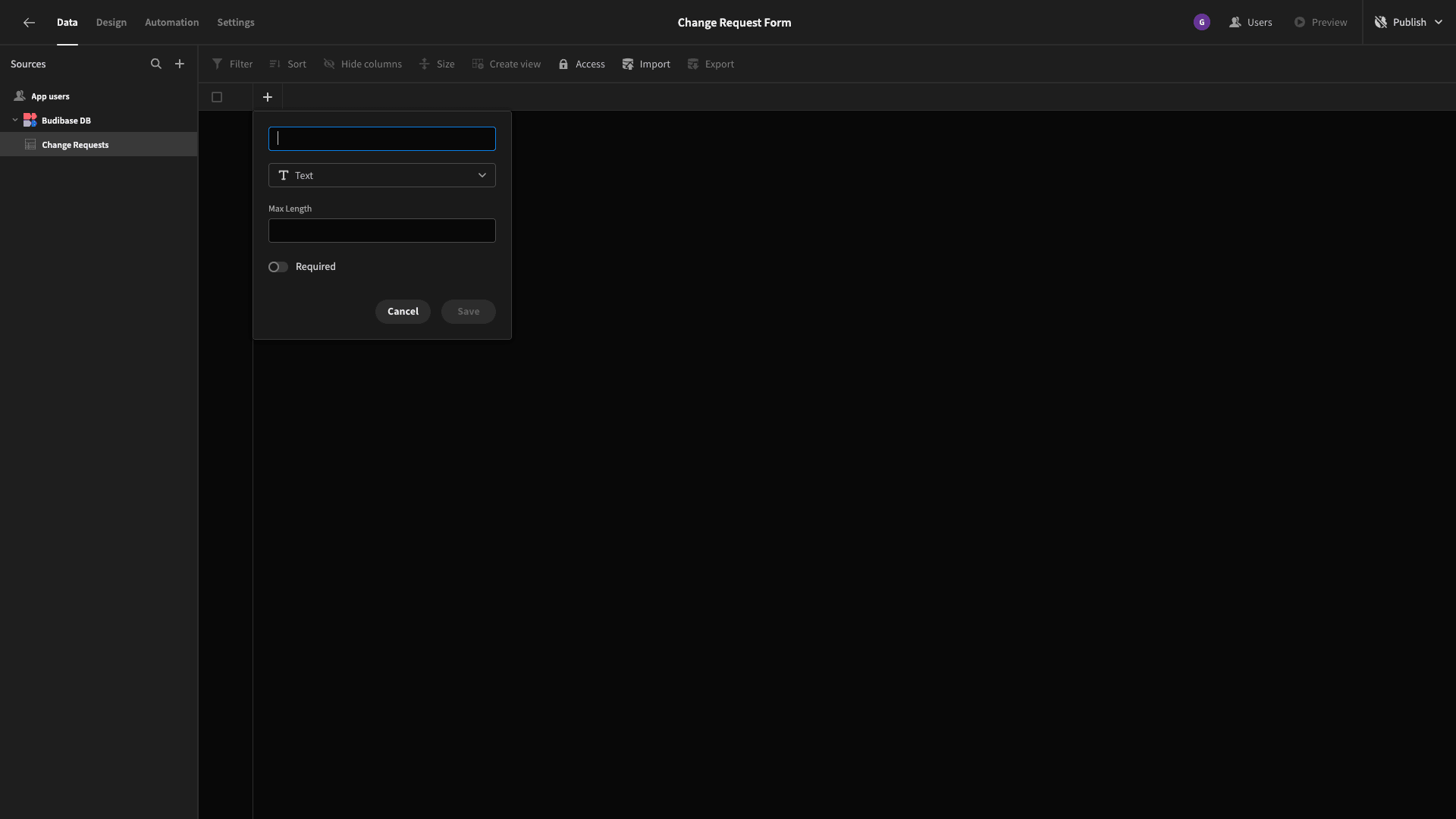
Rather than showing you how to add each individual column, here’s a list of the attributes we want to store in our change request form, along with their respective types.
- Project - Text,
- Request Title - Text,
- Request Date - Date,
- Requested By - Text,
- Request Description - Long-Form Text,
- Request Justification - Long-Form Text,
- Status - Options,
- Impact - Long-Form Text,
- Response Date - Date.
Let’s add these:

Before we move on, we want to make a couple of additional tweaks to our data layer.
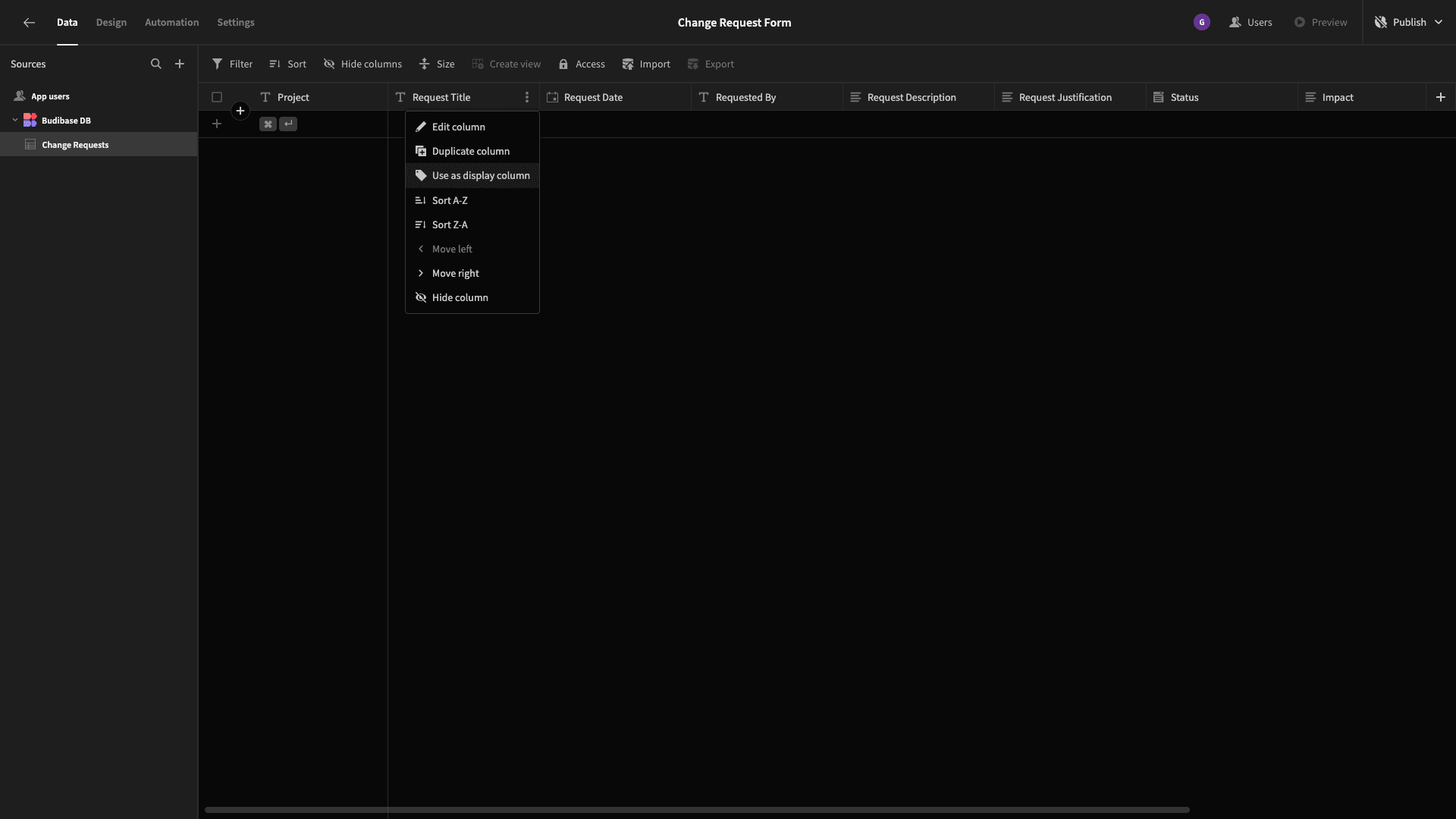
First, we want to designate a Display Column. This isn’t critical since our app is only going to have one table, but if we wanted a more complex data model down the line, it’s vital. By default, this is whichever column we added first.
We’re going to swap this to be our Request Title attribute:
We also added an Options column called Status - but we still need to configure what the possible options are.
For a very simple approval flow, we’ll set these to Requested, Approved, and Declined:
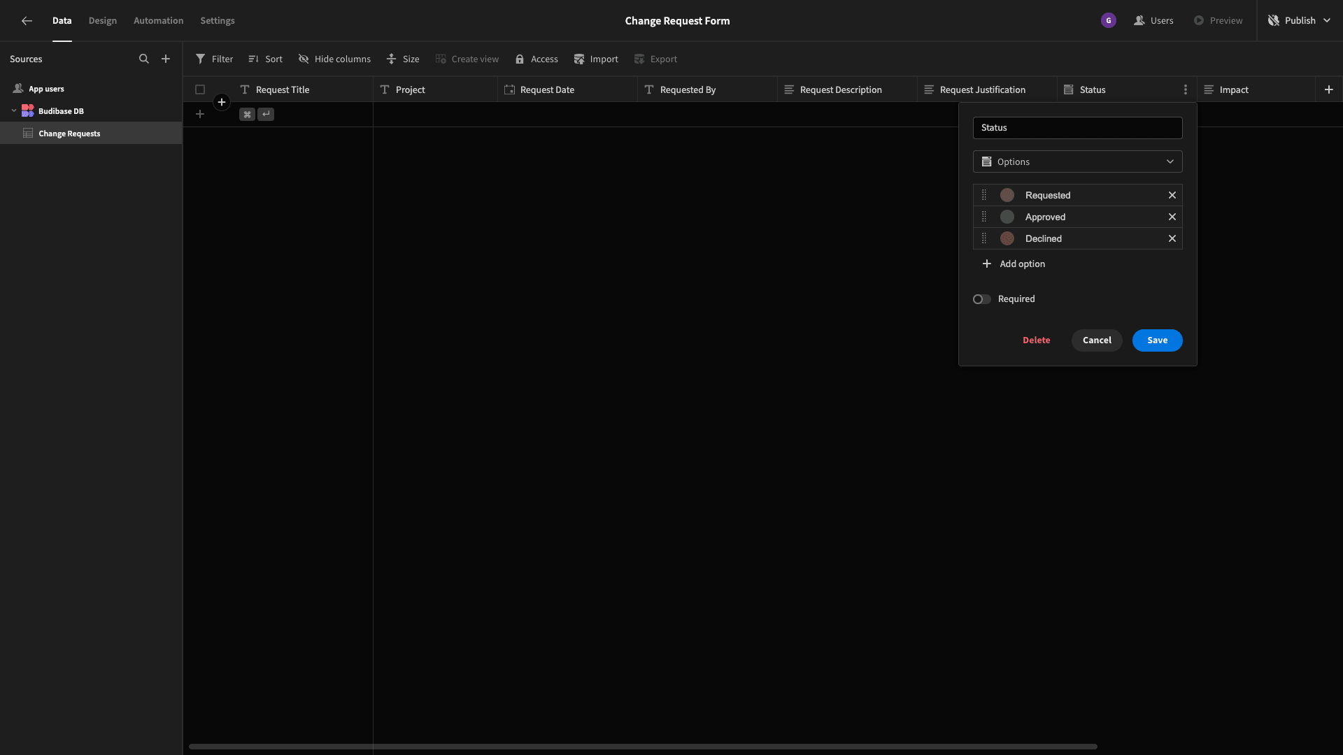
Budibase also lets us set a color to correspond to each of these, which will be used within tags in our autogenerated UIs. As you can see, we’ve opted for a simple traffic light system.
Lastly, we’ll input some dummy data, which will help us when it comes to designing our app UIs.
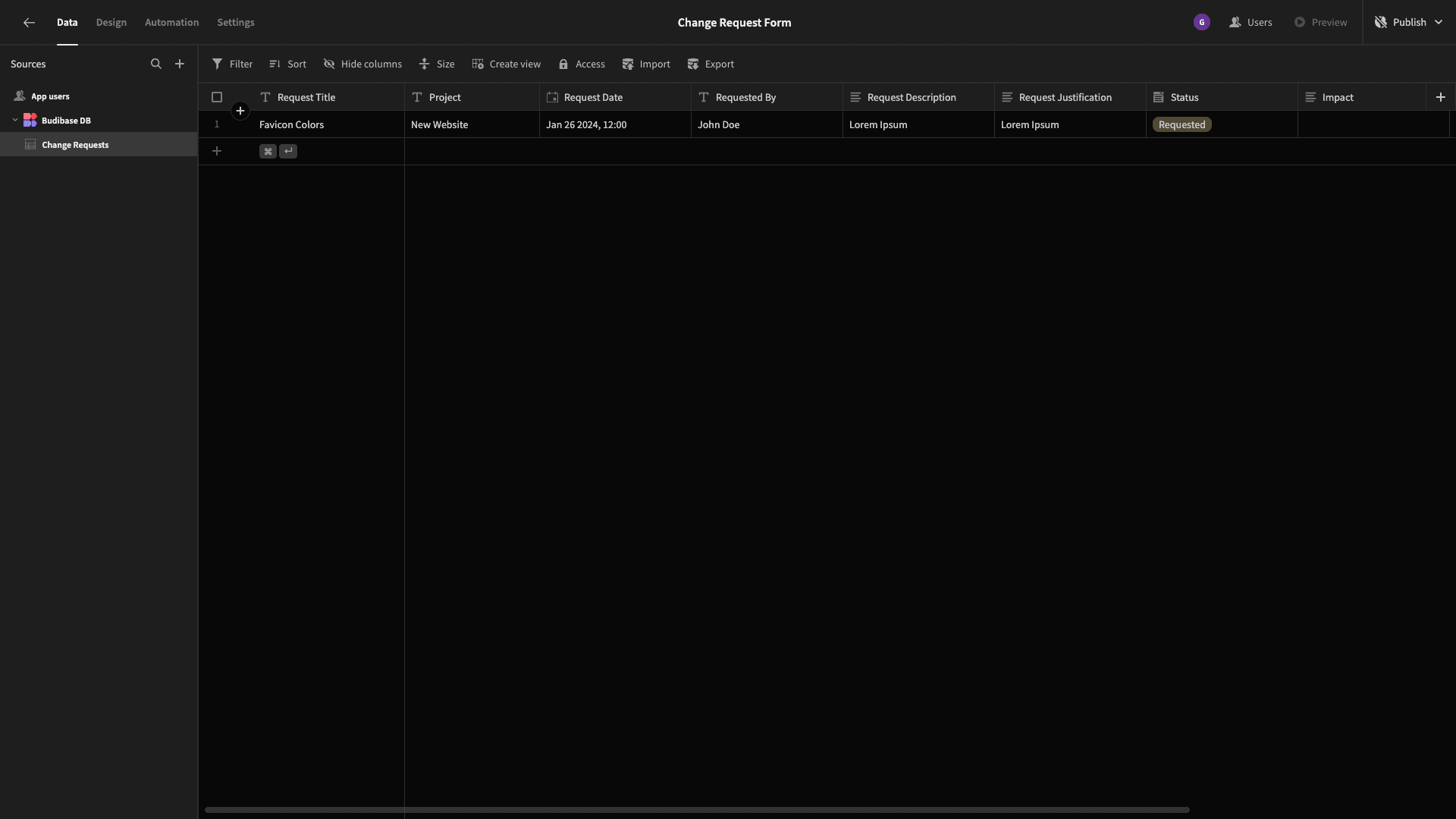
And that’s our data layer completed.
Time to start building some forms!
2. Building our change request form
The first UI we’re going to build is our change request form itself. Head to the Design tab, and we’ll be presented with a few options for how to build our first screen:
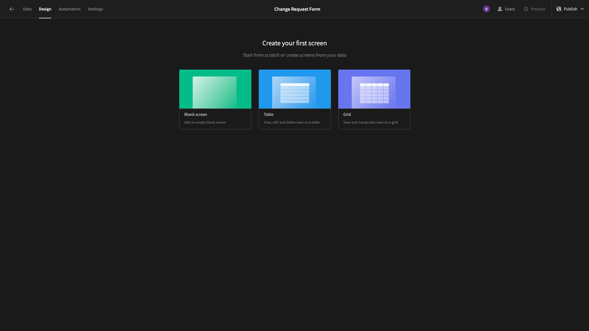
We’re starting with a blank screen. When prompted to choose a URL for this, we’ll go with /change-requests/new.
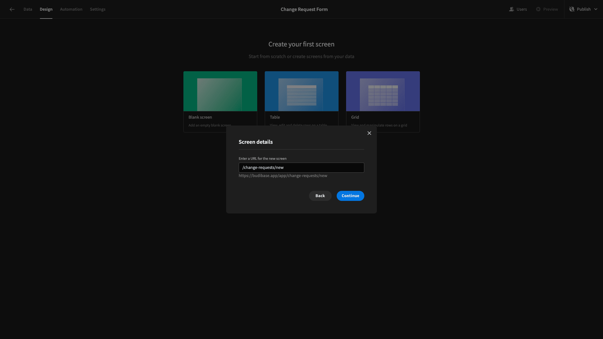
We’ll also be asked to choose an access level for this screen, but we’ll ignore this and use the default option for now. We’ll have a whole section on setting up our access control a little bit later.
So, here’s our blank screen:
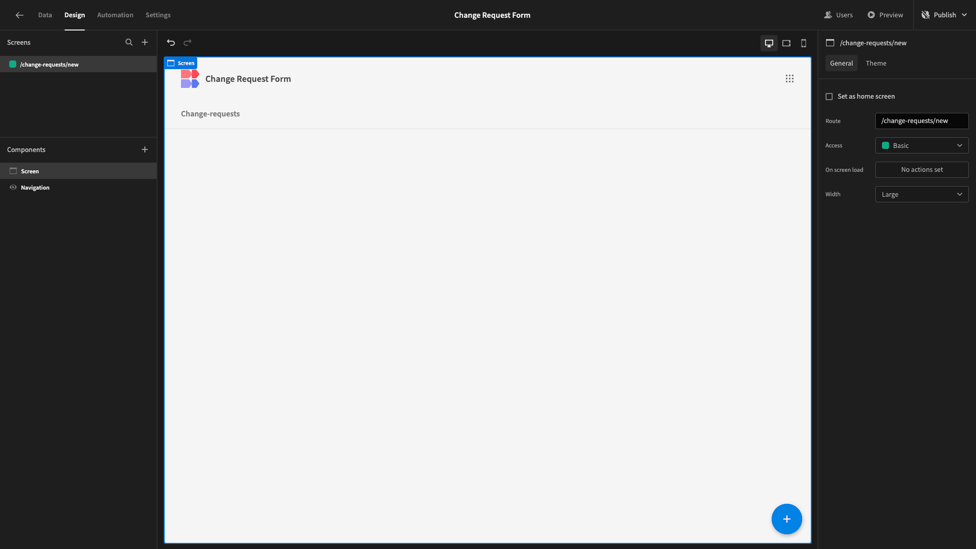
Budibase makes building custom forms from existing data schemas incredibly easy.
We’ll start by adding a multi-step form block. As the name suggests, this is a preconfigured set of components that outputs a working multi-step form for the data source we point it at.
Our app only has one data table, so it’s already set to this. By default, it’s also set as a Create form, so we don’t need to make any changes here either.
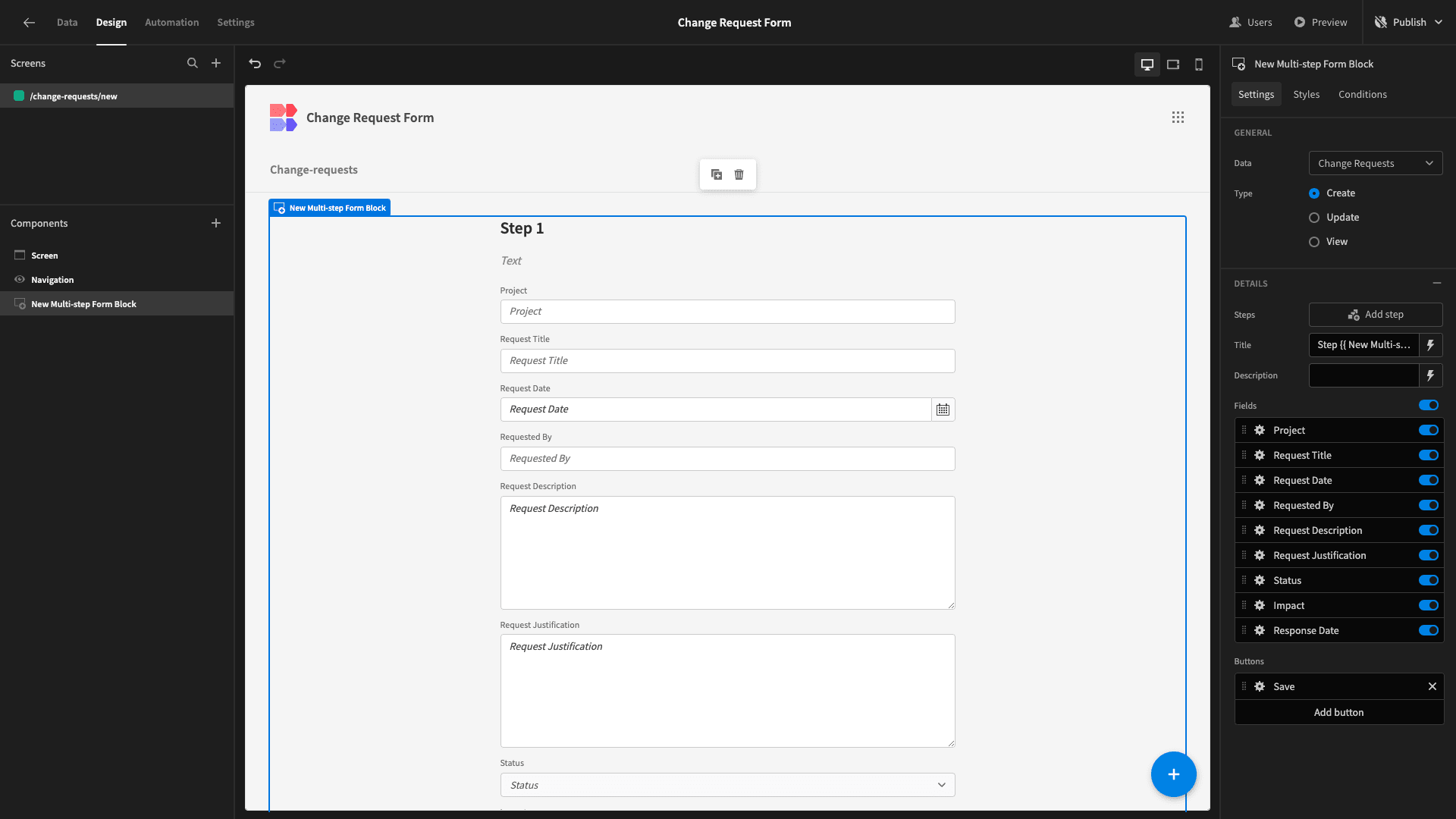
All we need to do is tweak the design to our liking.
By default, our form has a single step that contains fields for all of our table’s attributes. So, our first task is to arrange this into a more logical flow.
We want our form to comprise two steps. The first will contain the Project, Request Title, Request Date, and Requested By attributes. The second will contain the Request Description and Request Justification.
The Status, Impact, and Response Date won’t be included at all, as these aren’t part of the initial change request submission.
For our existing step, we’ll deselect all of the attributes except the first four that we listed:
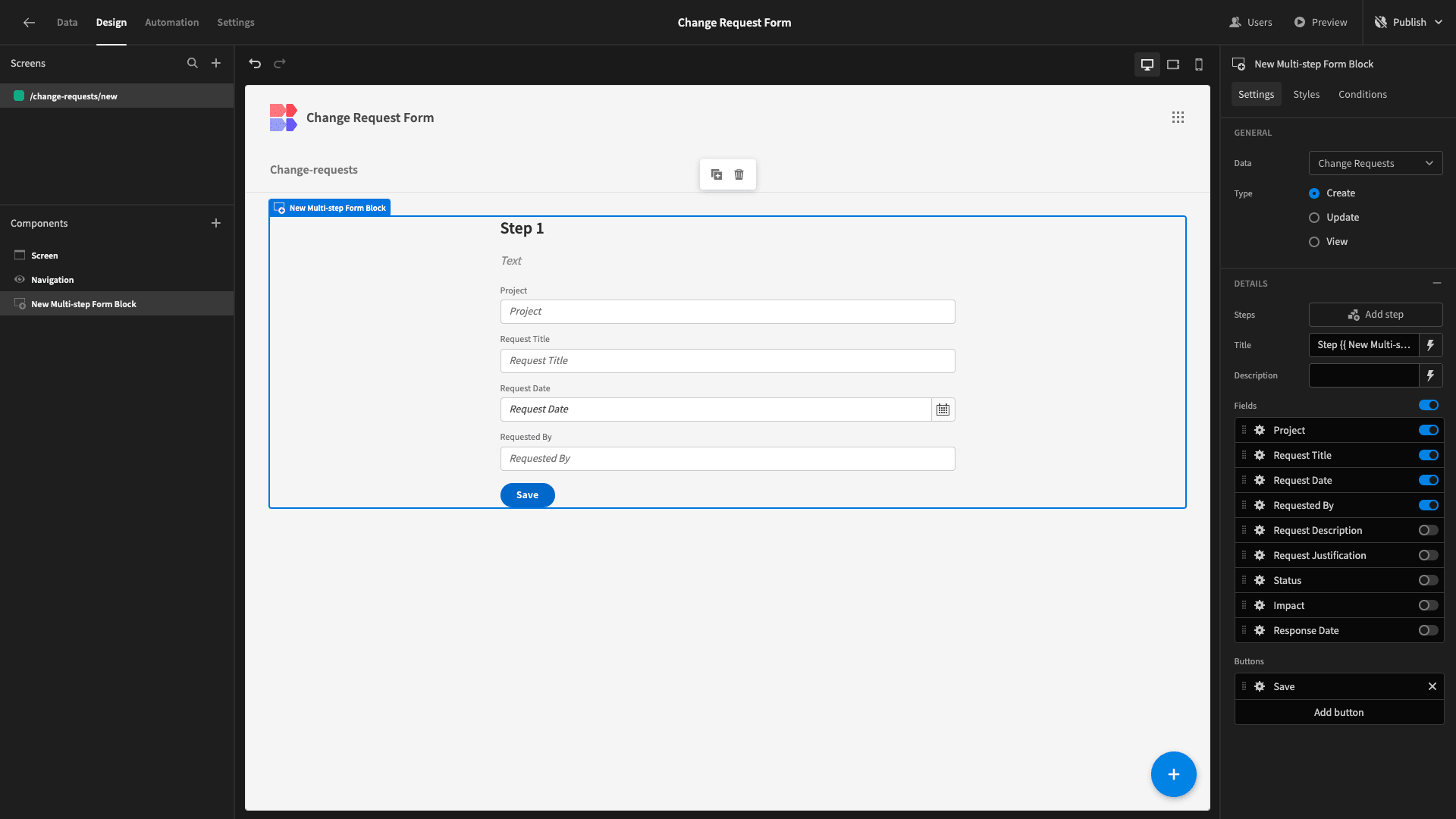
Then, we’ll hit Add Step:
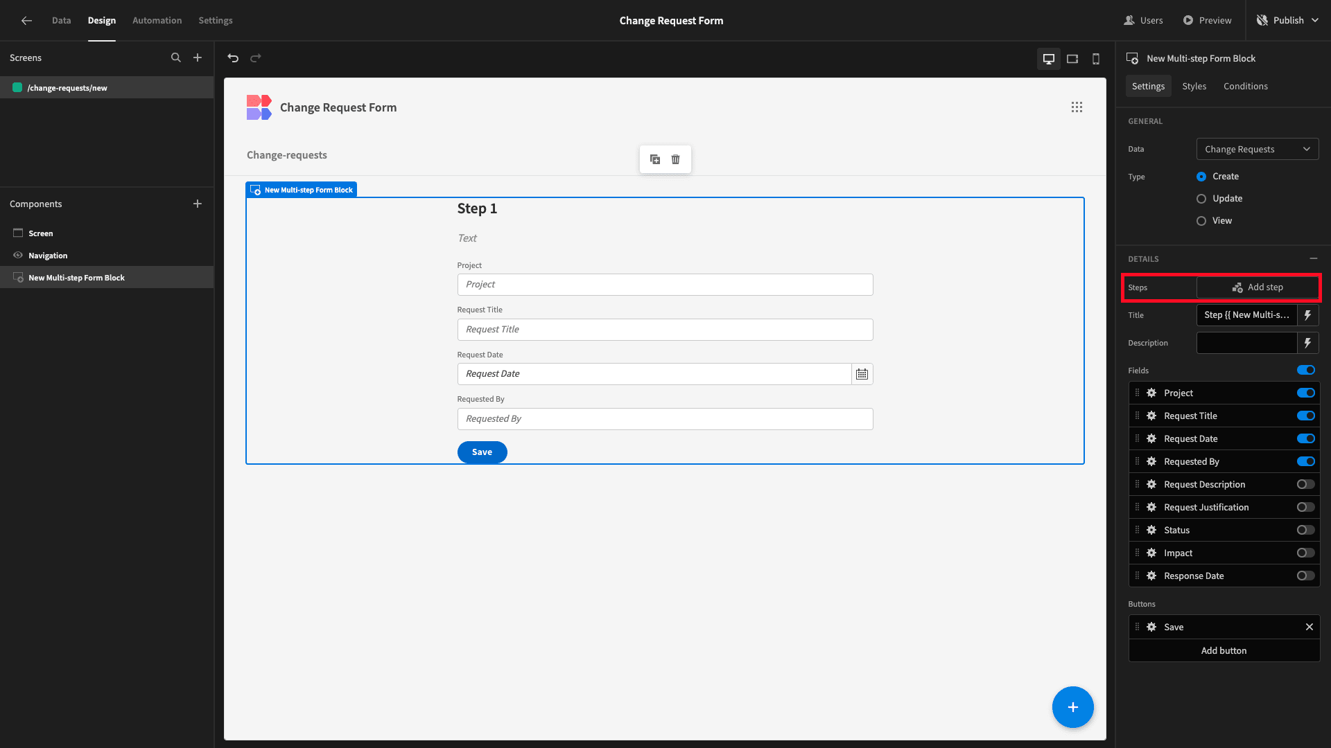
And, this time, we’ll deselect everything except the Request Description and Request Justification fields:

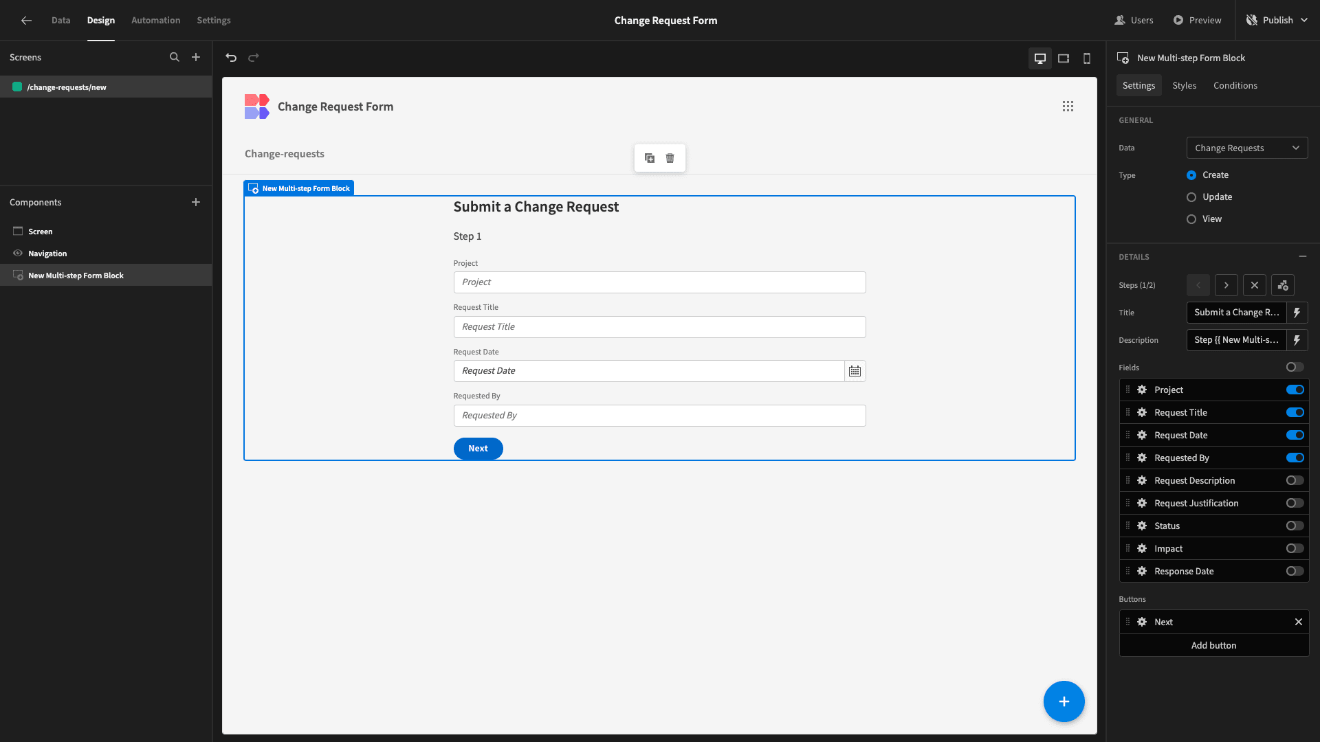
We can also make a few UX improvements. Each form step has a title and description attribute. By default, the title displays the current step number.
We’re going to move this to the description and then give our form a more descriptive title:
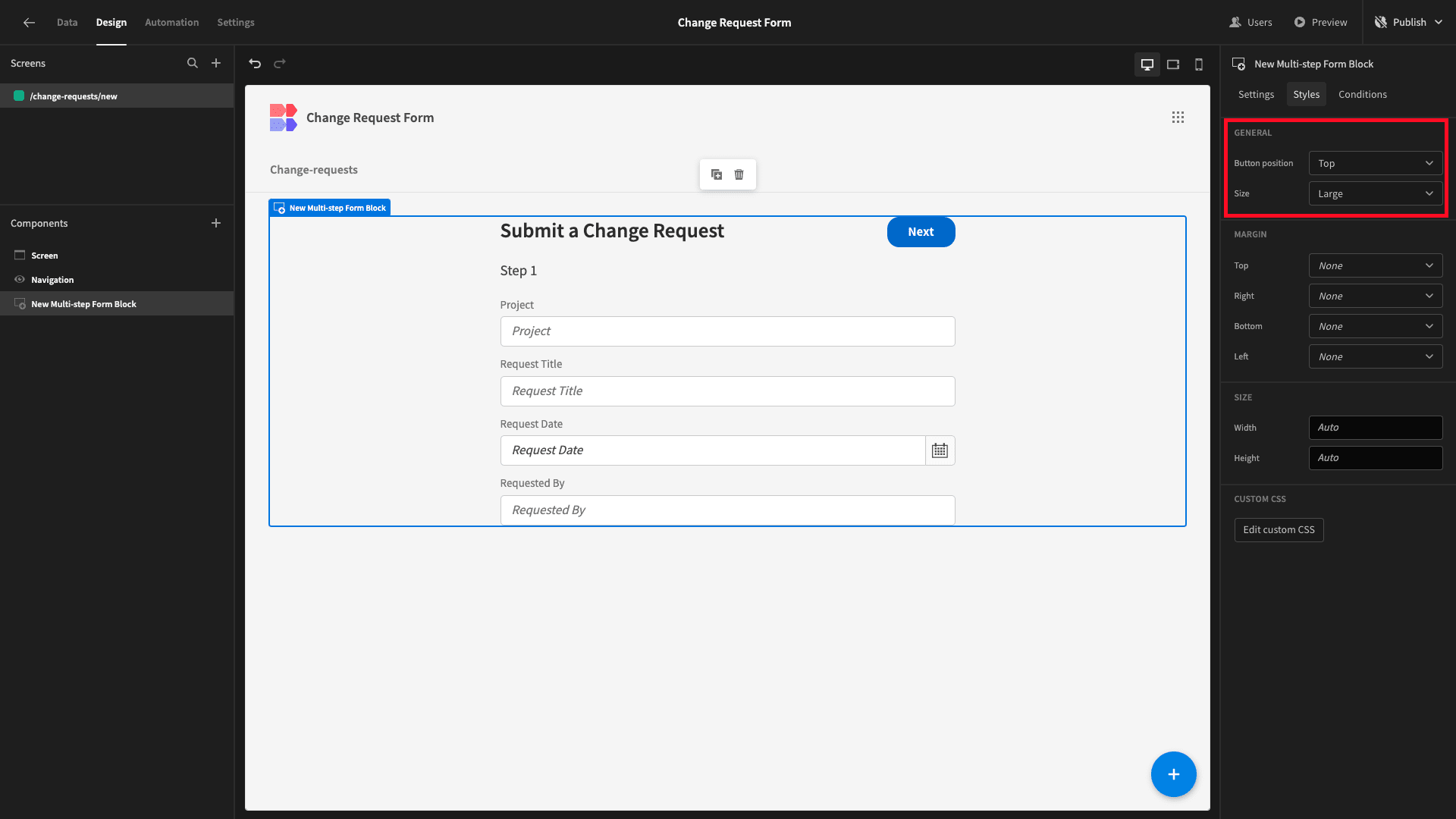
Under the Styles tab, we’ll also set the Button Position option to Top and the Size to Large:
Lastly, this is the only screen that certain users will be able to access. So, we need to provide a message to say that their request has been submitted.
Below our Multi-step form block, we’ll add a Headline component. We’ll set the Text attribute to our message, and the Alignment to center:

Back on our multi-step form block, we’ll add an action to our save button, creating a state variable called ‘complete?’ and setting it to true:
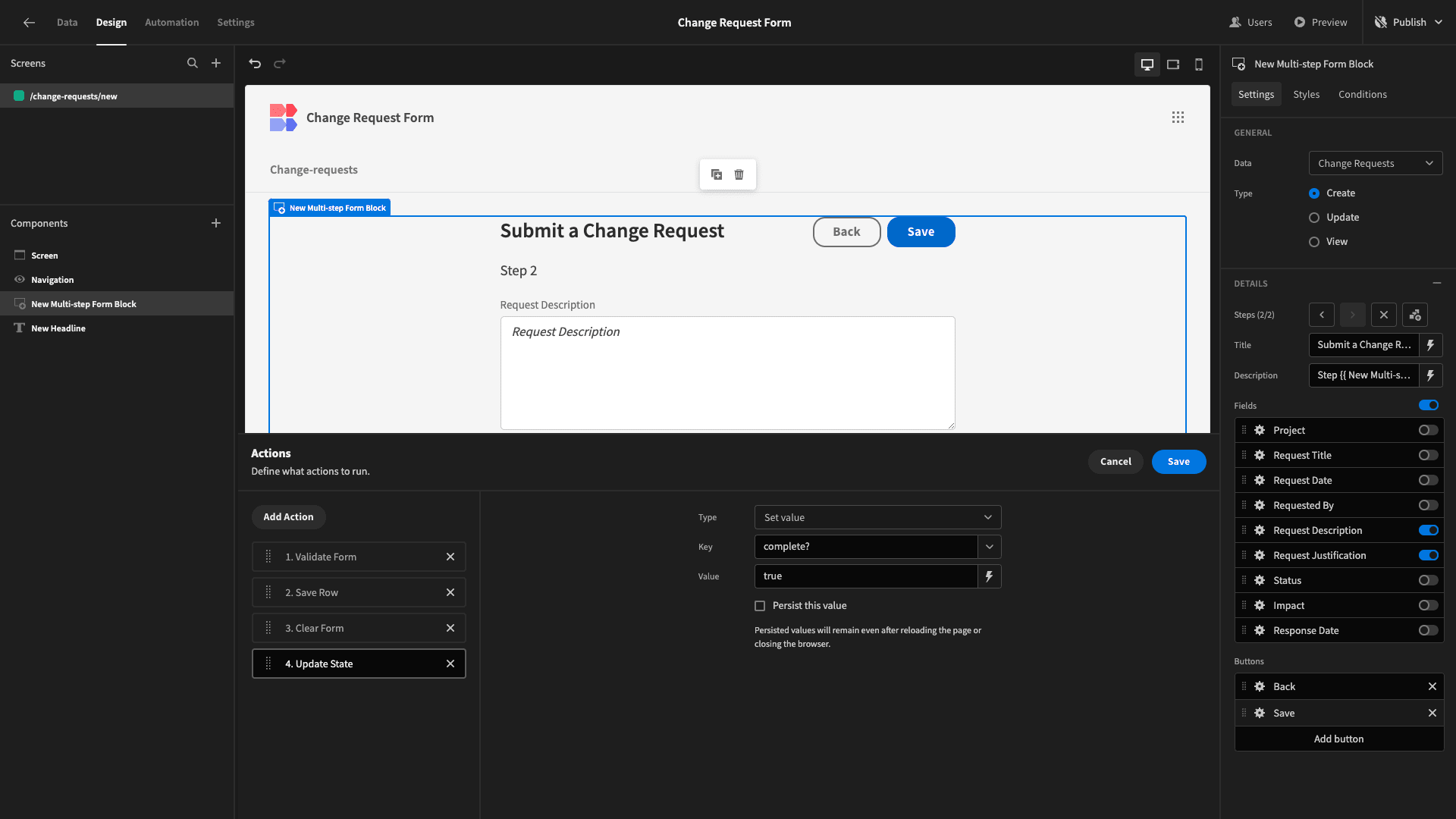
Under the conditions drawer for our form block, we’ll set a rule so that this component is hidden is {{ State.complete? }} is true.
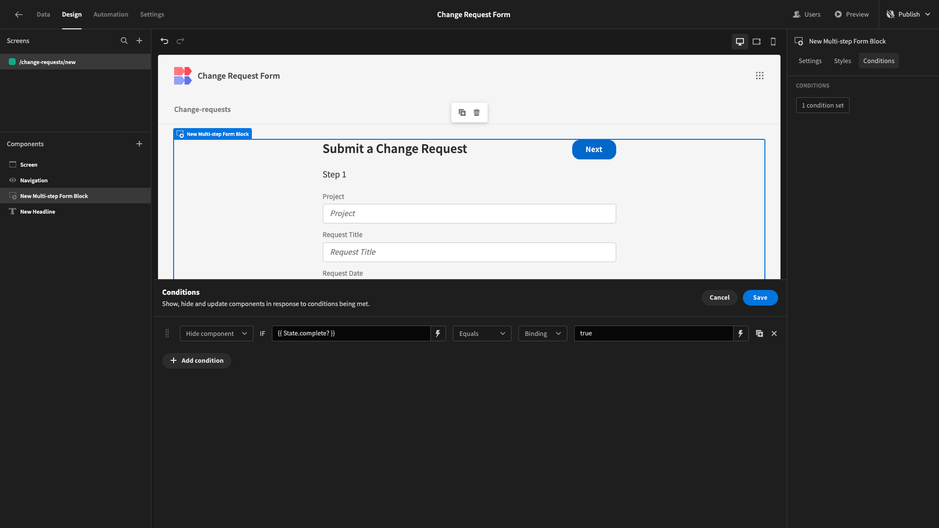
And we’ll add a corresponding rule to our Headline component so that it’s only displayed if our state is set to true.
Now, when users hit Save, the form block will disappear and the confirmation message will be displayed in its place.
And that’s our form UI completed.
3. Generating a CRUD screen
Next, we’re going to create a screen where responsible colleagues can manage submissions to our change request form.
We’ll start by adding a new screen. This time, though, we’re choosing the Table option:
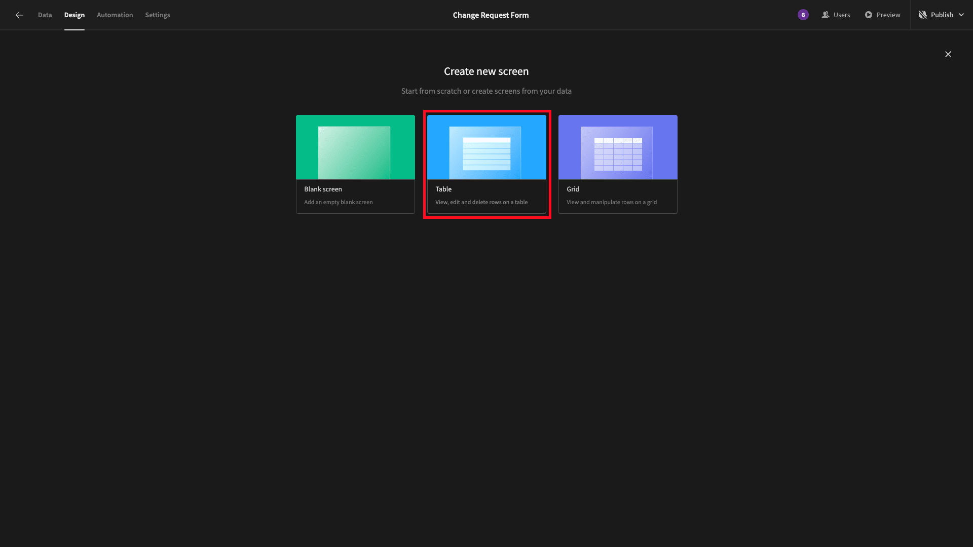
This will autogenerate a working CRUD UI for whichever data table we choose.
Of course, our app only has one table connected to it - so we only have one option:
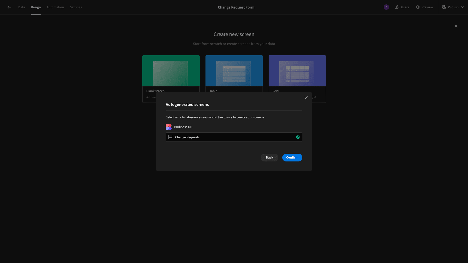
Again, we won’t worry about setting an access role until a little bit later.
Here’s what this looks like straight out of the box:
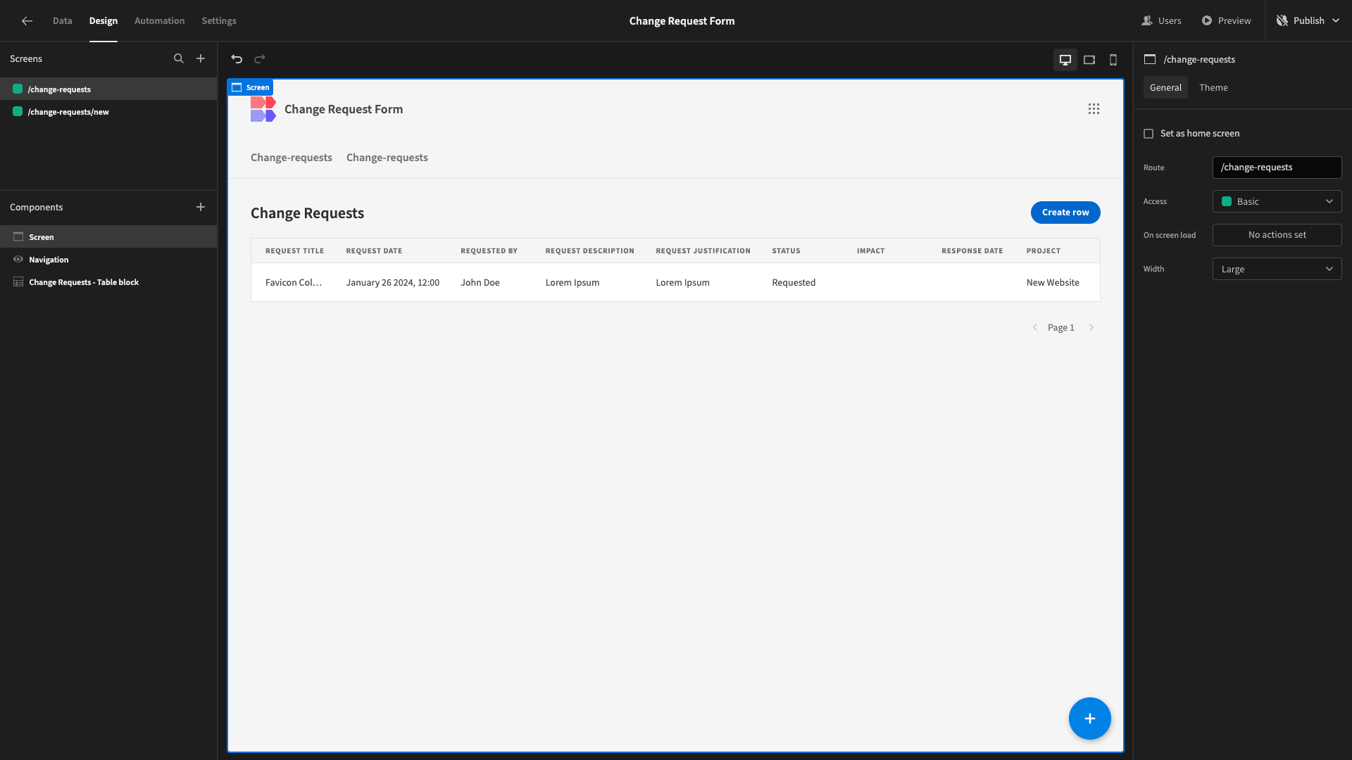
We can access Update and Create forms for our table, by clicking on a row or the Create New button, respectively:
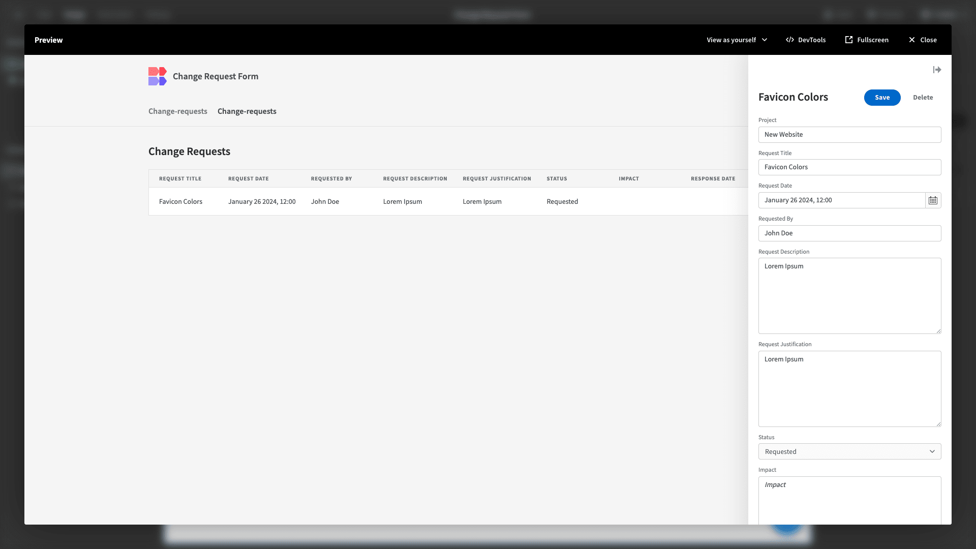
From a purely functional standpoint, this autogenerated screen already does everything we need it to. We’re simply going to make a few design tweaks.
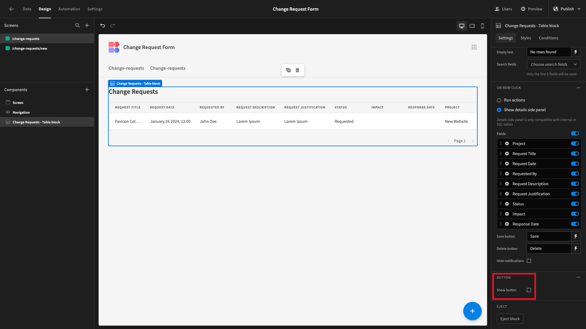
First of all, we’ve just built a custom change request form. So, we don’t need the side panel for creating new entries. Therefore, we’ll uncheck the option for displaying the Create New button:
However, we do want our users to be able to search for specific entries. Under the Search Fields dropdown, we’ll select Project, Request Title, and Request Date as searchable fields:
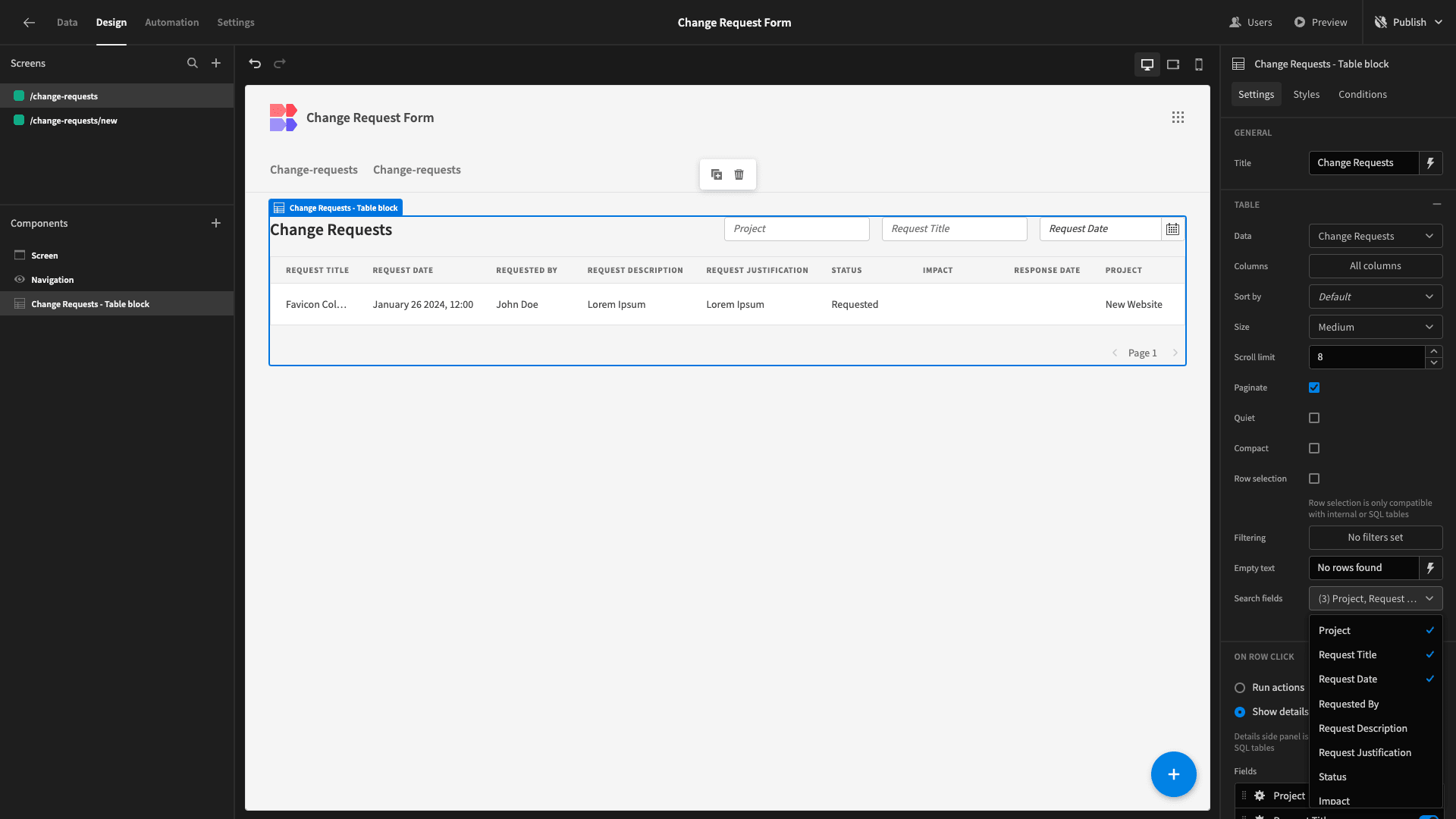
As you can see, this adds form fields above our table for looking up rows.
Now, by default, our Update form allows users to edit all attributes stored against each row. We want the fields relating to the original submission to be readable on this screen. Only the remaining response fields should be editable:
So, under the field settings menu, we’ll select Disabled for all attributes except Status, Responses Date, and Impact:
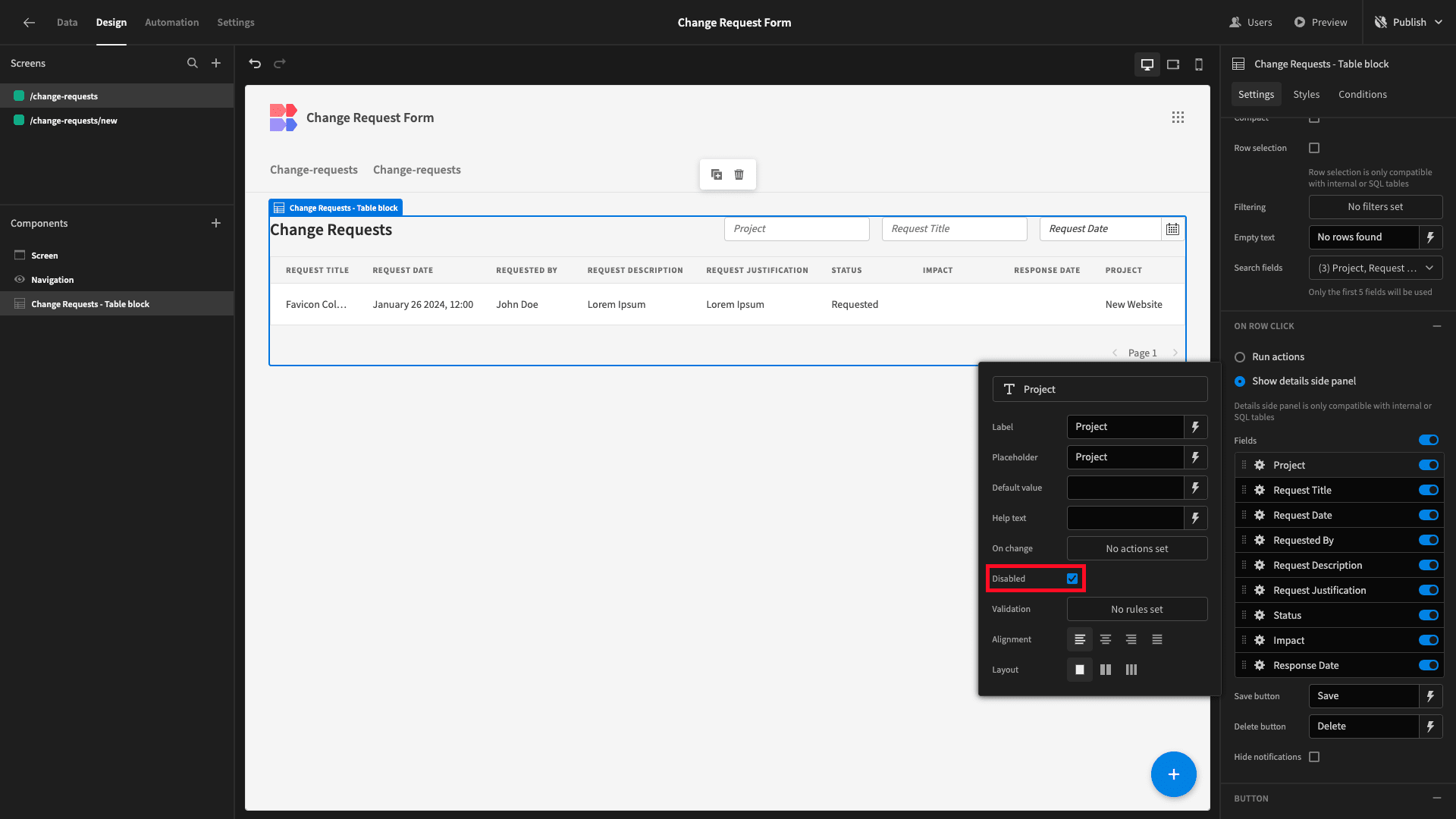
Here’s how this will look in situ:
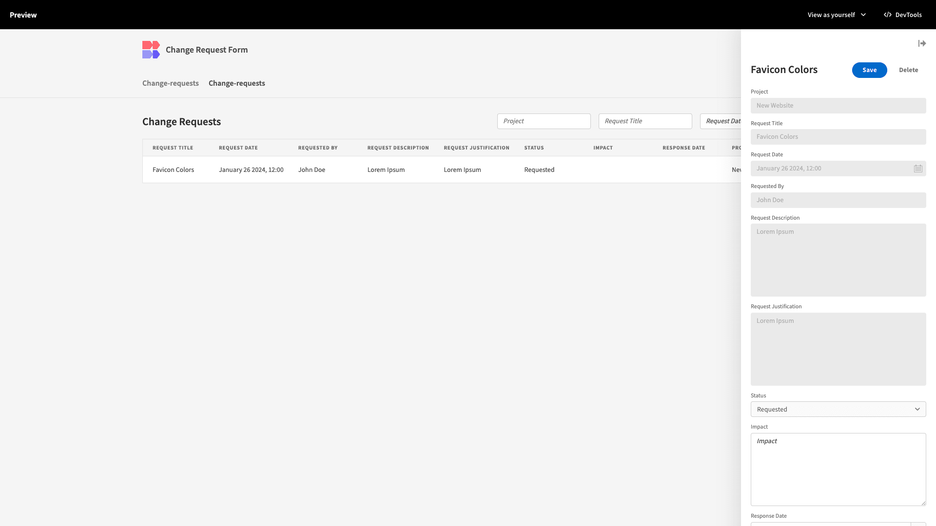
So, using just a couple of forms, we’ve created a simple workflow for gathering and responding to change requests.
4. Assigning access
Now, we said at the outset that distinct groups of users will interact with our change request form in different ways.
Specifically, we’re going to use Budibase’s built-in RBAC to create a two-tier access control system for our app. Basic users will only be able to access our submission form. Power users will have access to this and our table UI.
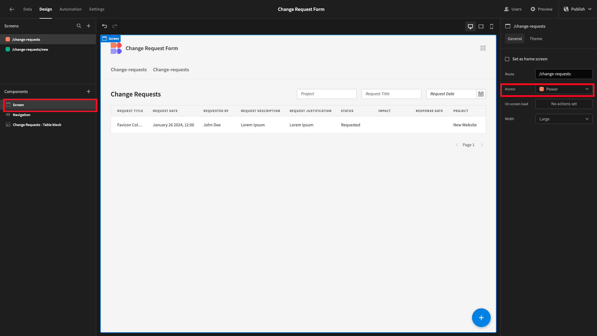
By default, all screens are configured to require the Basic role. So, our first step is to update the minimum role for our table UI to Power, under the Screen menu:
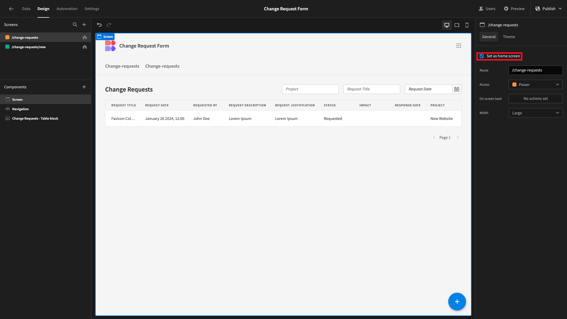
We’ll also check the ‘Set as home screen’ option on both screens - configuring them as the landing page for their respective roles:
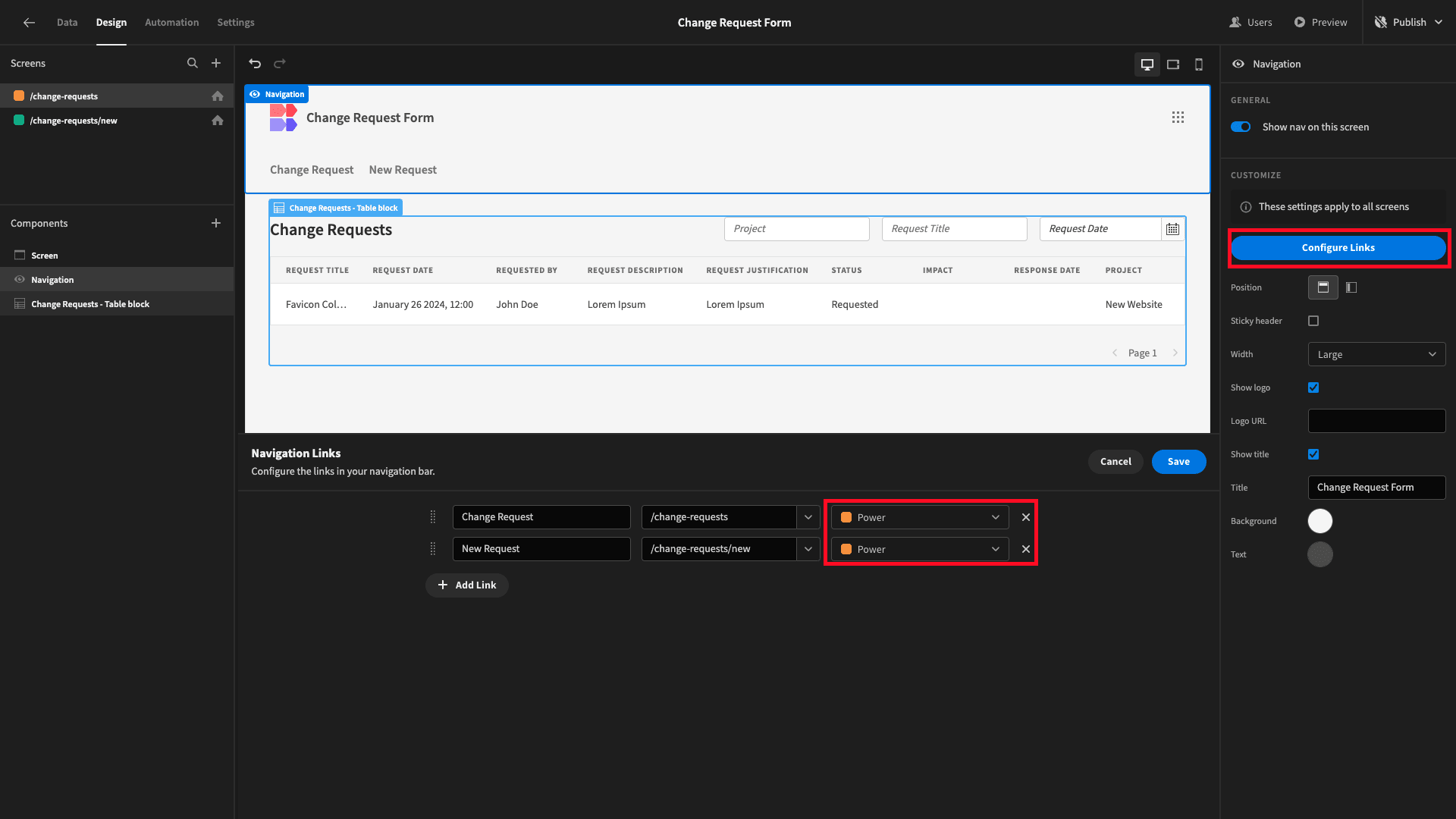
Lastly, under Navigation, hit Configure Links. Here, we can set the minimum role required for each page to be displayed in our nav bar. We’re setting this to Power for both screens. We’ll also tidy up the display text while we’re here:
This means that not only can Basic users only access the submission form - they won’t even see the option to navigate to any other pages:
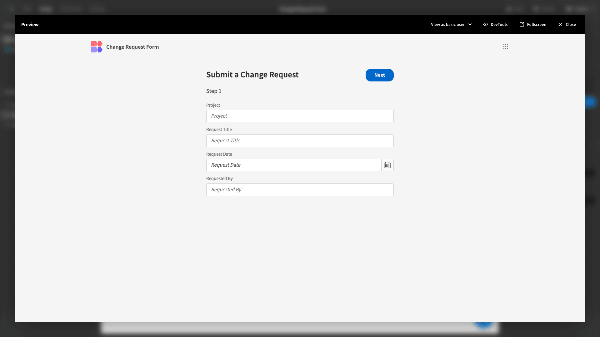
And that’s everything we need to do in terms of navigation and access control.
5. Design tweaks and publishing
We’re almost ready to push our change request form tool live for users. First, though, we can make a few more changes to the overall design of our application.
Under the Screen menu, we have a choice of several built-in app themes. We’re going to go with Midnight:
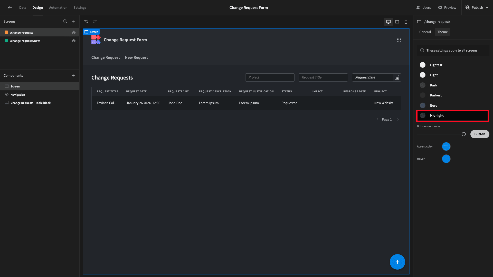
If we wanted to, we could also update the default button colors for our app here to match our own brand identity, but we’ll leave these as the default options for today.
When you’re happy with the look and feel of your change request form, you can hit Publish to push it live:
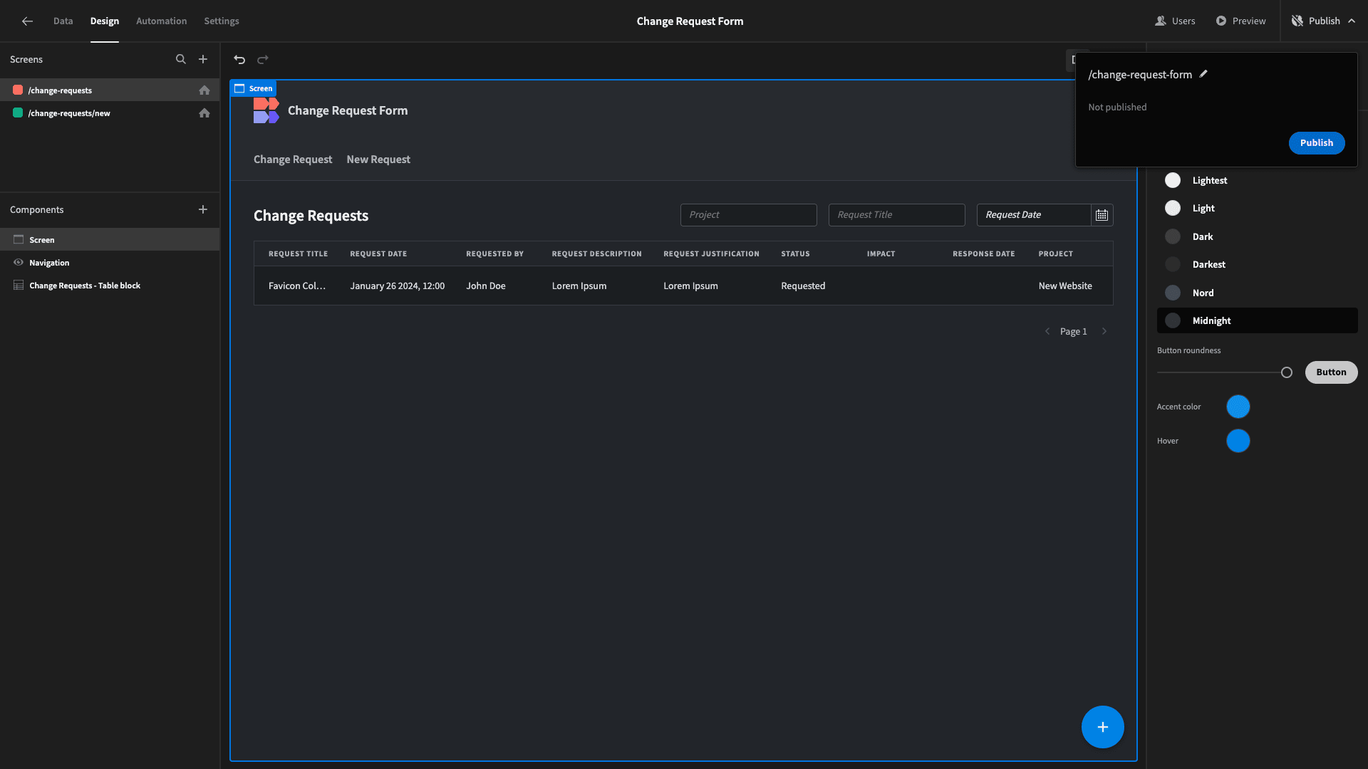
Once our app is live, we can view it in a new tab.
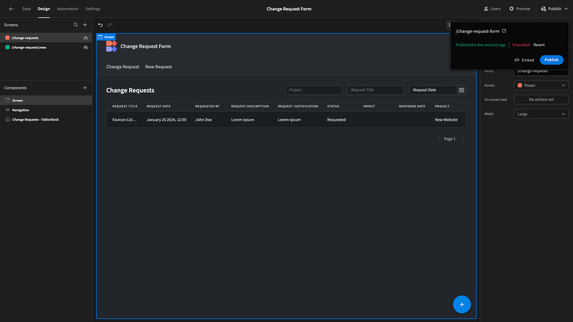
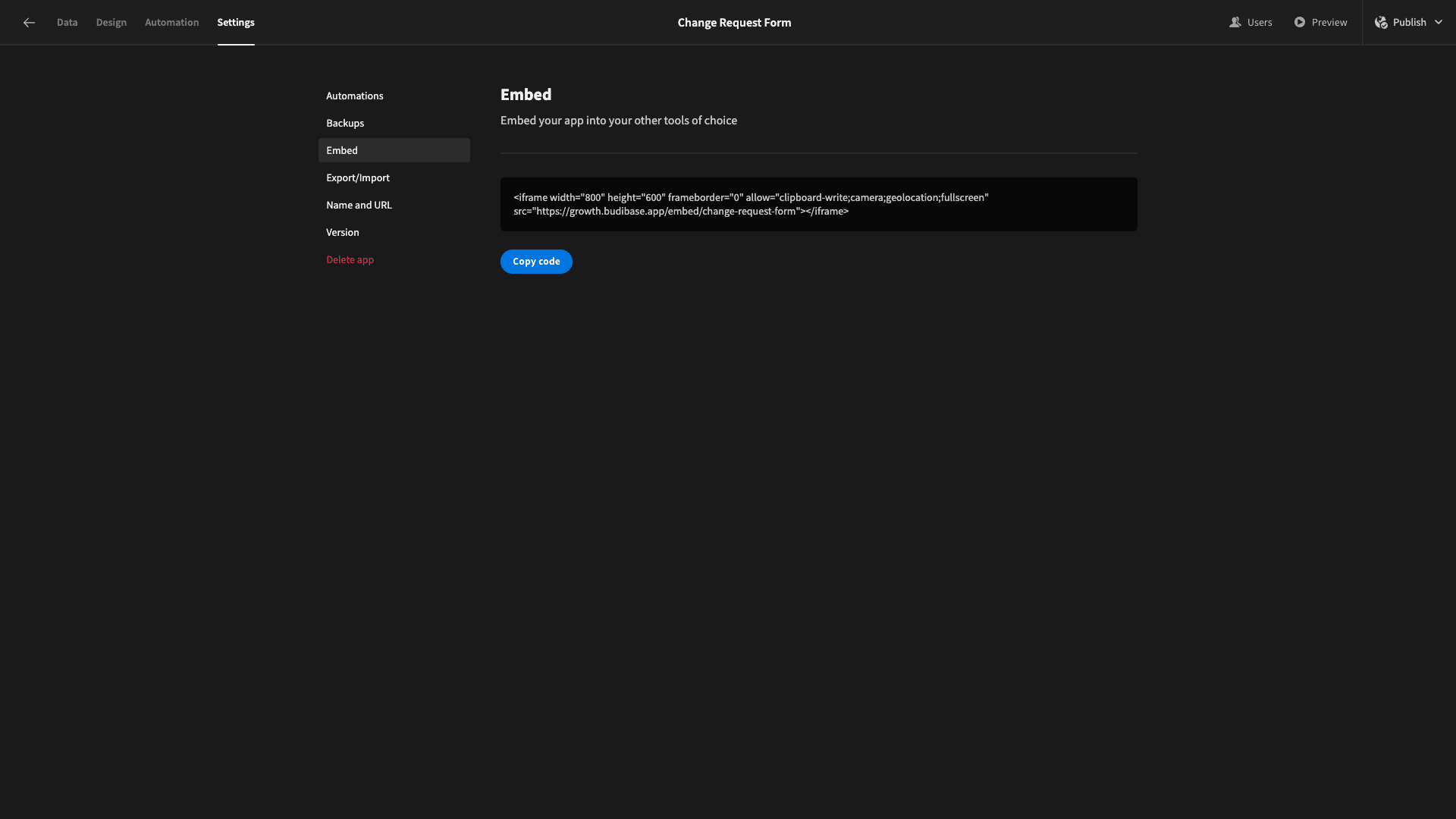
We can also hit the Embed button, and Budibase will generate an iFrame that we can add to HTML documents:
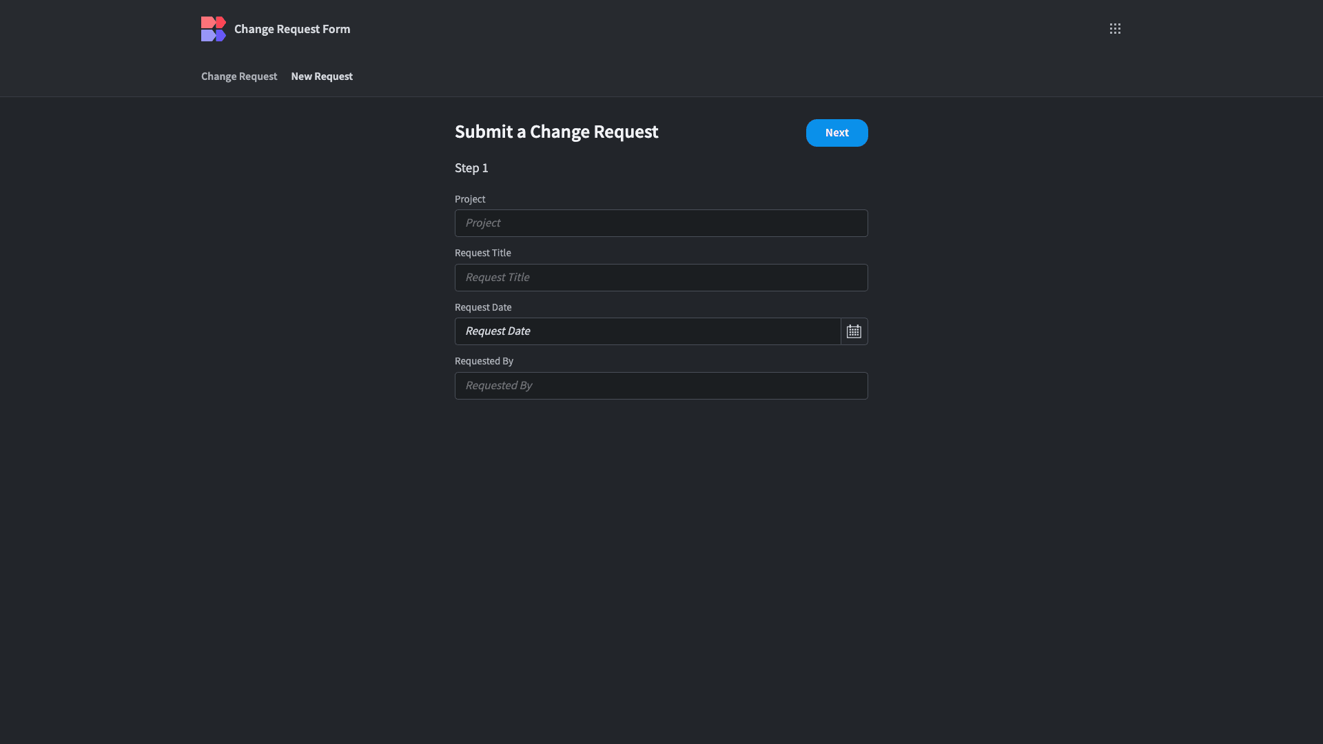
Here’s what our finished change request form looks like:
To learn more about building advanced forms on top of any data source, check out our digital forms page.