Creating an Employee Management App | 6-Step Guide
Today, we’re going to run through how to build a relatively simple but no less powerful tool - an employee management app using Budibase.
Your employees - along with their skills, knowledge, and expertise - are some of your most valuable assets. Therefore, making better use of their time is one of the easiest ways to create huge efficiency savings.
And for that, we need proper oversight. Who is doing what - and when?
When you have a couple of team members all working in the same location, this isn’t such a challenge. For bigger, remote, or dispersed teams, things can get very tricky, very quickly.
We’re going to show you how you can build a fully custom solution for managing your employees, with minimal coding skills - in just six steps.
But first, let’s cover a bit of background information.
What is an employee management app?
Employee management apps are used to control which employees work on different tasks. Essentially, we can add new tasks, and assign them to whichever employee is best placed to complete them.
This might be based on their skills, experience, availability, location, or any other business logic.
Within the same platform, individual employees can check the tasks that have been assigned to them, update their own details, or mark assignments as complete.
That’s the core functionality anyway.
Depending on our needs, we might also want to build additional features around this. For example, reporting, automatic assignments, financial management, or integration with relevant third-party platforms.
We’ll come on to what our app does shortly. First, though, let’s zoom out a little bit and think about why this matters in the context of effective ops.
What does an employee management app achieve?
When it comes to building any kind of solution, it’s important that we have a firm grasp on the underlying business pain points we want to alleviate.
When it comes to improving our employee management efforts, this can play out in a couple of key ways.
Specifically, you’re probably here because you want to improve some combination of the following business variables:
- Costs - how much we spend on particular tasks as well as delegating these among colleagues.
- Communications - reducing the risk of miscommunication.
- Planning and resource allocation - ensuring that we have a clear idea of the time and costs required to complete jobs.
- Employee satisfaction - delegating work in a way that ensures fairness and matches individual employees’ skills and goals.
- Performance management - gaining oversight into how effectively employees carry out different kinds of tasks.
- Auditability - creating a paper trail of when different jobs are completed.
- Efficiency - providing a streamlined UX for delegating, viewing, and managing employees and tasks.
For example, we can contrast this with assigning tasks with manual communications, where details can be misinterpreted, or other redundancies and errors can easily occur.
For more inspiration, check out our round-up of examples of web applcation design.
With that in mind, let’s take a look at what our finished employee management app will look like.
What are we going to build?
The solution we’ll build today comprises two parts:
- A pair of CRUD screens, where power users can manage employee and task details - as well as delegating work.
- A separate set of screens for basic users to view and manage their assigned tasks or update their own details.
So, here’s the home screen for power users:
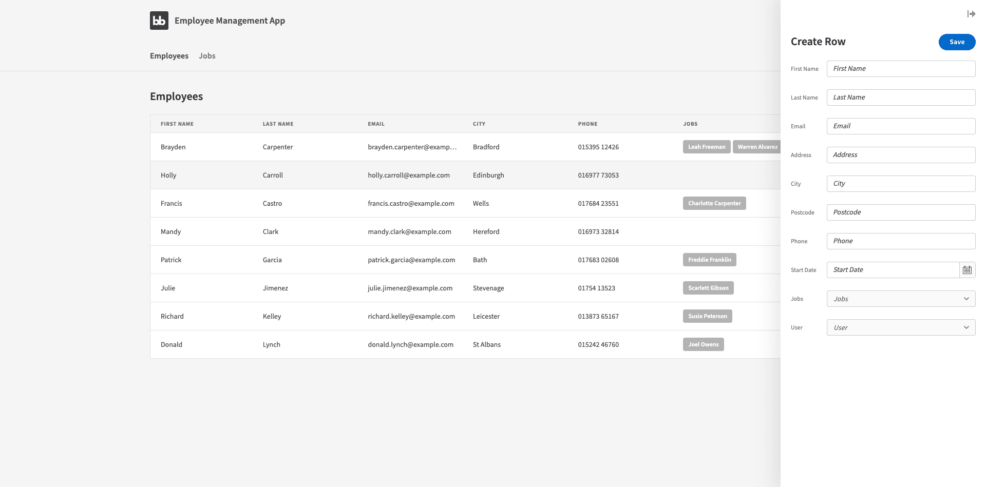
They can also access the equivalent screen for Jobs.
Whereas basic users will see this:
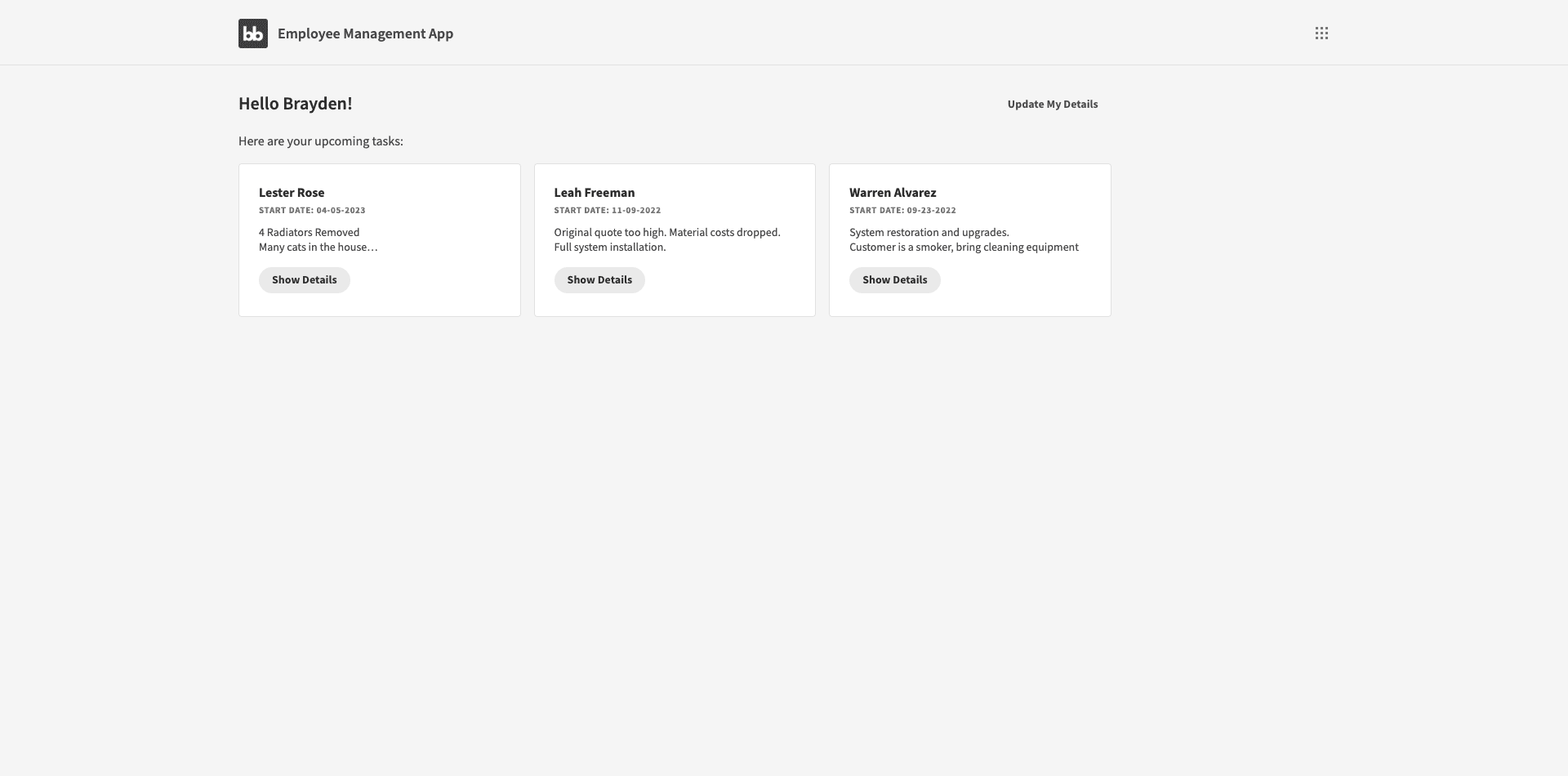
Note that there are several buttons here where employees can click through to modal screens for managing tasks or updating their personal details.
For a better understanding of what’s going on here, let’s drill into the different elements of what we have.
Data
First our data model. This is pretty simple, actually.
We’ve got three internal tables for:
- Employees,
- Jobs,
- Users.
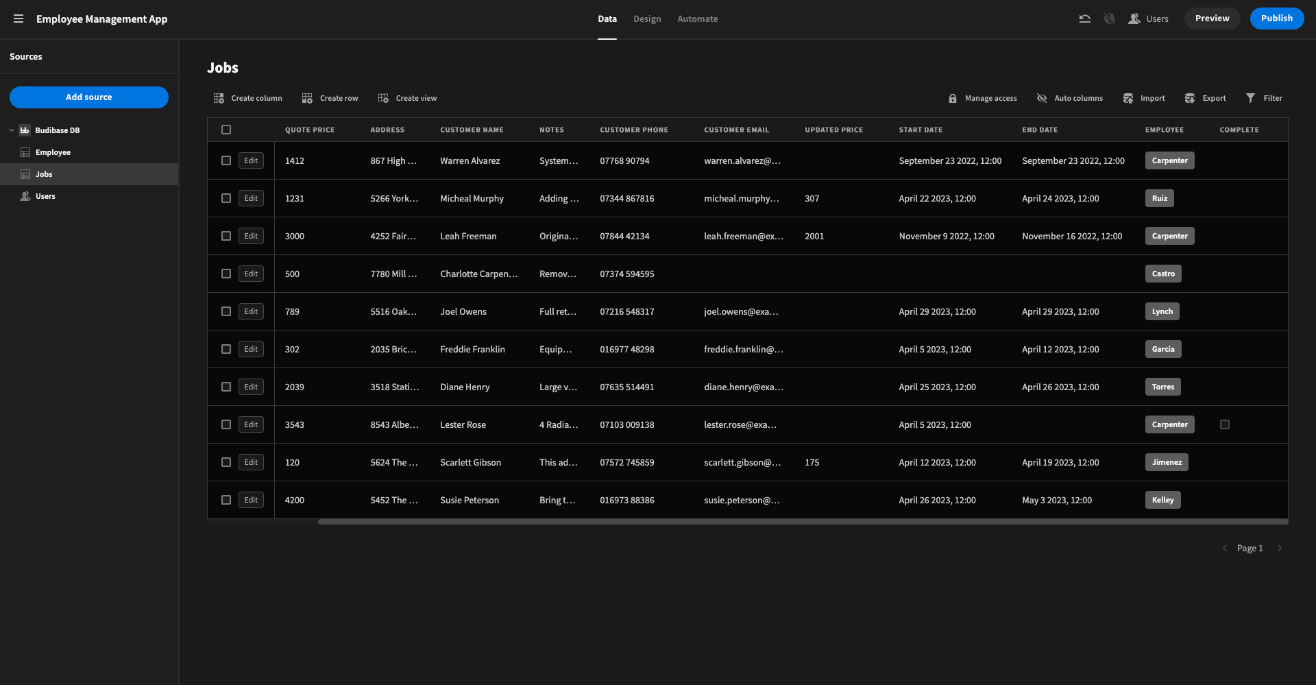
We’ve created these using our internal database, BudibaseDB - but we could just as easily have used external data. For instance, with SQL or REST.
We won’t bore you by going through every attribute in each table, since it’s just sample data.
What’s more important is the relationships we’ve configured between these tables. We have two:
- A many-to-many relationship between the employees and jobs tables.
- A one-to-one relationship between the employees and users tables.
We’ll see how this works a little later.
You might also like our guide on how to build a dashboard .
UI
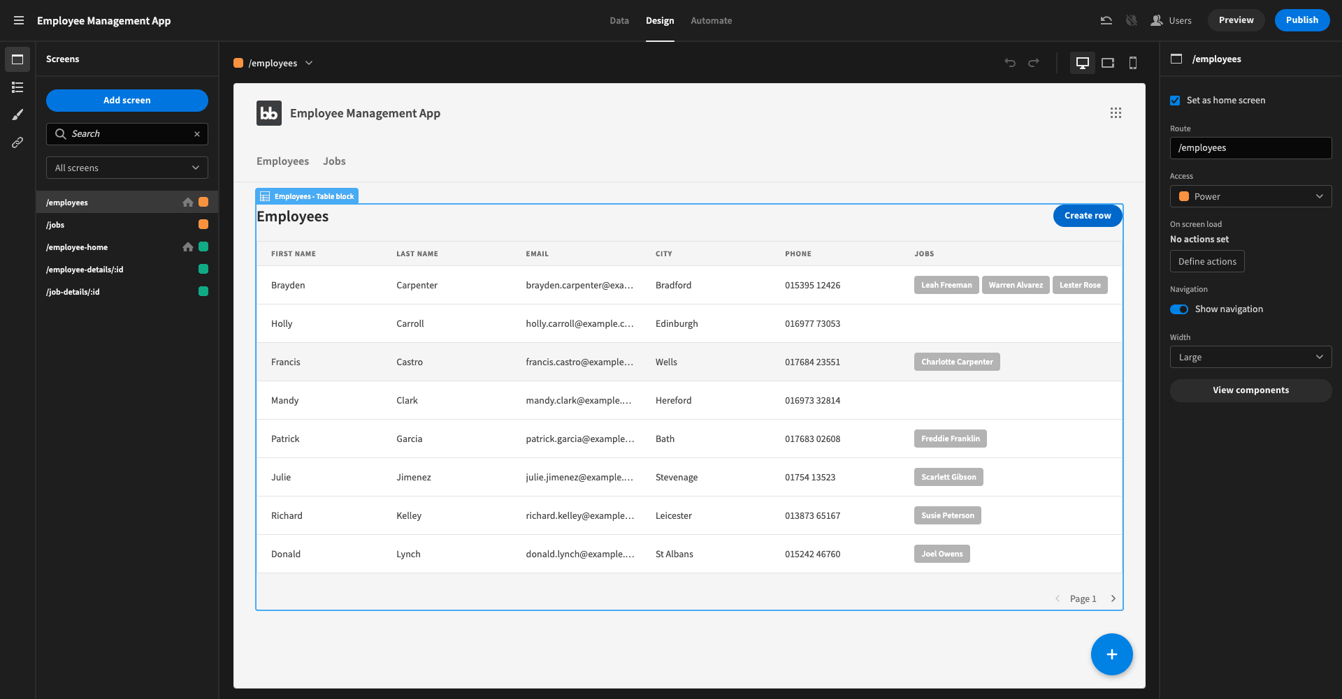
Next, let’s take a look at the screens we have to manipulate this data. We’ve got five separate UIs:
- /empoyees - a CRUD UI for our employees table.
- /jobs - a CRUD UI for our jobs table.
- /employee-home - the main dashboard screen for basic users.
- /employee-details/:id - a form for updating some limited employee attributes.
- /job-details/:id - for displaying and managing assigned tasks.
As we’ll see a little later, these last two open as modal screens from /employee-home. The first two are autogenerated screens, with just a little bit of tweaking.
We’ll cover each individual screen shortly.
Here’s what our design panel looks like:
Access Control
Finally, we’ve used Budibase’s built-in role-based access control to determine which kinds of users can access each screen. As we said earlier, we’re using two out of our four available roles, so each user’s role can either be basic or power.
We can set this when we create a user or at any point afterward.
To restrict a particular screen to an access role, we can use the drop-down editor on the right:
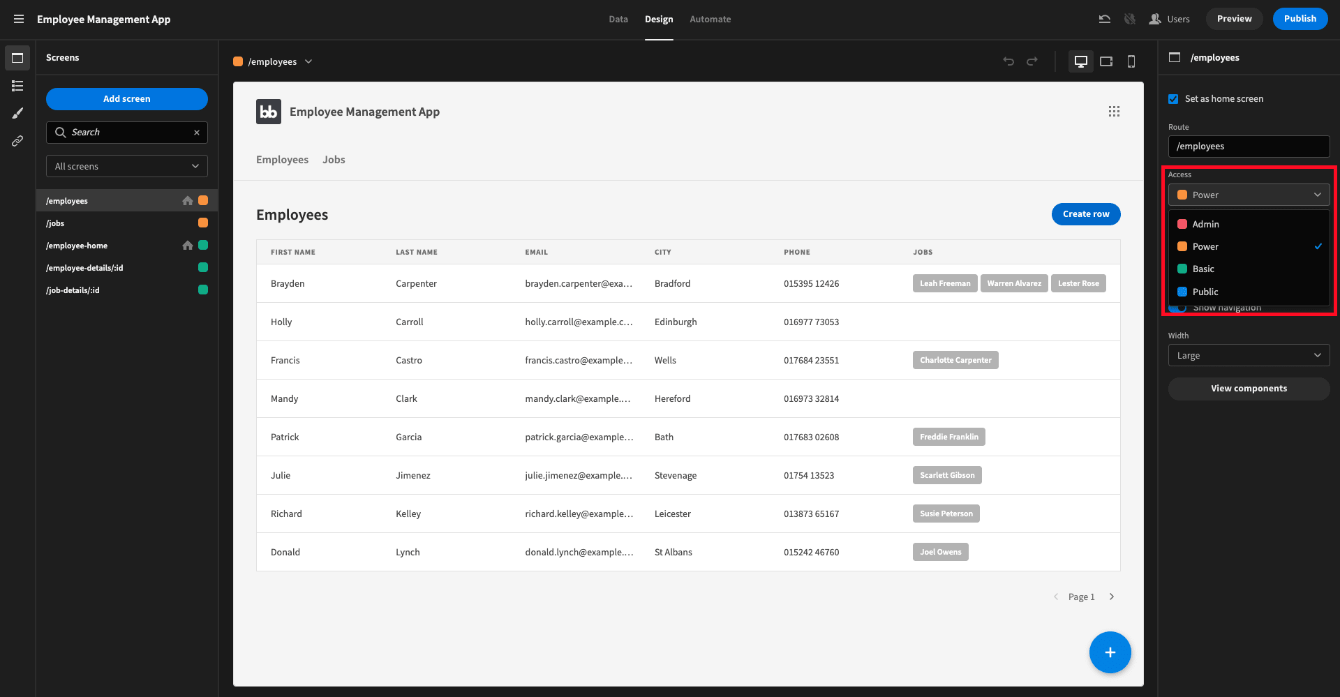
Our power users can access all screens, including /employees and /jobs, as well as the app’s navigation bar.
Basic users can only access the three remaining screens.
You might also like our guide on how to build a Google Sheets GUI .
How to build an employee management app in 6 steps
So, we know exactly what we want to build. All that remains is to do it. With Budibase, we can build this employee management app with minimal coding skills, and plenty of scope for customization around our core solution.
Here are the six steps you need to follow.
1. Create a new Budibase app
First, we’ll need to start by creating a new Budibase app. From the portal, we can click on create new app and then select start from scratch.
We’re then presented with the following screen:
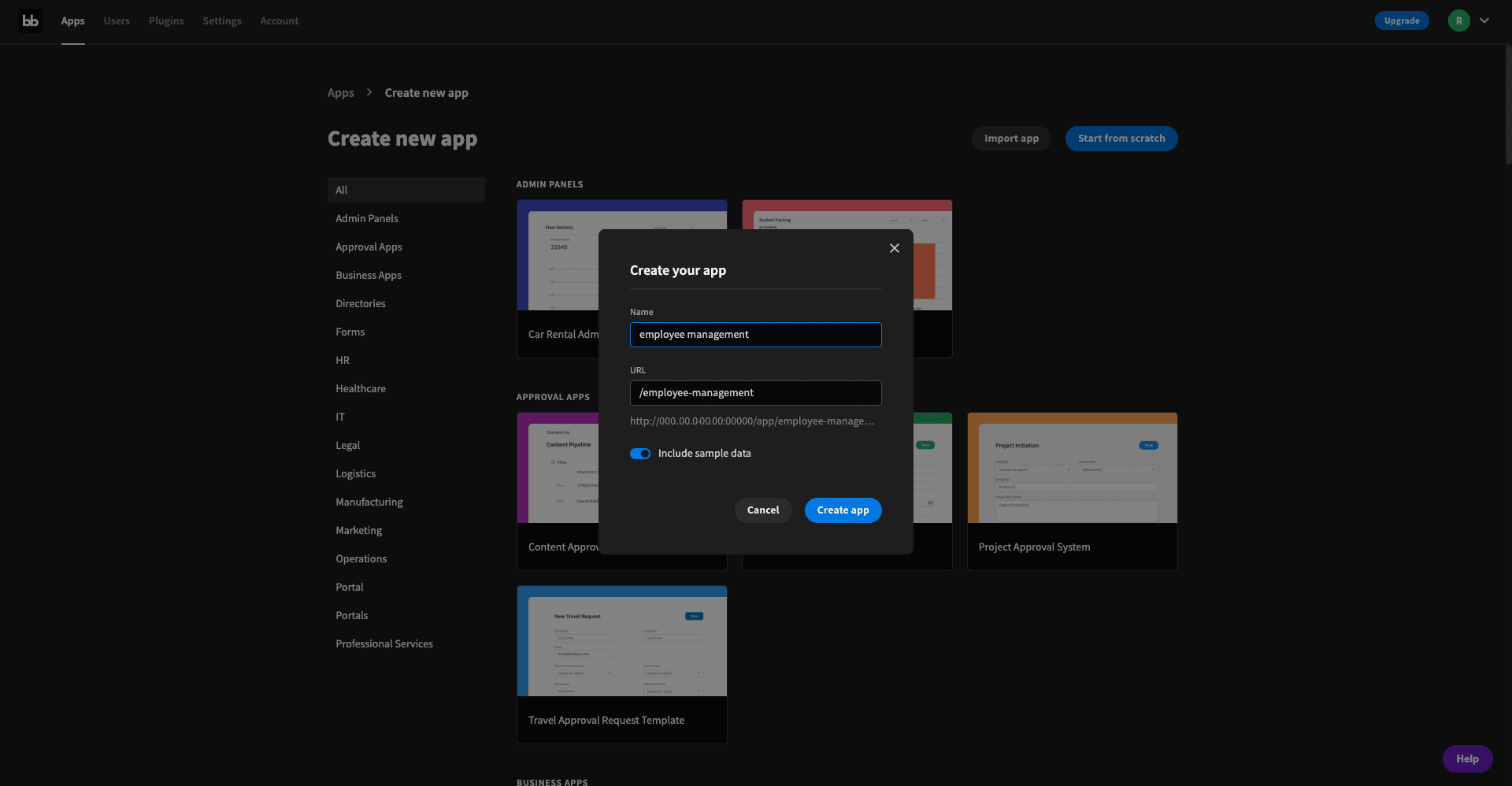
Here, we’ll give our app a name and unselect include sample data. We can also change the URL if we want, but otherwise, Budibase will generate this to match the name we’ve chosen.
We’re then prompted to choose a data source. We’re picking BudibaseDB:
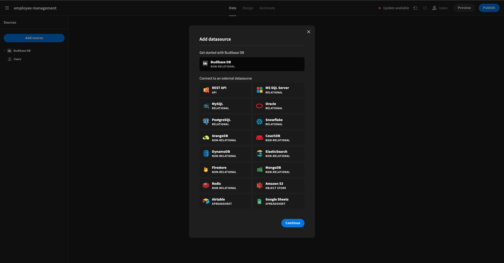
As we mentioned earlier though, you’ve got plenty of options depending on where the data you need lives.
2. Building our data model
At this point, we’re prompted to create our first table. We can do this from scratch by setting all of the attributes we want and then adding rows to fill their values.
For the sake of speed, we’re just uploading a couple of CSV files:
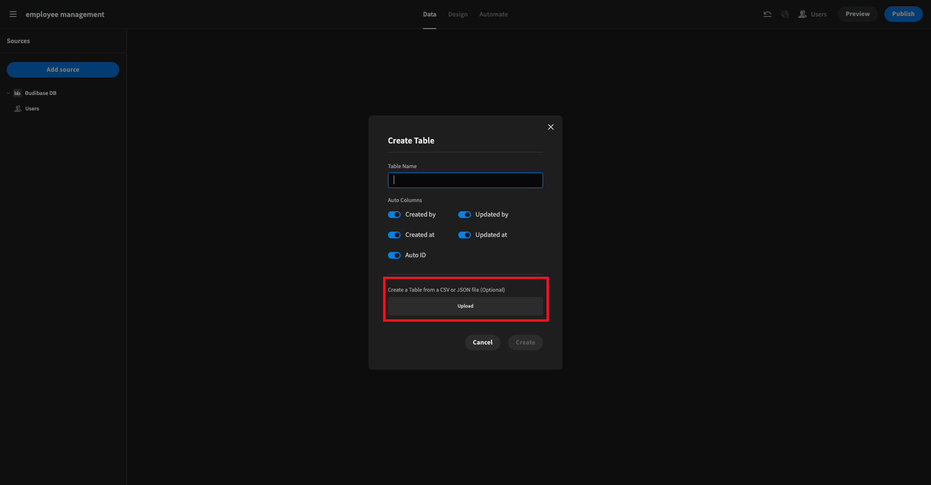
This is how we’ll create the employees and jobs tables. The users table is already present in our app, based on our existing Budibase tenant.
Next, we need to create the relationships between tables that we outlined earlier.
We’ll start with the many-to-many relationship between employees and jobs. From the employees table screen, we’ll select create column, which presents us with this modal:
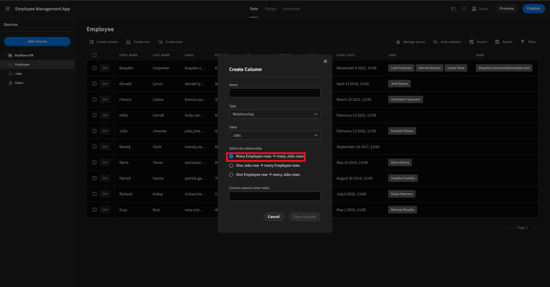
We need to give our relationship field a name, pick a target table, a relationship type, and what we want to call the equivalent field in the target table.
Then, we’ll repeat the same thing for the one-to-one relationship between employees and users.
And that’s it! Our backend is now in place and we can start building our UIs.
3. Create CRUD screens
We’ll start with the CRUD screens for our power users - since Budibase actually does the bulk of the work for us here.
First, we’ll head to the design tab and hit Add Screen, bringing up this modal:
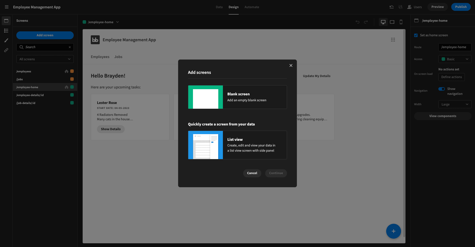
We’ll choose the second option - List view - and then pick a table and give our screen a name.
We’ll get something like this:
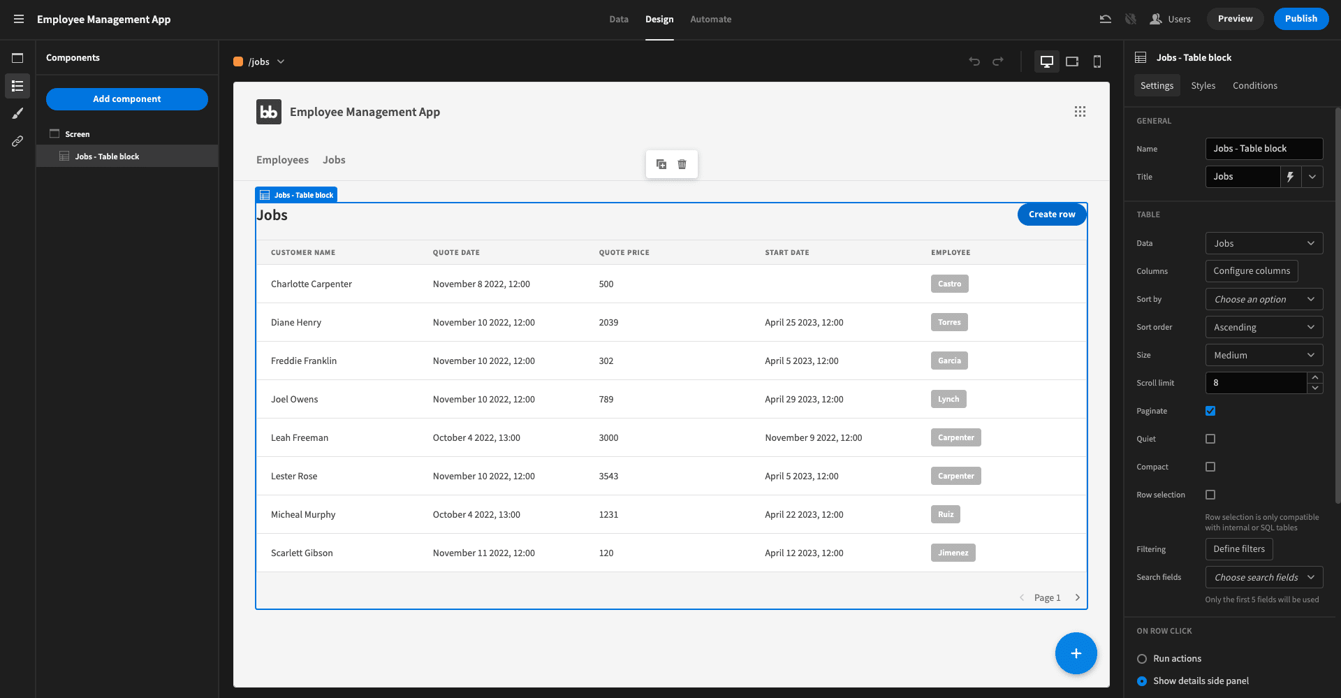
Basically, it’s a table UI that gives us access to two side-panel forms:
- A create form that’s accessible through the button in the top right corner.
- An update form that we can access by clicking on any individual row.
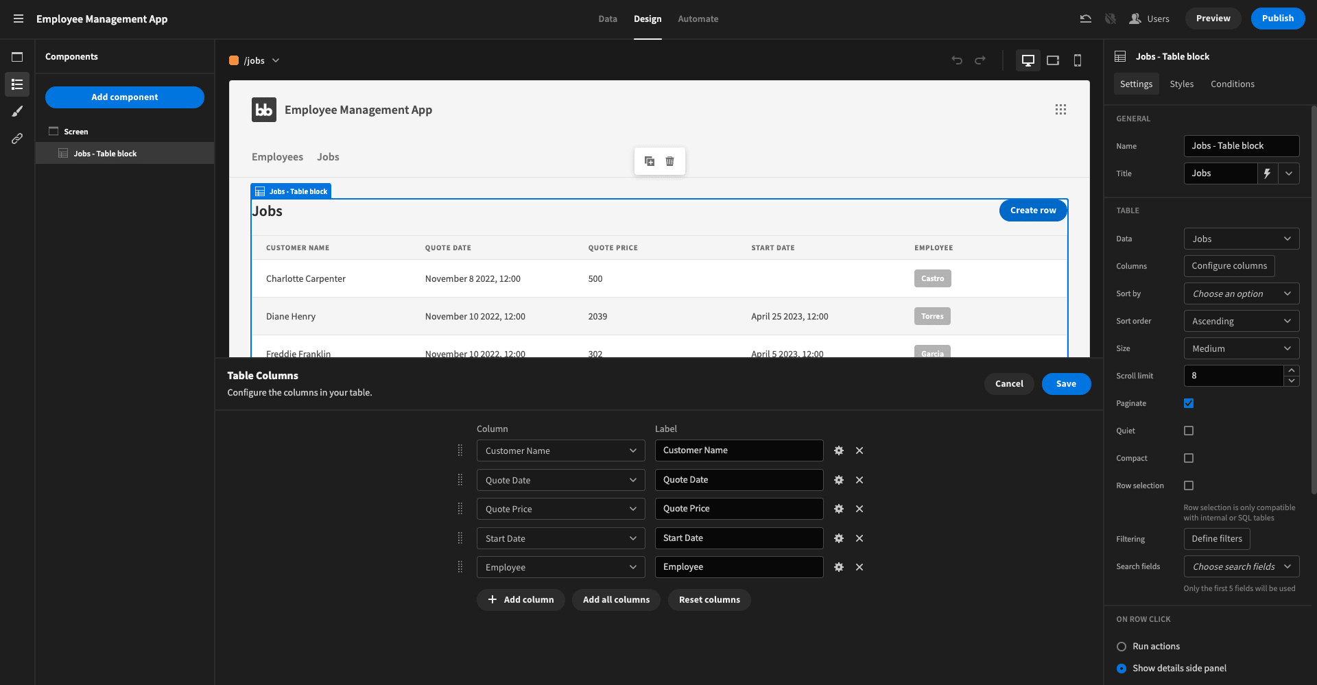
The only customization we’ve added is a bit of configuration around which table attributes we want to display. Our data table has more attributes than will fit neatly on the screen, so it looks a bit nicer if we only use a subset of them.
We clicked on the table block’s configure columns button and used the following configuration:
We’ll repeat the same process for our employees data and then our CRUD screens are done.
Remember we set the access level for these screens to Power so our on-the-ground employees won’t be able to access them. We’ll also check the set as home screen tick box one of them - it’s not a big deal which you choose. We’ve gone with /employees.
4. Our employee dashboard
Next, we’ll build our employee dashboard. This is a little bit more sophisticated, so we’ll need to create it from scratch.
Here’s what our component tree looks like:
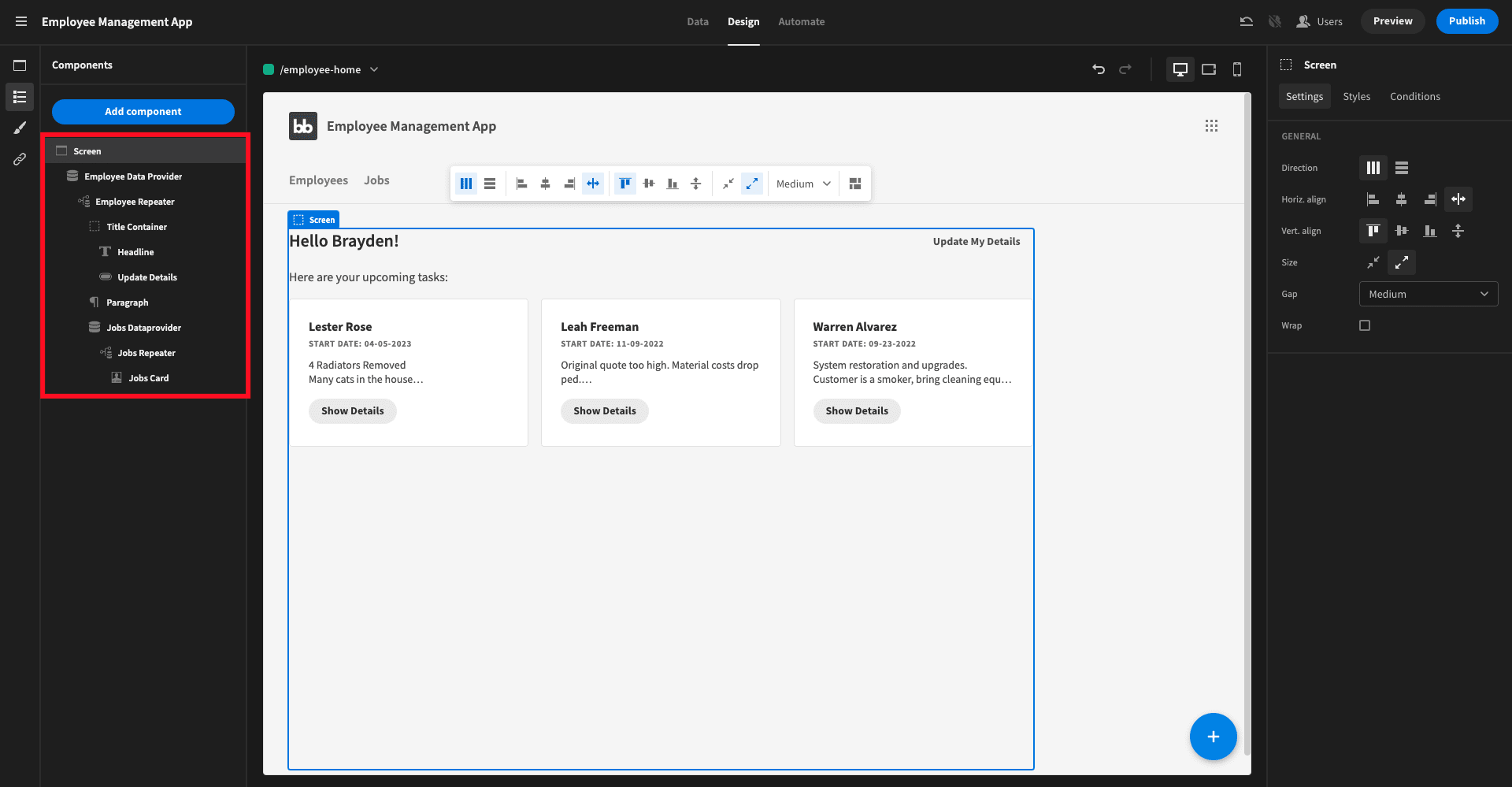
Let’s break this down.
First, we have a data provider with its data set to Current User.Employee and it’s limit set to 1. This pulls the appropriate employee row that’s related to the current user’s account in our data model. Then we have a repeater nested in this so we can access individual attributes.
Next, we have a vertical container with a headline component and a button. The headline’s text is set to Hello {{ Employee Repeater. First Name}} !. The button navigates to /employee-details/{{ Employee Repeater._ID}} in a new modal.
We’ll explain this last part a little bit more in the next section.
Then we have a static paragraph - just for a little bit of UX.
The second data provider and repeater is where things get a bit more interesting. This time, the data is set to {{ Employee Repeater.Employee.Jobs }}. It’s worth explaining what’s going on here.
Remember our other data provider queries the relevant row in the employee table that’s related to the current user. This second one inherits that data and then queries any rows in the jobs table that are related to that employee row.
Then, we have another repeater to access the attributes contained therein - only this time, its direction is set to horizontal.
Inside this, we’ve got a card component to display some of the details from each job entry. We’ve also added a button that navigates to /job-details/{{ Jobs Repeater._ID}}, opening a new modal screen.
Access for this screen is set to basic. It’s also set as the employee management app’s home screen for this role.
5. Building employee modal screens
To finish off our employee dashboard, we need to build our two modal screens.
We’ll start with the form that lets our employees update their own details. First, create a new blank screen with the URL /employee-details/:id and set the access role to basic. This URL format is what allows us to pass a particular row to the new screen, as in our bindings above.
On the screen, we’ll simply add a form block:
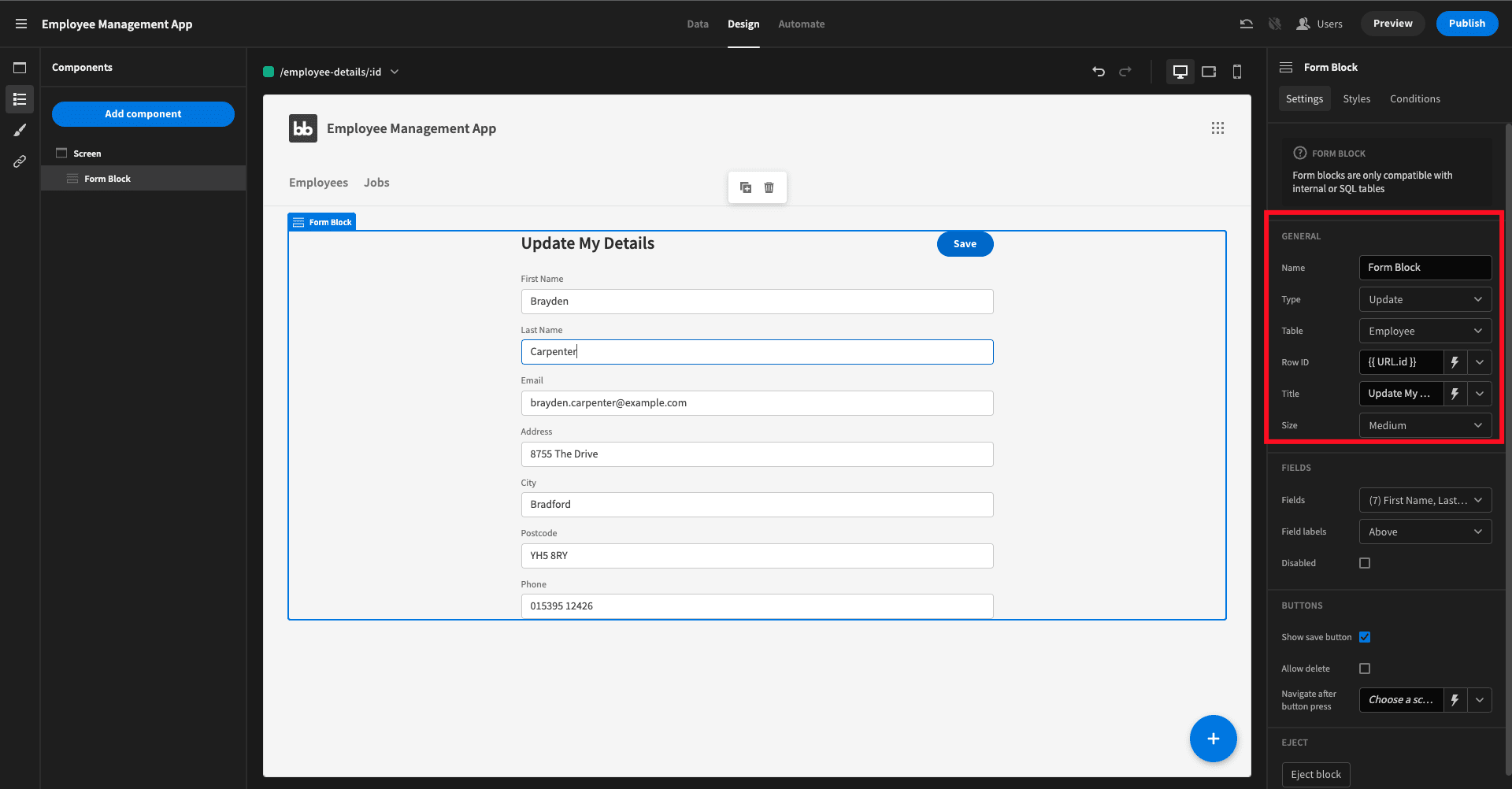
The table is set to employee, the form type is update, and the Row ID has {{ URL.ID }} as its value. Then, all we did was set the Fields dropdown to the specific attributes we want employees to be able to update.
The /job-details/:id screen is based around the same idea - but it’s a little bit more sophisticated:
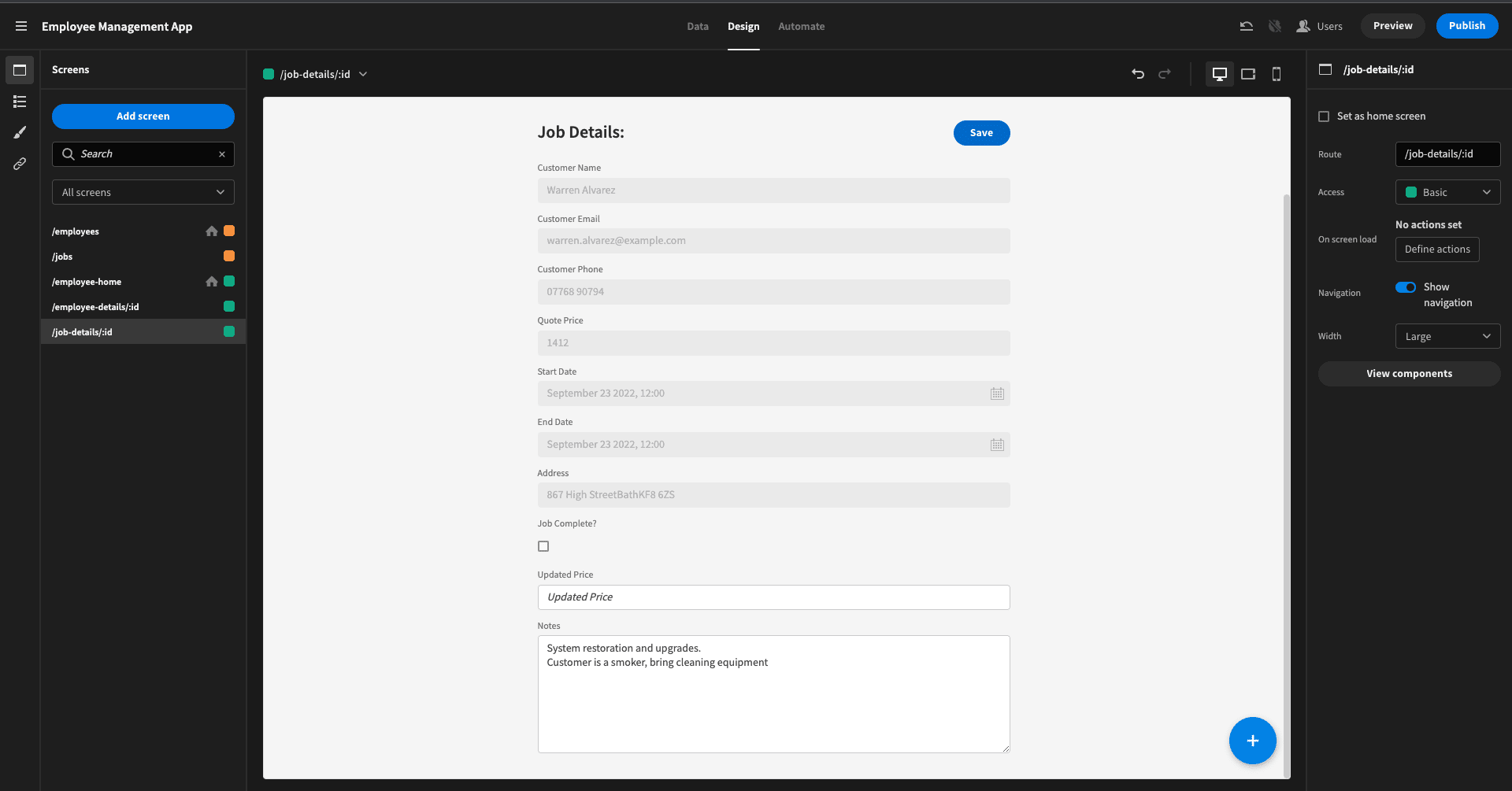
We start with a similar form block and select the attributes we want to include. However, this time we need to hit the Eject button in the block’s side panel. We need our employees to be able to read every data field, but only update some of them.
So we select Disabled on any form fields that are meant to be read-only.
Finally, we want employees to be able to leave notes on the job, without overwriting the previous ones. Within the Save button’s save row action, we’ll manually set the Notes attribute to a little bit of JavaScript:
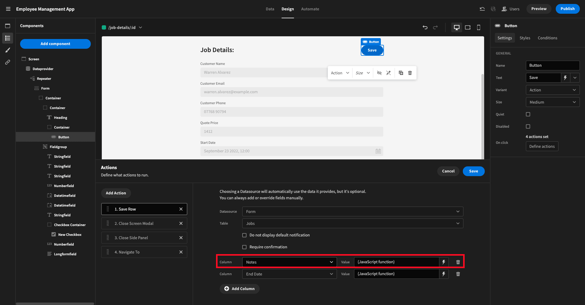
Here’s our code:
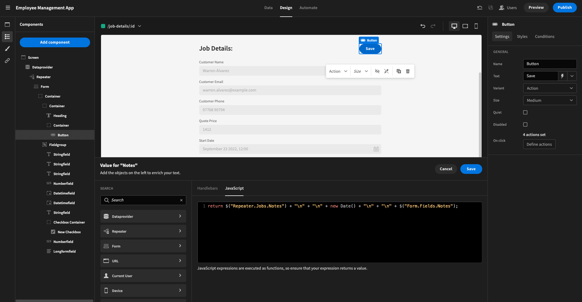
This returns the existing notes, followed by two line breaks, today’s date, two more line breaks, and whatever the user provides in the form field.
We also added some code to the End Date attribute, setting it to the current date if the user marks a job as complete:
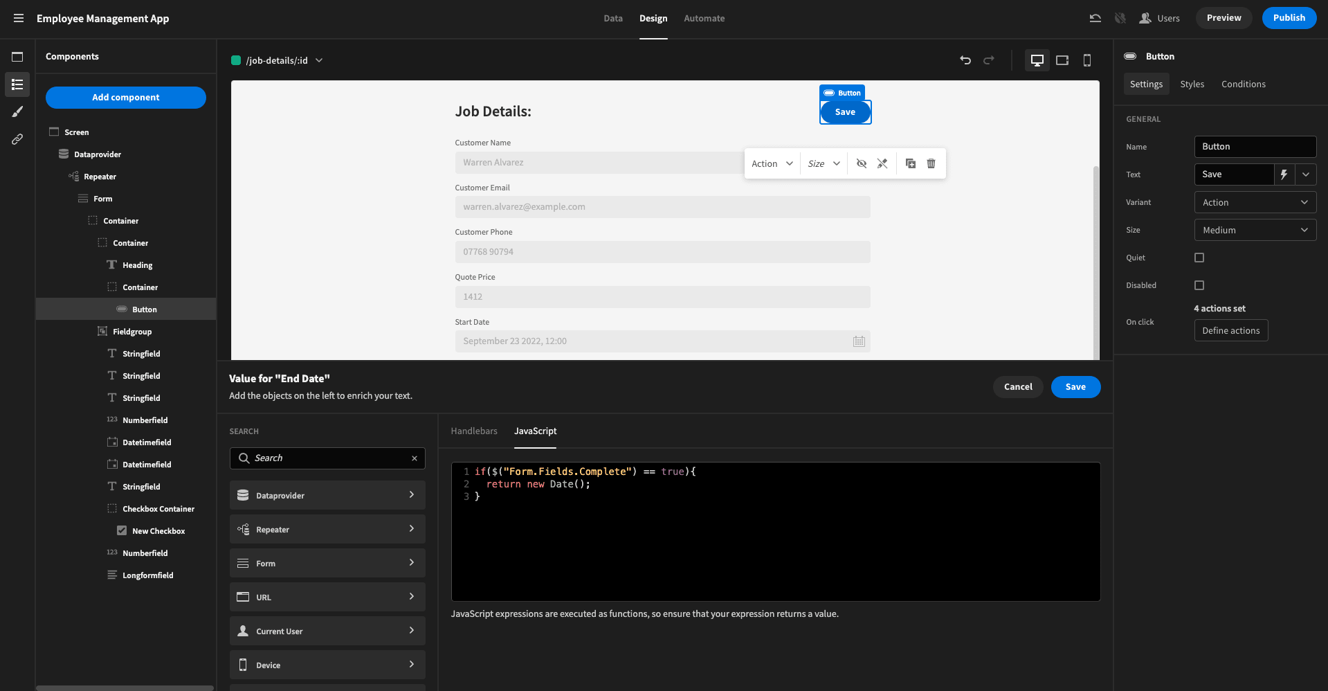
And that’s basically our app completed!
6. Design tweaks, UI, and branding
Of course, we can go further if we want. In particular, Budibase makes it easy to customize the design and UI of our tools.
This could be as simple as choosing one of our six built-in themes or configuring design elements like button roundness, logos, navigation, and accent colors across your entire employee management app.
Or, maybe you’d like to go a little bit further by applying custom CSS and conditionality rules to individual components.
You can even set design elements across all of your Budibase apps and their metadata, thanks to our custom branding features.
There’s never been an easier way to build professional applications at pace.
Sign up to Budibase today
Budibase is the smart way for busy IT teams to build custom web apps. With autogenerated CRUD screens, extensive data support, and custom automation rules, there’s never been a faster way to create professional, performant apps.
Let’s take a look at what makes Budibase tick.
Our open-source, low-code platform
Our design philosophy is simplicity by default; extensibility when you need it. We’re on a mission to revolutionize the way teams build custom solutions for all sorts of business problems.
Check out our features overview to learn more.
Turn data into action
Budibase turns data into action. We offer external data connectors for SQL, Postgres, Airtable, S3, Oracle, Mongo, Couch, REST, Google Sheets, Arango, and more.
We’ve also got our own built-in database with full support for CSV uploads.
Optional self-hosting
Self-host Budibase for complete control over your low-code app builds. Deploy to your own infrastructure with Kubernetes, Docker, Docker Compose, Digital Ocean, and more.
We also offer Budibase Cloud so you can ship web apps at the click of a button. Check out our pricing page to learn more about both options.
Configurable RBAC
Budibase offers configurable RBAC so you can create secure, user-friendly applications with minimal custom code.
Assign roles to each user, and enforce permissions at the level of data sources, queries, automations, screens, or even individual components.
Automate business logic
Use our flow-chart-based automation editor to quickly build custom rules, with a whole range of built-in triggers and actions.
Connect to third-party tools with Zapier, webhooks, or REST API to use external events as automation triggers and actions.
Build custom plug-ins
No other low-code tool comes close to Budibase for extensibility. Build your own data sources and components with our dedicated CLI tools and ship them across your Budibase installation.
Check out our plug-ins page to learn more.
50+ free app templates
Businesses all over the world choose Budibase to build all manner of use cases. If you liked our employee management app tutorial, why not check out our free, customizable app templates ?
To start using Budibase for free, sign up today.