How to Build a Firebase GUI
A Firestore Firebase GUI is the easiest way to interact with your database without coding.
Firebase is a versatile tool for app developers. It can completely replace the back end of your app, so you can focus on its front end and features.
But all this versatility comes with a cost.
Firestore Firebase is widely used by developers, but interacting with it can be quite hard - in particular, if you need to perform admin actions.
Sometimes you just need to check some fields, let a teammate look up information, or create some demo data.
By default, you need to code an entire app, admin panel, or a debug feature in Firebase Console just to do that. It’s complete overkill.
For this reason, a dedicated GUI is essential in Firebase projects.
Let’s see how you can quickly build a Firestore GUI in just 4 steps, without coding. You can do it in a few minutes for free using Budibase.
What is the difference between Firebase and Firestore?
The difference between Firebase and Firestore is that Firebase is a suite of tools for app development, and Firestore is one of the databases in it. Firebase includes other tools to completely replace the backend for apps, such as authentication flows, sign-in UIs, notifications, messaging, and more.
Firestore is a NoSQL database, with great performance optimized for saving and retrieving data at scale.
Check out our ultimate guide to web app data sources .
What is Firebase used for?
Firebase is used to get started with app development. You don’t need to set up a server, deal with connections, define database structure, or configure authentication.
You just plug into Firebase and they handle it all.
What are the limitations of Firebase?
One of the Firebase limitations is that it can’t handle complex queries particularly well. Things that are trivial in other databases, such as search wildcards (“like”) are just not possible.
If you want to use Firebase and you want to perform these actions, you’ll probably need to use other tools, such as ElasticSearch.
Does Firebase have a GUI?
There isn’t a native Firebase database GUI. They provide a web tool to explore data in a table view, but you can’t customize it in any way.
For this reason, it’s a good idea to build a Firebase GUI using a low-code, open-source tool such as Budibase. This allows you to quickly connect to your Firebase Firestore, manage your data, and can customize your Firebase UI any way you want.
We’re going to build a web-based Firebase GUI client, offering seamless cross-device experiences.
Check out our guide to building a Redis GUI.
This is exactly what you’ll build today.
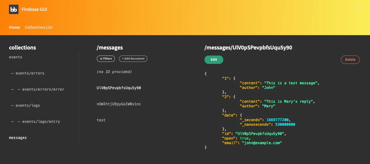
This is the main screen. In it, you can see the list of collections, which are the Firestore equivalent of SQL tables. Since Firebase Firestore is a no-SQL database, you don’t have the fixed structure that you would have in SQL databases.
Also, notice that there are some sub-collections. They are useful in case you want a hierarchy for your collections. For example, the “events” collection stores “errors” in /events/errors/error and “logs” under “events/logs/entry”.
The middle column displays the Firestore documents list. They are similar to SQL rows. The difference is that documents store data in key/value pairs. Therefore, you can add any key/value pair to your documents, unlike table rows that must have the same columns for each row.
In addition, you can see the document data on the right-hand side. This is a collection of chat messages. So the document contains entries for each of the messages in a chat (1 and 2), and fields about the chat itself (email, open, timestamp).
Another feature in your Firebase GUI is filtering. You can use the filters option to limit what you see in the documents list.
Once you click that button this modal opens:
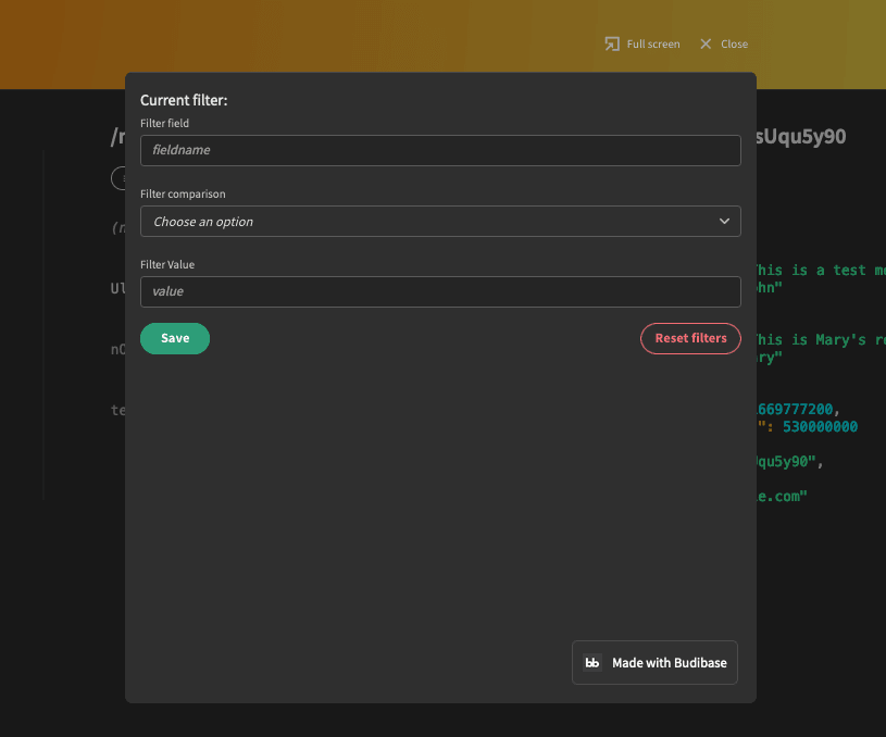
You can add searches for fields using a field key, a value, and a comparison method. For example, you can search for user_emails that end with @gmail.com.
Back to the home screen, if you click on “add new” you’ll see a form like this one:
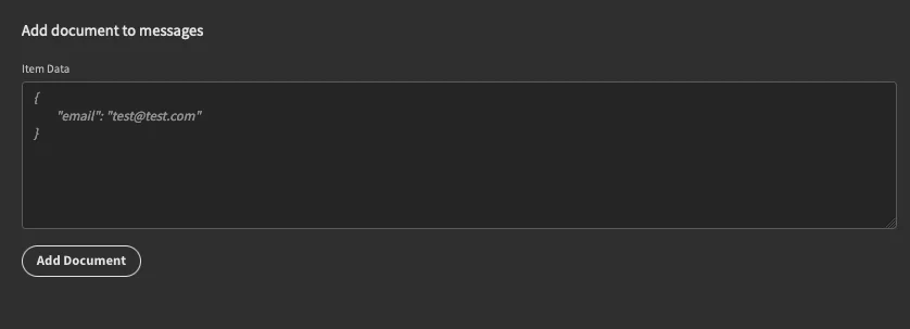
This form allows you to add documents to a collection. You can click on “edit” as well if there is an ID for the item:
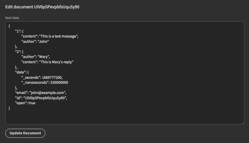
This is the edit form. You can add or remove fields here.
If there is no ID provided, it isn’t possible to edit the item, so you’ll see something like this on the panel screen:
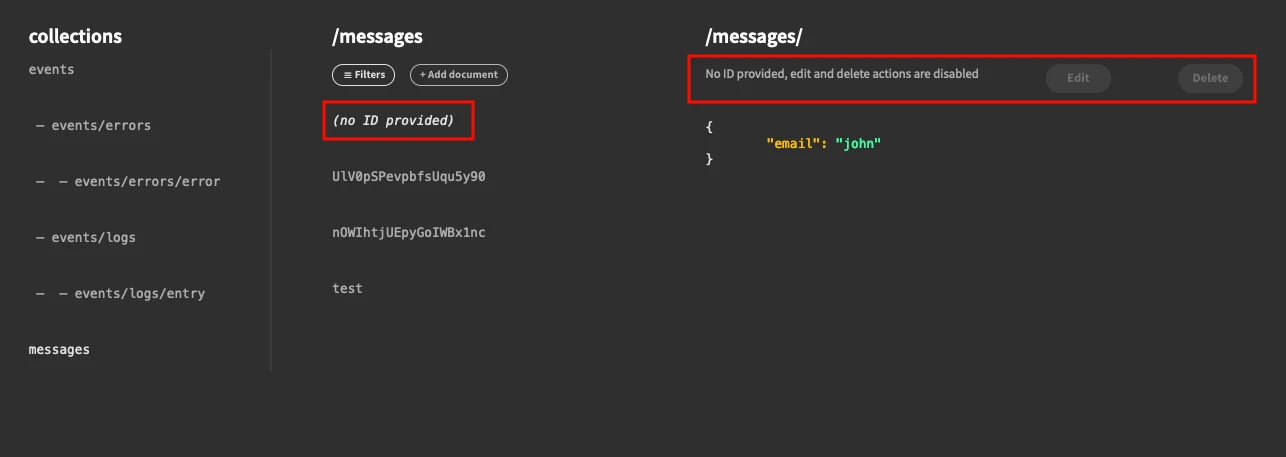
This usually happens if you create a document but you don’t add an “id” key in it.
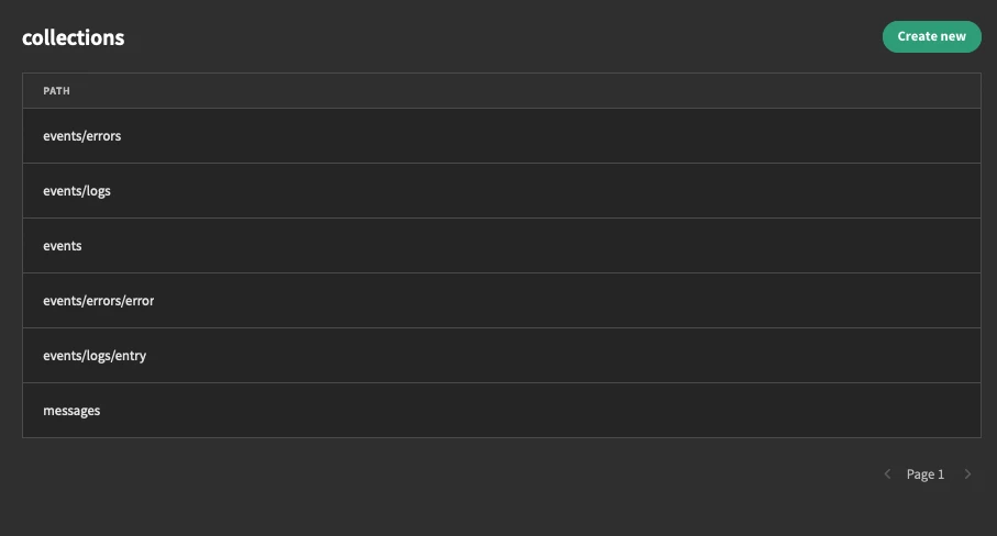
The collections list is actually stored using BudibaseDB, our internal database. You can view, edit, create, and delete items using the “collections list” menu link
Now let’s see how you can create your Firebase GUI in just four steps.
Step 1 - How to build a Firebase GUI
The very first step to create your Firestore Firebase GUI is to sign up for Cloud Firebase and Budibase.
Both are free, with paid plans available if you have additional needs.
He is a quick start guide for Cloud Firebase:
- You can read the full instructions here.
- Create a Firebase Project .
- Go to the “Cloud Firebase” section of your console.
- Select the starting mode for your project. Either testing mode (anyone can read/write data for 30 days from mobile and web clients) or restricted (only authenticated apps can access).
- Select a location for your database.
- Then go to Project Overview > Project Settings > Service accounts > Generate new private key.
- You should get a JSON file as a download. That’s all you need.
Now navigate to “Firestore Database” and create a couple of collections to get started.
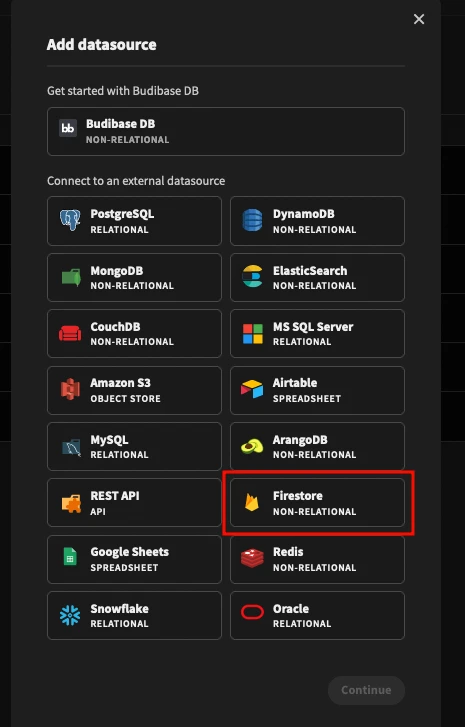
Next, sign up for Budibasewith your preferred sign-in method, create a new app, and select Firestore as your data source:
On the next screen, you are going to use the data from the JSON file you’ve downloaded from Cloud Firestore. Use the email, private key, and projectID fields.
That’s the DB connection. Now Budibase can write directly to your Cloud Firestore database.
While you are at it, let’s create some queries. For this app, you’ll need 5 Firestore queries. Here they are:
deleteDocument:
- This query deletes a document
- Function: Delete
- Bindings:
- Collection
- id
- Collection: {{ collection }}
- Fields: { “id”: “{{id}}” }
getCollection:
- This query gets all documents from a collection
- Function: Read
- Bindings: Collection
- Collection: {{ collection }}
getCollectionEqualsTo:
- This query gets documents that match an “equalsto” comparison
- Function: Read
- Bindings: Collection, Field, Value,
- Collection: {{ collection }}
- Filter field: {{ field }}
- Filter comparison: ==
- Filter value: {{ value }}
newDocument:
- This query creates a new document
- Function: Create
- Bindings: Collection, Data
- Collection: {{ collection }}
- Fields: {{ data }}
updateDocument:
- This query updates a document
- Function: Update
- Bindings: Collection, Data
- Collection: {{ collection }}
- Fields: {{ data }}
Here’s an example of how one of the queries looks:
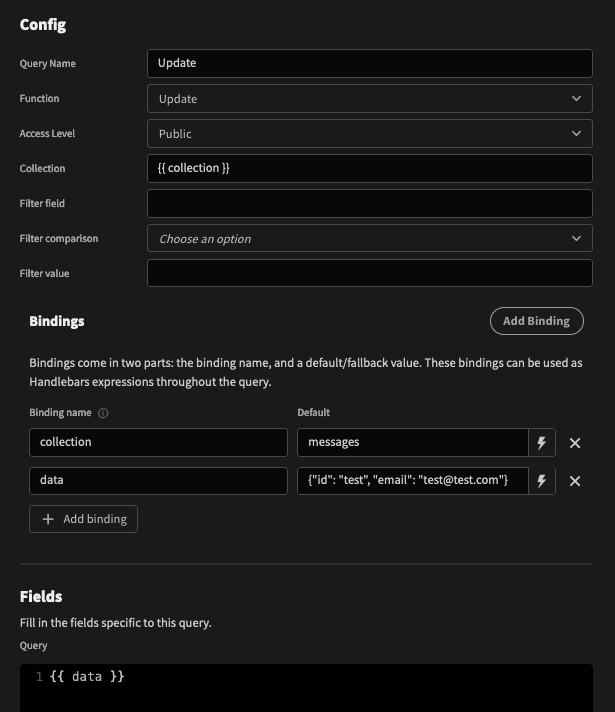
In general, you can use bindings whenever you need user inputs or variables. This allows you to send information in your query. So instead of creating a query for each of your collections, you create one “getDocuments” query and you pass the collection name as a binding.
Now to create a Firebase GUI, or really any app, you usually need some local storage. This data storage is used for the app itself. For instance, you can create app settings and store them there.
Create a new data source, and pick BudibaseDB. Create a table named “collections” and add a field for “path”.
You’ll use this table to store all your collections. You could use the Cloud Firestore REST API to get them automatically, but that would require a tutorial in itself.
That’s all you need for your data connections.
We’ve also create a tutorial on how to build an Elasticsearch GUI .
Let’s create some screens.
Step 2 - How do I add data to Firestore?
You can add data to Firestore using the Budibase queries and custom screens.
Head over to the “design” tab. Then, you can use the four icons on the left to edit different visual elements of your app.
Click on the “theme” icon and there you can pick your app theme, and change the accent colors:

In the navigation section, you can define the menu items and the header background color, including CSS gradients. For example, the demo app uses this color:
1radial-gradient( circle farthest-corner at 10% 20%,
2rgba(252, 123, 3,1) 0%,
3rgba(250, 245, 92,1) 90% )
You can interact with your app using screens.
These are all the screens you need for this app:
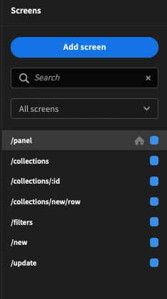
But you don’t need to create them all now. Let’s create one at a time.
2.1 - The /new screen
First, create the /new screen. This is the screen you see when you click on “add new”.
This is the structure of the components for it:
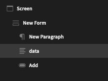
It is quite simple. There’s a form, a paragraph, a field, and a button.
Add these components to your screen. In terms of setup, for the paragraph you can use this text: Add document to {{ State.collection }}
This is just some visual feedback to your users to show the collection they are editing.
The “add document” button has two onclick actions:
- Execute query Addnew.
- Navigate to /panel.
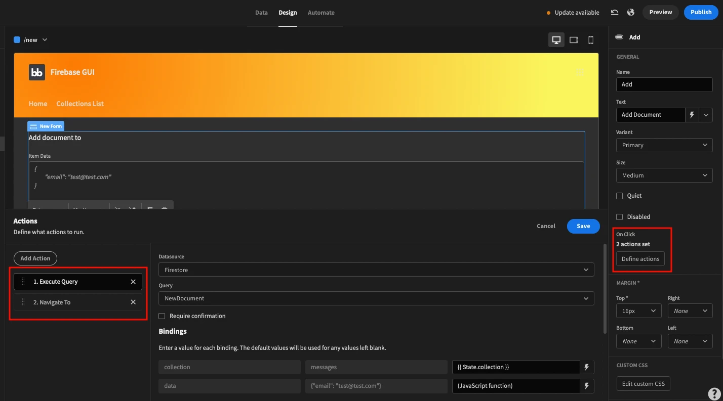
The addNew query requires two bindings - the collection and the document data. In this case, the collection comes from the app state, just like the title. So add this binding to it:
{{ State.collection }}
The query data requires a JSON object containing all the fields for that item. You could just use a binding to load data from the form field, but you might run into some errors. To make sure it works smoothly, remove all spaces from the data input.
You can do it by using this JS function instead of the bindings:
1return $("New Form.Fields.data").replace(/[\r\n]/gm, '');Well done! Now, you can add data to your Firebase GUI. Feel free to preview and test this screen.
2.2 - The /update screen
In addition to adding data, you’ll need to update data.
You can update data on your Firebase Firestore GUI with an update screen that contains the same fields as the “add new” screen.
To make it easier, you can duplicate the “add new” screen and rename the route to update.
Now let’s adjust it a little bit.
You can use this text for the paragraph component:
Edit document {{ State.documentID }}
The paragraph shows the documentID appstate to your users, to make sure that they are editing the item they want to.
In the text field for your data, use these settings:
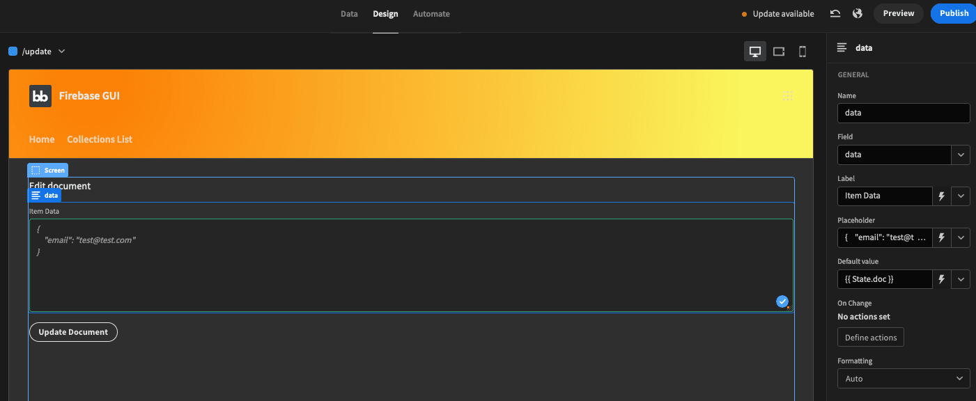
Here the really important part is the default value:
{{ State.doc }}
This binding loads the “doc” appstate as the default value in that field. Therefore, users can just do some light edits, as opposed to writing it all again.
Lastly, you need to adjust the onclick actions for the “update” button.
This time, you need to execute the “Update” query. Again, to avoid any issues with your JSON code, send the form field “data” with no line breaks or spaces using this JS code:
1return $("New Form.Fields.data").replace(/[\r\n]/gm, '');Then, can show a notification to inform users that the update worked, and navigate to the panel screen.
2.3 - The /filters screen
The last custom screen for data entry and manipulation is the filters screen. This is the modal screen that is loaded when you click on “filters”.
Here is the elements tree for it:
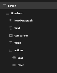
The first paragraph shows the current filter if there is one. You can use this text in it:
Current filter: {{ State.filterfield }} {{ State.field }} {{ State.filtervalue }}
As you can see, you store the filters using app states.
You can add {{ State.filterfield }} as the default value for the filter field like you did with other form fields. This ensures that the current filter is preloaded there and you can easily edit it. The same goes for the value field, with {{ State.filtervalue }}.
You should set the options picker with “Options Source” as “custom”. This allows you to configure the value/labels for the dropdown options.
Add a row for each of the possible options you are going to use:
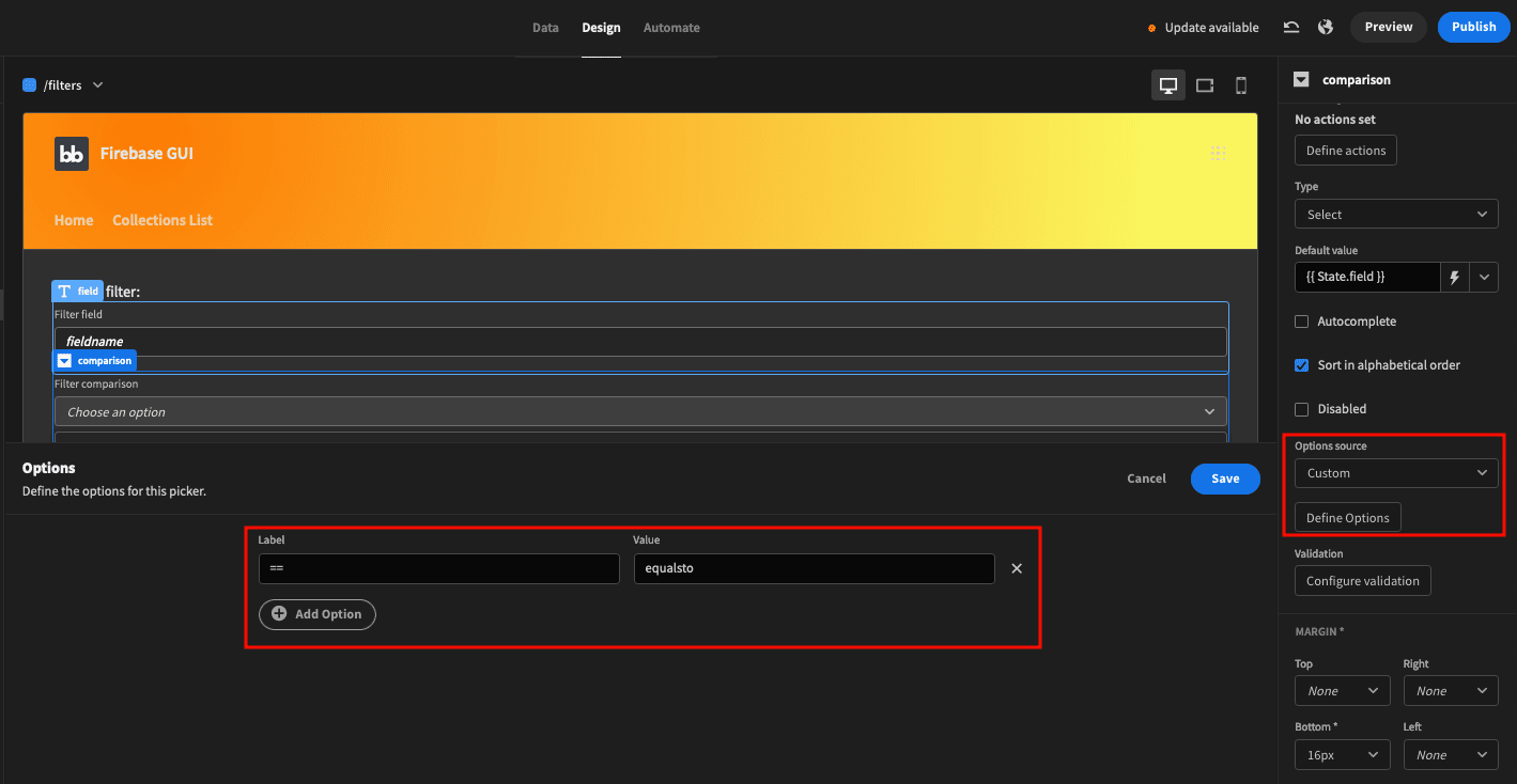
To make it easier, this Firebase GUI has just one filter - equalsto. But you can add more filters if you want. Just make sure you create a new query for each of them like you did for the equalsto in step 1.
You can pre-populate the dropdown value. Set it as {{ State.field }}.
Lastly, there’s the actions row. The save button simply saves the form fields to app states and closes the modal, like this:
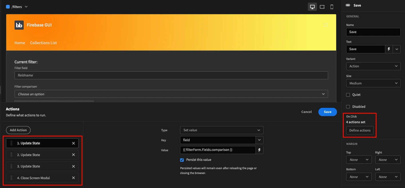
And the reset field just deletes these app states.
Therefore, when these buttons are pressed, they either store the entire filter selection as app states or delete them, and close the modal to see the panel screen again.
We could also filter on other kinds of data. For example, if we stored different phone numbers inputs that share the same country code.
2.4 - The Collections List
The final touch to add data to your Firebase GUI is to use the collections list. In this example, collections are stored in BudibaseDB. This means that you can easily autogenerate CRUD screens for it.
Go to screens > Add new > Autogenerate screens. Select your Budibase table.
This automatically creates three screens:
- Collections - the “read” operation, a list of all collections.
- Collections/add/new - the “create” operation. A form with the path field to add new collections.
- Collections/:id - the “update” and “delete” operations. In this case, the ID is passed via the URL, so if you visit collections/15, Budibase knows that the variable ID is equal to 15.
Now almost all the screens are ready. You just need one last screen, the panel.
Step 3 - How do I get data from collections in Firestore?
You can get data from collections using simple queries (such as getDocuments) or filtered queries (such as getDocumentsEqualsTo). Let’s start with simple queries to just list all data.
This is the components tree for the panel page:

That’s quite a lot of components, but a lot of them are just containers to create this layout or to hold onclick actions.
To create this three-column style you can use two columns, then two columns again. The first column contains the collections list. The second column contains two columns, one for the documents list and one for the document details.
This is a representation with borders to make it easier to understand:
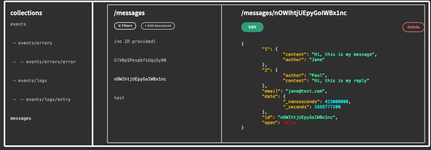
With this layout you can use a single query for the entire right side (documents list and details), saving additional queries and processing time.
One query populates both columns.
You can set the panel container to horizontal. This makes your elements appear side by side:
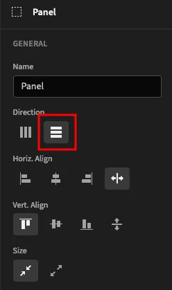
So whenever you see elements side by side on the screen, then have a container with the horizontal direction. For example, the actions buttons have a container around them with the same option.
You can create a container for the collections query, and set it to 20% width. This means that the documents list and details are 80% wide.
Set the data provider to load the collections table, ordered alphabetically:
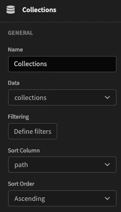
You can use a repeater to extract data from the data provider. This is more flexible than using a premade table or cards since you can add any components you want inside of it.
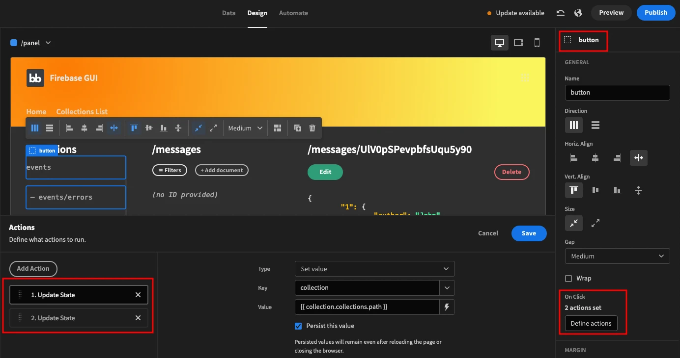
You need a container to hold the onclick actions:
- Update state: collection as {{ collection.collections.path }} / persist this value
- Update state: rowindex as 0 - this ensures that whenever you click on a different collection it starts by the first document.
These actions save an app state for the collection you have just clicked. Also, it resets the row index as zero. This ensures that when you click on a new collection you load the first item of your list since the row index is zero.
Here is how it looks:
In terms of contents, the embed component outputs the collection name with dashes to display the hierarchy. You can use this JS function:
 1var path = $("collection.collections.path");
 2var slashes = ( path.match(/\//g) || []).length;
 3var selected = $("[state].[path]");
 4
 5if ( ! selected ) {
 6selected = "messages";
 7}
 8
 9if ( selected == path ) {
10selected = 1;
11}
12else {
13selected = 0.7;
14}
15
16for (let i = 0; i < slashes; i++) {
17path = " — " + path;
18}
19
20return "<pre style='opacity: "
21+ selected + "'>" + path + "</pre>";
This function gets the current path and counts how many slashes there are in it. For each slash there’s a hyphen, making the hierarchy clearer.
In addition, there’s an opacity change to indicate the currently selected collection.
Moving to the next big column, the documents container in the elements tree is there just to hold the data provider. The data provider queries all documents using the getCollection query with a binding to pass the collection app state as a variable.
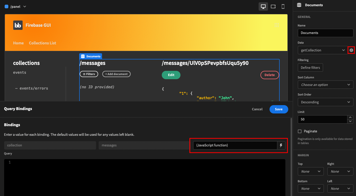
This is the JS code there:
1var collection = $("State.collection");
2if ( ! collection ) {
3collection = "messages";
4}
5
6return collection;
This code simply gets the collection app state. If it’s empty, it sets a default collection (messages).
The panels container creates the last two columns using the horizontal alignment.
You can create the first column with the “documents list” container. In it you can add a title (collection name), then a container for the action buttons.
The filter and add new buttons have onclick actions to navigate to their screens, either /filters or /new. The filter link is in a modal screen but the add new button isn’t.
You can add a repeater to list all the documents. You can add a container in it to work as a button using its onclick actions as you did for the collections list.
This button updates the row index appstate to {{ Document.Row Index }}, and saves {{ Document.getCollection.id }} as a documentID app state.
You can display the document ID using an embed component with this JS code:
 1var id = $("Document.getCollection.id");
 2var row = $("State.rowindex");
 3if ( ! id ) {
 4//id = $("Document.Row Index");
 5id = "<i>(no ID provided)</i>";
 6}
 7
 8if ( ! row ) {
 9row = 1;
10}
11if ( row == $("Document.Row Index") ){
12row = 1;
13}
14else {
15row = 0.7;
16}
17
18return "<pre style='opacity: " row + "'>" + id + "</pre>";
This code gets the title of the collection and displays either the title or “(no ID provided)”. In addition, this code checks if the current row is active and changes its opacity to 1. Otherwise, it’s at 70% opacity.
Moving on, you can create the next column with the “details” container.
You can use this JS function for the title:
 1var collection = $("State.collection");
 2var id = $("State.rowindex");
 3
 4if ( ! collection ) {
 5collection = "messages";
 6}
 7
 8if ( ! id ) {
 9id = 1;
10}
11id = $("Documents.Rows")[id]["id"];
12
13if ( ! id ) {
14id = "";
15}
16
17return "/" + collection + "/" + id;
This function shows the complete path of the document.
You can also create a container for the action buttons for the documents.
Remember how the update screen pre-populates data from an appstate? Therefore, your edit button must save this data in an appstate and navigate to the edit page.
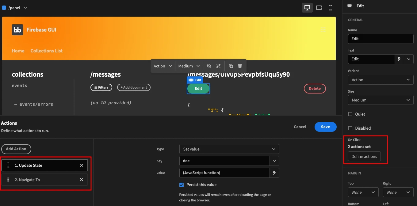
This is the JS function for the doc appstate:
1var rowindex = $("State.rowindex");
2
3if ( ! rowindex ) {
4rowindex = 1
5}
6
7return JSON.stringify(
8$("Documents.Rows")[rowindex] , null, "\t");
This function stores the current document data as a stringified JSON notation, using tabs to make it prettier.
You can create the delete button with three onclick actions.
First, it runs the deleteDocument query.
Then it refreshes the “documents” data provider so that it won’t show the old document anymore.
Lastly, it deletes the documentID app state to avoid issues if your visitor manually navigates to the edit page.
The action buttons component is visible only when there is an ID. You can do it with display conditions.
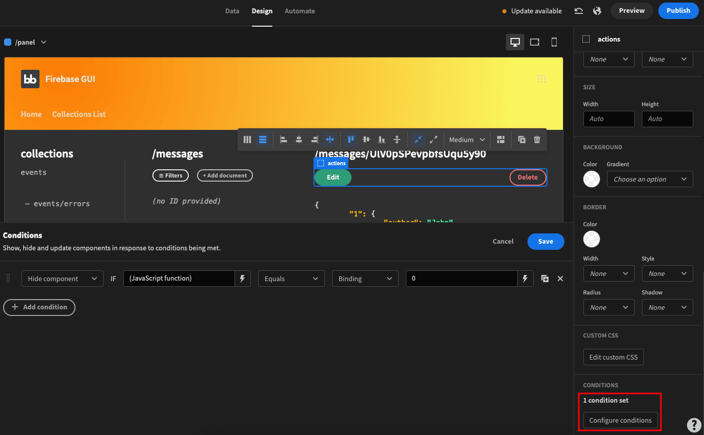
This condition hides the action buttons when this code is equal to zero:
 1var id = $("State.rowindex");
 2
 3if ( ! id ) {
 4id = 1;
 5}
 6
 7id = $("Documents.Rows")[id]["id"];
 8if ( ! id || id == "" ) {
 9id = "0";
10}
11
12return id;
Likewise, you can display a “no actions” row only when this condition is zero (so there’s no valid ID).
When it comes to displaying the document data, you can use an embed.
In it, you use some REGEX to beautify the JSON. This is the JS code of your embed component:
 1function replaceKey( str ) {
 2return "<span style='color: #fcba03'>"
 3+ str + "</span>";
 4}
 5
 6function replaceValue( str ) {
 7str = str.slice(2);
 8var color = "#03f4fc";
 9var comma = "";
10if ( str == "{" || str == "[") {
11
12//value type array, no formatting
13str = ": " + str;
14}
15
16else {
17if ( str.charAt( str.length-1 ) == ",") {
18
19//if it ends in a comma,
20//remove it from styling and add it back later
21str = str.slice(0, -1);
22comma = ",";
23}
24
25if( str.charAt(0) == '"' ) {
26//if it's a string, #3dfca0
27color = "#3dfca0"
28}
29else if( str == 'false' ) {
30
31//if it's a boolean false, #ff0000
32color = "#ff0000";
33}
34
35else if( str == 'true' ) {
36
37//if it's true, #03fc5e
38color = "#03fc5e";
39}
40
41//build the formatted value
42str = ": <span style='color: "
43+ color + "'>" + str + "</span>" + comma;
44}
45return str;
46}
47
48var rowindex = $("State.rowindex");
49if ( ! rowindex ) {
50rowindex = 1
51}
52
53var data = $("Documents.Rows");
54
55if ( ! data ) {
56return "no data";
57}
58
59data = data[rowindex];
60
61if ( ! data ) {
62return "no data";
63}
64
65data = JSON.stringify(data, null, "\t");
66data = data.replaceAll(/[:]\s(.*)/g, replaceValue);
67data = data.replaceAll(/("[^"]+":)/g, replaceKey);
68return "<pre>" + data + "</pre>";
It seems daunting, but this code is quite simple.
First, there are two helper functions that you can use to format the JSON keys and values with colors. The values are formatted depending on their data type.
Then you get the document data from the documents data provider, using the current row index appstate. Lastly, you pass this data through the formatting functions and display the outputs.
Now your Firestore Firebase GUI is almost ready. It is just missing one piece: the filtering options.
Step 4 - How do you query on Firestore?
You can query data on Firestore with filters. But you need to create one Budibase query for each of your filters. That’s why we have a getCollection query to get all data, and a getCollectionEqualsTo query to get filtered data using “equals to” as a comparison.
But you need to display these queries as well.
The trick here is that you are going to create a container for the documents list and details for each of your filters.
Therefore, this entire container is duplicated:
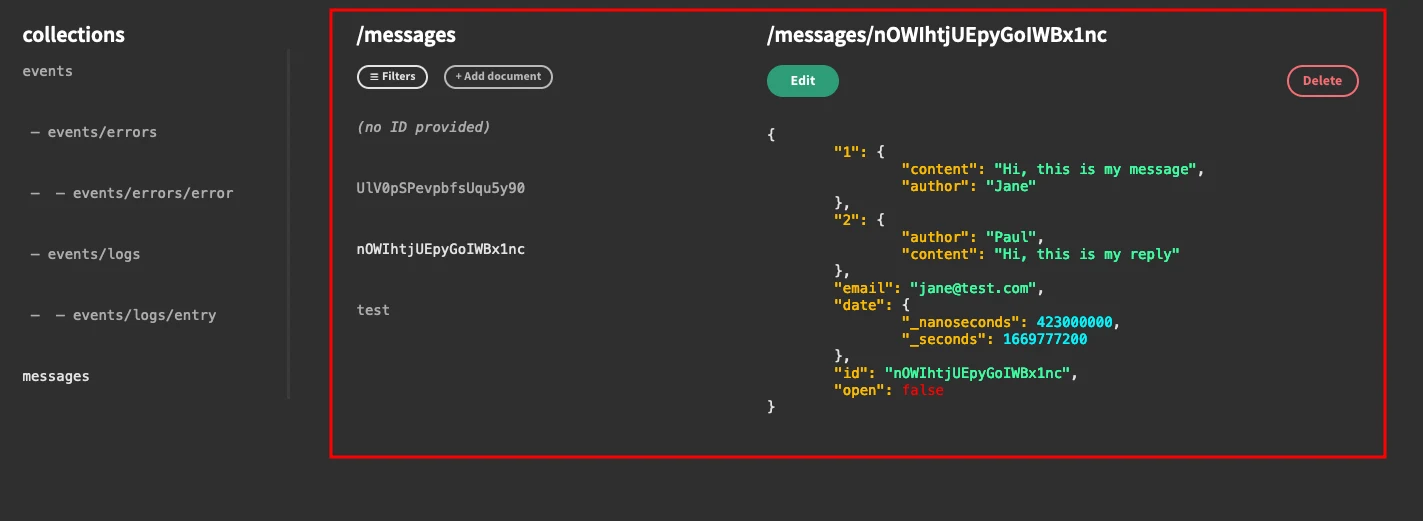
Now, duplicate the DocsContainer component, and rename it to DocsContainerEqualsTo.
This container stays precisely like the first one, but you need to update the Documents data provider to load the equals to query. Don’t forget to use the filter bindings on it, like this:
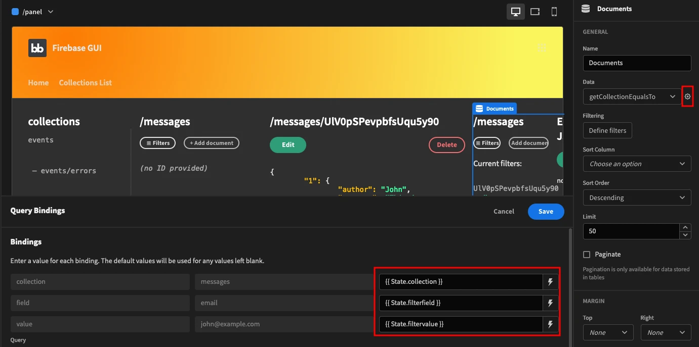
You are creating these appstates in the /filters modal page.
Now you need to hide/show the correct container, DocsContainer or DocsEqualsTo. You can do it with display conditions. Use these conditions for the DocsContainer:

And use the opposite for the equalsTo container.
If you want more conditions you can repeat this process for all comparison types. Just duplicate the container and hide/show the right one.
How to build a Firebase GUI
Today you learned how to create a complete Firestore Firebase GUI. From the very basics of when to use it and how to set up an account, to the complex operations such as building dynamic queries and updating data.
We hope you enjoyed it, and see you again next time!
If you enjoyed this tutorial, check out our in-depth guide to creating a database GUI .