How to Build a Fleet Management Dashboard
An effective fleet management dashboard is one of the most fundamental tools in any logistics team’s arsenal. The idea is to give us a clear, up-to-date snapshot of our vehicles across our entire distribution network.
Today, we’re exploring how we can use Budibase to build professional dashboards that leverage existing data.
As we’ll see, Budibase is the ideal tool for extracting insights from all kinds of data sources and turning them into clear, actionable insights - so we can make better-informed decisions.
But before that, let’s think about what this means for logistics teams.
What is a fleet management dashboard?
Fleet management dashboards are reporting UIs that display key metrics and KPIs relating to various aspects of how we use our vehicles.
This can include things like where our assets are, how much we’re spending on fuel, our performance in terms of deliveries, statistics around our overall vehicle utilization, driver safety, or any other relevant data that decision-makers might need.
Of course, this will vary greatly depending on the size and complexity of your fleet - as well as how you use it.
As with any kind of dashboard, the idea is that we can configure our reports once - and then they’ll populate with the most up-to-date information in real-time.
What are we building?
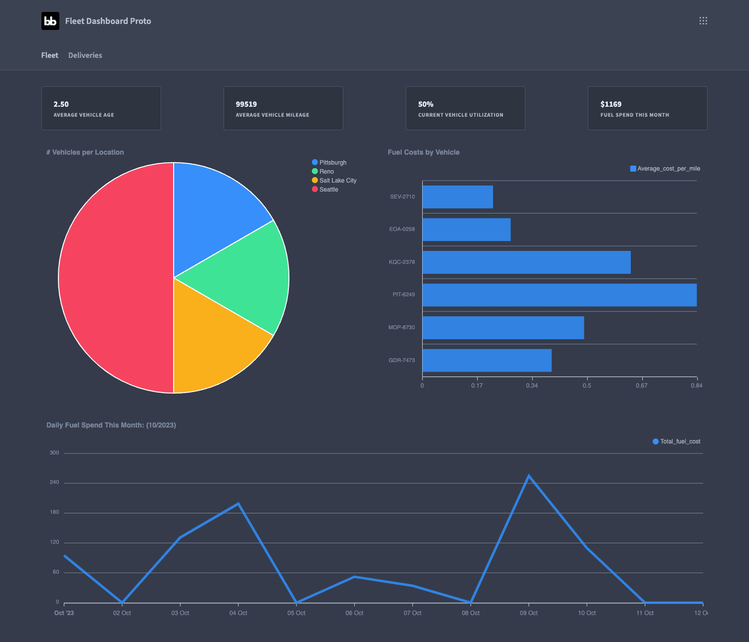
Our fleet management dashboard is built around two thematic reports - one for insights into our vehicles themselves - and one for their performance on deliveries.
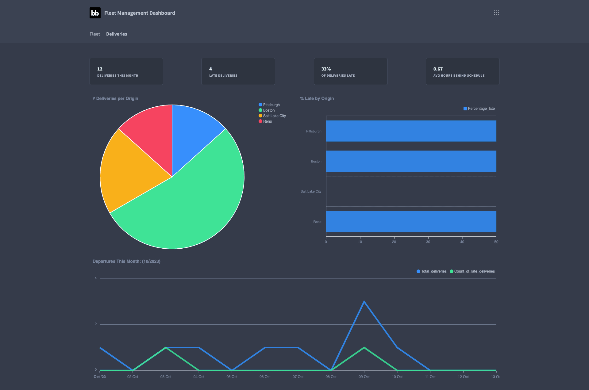
Here’s what the fleet dashboard UI will look like when we’re done:
Let’s dive in.
How to build a fleet management dashboard in 5 steps
If you haven’t already, sign up for a free Budibase account so you can follow along with this tutorial.
1. Create a Budibase app and connect your data
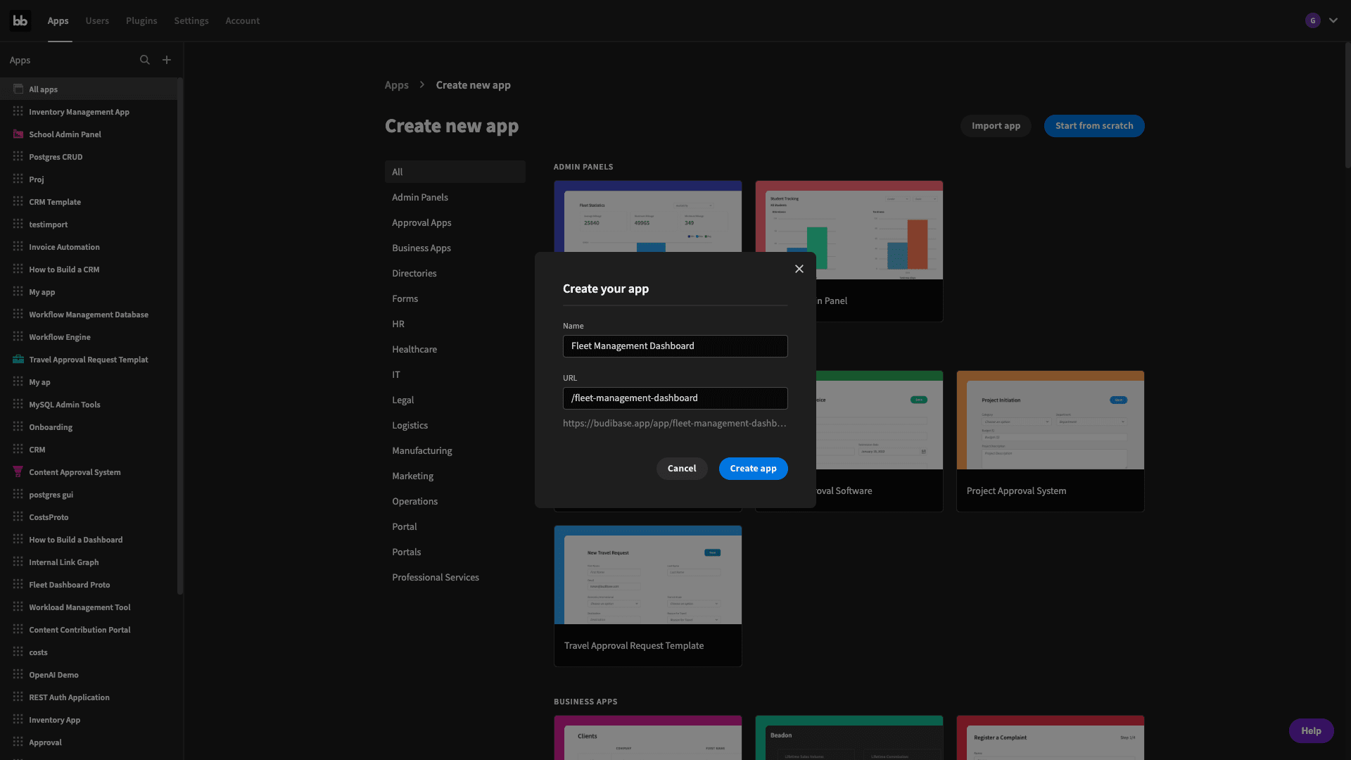
The first thing we’re going to do is create a new Budibase application and give it a name. We have the option of starting with a template or importing an existing app, but we’re starting from scratch:
Straight away, we’ll be prompted to choose our data source. Budibase offers dedicated connectors for a huge array of relational and non-relational databases, as well as REST, Google Sheets, and our own internal DB.

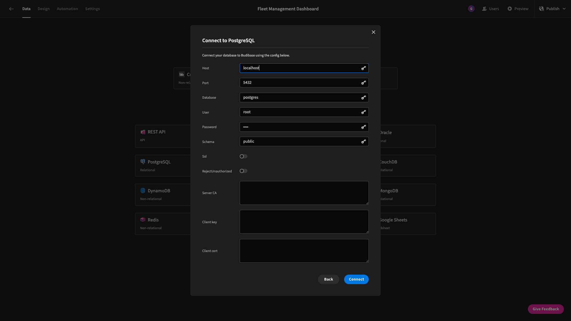
We’re going to build our dashboard around data that lives in a Postgres database. When we select this, we’re prompted to enter our database credentials. Users on paid tiers can use environment variables to store these and leverage them across their Budibase apps.
We’re then asked which tables we want to pull into our Budibase app:

Our fleet management database is made up of two tables, called vehicles and deliveries. We’ll fetch both.
2. Configuring our data model
Once we’ve fetched our tables, we can immediately start to manipulate them in Budibase’s back-end:
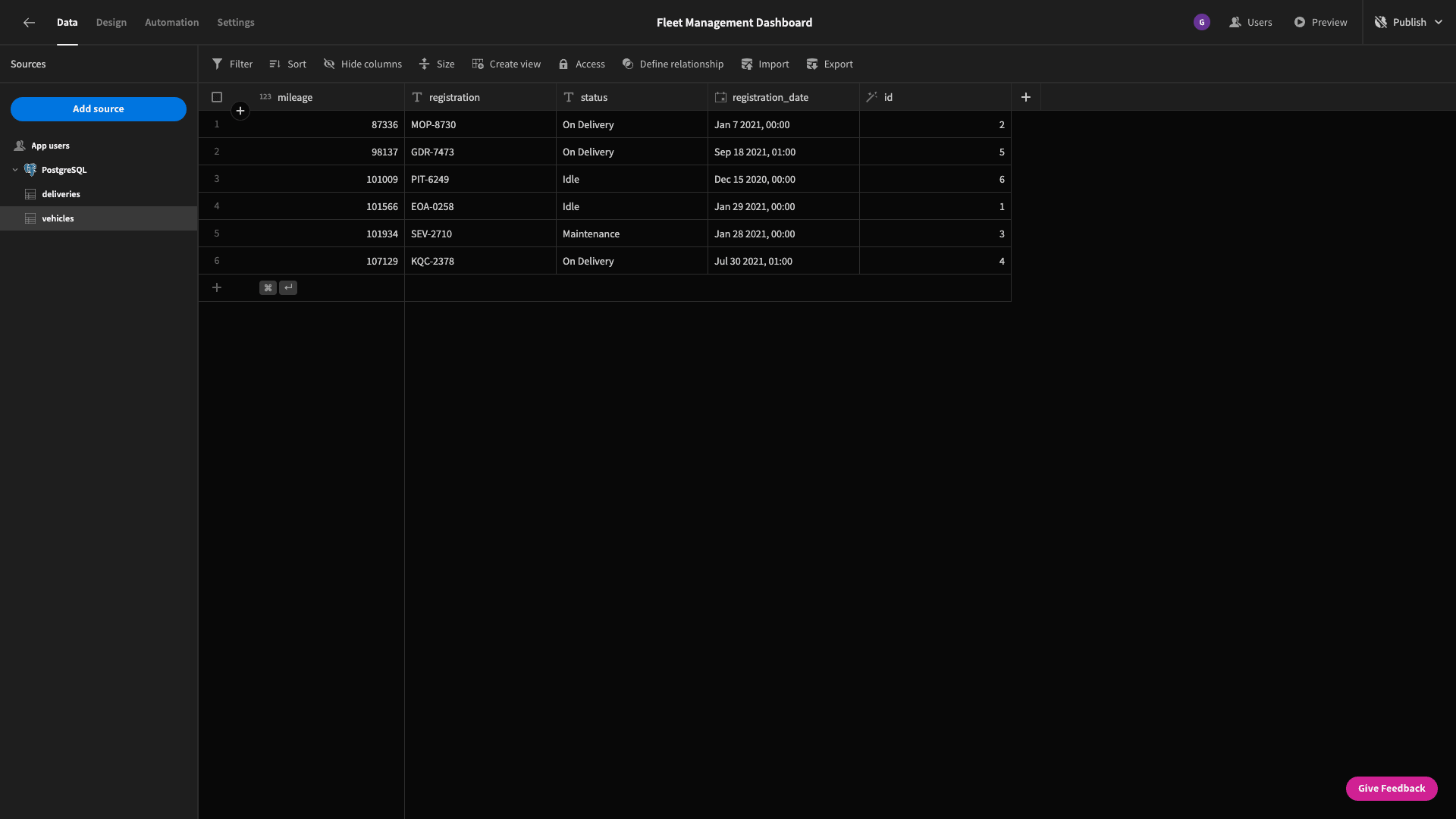
We can use this editable table to add, edit, or delete rows - as well as altering our table’s schema.
Our fleet management dashboard will be mainly built around custom Postgres queries, but we’re still going to make a few changes to our data tables for the sake of house keeping.
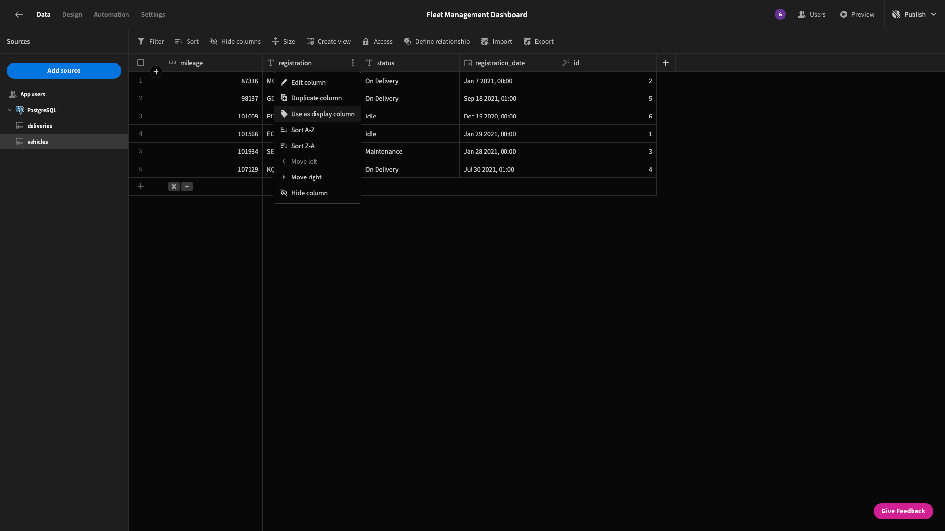
On the vehicles table, we want to select the registration attribute as our display column:
We’ll also edit the status attribute and choose the options type, rather than keeping it as a text field. We’ll input the three possible values - On Delivery, Idle, and Maintenance:
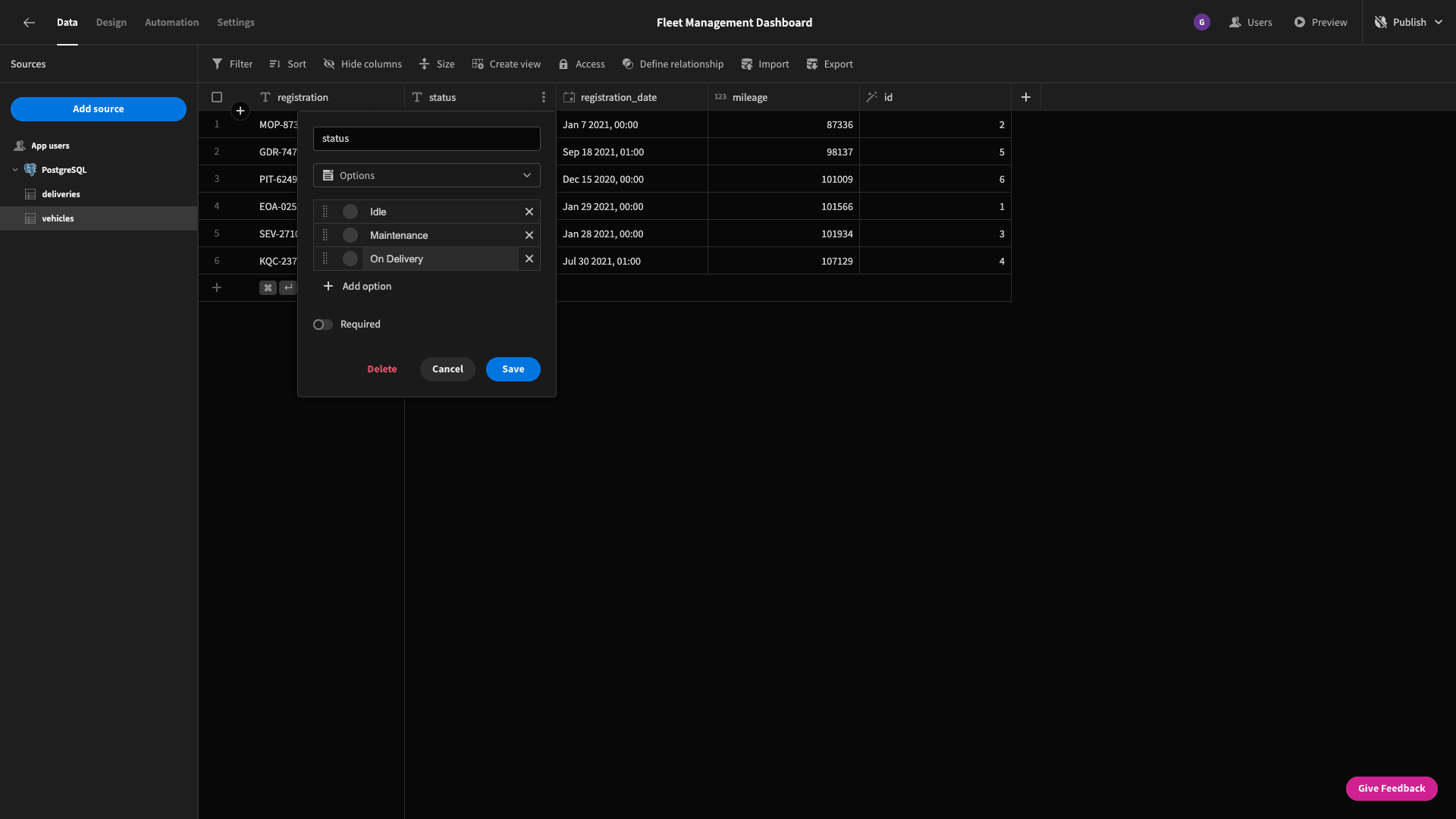
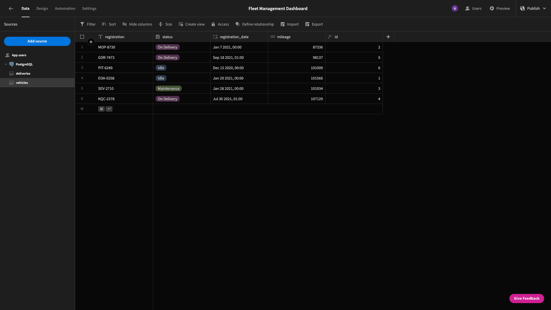
We can set a custom color code for our options, but if we don’t then Budibase will do this for us. Here’s what our table looks like now:
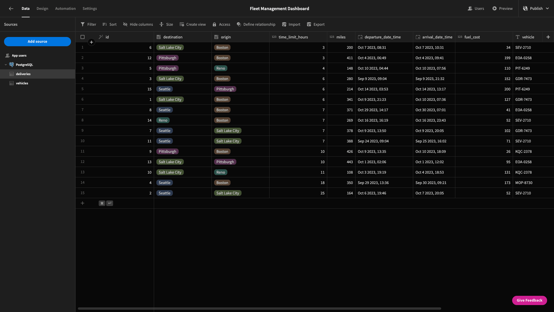
We’ll make some similar changes to our deliveries table - setting the id attribute as our display column and changing the origin and destination fields to the options type.
3. Building our fleet report
Now, we can start building some interfaces. Each of our reports is effectively made up of four distinct parts.
So, we can take each in turn.
Summary cards
At the top of our fleet management dashboard, we’ve got a series of cards that read out key statistics about the current state of our fleet.
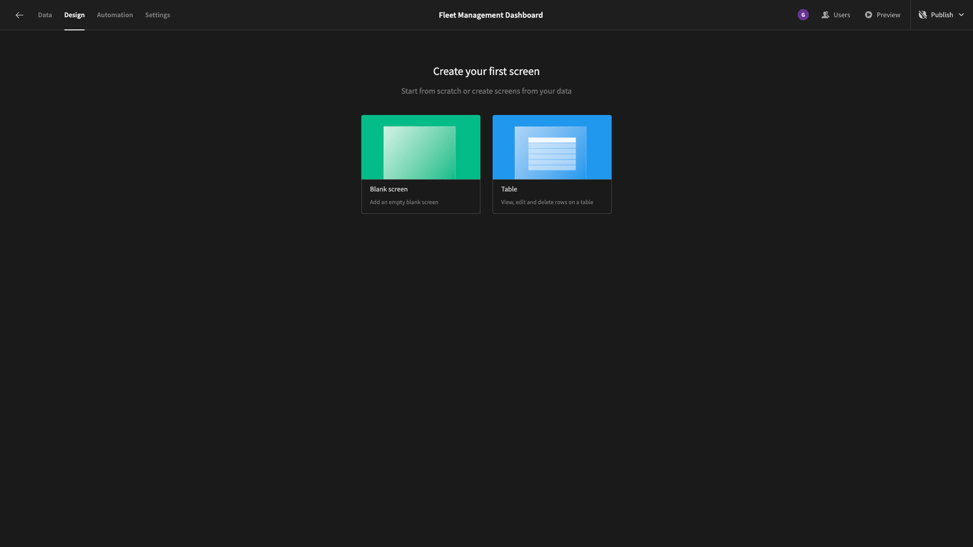
We’ll start by adding a new blank screen:
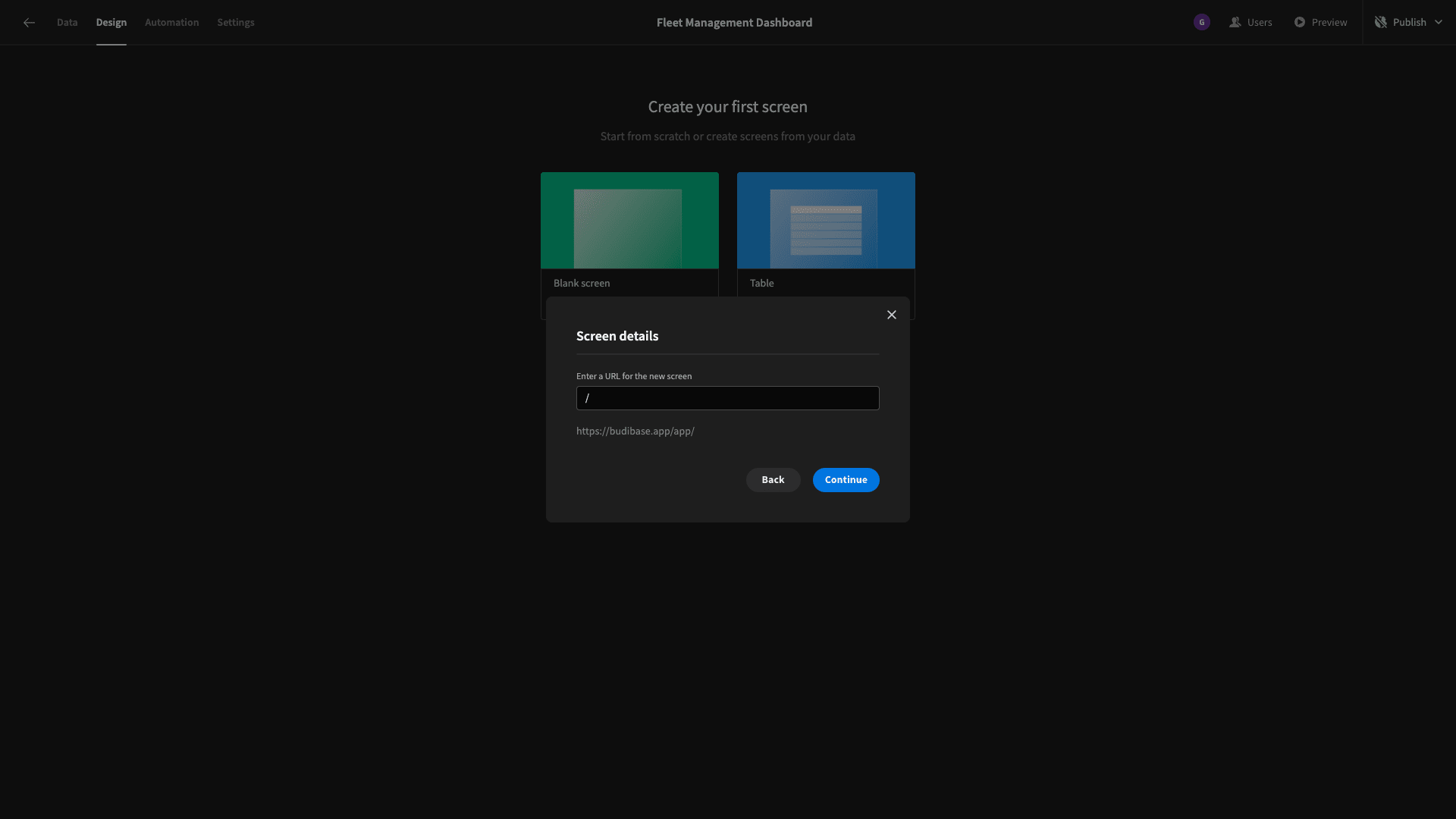
This will be our home screen, so we’ll leave the URL extension blank:
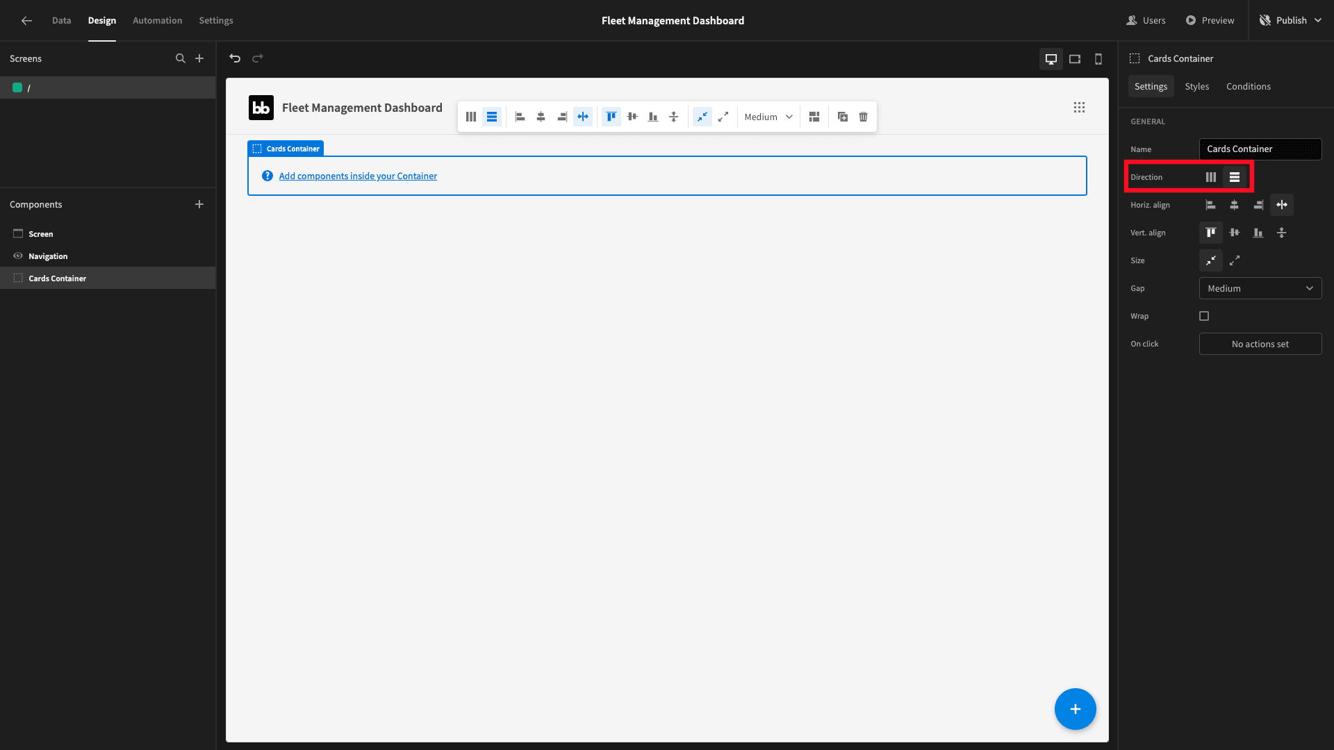
The first component we want to add is a container. We’ll also give this a name and set its direction to horizontal:
Inside this, we’ll place four cards blocks. Each of these will iterate over a specific data set and display whichever values from each entry that we want them to.
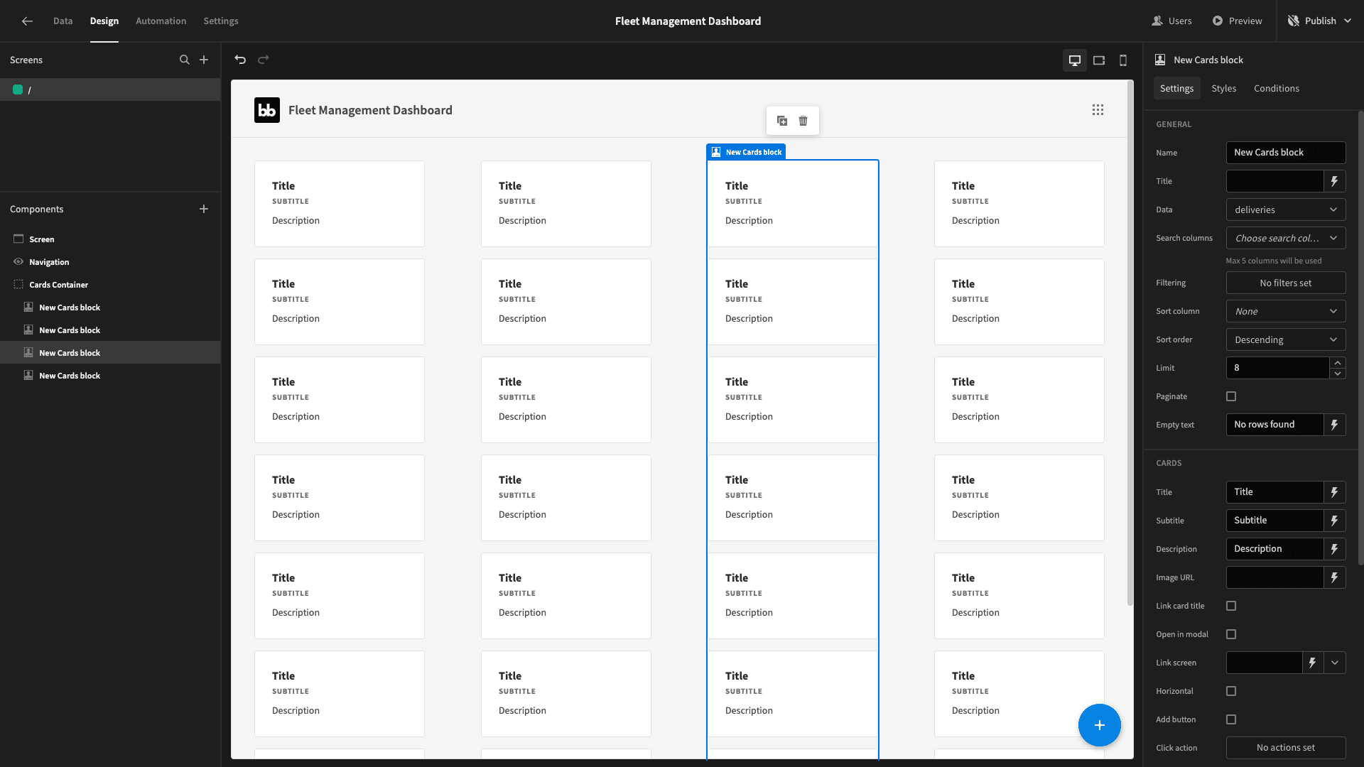
Eventually, we’ll populate these with a data set that only has one entry - so we’ll just have one card per cards block.
If you cast your mind back to our finished dashboard from earlier, the four metrics we’re going to display in these cards are:
- The average age of vehicles in our fleet.
- Their average mileage.
- The percentage of our vehicles that are currently in use.
- How much we’ve spent on fuel this month.
We’ll get these first three metrics from a single custom query.
So, head back to the data tab and add a new query under our Postgres connection:
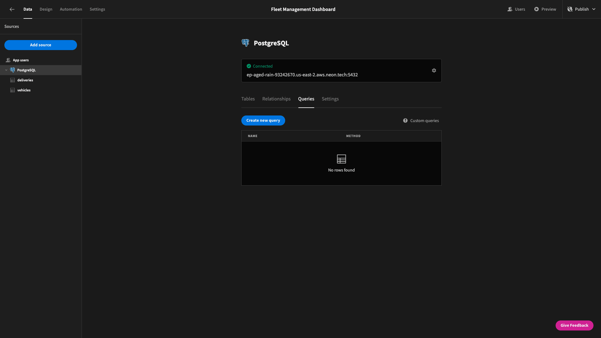
We’ll call this AgeMileageUtilization.
We need to write a SELECT statement that will return three things:
- The AVG of the current date minus each vehicle’s registration_date.
- The AVG of the mileage attribute.
- The COUNT of vehicles with the status attribute “On Delivery” divided by the COUNT of all vehicles.
Therefore, our query will be:
 1SELECT CAST(AVG(
 2
 3  EXTRACT(YEAR FROM AGE(NOW(), registration_date)) +
 4
 5  EXTRACT(MONTH FROM AGE(NOW(), registration_date)) / 12.0
 6
 7) AS DECIMAL) AS average_age,
 8
 9AVG(mileage) AS average_mileage,
10
11(COUNT(CASE WHEN status = 'On Delivery' THEN 1 END)::decimal / COUNT(*)) * 100 AS percentage_on_delivery
12
13FROM vehicles;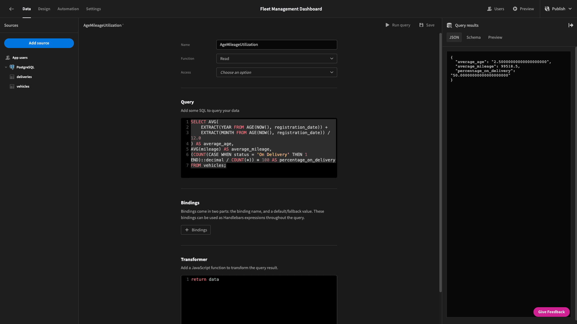
This returns a data objec that looks like this:
1{
2
3 "average_age": "2.50000000000000000000",
4
5 "average_mileage": 99518.5,
6
7 "percentage_on_delivery": "50.00000000000000000000"
8
9}
Hit save and head back to the design section.
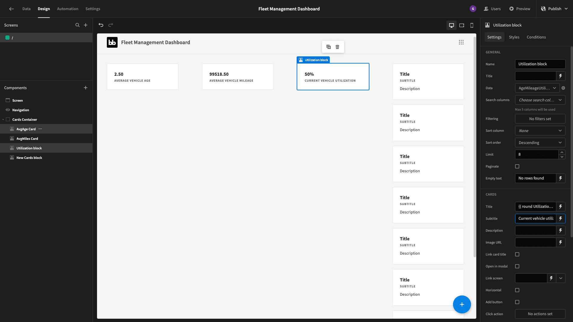
We’ll start by giving our first three cards more descriptive names and setting their data to our new query. Now each one only displays one card - because it only iterates over a single object:
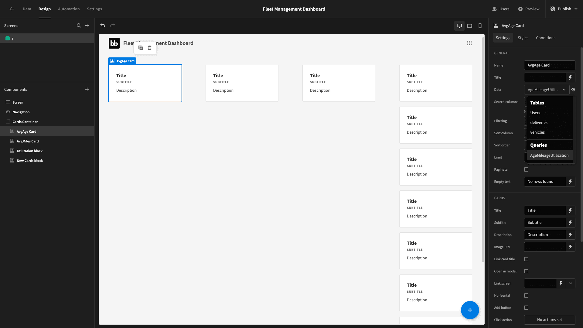
Each one has a title, subtitle, and description field. We’ll set the title to be each of the respective figures - and the subtitle as some text to explain what this is.
We’ll just delete the description outright - since we don’t need it.
Budibase gives us two different ways to bind values to a field - handlebar expressions or JavaScript. If we were happy with the format of our data as it’s returned by our query, we could just select plain handlebars:
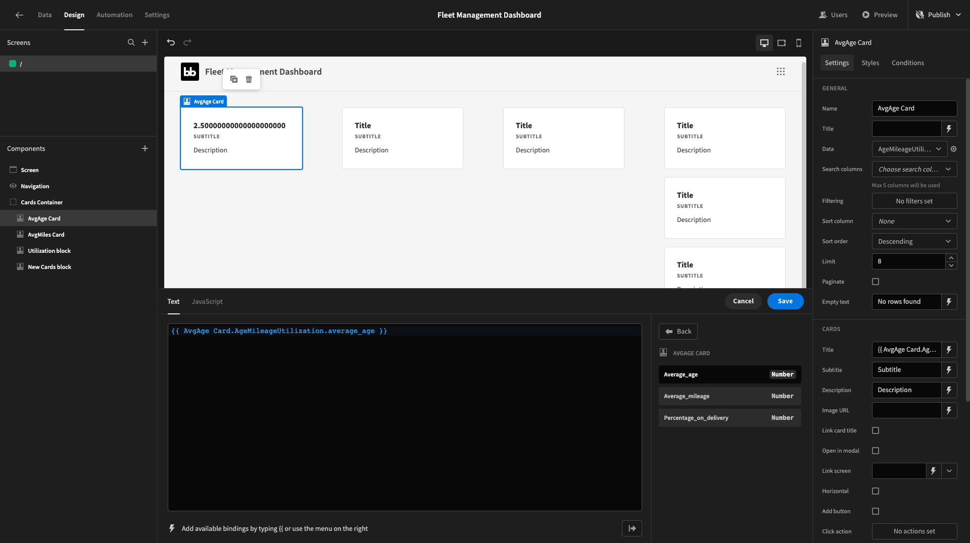
But, we want to do a little bit of formatting. We’ll use some custom JavaScript for the first two because we want to round our figures to two decimal places.
So, for the average age, we’ll use the following JavaScript as our title binding:
1return Number($("AvgAge Card.AgeMileageUtilization.average_age")).toFixed(2);And we’ll set the subtitle to average vehicle age. We’ll also do basically the same thing with our next card, using our average_mileage output from the query.
So far, we have:

For our utilization rate, we can just display an integer with a percentage sign appended to it. To do this, we’ll use the following handlebars expression as our title binding:
1{{ round Utilization block.AgeMileageUtilization.percentage_on_delivery }}%Now we have:
For our last card, things are a bit more complicated. We want to display how much we’ve spent on fuel for the current month so far.
To get this, we’ll first need a new query to SELECT the numerical month, year, and SUM of the fuel costs - grouped and ordered by month and year.
We’ll follow the same process as above to add a new query called FuelCostByMonth. The specific query we’ll use is:
1SELECT
2
3 CAST(EXTRACT(MONTH FROM departure_date_time) AS INTEGER) AS departure_month,
4
5 CAST(EXTRACT(YEAR FROM departure_date_time) AS INTEGER) AS departure_year,
6
7 SUM(fuel_cost) AS total_fuel_cost
8
9FROM deliveries
10
11GROUP BY departure_year, departure_month
12
13ORDER BY departure_year, departure_month;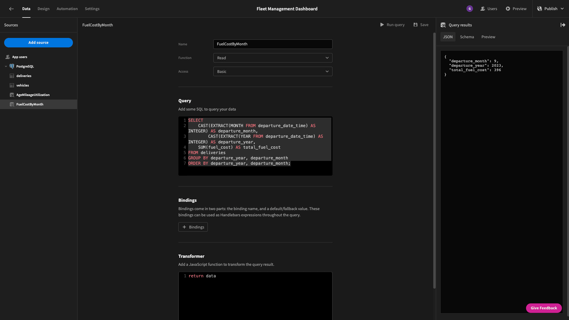
Here’s the schema that this returns:
1{
2
3 "departure_month": 9,
4
5 "departure_year": 2023,
6
7 "total_fuel_cost": 396
8
9}
We’ll go ahead and bind this total_fuel_cost value to our final card:

But - there’s a problem!
Our query returns multiple data objects. So, we need one final step to add some front-end filtering so that we only see the current month’s figures.
Use the button on the right to open up the filter drawer:
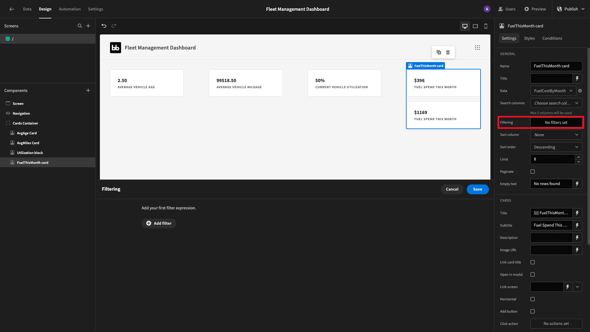
We need two expressions - one to match the departure_month to the current month and another to do the same for the departure_year.
For the month, we’ll use this piece of JavaScript (we need to add one because JavaScript uses zero-based counting - so January has an index of 0:
1var currentDate = new Date();
2
3return currentDate.getMonth() + 1;
For the year, we can use:
1var currentDate = new Date();
2
3return currentDate.getFullYear();
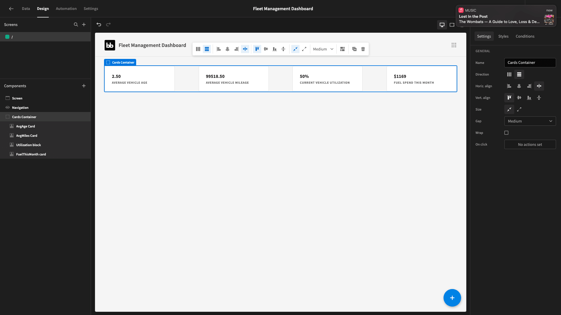
And that’s our cards done!
Current location chart
Next, we want a pie chart that displays a breakdown of how our fleet is spread out on the ground.
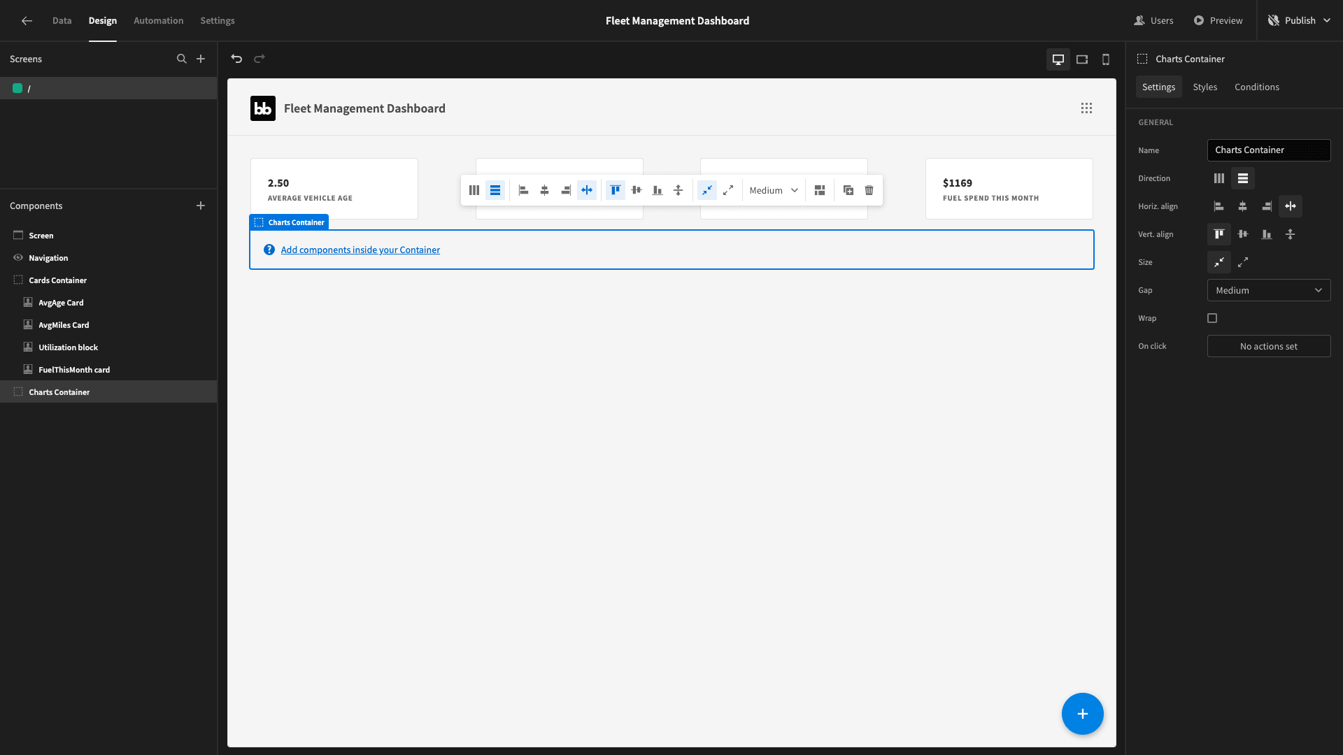
We want this chart to occupy half of the screen - and later we’ll put another graph beside it - so we’ll start by adding another horizontal container:
We’ll need another query, which we’ll call VehicleCountByLocation.
Again, this is a slightly more complex query - because our vehicles table doesn’t have a column for their current location. However, we can figure out the last location where each one made a delivery.
So, we basically need a query that finds the row for each vehicle with the most recent arrival_date - and then counts the vehicles at each location based on this.
Our query is:
1SELECT
2
3 d.destination AS current_location,
4
5 COUNT(*) AS vehicle_count
6
7FROM deliveries d
8
9INNER JOIN (
10
11 SELECT
12
13 vehicle,
14
15 MAX(arrival_date_time) AS max_arrival_date
16
17 FROM deliveries
18
19 GROUP BY vehicle
20
21) recent_arrival ON d.vehicle = recent_arrival.vehicle AND d.arrival_date_time = recent_arrival.max_arrival_date
22
23GROUP BY d.destination;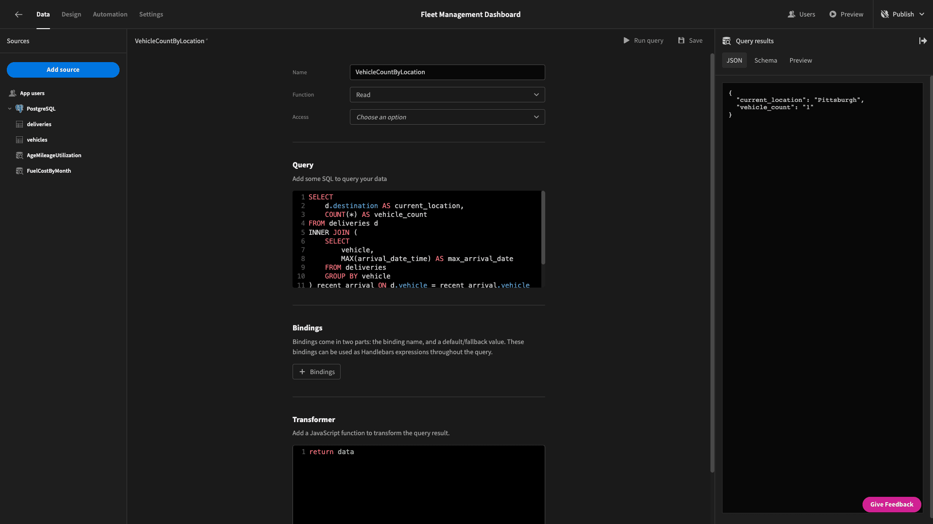
Here’s an example of the kind of data object we’ll get back:
1{
2
3 "current_location": "Pittsburgh",
4
5 "vehicle_count": "1"
6
7}
Back to the design tab!
Inside our container, we’ll add a chart block. We’ll give it a name, set its type to pie, and point it to our new query:
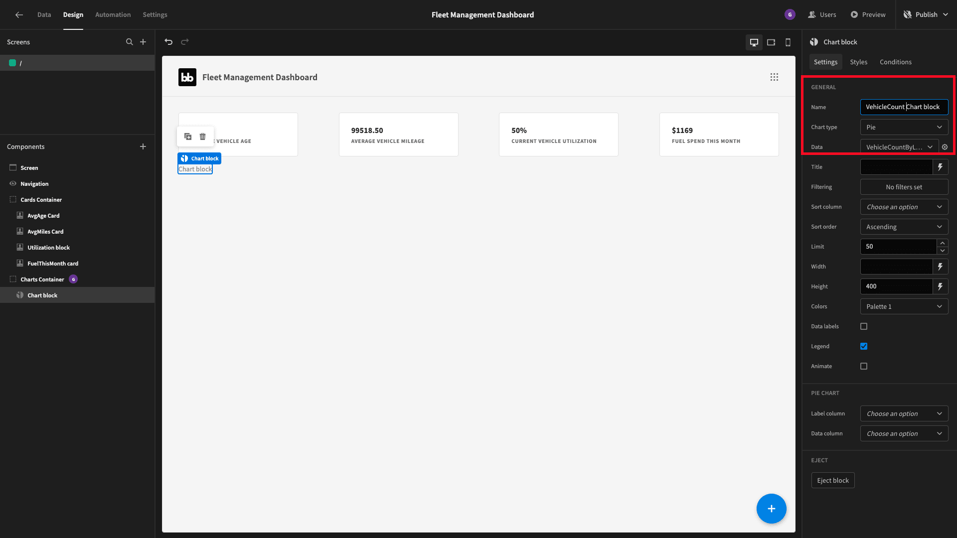
However, this won’t display any data until we tell it which attributes we want to use for what.
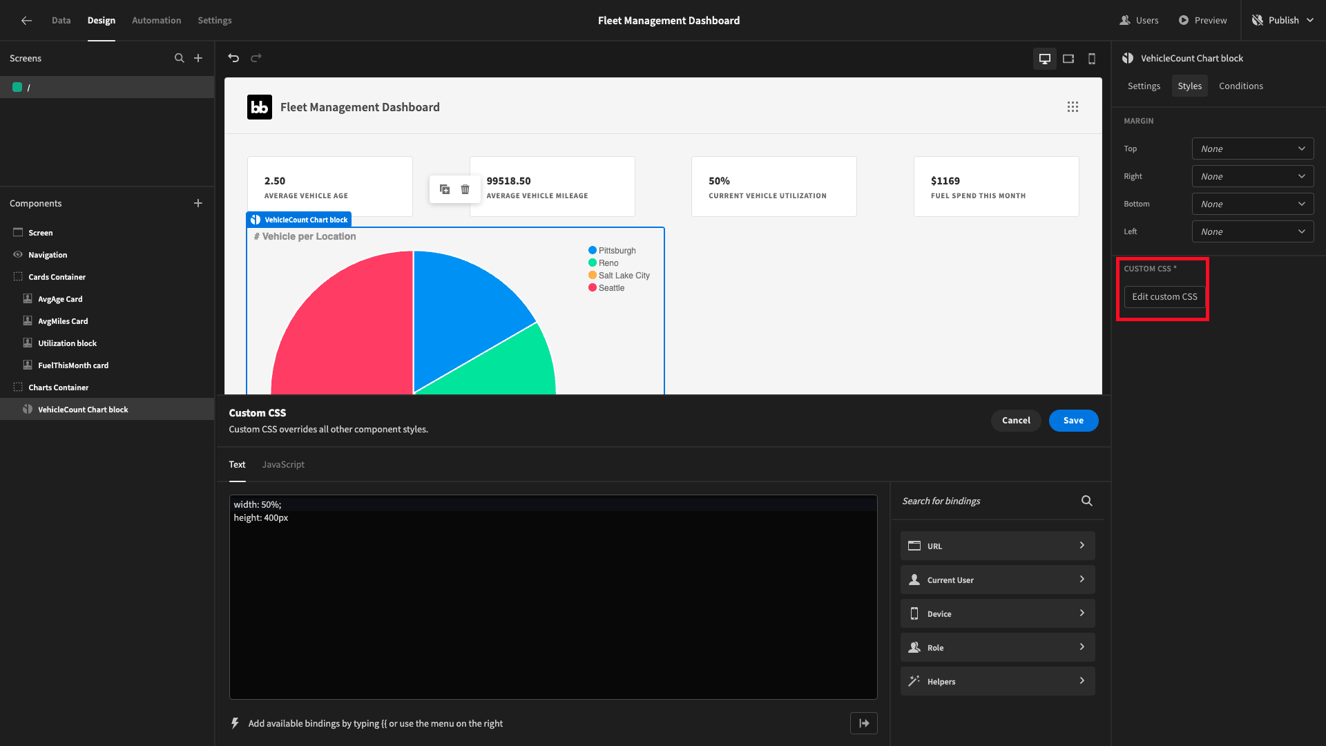
We’ll set the label column to current_location and the data column to vehicle_count.
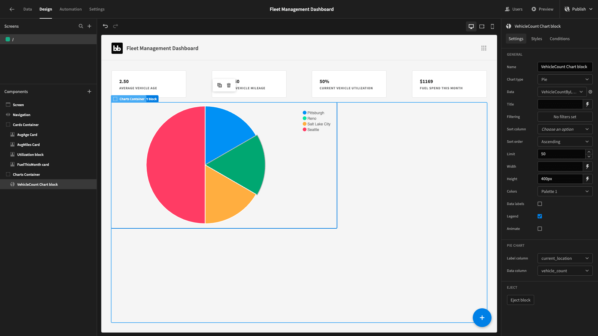
Lastly, we want to make some space for the other chart, so we’ve added some custom CSS to set the chart’s width to 50% and fix its height at 400px. We’ve also given it a descriptive title:
Fuel efficiency chart
Next, we want a bar chart that displays each of our vehicles’ average fuel cost per mile.
We’ll start with a new query called FuelCostByVehicle. This one is relatively simple. We just need the average of (fuel_cost over miles), grouped by vehicle.
Here’s the query:
1SELECT
2
3  vehicle,
4
5  AVG(fuel_cost / miles) AS average_cost_per_mile
6
7FROM deliveries
8
9GROUP BY vehicle;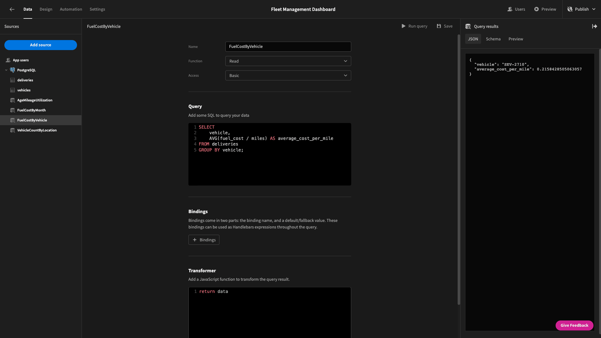
And the output:
1{
2
3 "vehicle": "SEV-2710",
4
5 "average_cost_per_mile": 0.2158428505063057
6
7}
We’ll add another chart block inside our container - this time setting its type to bar and its data to our new query:
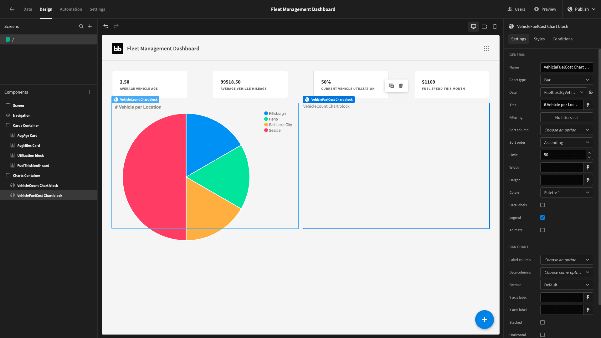
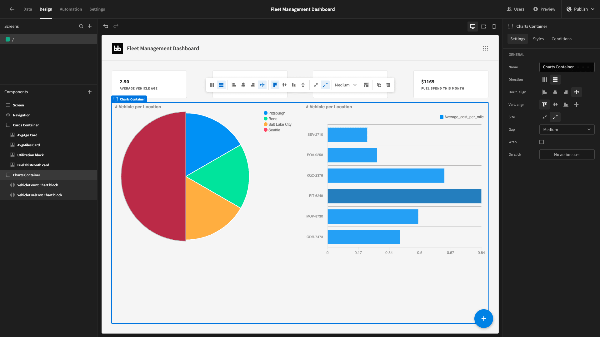
Our label column is vehicle and the data column is average_cost_per_mile. We’ll also select the horizontal option and apply some similar custom CSS to what we did for our pie chart.
Daily fuel costs
The last chart we’ll put on this screen will display our daily total spend on fuel for the current month.
But, we don’t necessarily have values for every date. We’ll need a query that takes account of this fact.
We’ll first create a series of all of the days so far this month. We’ll then use a COALESCE statement to SUM our fuel_cost attributes - but return 0 on the rows where this is NULL - and LEFT JOIN this to our series.
So, the final query is:
1WITH all_dates AS (
2
3 SELECT generate_series(
4
5 date_trunc('month', current_date)::date,
6
7 current_date::date,
8
9 '1 day'::interval
10
11 )::date AS date
12
13)
14
15SELECT
16
17 ad.date AS departure_date,
18
19 COALESCE(SUM(d.fuel_cost), 0) AS total_fuel_cost
20
21FROM all_dates ad
22
23LEFT JOIN deliveries d ON DATE(d.departure_date_time) = ad.date
24
25GROUP BY ad.date
26
27ORDER BY ad.date;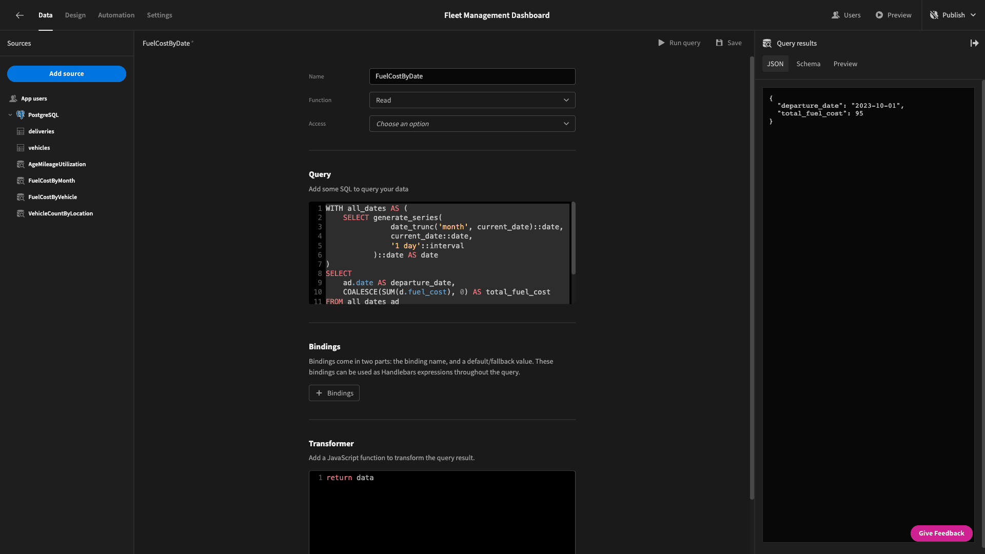
The data we get back looks like this:
1{
2
3 "departure_date": "2023-10-01",
4
5 "total_fuel_cost": 95
6
7}
We’ll use this data as a line chart below our existing charts:
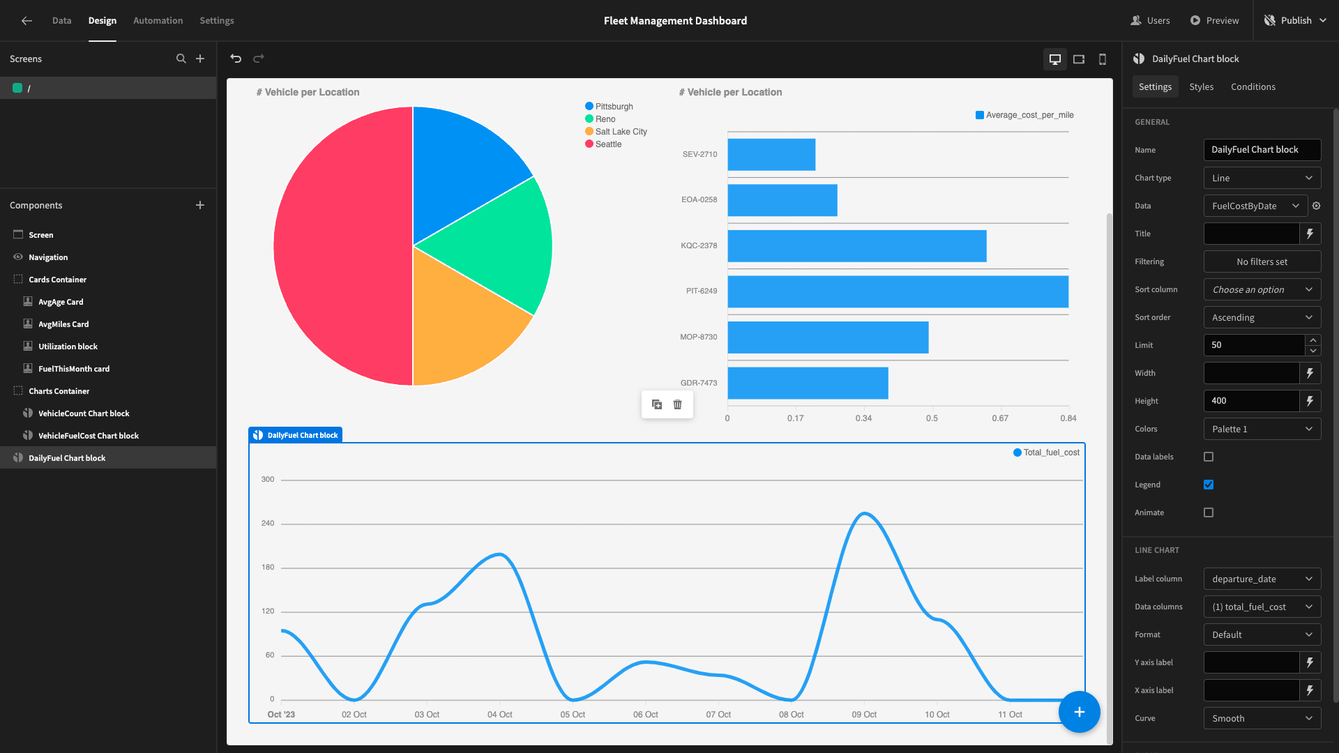
Since this is for the current month only, we’ll use a bit of JavaScript to reflect this fact in the title, using the expression:
1const today = new Date();
2
3const month = String(today.getMonth() + 1).padStart(2, '0'); // Adding 1 because January is 0
4
5const year = today.getFullYear();
6
7return `Daily Fuel Spend This Month: (${month}/${year})`;
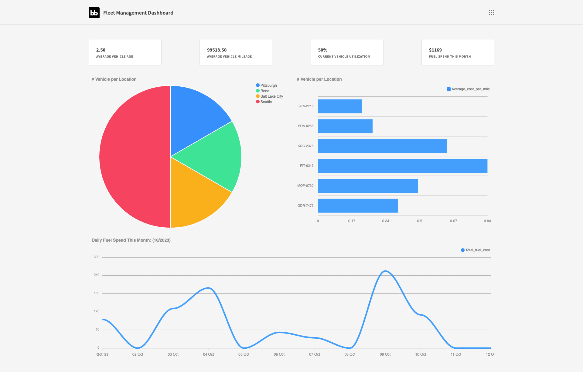
Our dashboard so far looks like this:
4. Building our deliveries report
Next, we want to build a very similar dashboard screen for data relating to our deliveries. We’ll start by duplicating what we have so far.
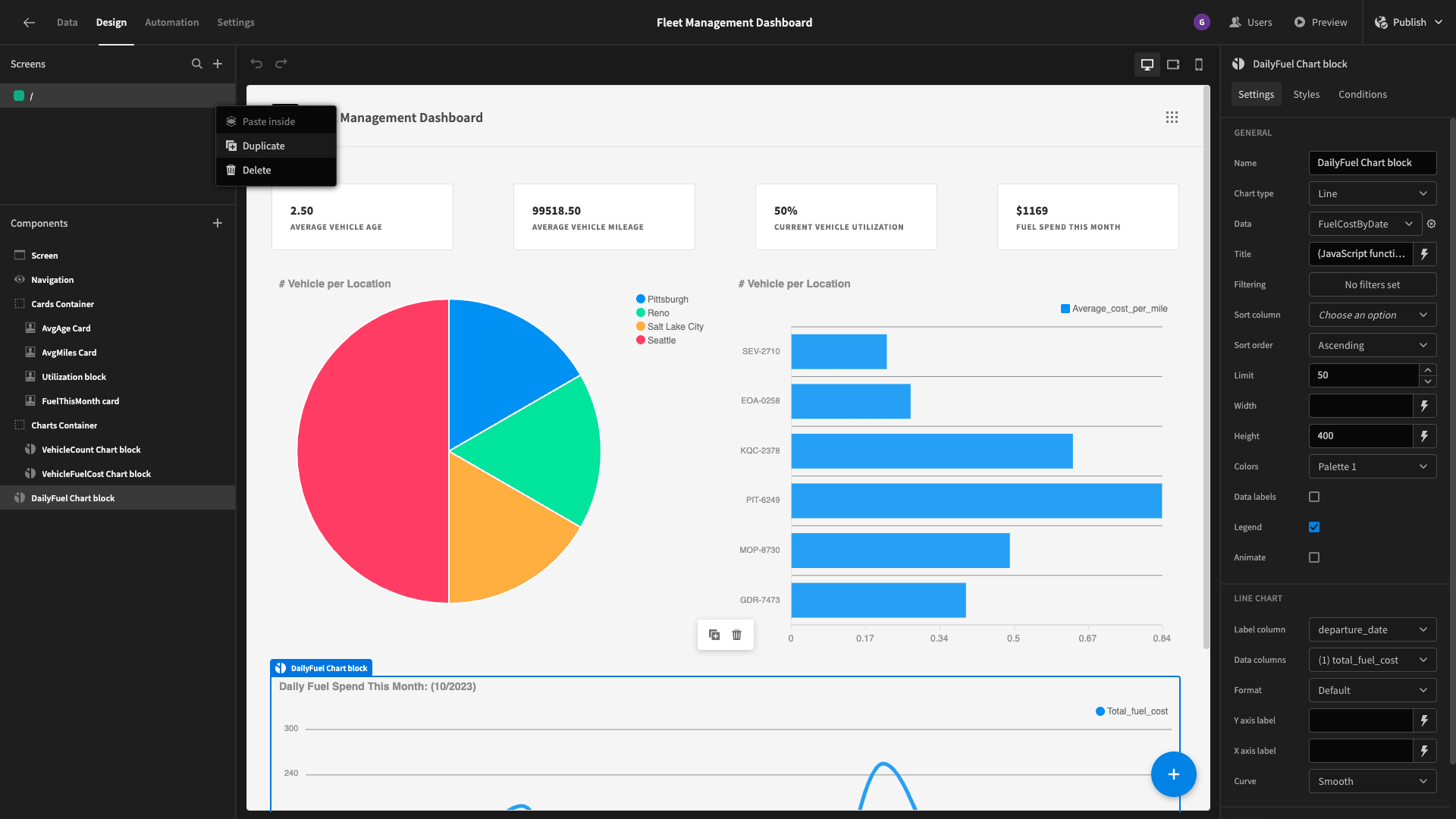
We’ll call the new screen /deliveries.
Now - what we want to do is work through each of our charts and swap out their data to display metrics that are relevant to our fleet’s performance.
We’ll start at the top and work our way down.
Summary cards
We want our summary cards on this page of our fleet management dashboard to display the following metrics for the current month:
- The number of deliveries we’ve made.
- The number of deliveries that have been late.
- The percentage of our deliveries that have been late.
- The average hours ahead or behind schedule we’ve been.
So, we need to select the following:
- The numerical month.
- The numerical year.
- The count of rows.
- The count of rows where the real elapsed time exceeds the time limit.
- The same thing expressed as a percentage.
- The average difference between the time limit and the elapsed time.
Our query will be:
1SELECT
2
3 CAST(EXTRACT(MONTH FROM departure_date_time) AS INTEGER) AS departure_month,
4
5 CAST(EXTRACT(YEAR FROM departure_date_time) AS INTEGER) AS departure_year,
6
7 COUNT(*) AS total_deliveries,
8
9 COUNT(CASE WHEN EXTRACT(HOUR FROM arrival_date_time - departure_date_time) > time_limit_hours THEN 1 END) AS count_of_late_deliveries,
10
11 (COUNT(CASE WHEN EXTRACT(HOUR FROM arrival_date_time - departure_date_time) > time_limit_hours THEN 1 END)::decimal / COUNT(*)) * 100 AS percentage_late,
12
13 AVG(time_limit_hours - EXTRACT(HOUR FROM arrival_date_time - departure_date_time)) AS average_time_difference
14
15FROM deliveries
16
17GROUP BY departure_year, departure_month;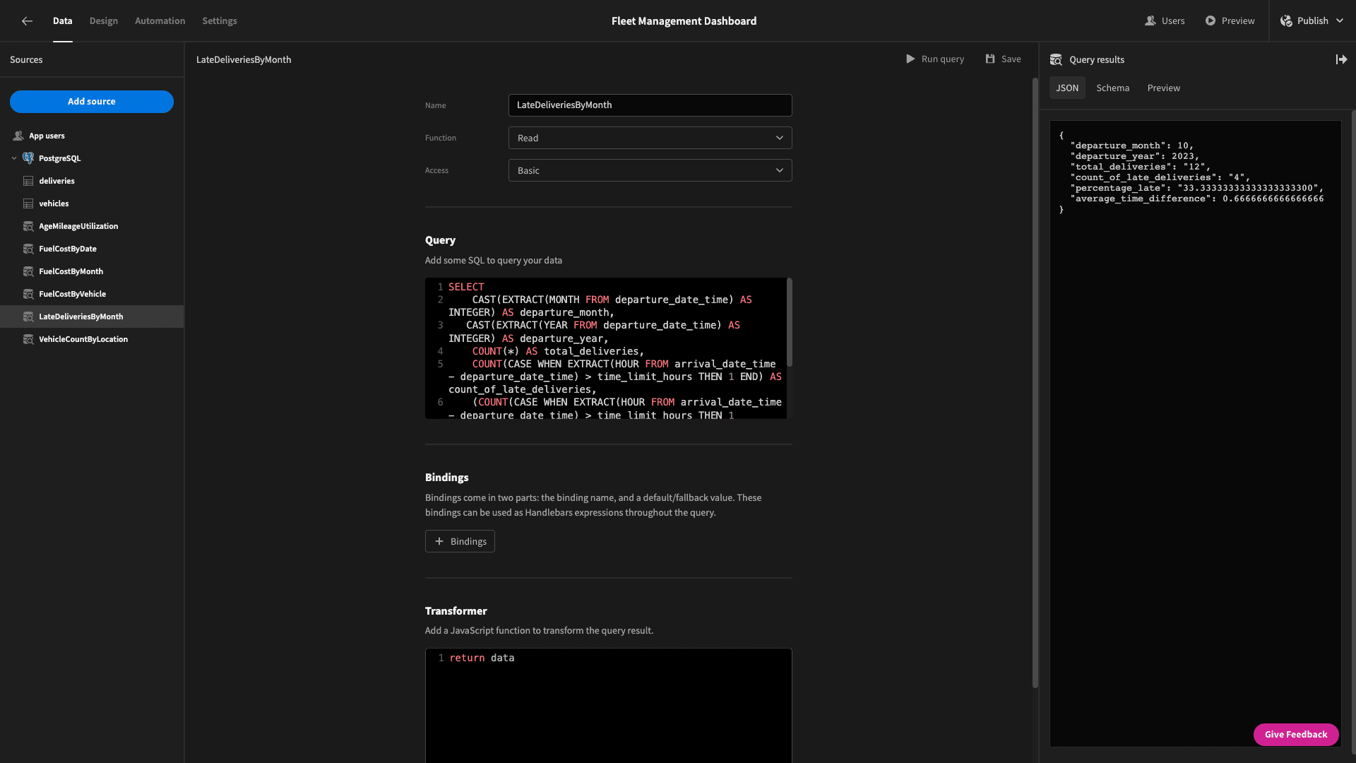
And the returned data objects look like this:
 1{
 2
 3 "departure_month": 10,
 4
 5 "departure_year": 2023,
 6
 7 "total_deliveries": "12",
 8
 9 "count_of_late_deliveries": "4",
10
11 "percentage_late": "33.33333333333333333300",
12
13 "average_time_difference": 0.6666666666666666
14
15}
Now, we can go back and swap out our values for these without much fuss - we just need to filter for the month and year again - using the same JavaScript binding as we did earlier:
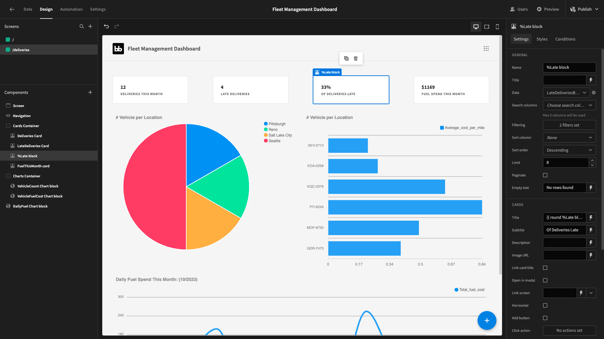
The fourth card is a bit trickier. Our query will return a positive or negative number depending on whether we’re ahead or behind schedule. We want to display a positive number no matter what and then alter the subtitle to indicate if we’re ahead or behind on average.
We’ll use the ternary operator in JavaScript to achieve both of these.
So, for the title, we check if the time difference is positive or negative. If it’s positive, we return it as is. If it’s negative, we multiply it by -1 before we return it:
1var hours = $("TimeDifference card.LateDeliveriesByMonth.average_time_difference");
2
3var hoursDifference = hours >= 0 ? hours: (-1 * hours)
4
5return hoursDifference.toFixed(2);
And we use the same principle to decide what string to display below:
1var hours = $("AllTimeLate Cards block.LateDeliveriesByMonth.average_time_difference")
2
3var displayString = hours >= 0 ? "Avg Hours Ahead of Schedule": "Avg Hours Behind Schedule"
4
5return displayString;
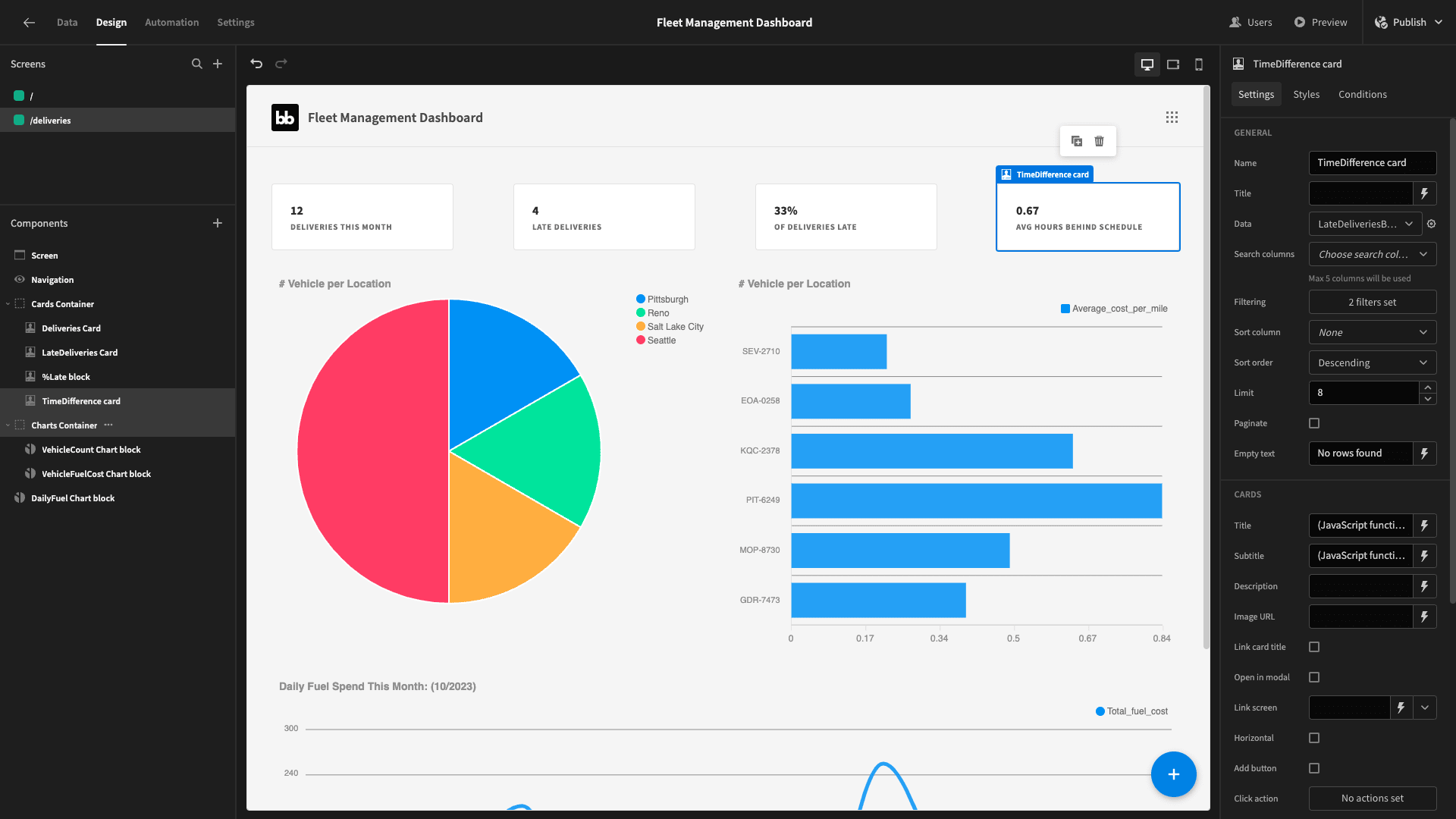
Here are our finished cards:
Deliveries by origin charts
For our pie chart and bar chart, we’re going to display the number of deliveries that have departed from each of our sites.
We’ll create a query called LateDeliveriesByOrigin. We’re basically going to get the same information as our previous query, but this time we’ll group it by source rather than my date:
 1SELECT
 2
 3  origin,
 4
 5  COUNT(*) AS total_deliveries,
 6
 7  COUNT(CASE WHEN EXTRACT(HOUR FROM arrival_date_time - departure_date_time) > time_limit_hours THEN 1 END) AS count_of_late_deliveries,
 8
 9  (COUNT(CASE WHEN EXTRACT(HOUR FROM arrival_date_time - departure_date_time) > time_limit_hours THEN 1 END)::decimal / COUNT(*)) * 100 AS percentage_late
10
11FROM deliveries
12
13GROUP BY origin;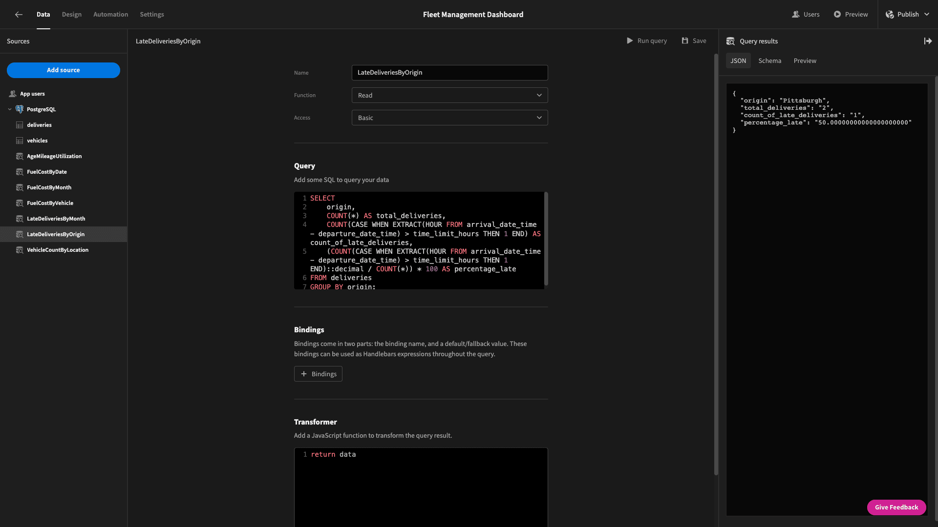
Here’s the response data:
 1{
 2
 3 "origin": "Pittsburgh",
 4
 5 "total_deliveries": "2",
 6
 7 "count_of_late_deliveries": "1",
 8
 9 "percentage_late": "50.00000000000000000000"
10
11}
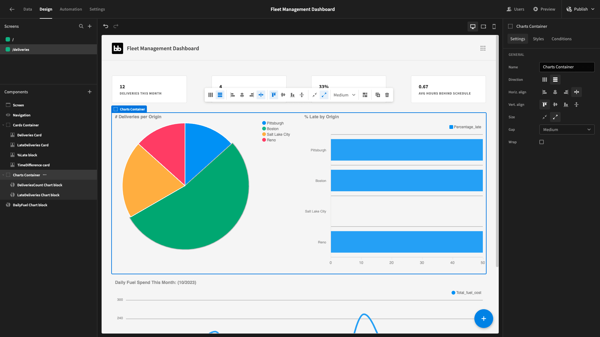
And we can just straightforwardly swap out the data and display titles for our charts:
Daily departures
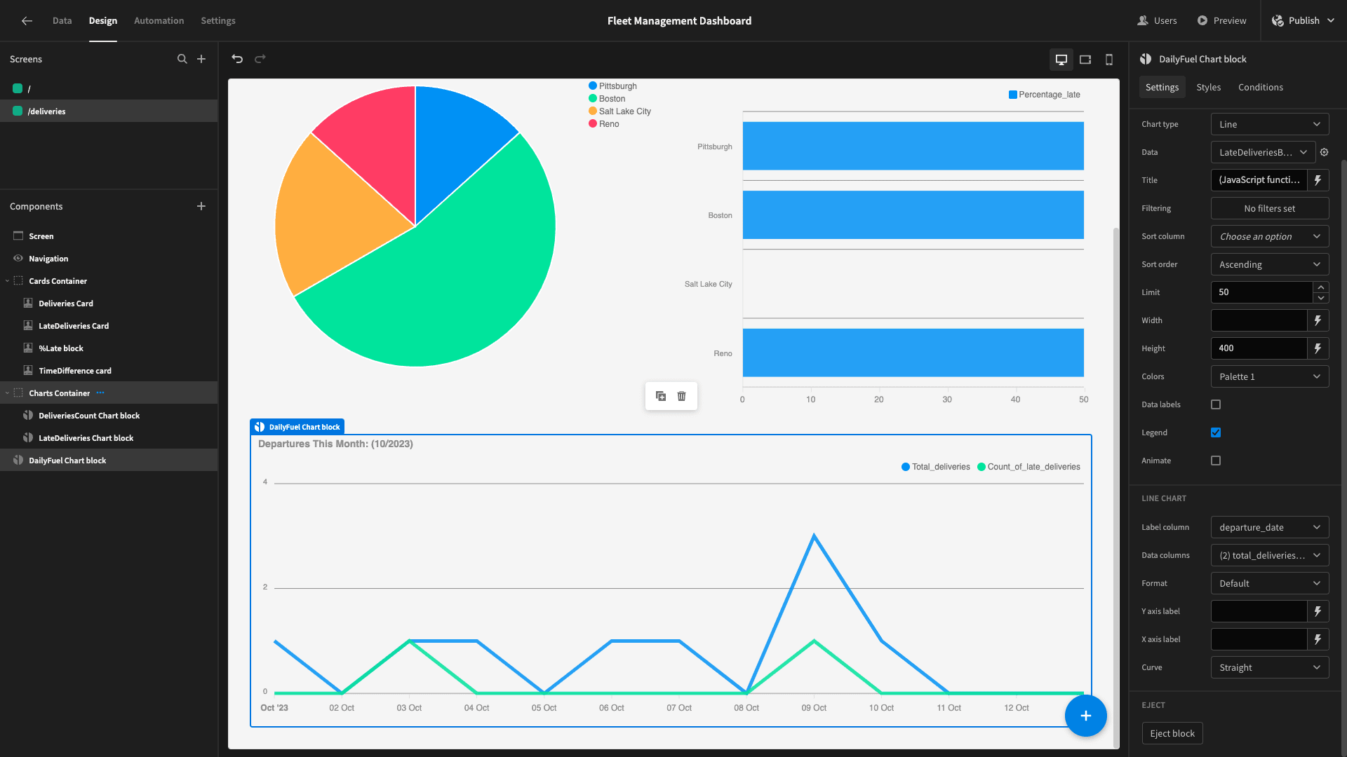
Our final chart is going to show the number of deliveries and late deliveries for each day this month.
So, we need to use the same WITH statement we did earlier to generate a series for each day this month and use a JOIN statement to match this up with data from our table.
Ultimately we’ll select the same count of deliveries and count of late deliveries as we have in the last couple of queries. We also have one extra statement that prevents us from getting a zero division error.
Here’s the query:
1WITH all_dates AS (
2
3 SELECT generate_series(
4
5 date_trunc('month', current_date)::date,
6
7 current_date::date,
8
9 '1 day'::interval
10
11 )::date AS date
12
13)
14
15SELECT
16
17 ad.date AS departure_date,
18
19 COUNT(d.departure_date_time) AS total_deliveries,
20
21 COUNT(CASE WHEN EXTRACT(HOUR FROM d.arrival_date_time - d.departure_date_time) > d.time_limit_hours THEN 1 END) AS count_of_late_deliveries,
22
23 CASE
24
25 WHEN COUNT(d.departure_date_time) = 0 THEN 0 -- Handle division by zero
26
27 ELSE (COUNT(CASE WHEN EXTRACT(HOUR FROM d.arrival_date_time - d.departure_date_time) > d.time_limit_hours THEN 1 END)::decimal / COUNT(d.departure_date_time)) * 100
28
29 END AS percentage_late
30
31FROM all_dates ad
32
33LEFT JOIN deliveries d ON DATE(d.departure_date_time) = ad.date
34
35GROUP BY ad.date
36
37ORDER BY ad.date;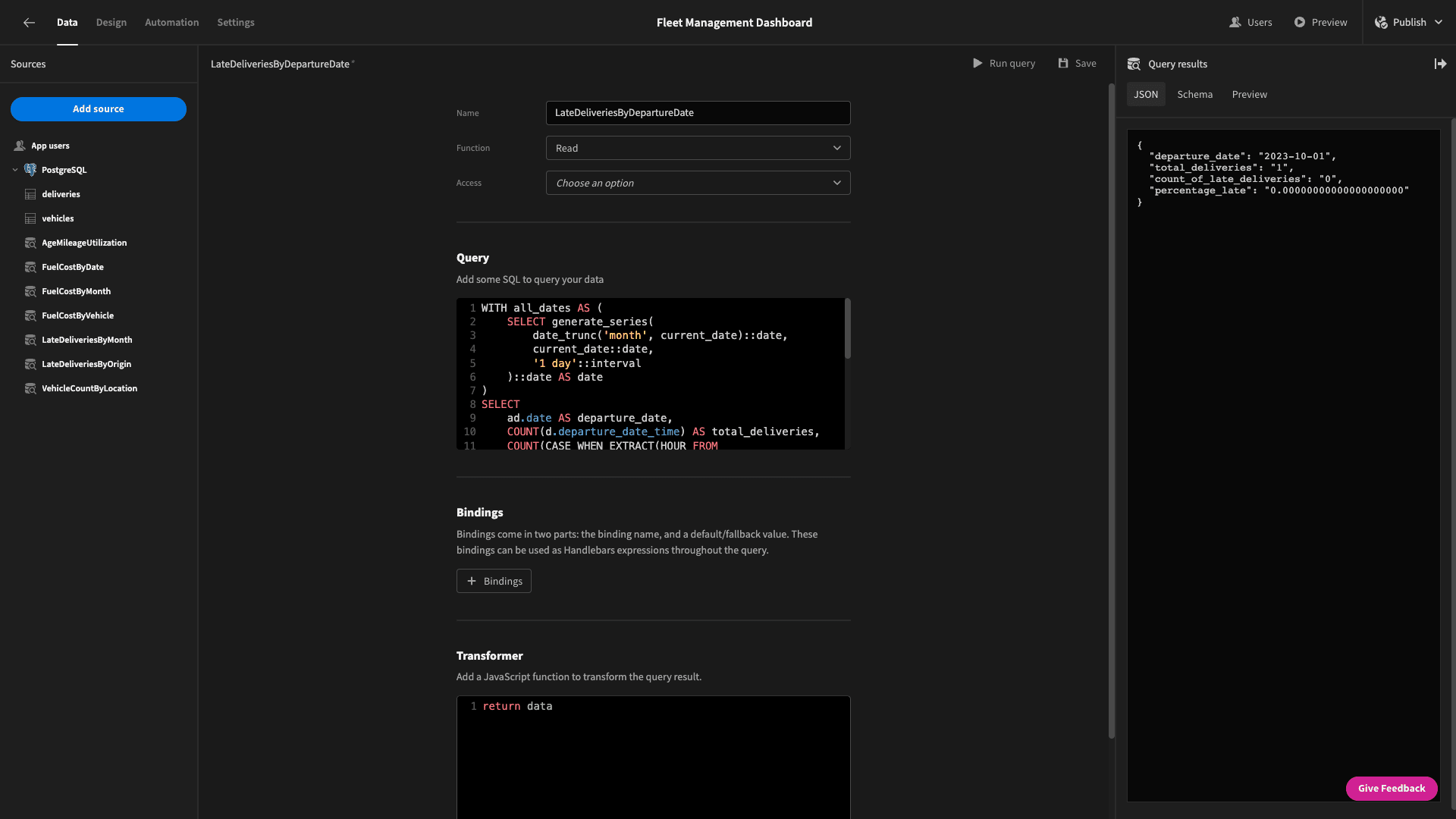
And the data we get back:
 1{
 2
 3 "departure_date": "2023-10-01",
 4
 5 "total_deliveries": "1",
 6
 7 "count_of_late_deliveries": "0",
 8
 9 "percentage_late": "0.00000000000000000000"
10
11}
We’ll plug this data into our chart to get:
5. Design tweaks and optimization
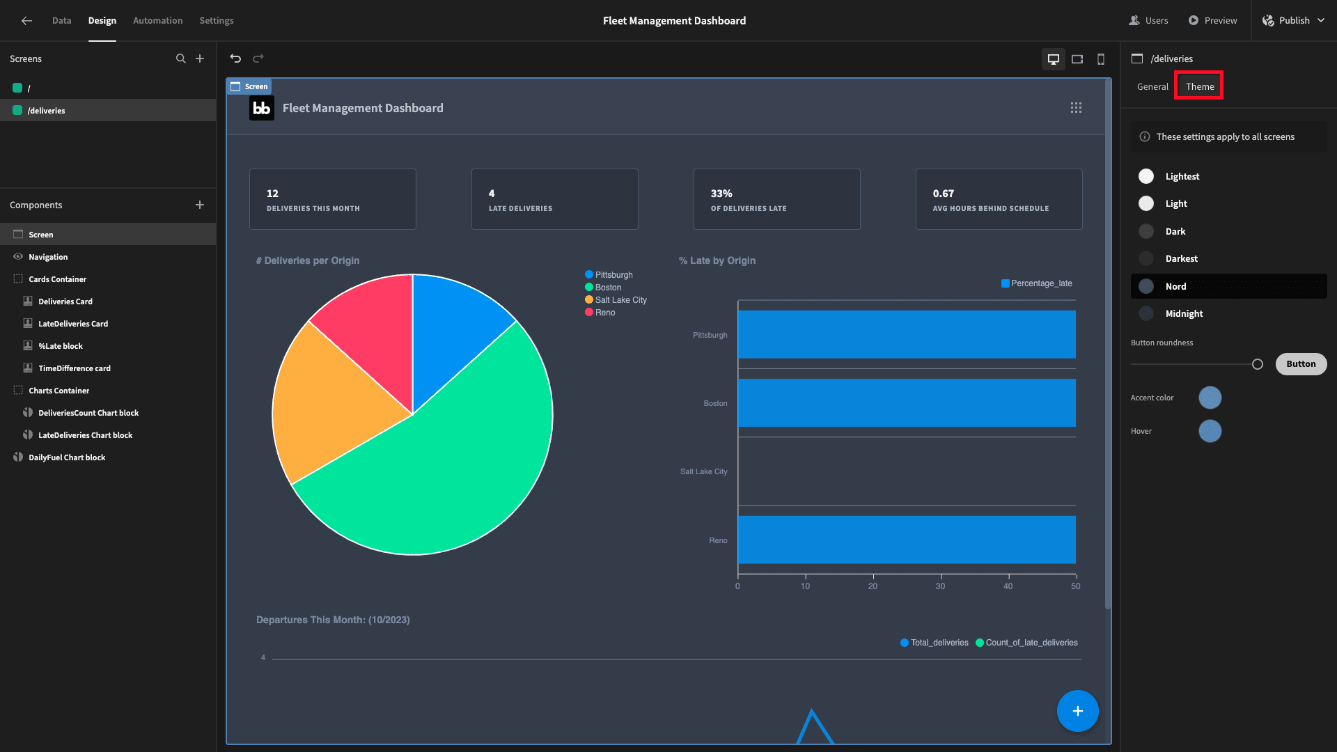
Lastly, we’re going to make a couple of little design tweaks. First of all, we’ll head to the theme tab and select Nord to give our dashboard a slightly different feel:
Then, we’ll select navigation and configure our menu links, so users can move between our two screens easily:
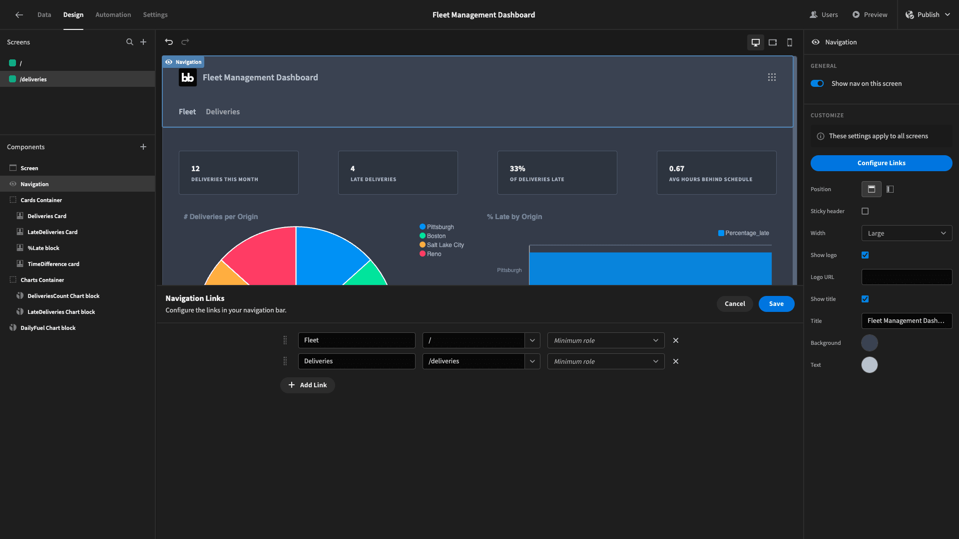
And that’s it! Here’s one last look at our finished fleet management dashboard:
We hope you found this tutorial helpful. To find out more about how Budibase empowers teams to turn data into action, check out our features overview .