How to Build a Procurement Dashboard
Sourcing raw materials and handling incoming stock are some of the most fundamental challenges that logistics teams face. The right procurement dashboard can make all the difference here.
See, a huge part of the problem is visibility. Procurement processes draw on a number of different types of data - across inventories, supply chains, finances, and more.
Without unified, coherent reporting, it’s almost impossible to make sense of all of this.
That’s where procurement dashboards come in.
Today, we’re showing how Budibase can be leveraged to turn data into action - including building custom dashboards around all kinds of existing data sets.
What is a procurement dashboard?
A dashboard is a real-time reporting UI that connects to an external data source. In other words, it’s a preconfigured report that displays the most up-to-date values for whatever data we build it around.
However, this normally isn’t just the raw data itself.
Rather, the goal is to give decision-makers fast, easy access to higher-level KPIs. So, we’ll typically perform transformations and aggregations on our data in order to extract the insights that we need - perhaps even integrating multiple data sets.
In the specific case of a procurement dashboard, we’re most likely to need information about our inventory, orders, shipments, vendors, or other relevant data sets in order to garner the insights our team needs.
So…
What are we building?
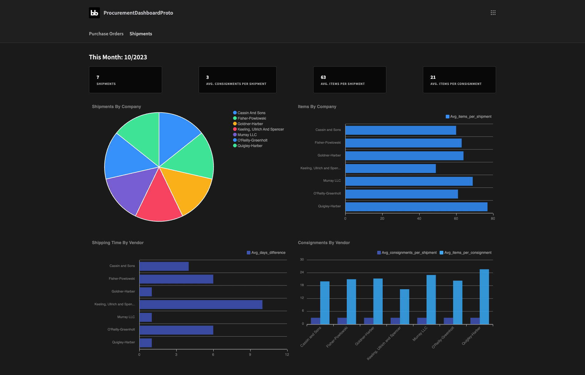
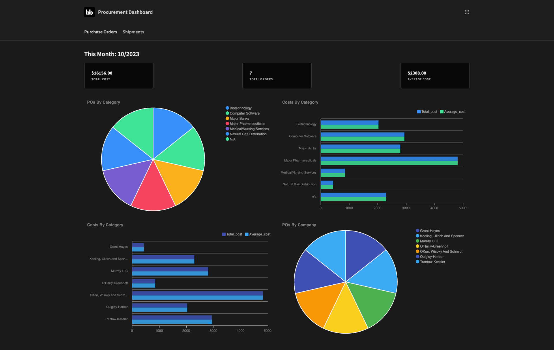
Our procurement dashboard is going to consist of two screens - one showing KPIs relating to our purchase orders for the current month - and the other for the current month’s shipments and consignments.
We’ll also drill down into individual vendors and product categories within these.
We’re going to draw our data from four tables within a Postgres database. These represent our vendors, shipments, consignments, and purchase_orders. All of these are interlinked via the shipments table.
We’ll make extensive use of custom queries throughout - but we’ll provide all of the relevant SQL syntax to show what we’re doing as we go along.
Here’s what the purchase orders screen will look like when we’re done:

And the shipments screen:
How to build a procurement dashboard in 8 steps
So, now we know what we’re building, let’s dive right in.
If you haven’t already, sign up for a free Budibase account.
1. Create a Budibase app and connect your data
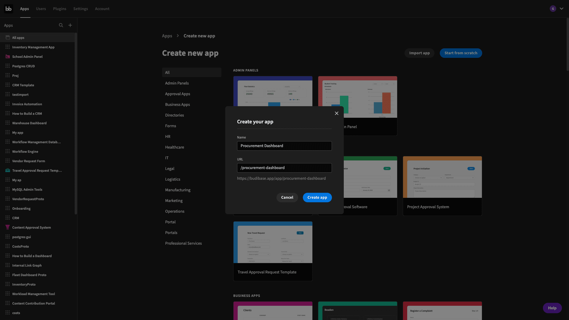
Our first step is to create a new Budibase application. We can import an existing app or use a template - but we’re starting from scratch. We’ll be prompted to choose a name and URL path for our new app:
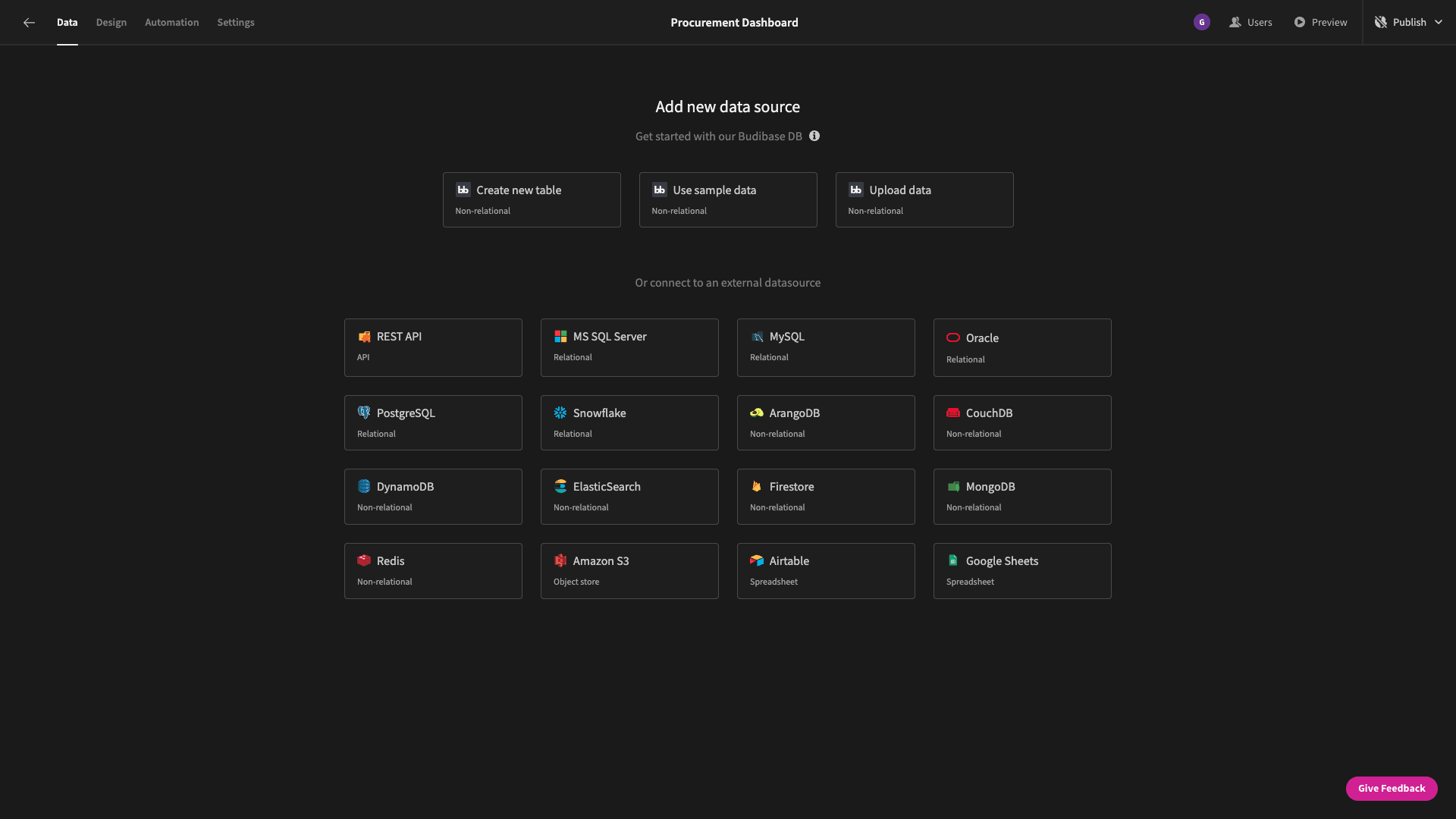
Then we need to choose the data we’re going to start with - although we can add more data sources later. Budibase offers dedicated connectors for a range of SQL and NoSQL databases - as well as REST, Google Sheets, and our internal tables:
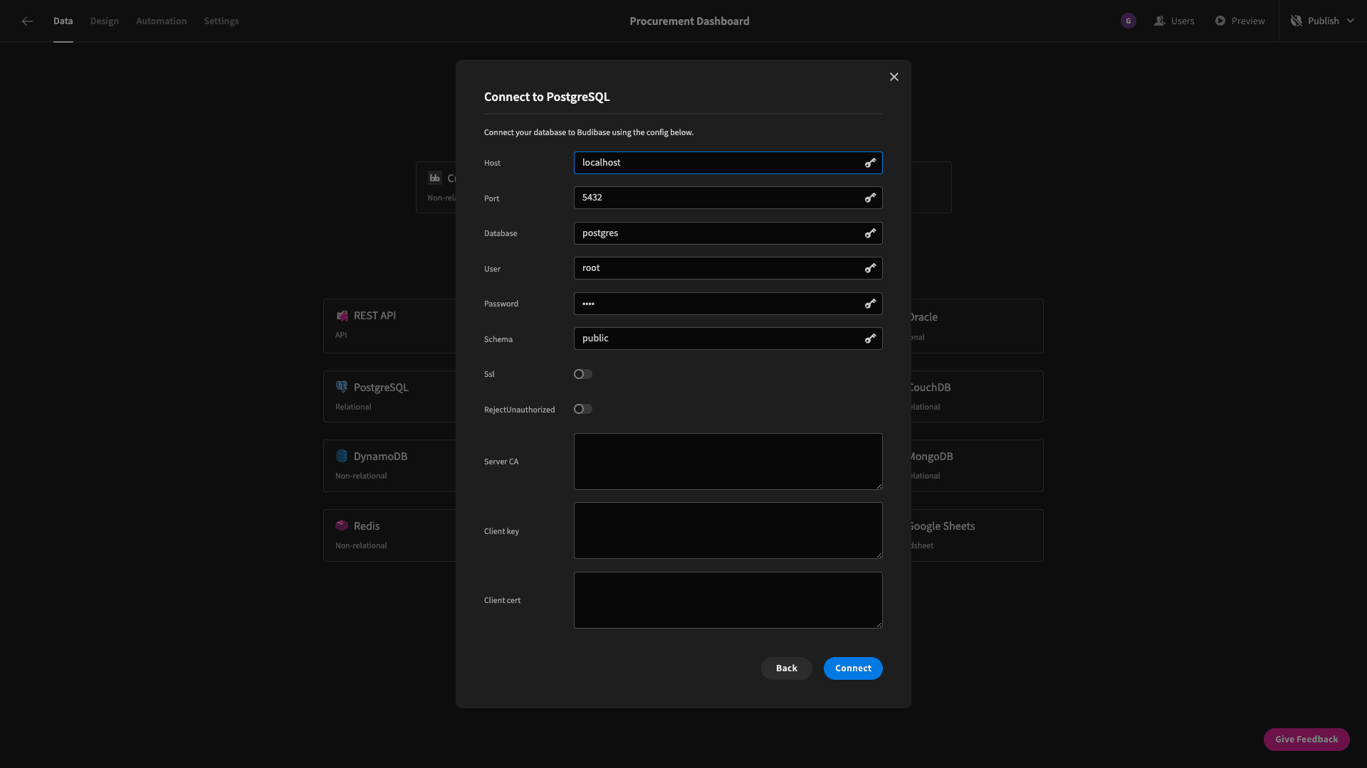
When we select Postgres, we’re prompted to input our configuration details:
Next, we can choose which tables we want to fetch - essentially pulling them into Budibase so we can use them. Our database has several tables that we don’t need, so we’re just selecting the four that we listed earlier:
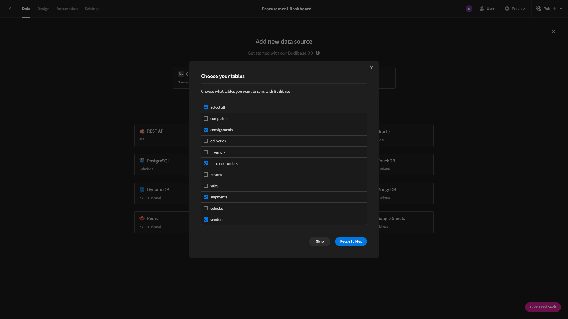
Straight off the bat, we can use Budibase’s back-end to perform CRUD operations or alter the schema of any of our tables:
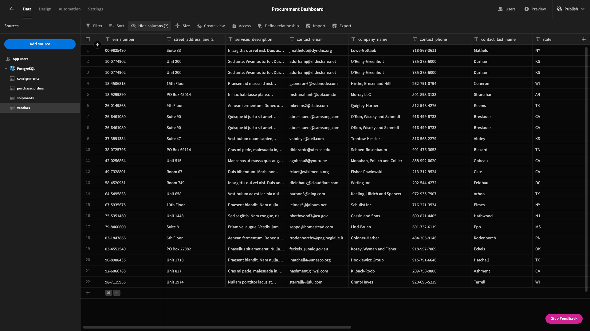
Before we go any further, here’s a quick summary of our data model - specifically, what each table includes and how they all like together.
So, we have:
- vendors - which stores the vendors’ contact, billing, and product information - including its category.
- purchase_orders - with an issue_date, complete_date, cost, and po_number.
- shipments - with a purchase_date, arrive_date, shipment_number, vendor_id, and purchase_order_id.
- consignments - with an item_name, quantity, consignment_number, and shipment_id.
So, we’ll need to combine information from different tables to get the insights we need - via custom queries.
Let’s jump in.
2. Building summary cards
We’ll start by creating a blank screen, with “/” as its page path. The first component we’ll add is a headline:
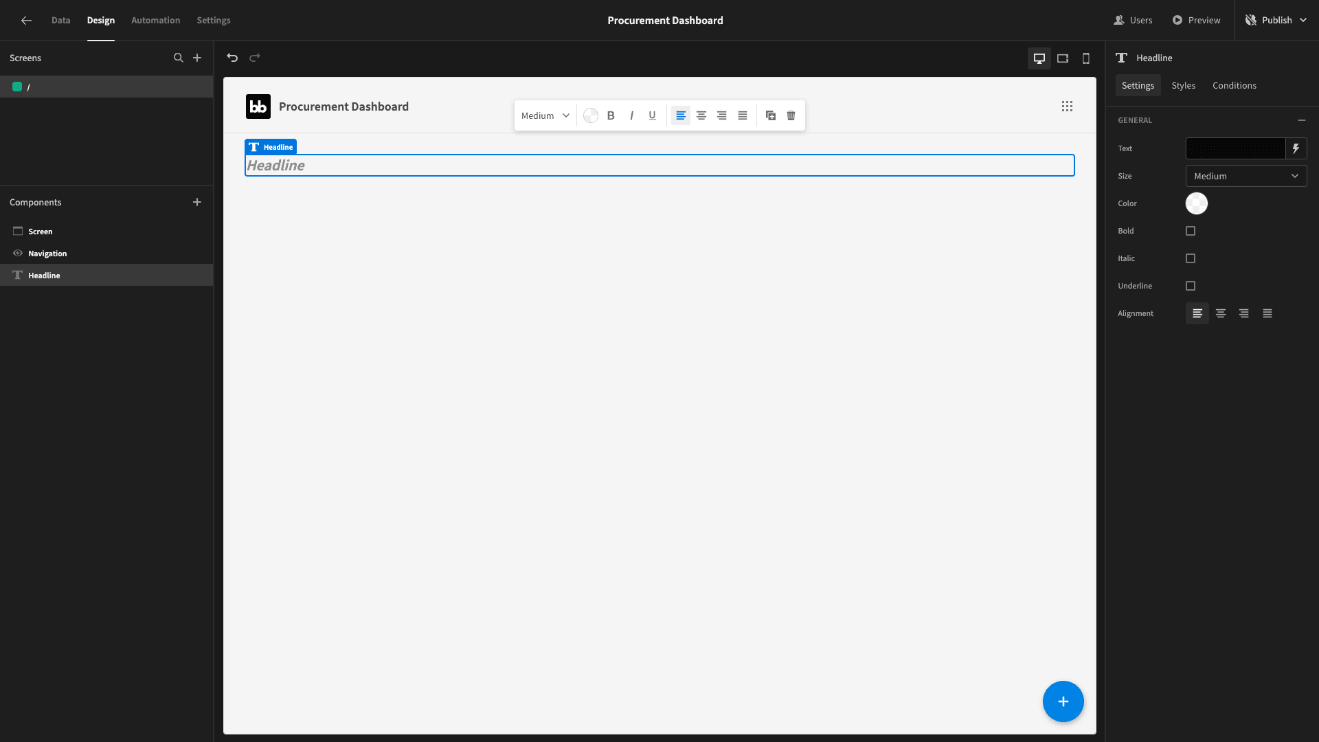
We want this to read This Month: followed by the current month in the format MM/YYYY. To do this, hit the lightning bolt icon beside the headline’s text field to open the bindings drawer. Here, we can set a value using plain text, handlebars, or JavaScript:
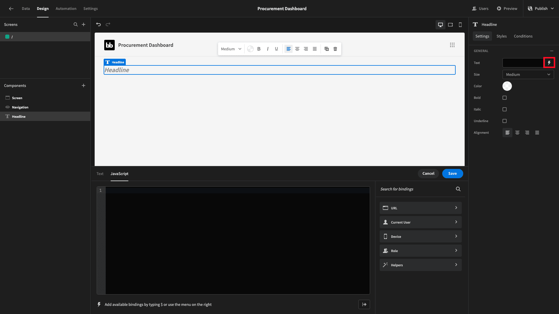
We’re going to bind this to the following JavaScript expression:
1var currentDate = new Date();
2
3return "This Month: " + (currentDate.getMonth() + 1) + "/" + currentDate.getFullYear();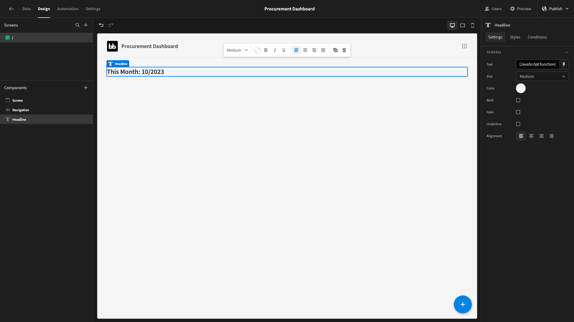
Beneath this, we’re going to add a container and set its direction to horizontal:
And then we’ll add a cards block inside our container. A cards block is a prebuilt set of components that will iterate over whatever data set we point it at. We can then bind attributes from this data set to display as text:
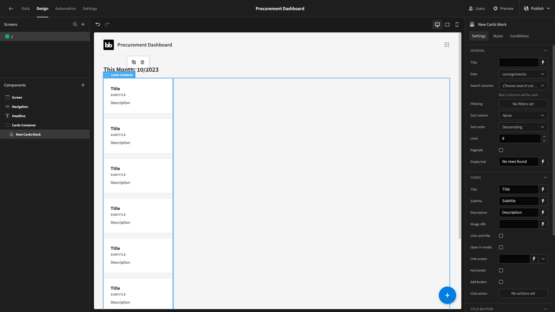
By the time we’re finished, we’ll have three cards blocks, each displaying a single card.
These will show the following values relating to our purchase_orders table for the current month:
- The total cost.
- The total number of orders.
- The average order value.
To get this information, we’ll need to add a new custom query under our Postgres connection:
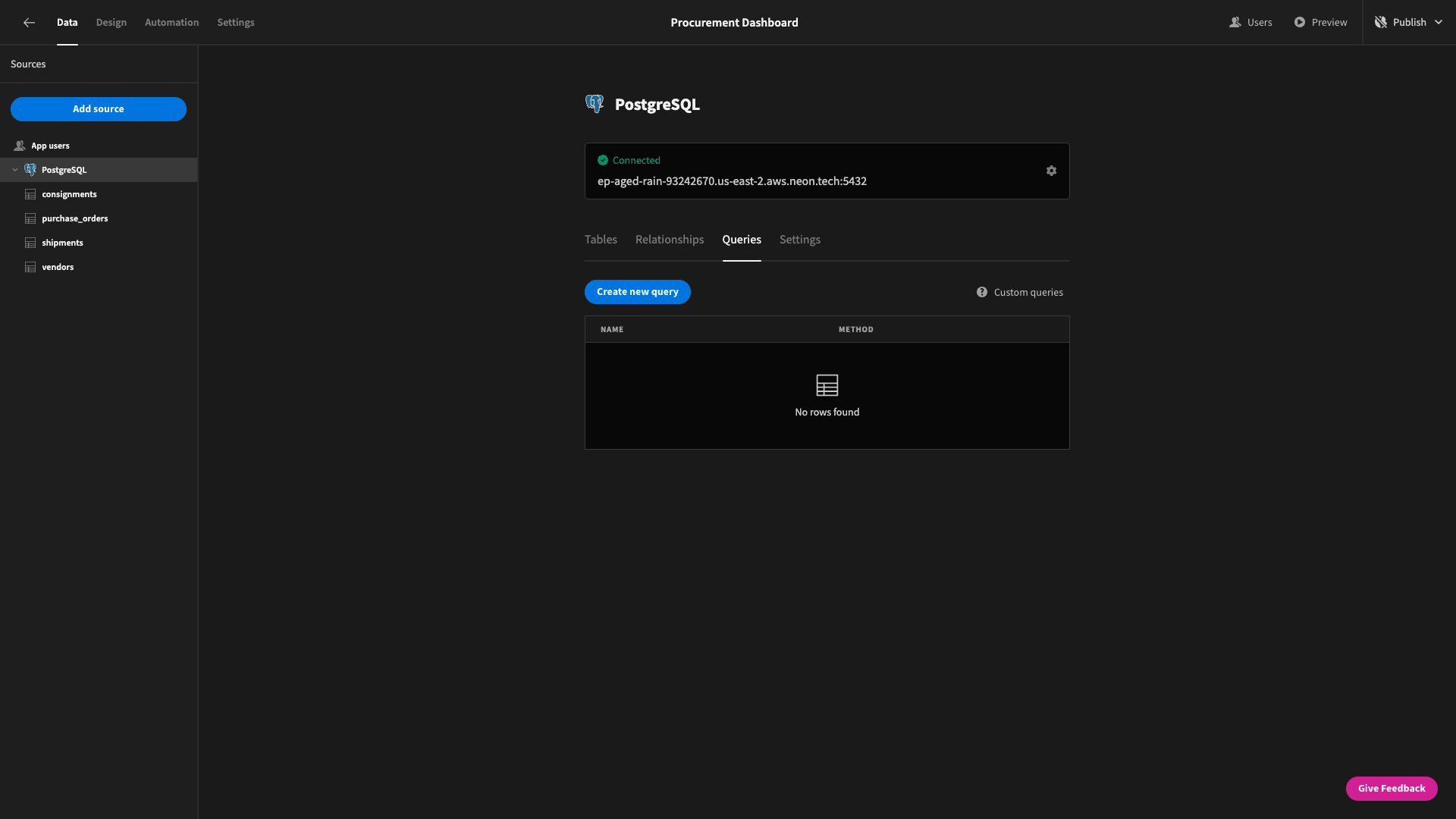
We’ll call this PurchaseOrderStatsByMonth.
We’ll use a SELECT statement to return:
- The numerical month and year extracted from the issue_date attribute.
- The COUNT of rows.
- The SUM of the cost attribute.
- The AVG of the cost attribute.
We’ll also add statements to GROUP and ORDER BY month and year.
So, our query is:
 1SELECT
 2
 3 CAST(EXTRACT(YEAR FROM issue_date) AS INTEGER) AS year,
 4
 5 CAST(EXTRACT(MONTH FROM issue_date) AS INTEGER) AS month,
 6
 7 CAST(COUNT(*) AS INTEGER) AS row_count,
 8
 9 SUM(cost) AS total_cost,
10
11 AVG(cost) AS average_cost
12
13FROM purchase_orders
14
15GROUP BY year, month
16
17ORDER BY year, month;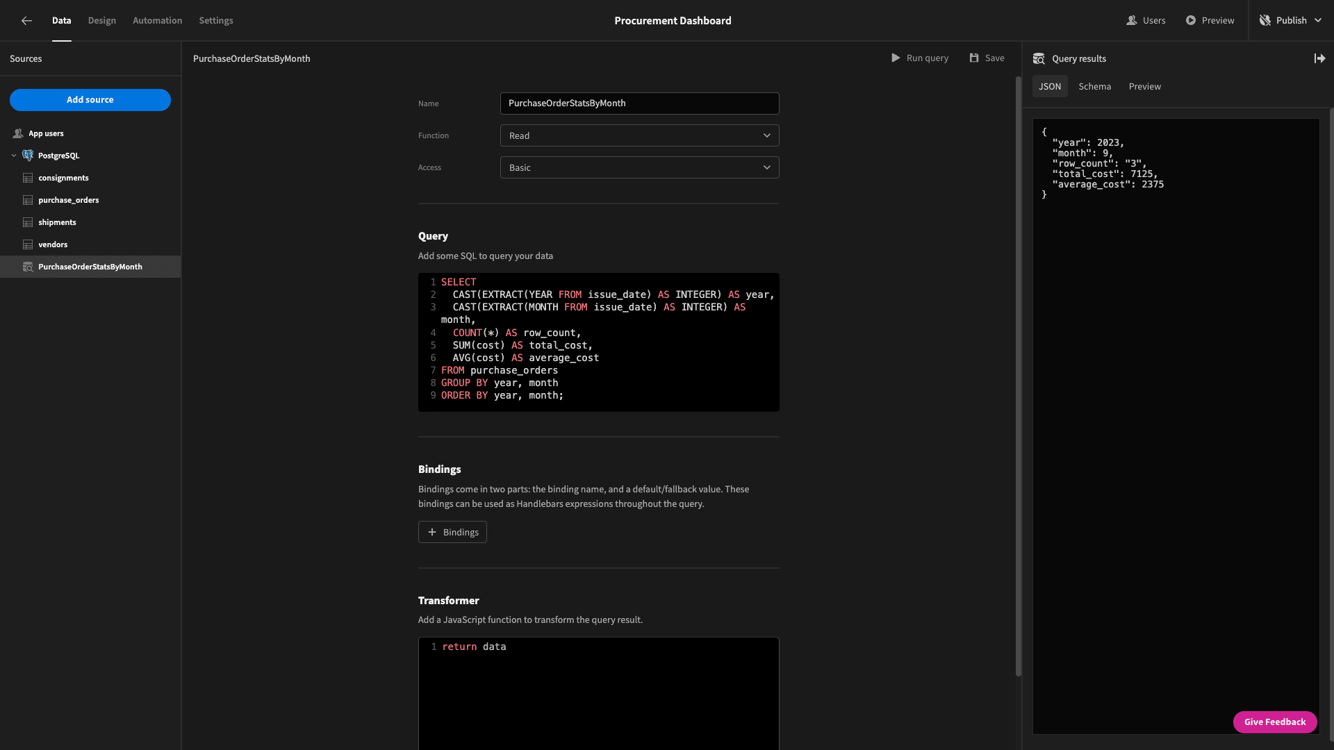
This will return the following data object:
 1{
 2
 3 "year": 2023,
 4
 5 "month": 9,
 6
 7 "row_count": 3,
 8
 9 "total_cost": 7125,
10
11 "average_cost": 2375
12
13}
Head back to the design section. We can now point our cards block to our new query under its data field:
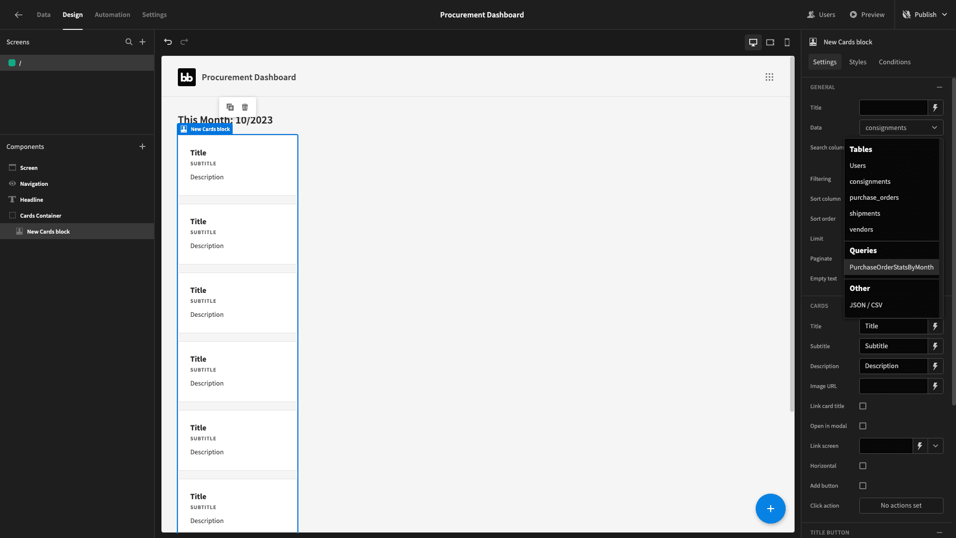
Now we only have two cards, since our sample data only goes back as far as last month:
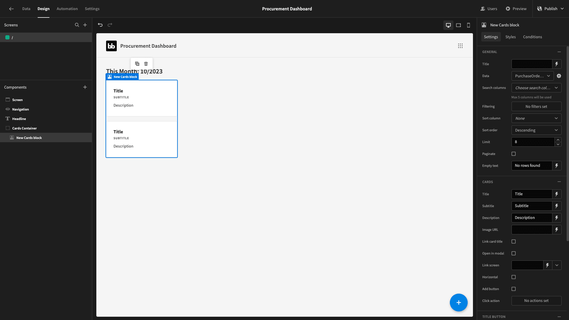
But, we only want to display a single card, so we need to add a couple of filtering expressions to only display rows where the month and year attribute match the current date:
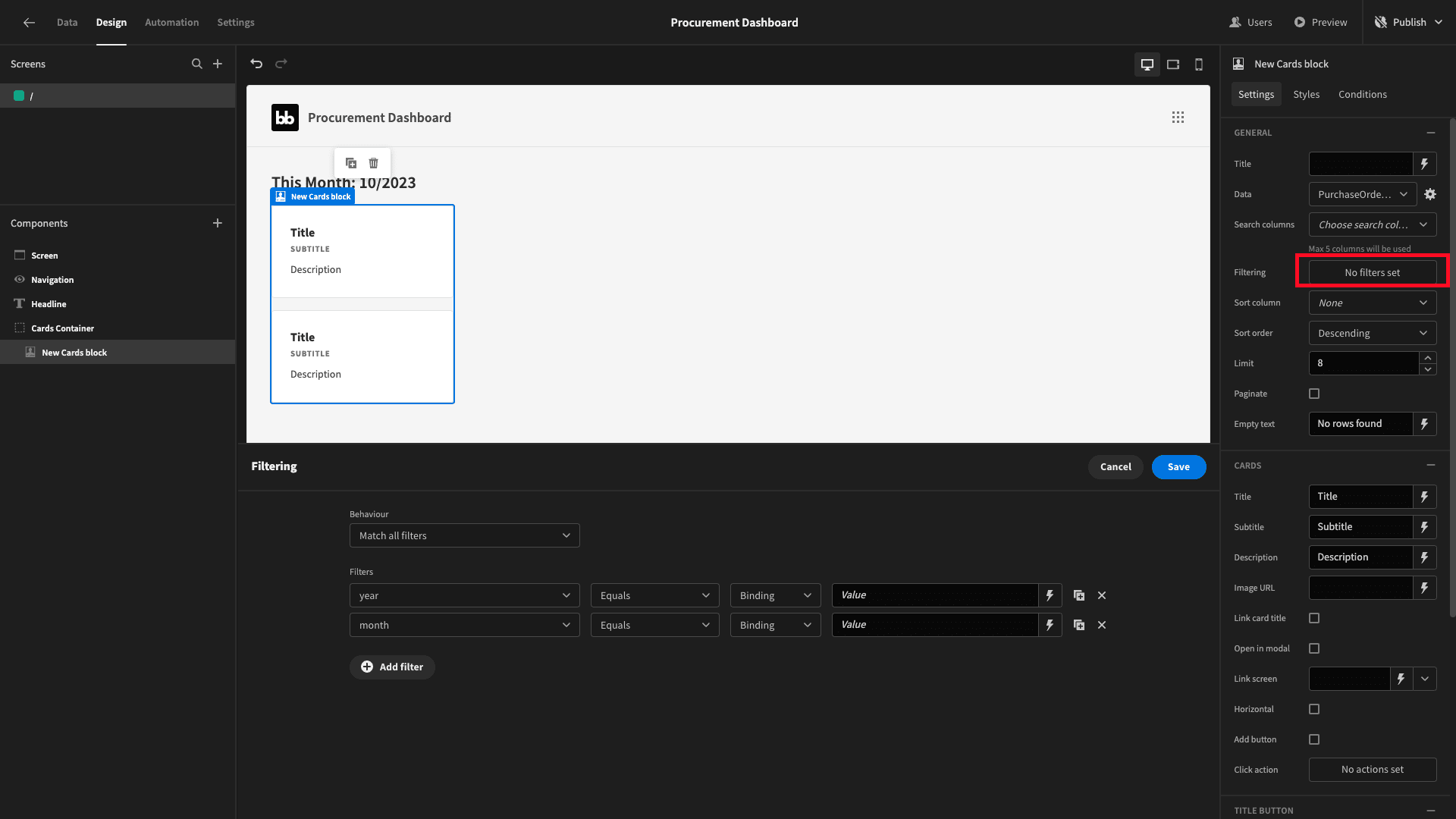
Again, we’re going to use JavaScript bindings here. So, we’ll bind year to equal:
1var currentDate = new Date();
2
3return currentDate.getFullYear();
And month to:
1var currentDate = new Date();
2
3return currentDate.getMonth() + 1;
JavaScript uses zero-based counting - so the index for January is 0, February is 1 etc. SQL does not. To reflect this, we’ve added one to currentDate.getMonth() in our return statement.
Now we only have one card:
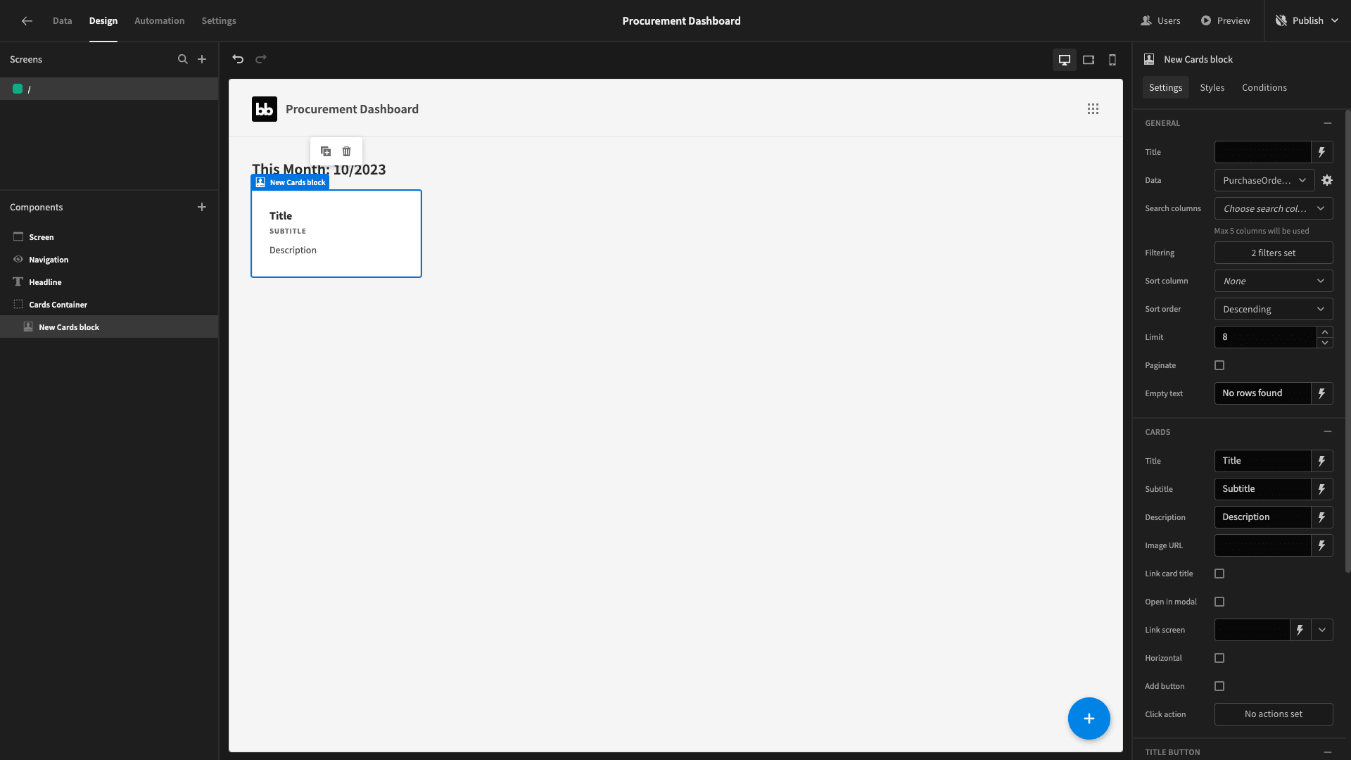
To finish this, we just need to populate the relevant data. We’ll start by renaming our component Total Cost Card.
Then, we’ll bind the following JavaScript expression to bind the title field to the total_cost attribute from our query response - adding a dollar sign and rounding it to two decimal places:
1return "$" + $("Total Cost Card.PurchaseOrderStatsByMonth.total_cost").toFixed(2);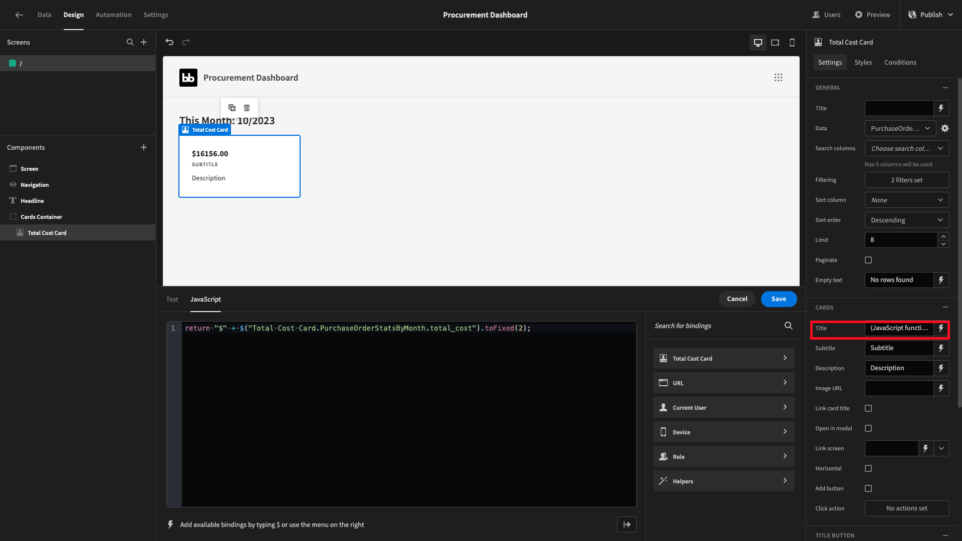
We’ll also give this a descriptive subtitle and remove the description field entirely.
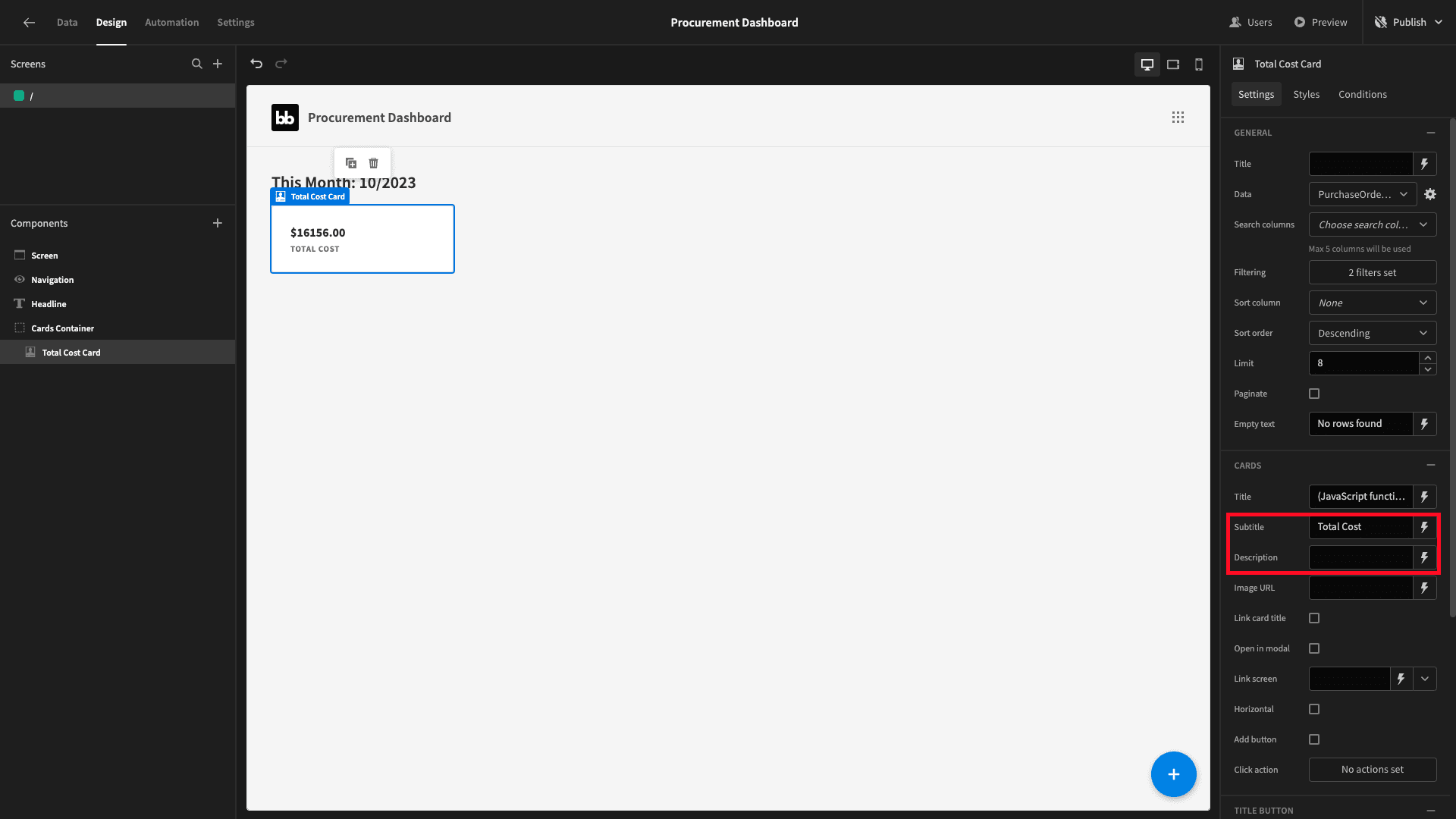
Now, duplicate this card:
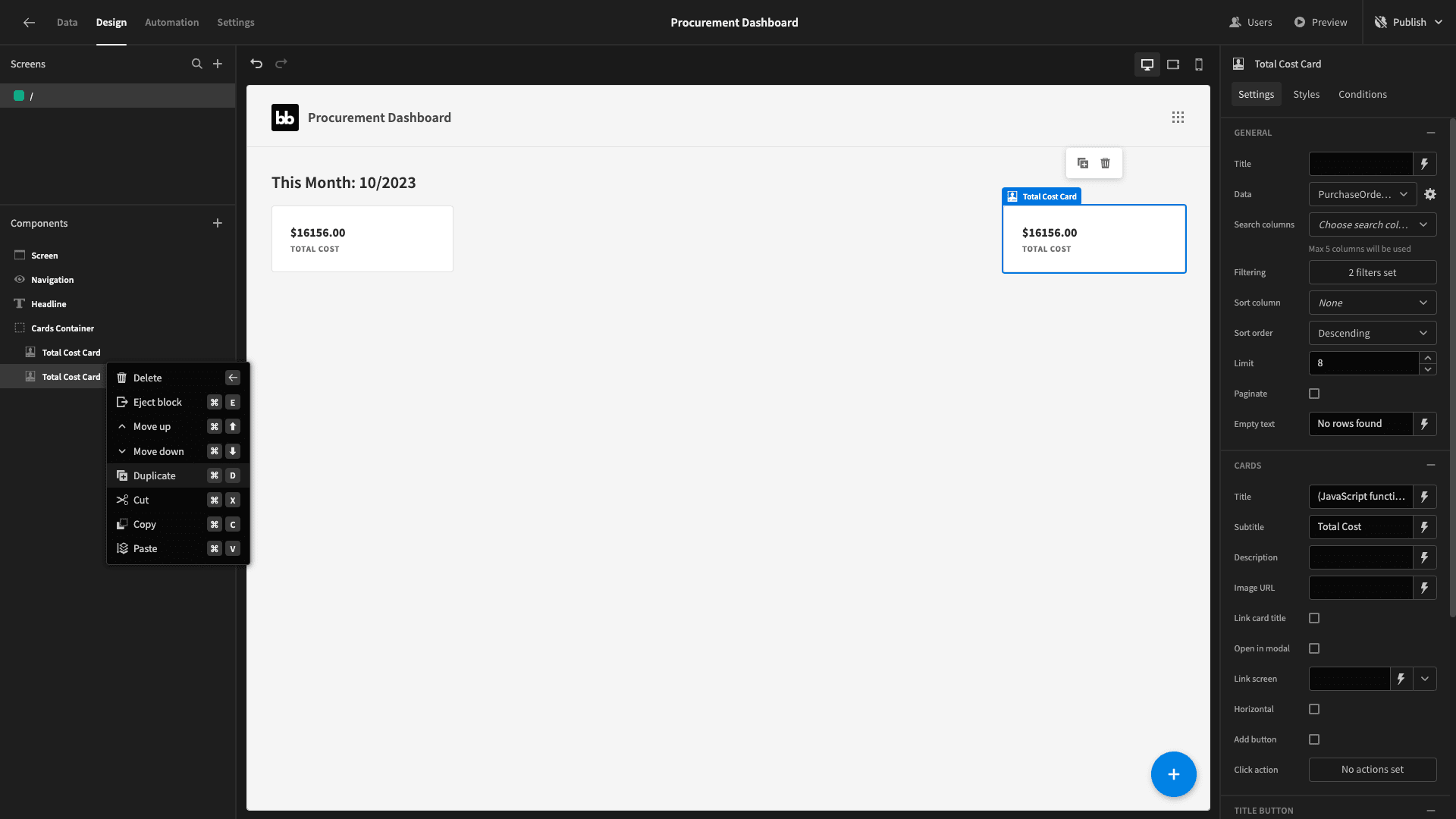
We’ll rename this new one and use handlebars to set the title field to the row_count attribute from our response - also updating the subtitle to match:
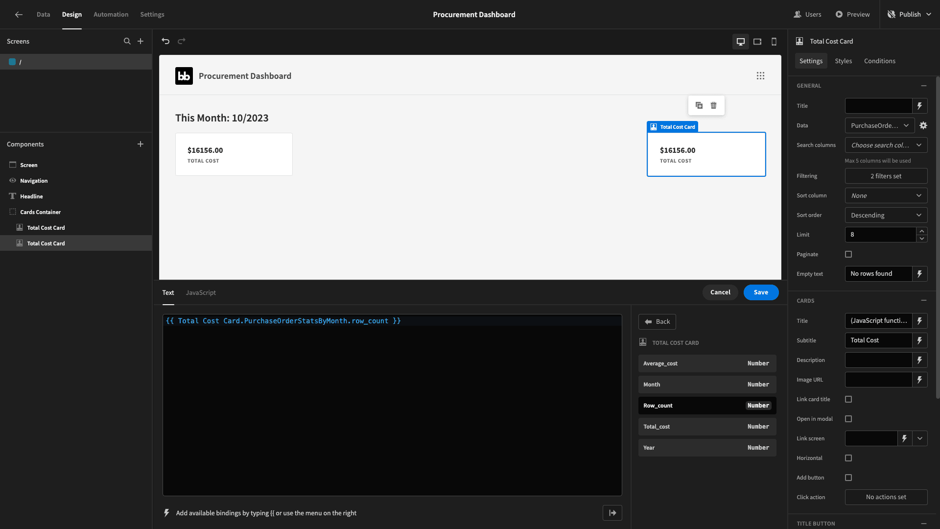
Two down, one to go.
Duplicate the card again, this time calling the new one Average Cost Card and setting its title binding to the following JavaScript:
1return "$" + $("Average Cost Card.PurchaseOrderStatsByMonth.average_cost").toFixed(2);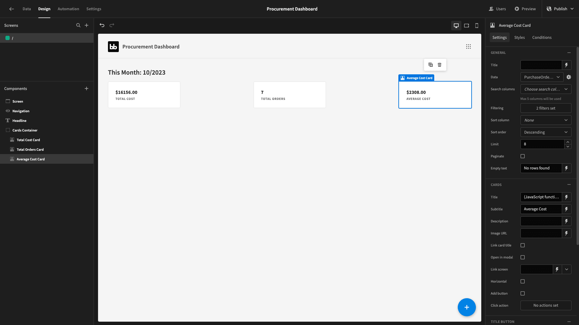
And that’s our cards done.
3. Purchase orders by company
Next, we’re going to add two charts, displaying similar statistics about our purchase orders - this time broken up by category.
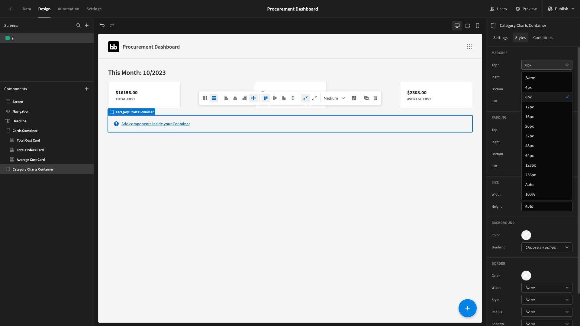
We want these to appear side-by-side. So we’ll add another horizontal container. We’ll also give this 8px of padding to the top:
We’re going to SELECT the same information as before, but this time we’re going to use JOIN statements to our shipments and vendors tables - so that we can also return and GROUP BY the category attribute which we store about our vendors.
The JOINS will work as follows:
- The po_number from purchase_orders to the purchase_order_id attribute from shipments.
- The vendor_id from shipments to the vendor_number from vendors.
Our query is:
 1SELECT
 2
 3 v.category,
 4
 5 CAST(EXTRACT(YEAR FROM po.issue_date) AS INTEGER) AS year,
 6
 7 CAST(EXTRACT(MONTH FROM po.issue_date) AS INTEGER) AS month,
 8
 9 CAST(COUNT(po.po_number) AS INTEGER) AS row_count,
10
11 SUM(po.cost) AS total_cost,
12
13 AVG(po.cost) AS average_cost
14
15FROM purchase_orders po
16
17JOIN shipments s ON po.po_number = s.purchase_order_id
18
19JOIN vendors v ON s.vendor_id = v.vendor_number
20
21GROUP BY v.category, year, month
22
23ORDER BY v.category, year, month;
We’ll call this one PurchaseOrderStatsByMonthByCategory:
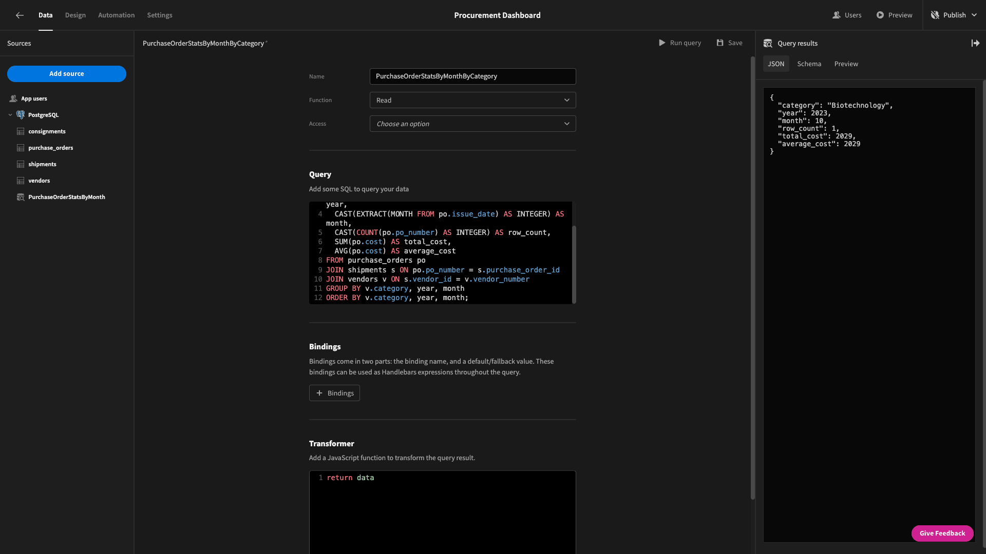
The response should look like this:
 1{
 2
 3 "category": "Biotechnology",
 4
 5 "year": 2023,
 6
 7 "month": 10,
 8
 9 "row_count": 1,
10
11 "total_cost": 2029,
12
13 "average_cost": 2029
14
15}
Now, head back to the design section and add a chart block inside our new container.
The chart block has attributes for chart type - to set the type of chart we want - and data to choose a data source. We can then decide which attributes from our data source we want to use for each axis.
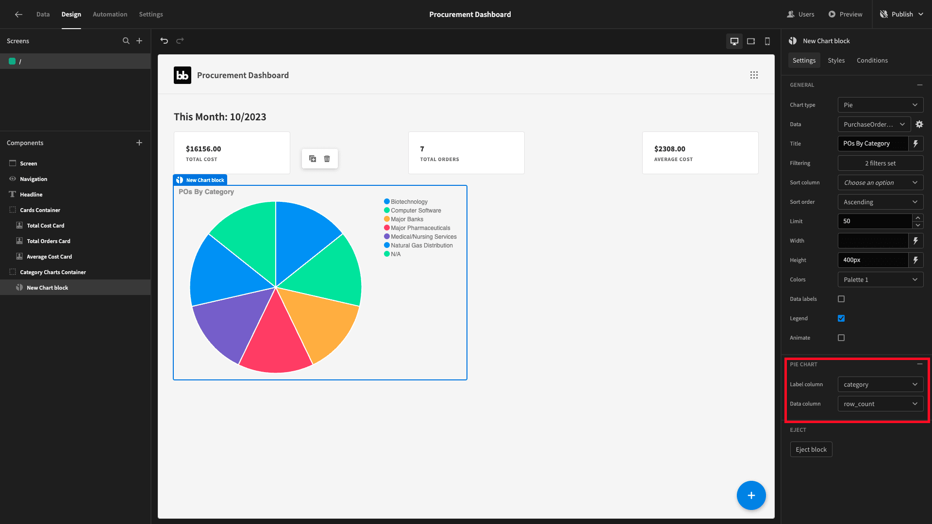
Set the data field to our new query and the type to pie. We’ll also set the exact same month and year filters as we did for our cards:
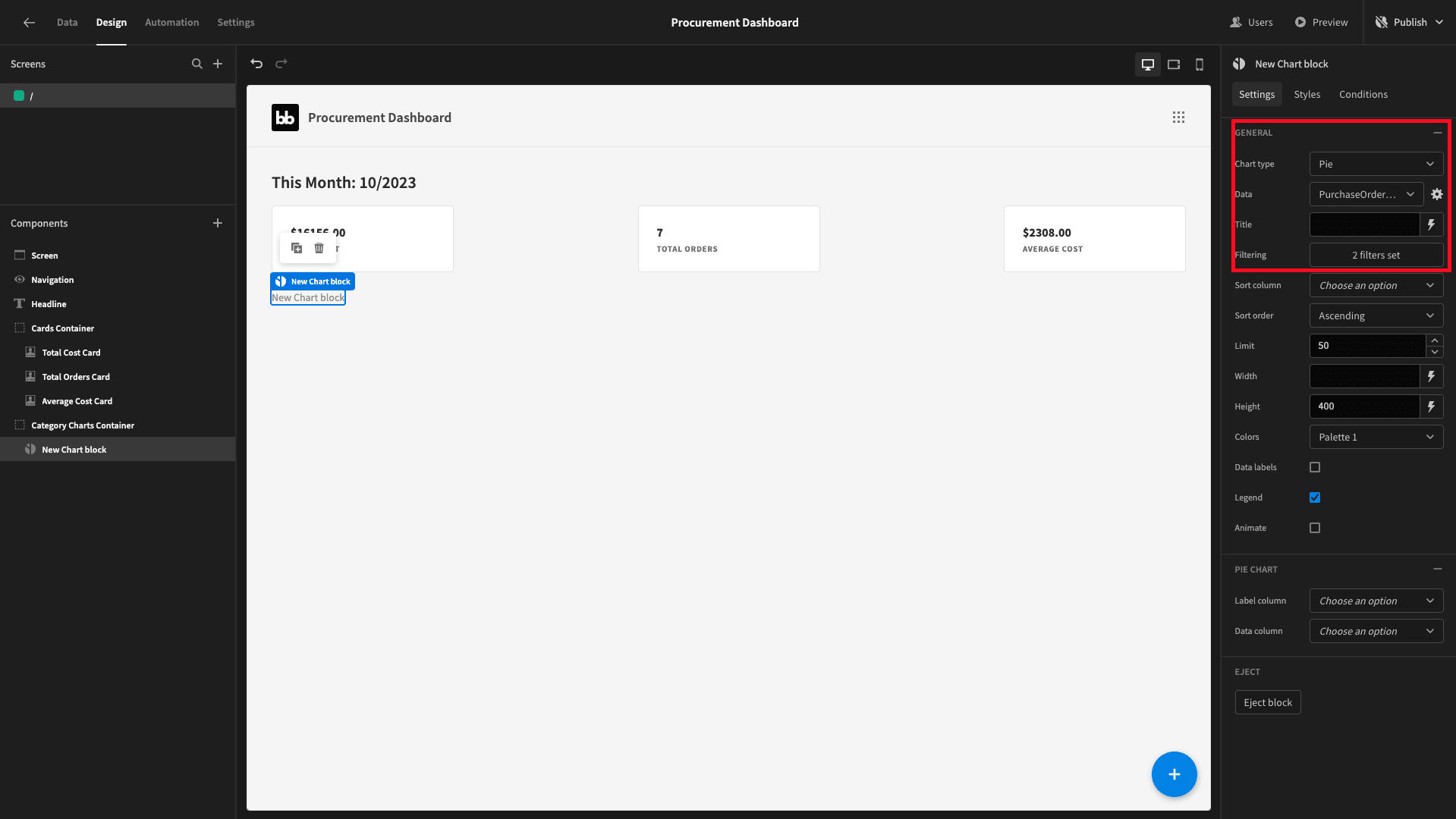
Next, we need to tell it what to display based on our query response. We’ll set the label column (x-axis) to category and the data column (y-axis) to row_count. We’ll also give it a descriptive title and set the width and height to 50% and 400px respectively:
Our second chart will be a bar graph that shows the total and average costs by category. Rather than starting from scratch, we’ll duplicate our existing chart:
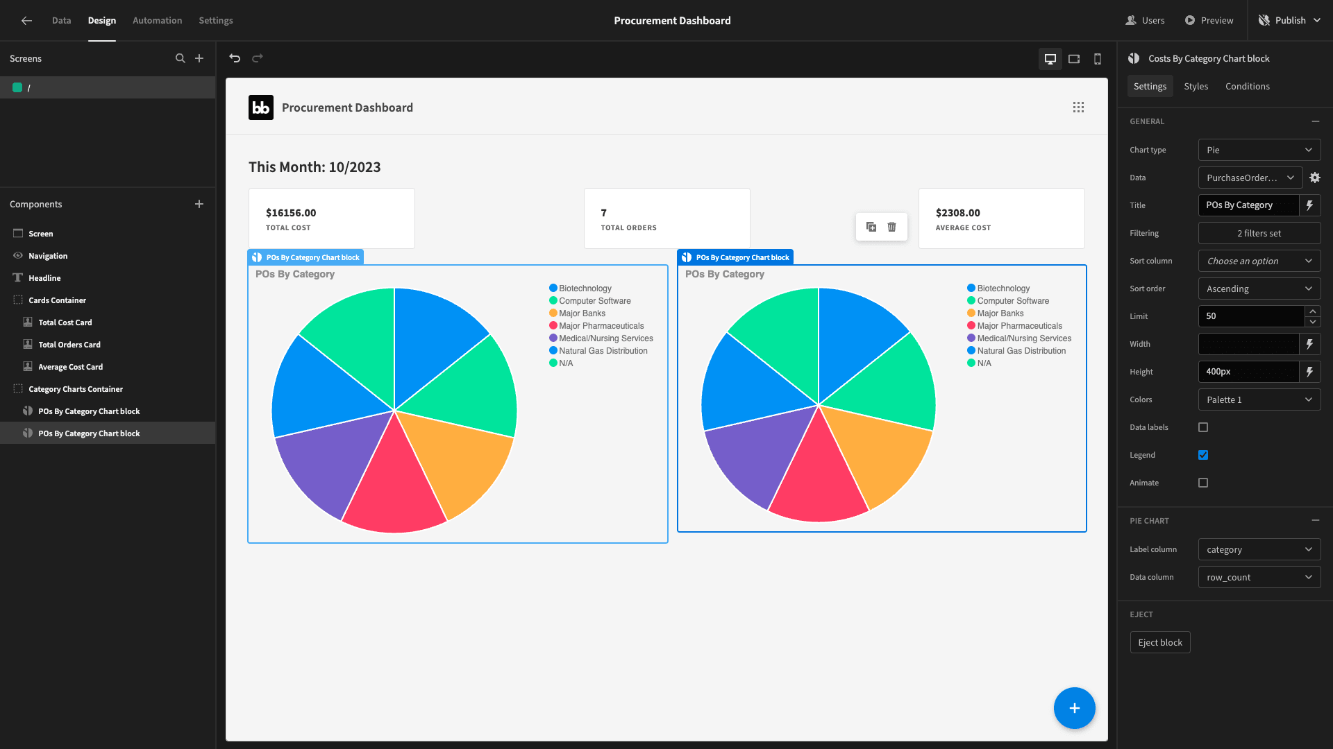
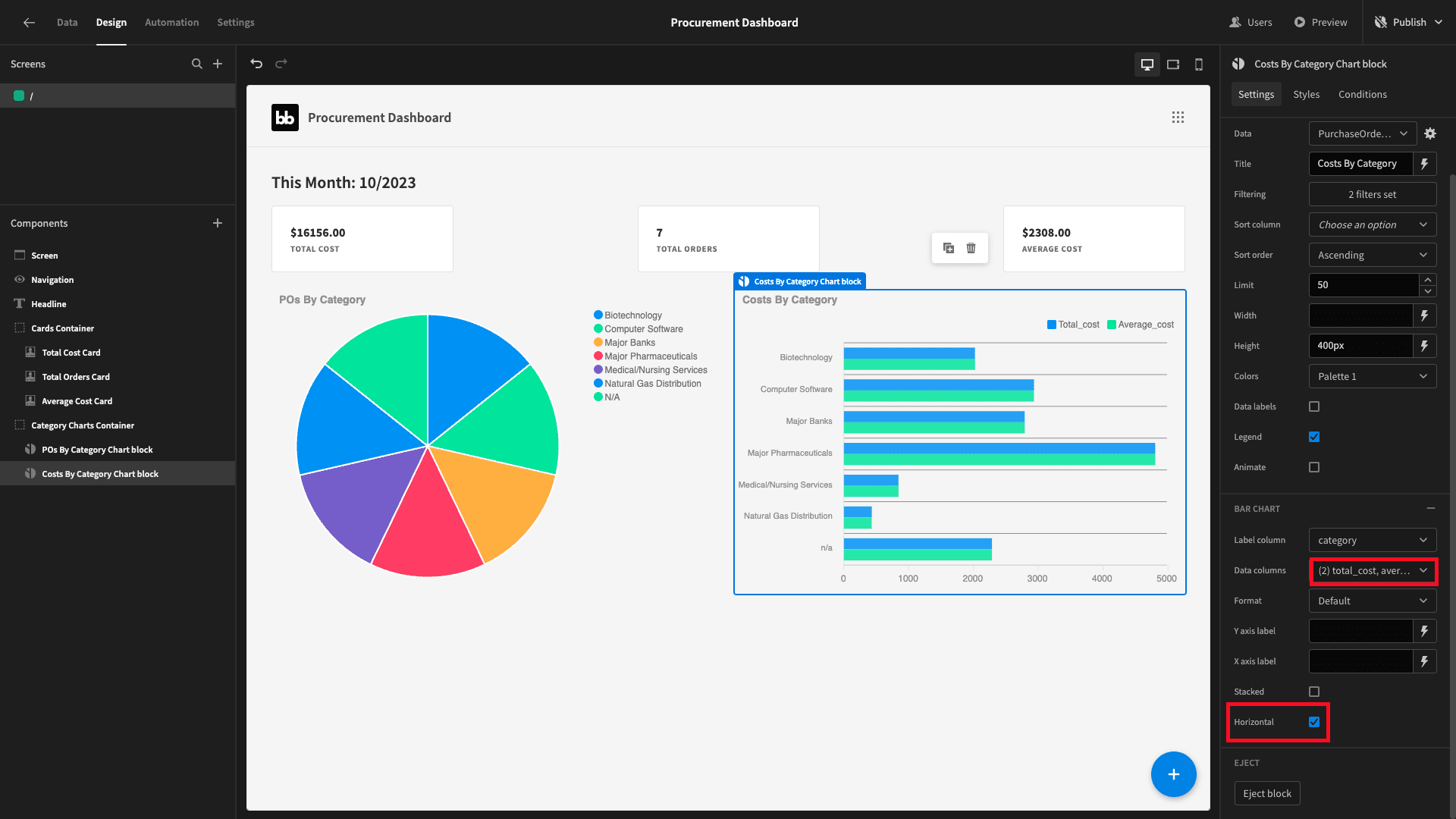
This basically saves us from having to configure our filters again. Rename the duplicate and set its type to bar. We’ll keep category as the label column but this time add two data columns - total_cost and average_cost.
We’ll also check the horizontal box:
4. Purchase orders by category
Next, we want to display the same information from our purchase_orders table - but this time broken up by company_name instead of category.
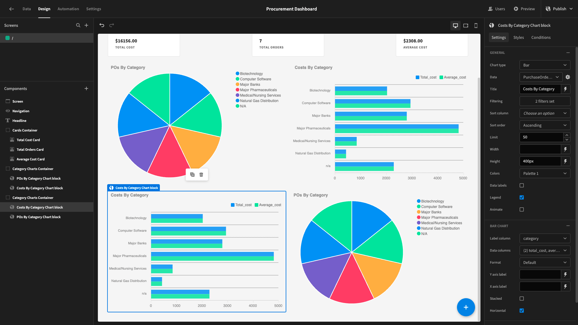
We’ll start by duplicating our existing charts container, but swapping our two charts around so that the bar chart is on the left and the pie chart is on the right:
Next, we’ll need a new query to retrieve the data we want. This will follow the exact same format as before, except that we’ll GROUP the response rows by the company_name attribute from the vendors table - rather than category.
We’ll call this PurchaseOrderStatsByMonthByCompany:
 1SELECT
 2
 3 v.company_name,
 4
 5 CAST(EXTRACT(YEAR FROM po.issue_date) AS INTEGER) AS year,
 6
 7 CAST(EXTRACT(MONTH FROM po.issue_date) AS INTEGER) AS month,
 8
 9 CAST(COUNT(po.po_number) AS INTEGER) AS row_count,
10
11 SUM(po.cost) AS total_cost,
12
13 AVG(po.cost) AS average_cost
14
15FROM purchase_orders po
16
17JOIN shipments s ON po.po_number = s.purchase_order_id
18
19JOIN vendors v ON s.vendor_id = v.vendor_number
20
21GROUP BY v.company_name, year, month
22
23ORDER BY v.company_name, year, month;
The response schema is:
 1{
 2
 3 "company_name": "Cassin and Sons",
 4
 5 "year": 2023,
 6
 7 "month": 9,
 8
 9 "row_count": 1,
10
11 "total_cost": 3078,
12
13 "average_cost": 3078
14
15}
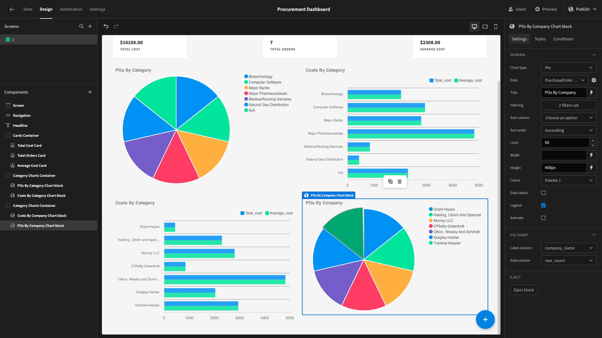
Back in the design section, we can simply swap the data field for our two new charts to this query - and update their label columns to company_name. We’ll also update their names and titles:
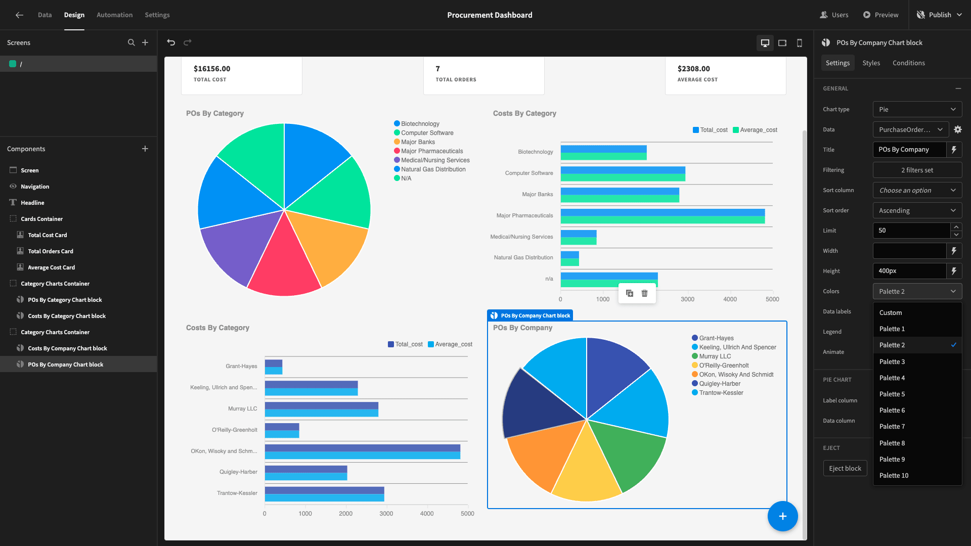
Lastly, we’ll change their color palette for better visual separation:
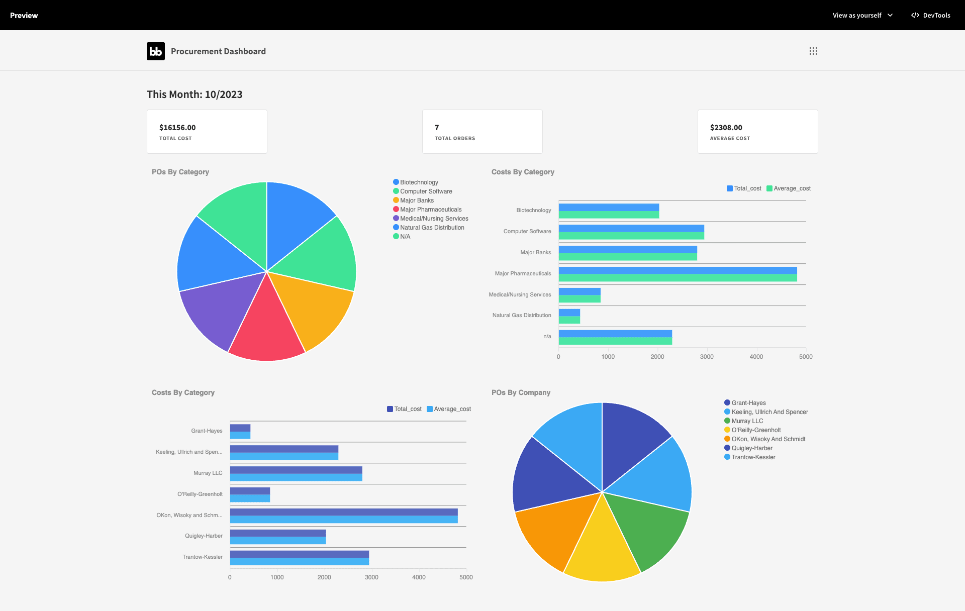
That’s our first screen done for now:
6. Adding a shipments screen
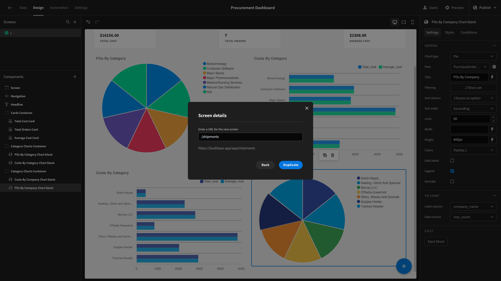
Next, we want to build a very similar UI for data around our shipments table. Start by duplicating this entire screen. We’ll give the new one the page path /shipments.
And we’ll work our way down the screen swapping out the data - starting with our cards. So, on this screen we want four cards, to display this month’s:
- Number of shipments.
- Average number of consignments per shipment.
- Average number of items per shipment.
- Average number of items per consignment.
Start by duplicating one of our cards again:
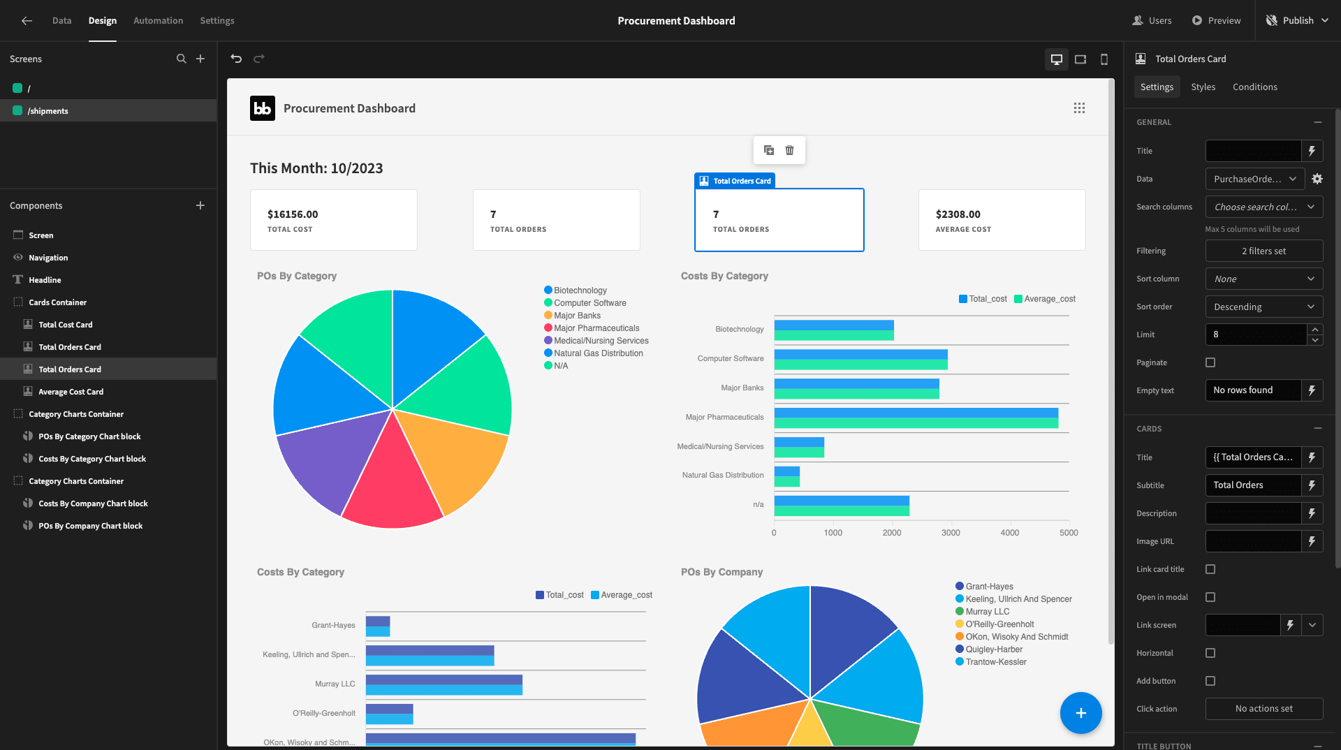
To populate these, we want a new query called ShipmentStatsByMonth. This is a bit more complex, because some of the data we need is stored in shipments and some of it is stored in consignments.
We’ll select:
- The numerical month and year, extracted from purchase_date in the shipments table.
- The COUNT of shipments rows.
- The AVERAGE of the number of consignments rows corresponding to each shipment.
- The AVERAGE of the number of items within each of these consignments for each shipment.
We’ll use a LEFT JOIN statement to match up shipments rows where the shipment_number matches the shipment_id in the consignments table.
Our query is:
1SELECT
2
3 CAST(EXTRACT(YEAR FROM s.purchase_date) AS INTEGER) AS year,
4
5 CAST(EXTRACT(MONTH FROM s.purchase_date) AS INTEGER) AS month,
6
7 CAST(COUNT(*) AS INTEGER) AS shipment_count,
8
9 AVG(avg_quantity) AS avg_items_per_shipment,
10
11 AVG(consignment_count) AS avg_consignments_per_shipment,
12
13 AVG(avg_quantity / consignment_count) AS avg_items_per_consignment
14
15FROM shipments s
16
17LEFT JOIN (
18
19 SELECT
20
21 shipment_id,
22
23 COUNT(*) AS consignment_count,
24
25 SUM(quantity) AS avg_quantity
26
27 FROM consignments
28
29 GROUP BY shipment_id
30
31) c ON s.shipment_number = c.shipment_id
32
33GROUP BY year, month
34
35ORDER BY year, month;And the response:
 1{
 2
 3 "year": 2023,
 4
 5 "month": 9,
 6
 7 "shipment_count": "3",
 8
 9 "avg_days_difference": "1.33333333333333333333",
10
11 "avg_consignments_per_shipment": "3.0000000000000000",
12
13 "avg_items_per_shipment": 78.66666666666667,
14
15 "avg_items_per_consignment": 26.222222222222225
16
17}
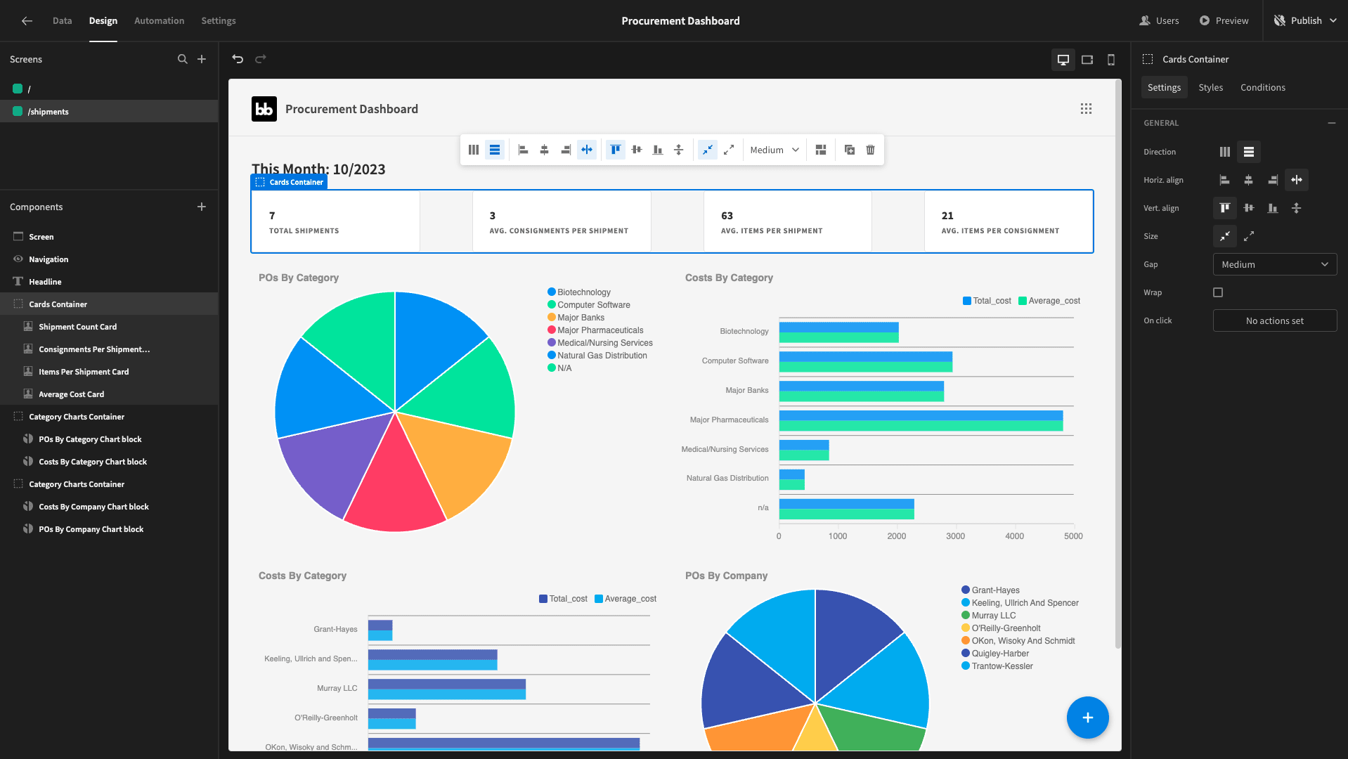
Back on the design tab, we’ll use handlebars bindings in the titles to display each of these new response attributes - using the round function where necessary. We’ll also update the subtitle and name attributes to reflect our new data.
That will give us:
7. Shipping stats by company
All four of our charts on this screen will be broken down by company_name. Here’s a summary of what each of these will display:
- The number of shipments per company as a pie chart.
- The average items per shipment by company as a bar chart.
- The average shipping time by company as a bar chart.
- The average consignments and items per shipment by company as a bar chart.
We’ll need one last custom query to achieve this, called ShipmentStatsByVendor.
This will be quite similar to our previous query, with two additional elements:
- We need an additional JOIN statement to SELECT the company_name attribute from the vendors table. We’ll also include this in a GROUP BY statement.
- We need to calculate and SELECT the average difference between the arrive_date and the purchase_date from the shipments table - expressed in days.
So, our query is:
 1SELECT
 2
 3 v.company_name,
 4
 5 CAST(EXTRACT(YEAR FROM s.purchase_date) AS INTEGER) AS year,
 6
 7 CAST(EXTRACT(MONTH FROM s.purchase_date) AS INTEGER) AS month,
 8
 9 CAST(COUNT(s.shipment_number) AS INTEGER) AS shipment_count,
10
11 AVG(EXTRACT(EPOCH FROM (s.arrive_date - s.purchase_date)) / 86400) AS avg_days_difference,
12
13 AVG(consignment_count) AS avg_consignments_per_shipment,
14
15 AVG(avg_quantity) AS avg_items_per_shipment,
16
17 AVG(avg_quantity / consignment_count) AS avg_items_per_consignment
18
19FROM shipments s
20
21LEFT JOIN (
22
23 SELECT
24
25  shipment_id,
26
27  COUNT(*) AS consignment_count,
28
29  SUM(quantity) AS avg_quantity
30
31 FROM consignments
32
33 GROUP BY shipment_id
34
35) c ON s.shipment_number = c.shipment_id
36
37LEFT JOIN (
38
39 SELECT
40
41  vendor_number,
42
43  company_name
44
45 FROM vendors
46
47) v ON s.vendor_id = v.vendor_number
48
49GROUP BY v.company_name, year, month
50
51ORDER BY v.company_name, year, month;
The response should look like this:
 1{
 2
 3 "company_name": "Cassin and Sons",
 4
 5 "year": 2023,
 6
 7 "month": 10,
 8
 9 "shipment_count": 1,
10
11 "avg_days_difference": "4.0000000000000000",
12
13 "avg_consignments_per_shipment": "3.0000000000000000",
14
15 "avg_items_per_shipment": 60,
16
17 "avg_items_per_consignment": 20
18
19}
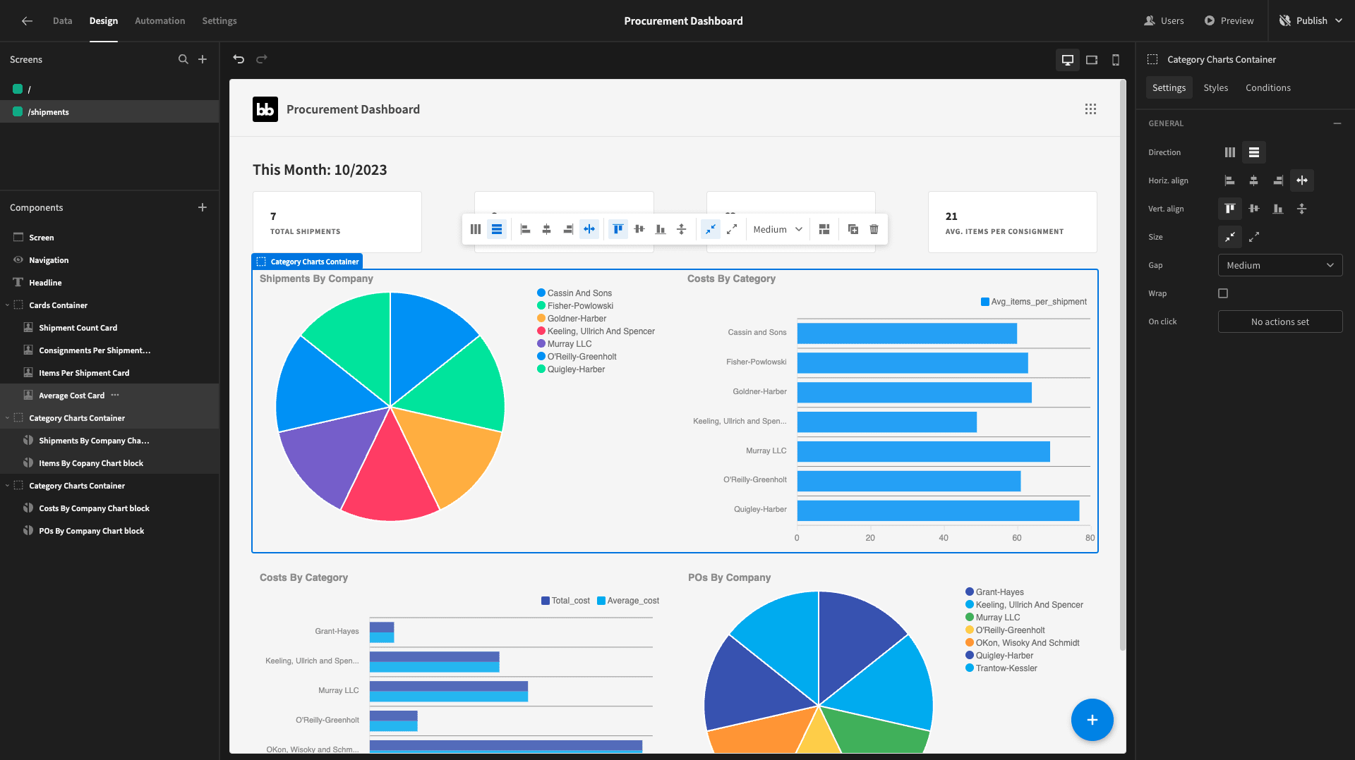
We’ll alter our first two charts to show the number of shipments per company and the number of items per shipment by company, respectively:
The third chart will show the avg_days_difference attribute - or, our shipping time:
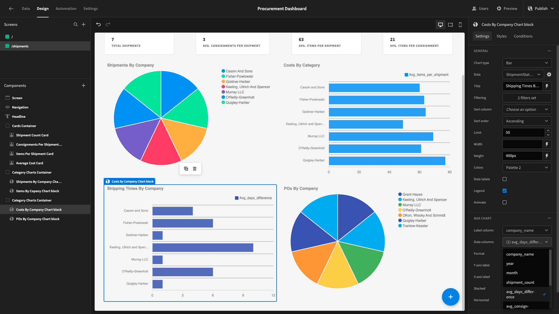
For the fourth and final chart, we’ll change the type to bar and set it to show our avg_consignments_per_shipment and avg_items_per_consignment attributes:
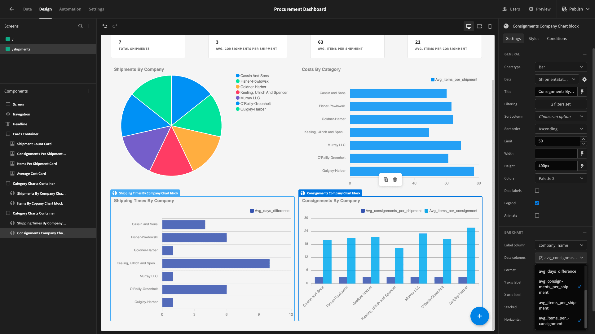
Here’s the completed screen:

8. Design tweaks and publishing
Lastly, let’s make a couple of UX tweaks to our procurement dashboard. We’ll start by hitting configure links under navigation and adding menu items for our two screens:
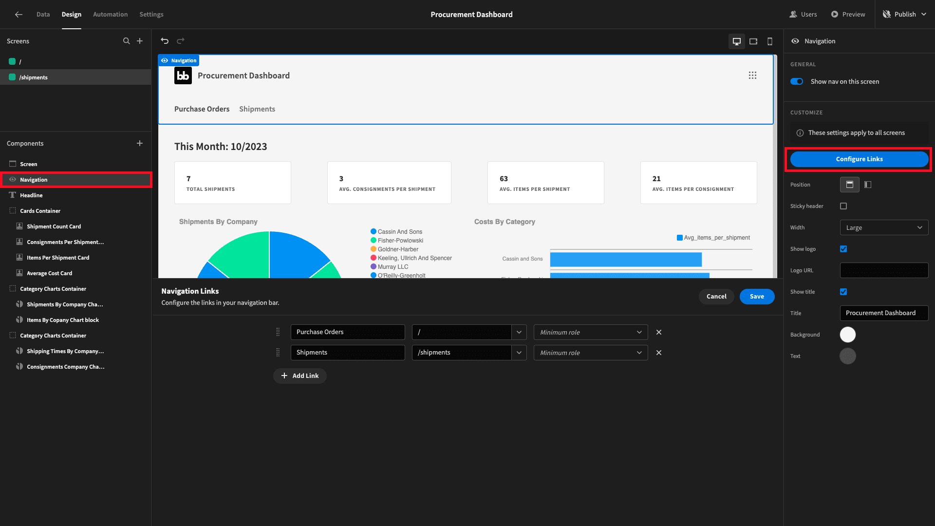
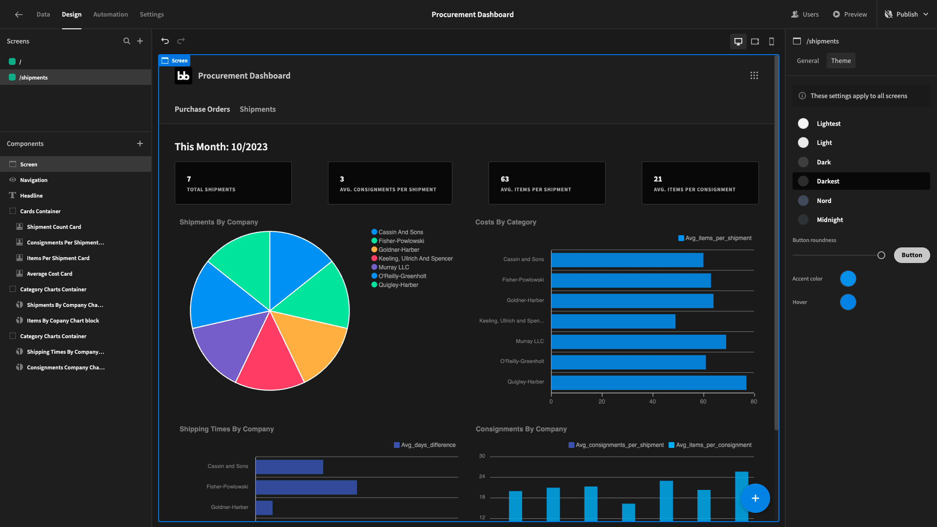
Then, under screen, we’ll change our app’s theme to darkest:
When you’re ready, you can hit publish to push your procurement dashboard live and send it to users:
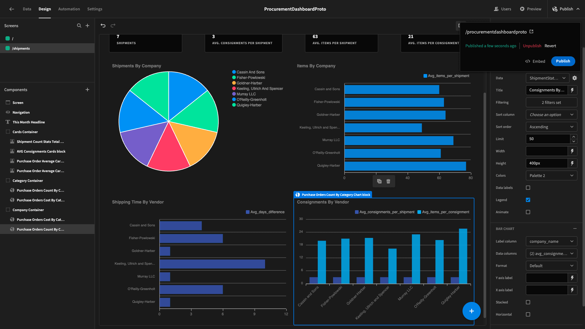
Here’s what the finished product looks like:
If you found this tutorial helpful, why not also check out our guide to building a custom vendor request form ?