How to Build a Secure Timesheet
We need an accurate record of the hours worked by our colleagues for all kinds of billing, payroll, HR, and other processes. For instance, paying salaries or invoicing clients for project hours.
But in doing so, we can’t compromise our employee’s privacy or the integrity of our internal data assets.
So, we need secure timesheets.
See, the majority of companies handle this using spreadsheets - or even pen and paper. This is manageable for smaller teams, but it also introduces a whole range of problems around security, accuracy, usability, and integration options.
Today, we’re showing off how Budibase empowers IT teams to build advanced forms on top of any data source.
Specifically, we’re going to see how our open-source, low-code platform can be used to build custom, performant timesheets with minimal custom code.
But first…
What is a secure timesheet?
At its core, a timesheet app is a form interface where employees can input the hours they’ve worked on different days and tasks.
This information can then be used within other workflows, like payroll processing, client account billing, or even monitoring productivity.
However, traditional form builders generally aren’t up to the task here as they lack vital security features like self-hosting, effective user management, and connectivity with external databases.
By contrast, Budibase is ideally suited to building secure, advanced forms.
We empower our users with unrivaled flexibility to use their own production databases and host their applications however they want - on top of native security tools like configurable RBAC, environment variables, and free SSO.
Check out our forms page to learn more.
What are we building?
Our secure timesheet app will consist of two screens. The first will enable colleagues to submit timesheets for up to five days at a time using a dynamic form UI.
The second will allow them to view their previous submissions - and the hours they worked each day.
We’re building this on top of a MySQL database - although Budibase gives us the flexibility to connect to and query just about any data source.
We’re going to use Budibase’s extensive customization options - including conditional logic and contextual bindings - to build a sleek, efficient experience for users submitting timesheets.
Check out our forms page to learn more about how Budibase empowers teams to build advanced forms on top of existing data.
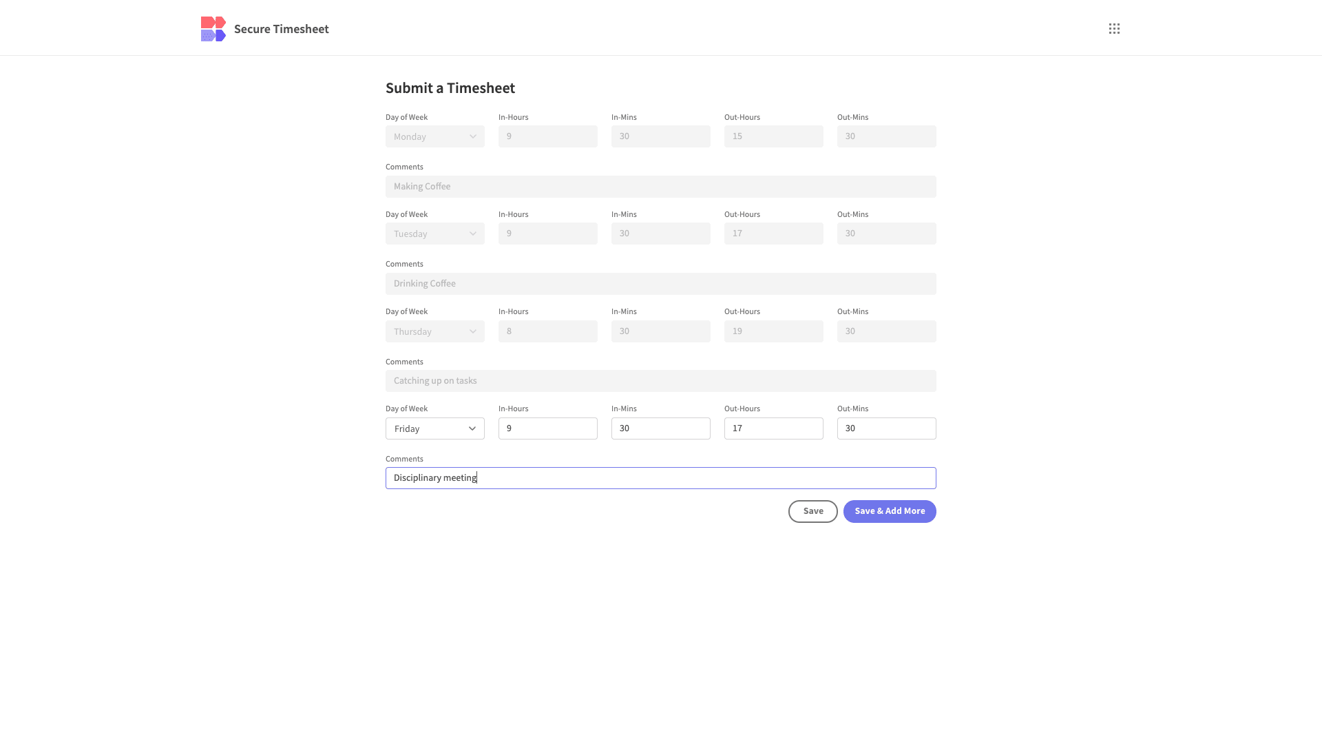
Let’s jump in.
How to build a secure timesheet in 5 steps
If you haven’t already, sign up for a free Budibase account.
1. Configuring our data model
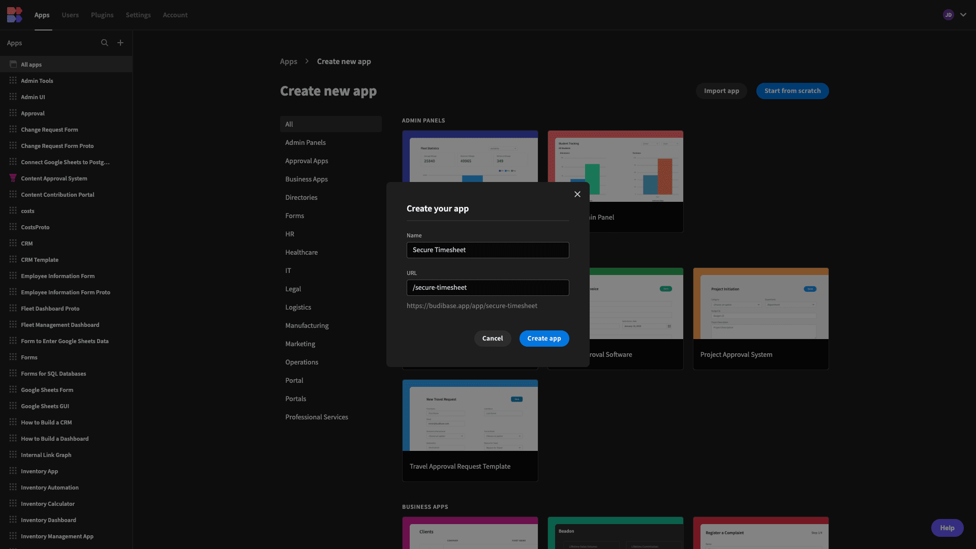
We’re going to start by creating a new Budibase application. We have the option of using a pre-built template or importing an existing app dump, but today, we’re starting from scratch.
When we choose this option, we’re prompted to give our app a name. By default, this will also be used to generate its URL extension.
Then, we need to choose what type of data source we want to connect to. Budibase offers dedicated connectors for a range of SQL and NoSQL databases alongside our internal DB, REST APIs, Google Sheets, Airtable, and more.
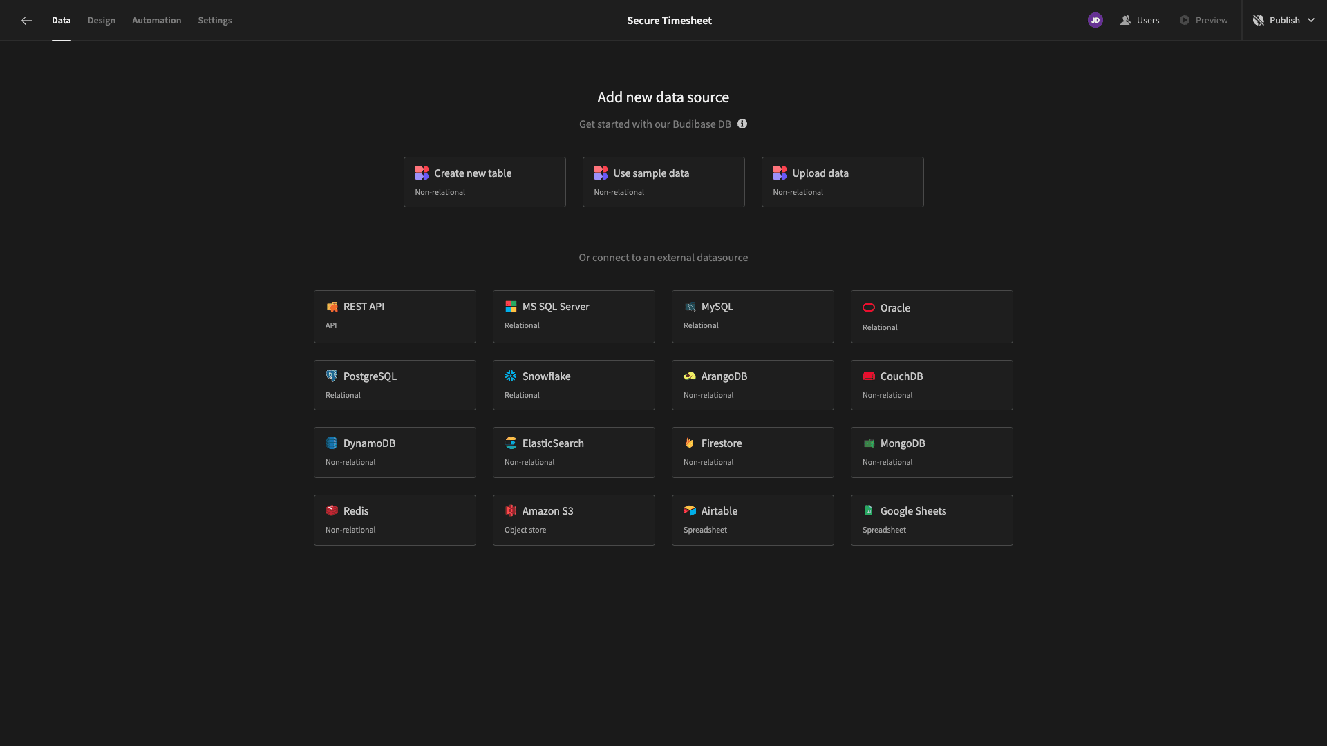
As we said earlier, we’re using MySQL for our secure timesheet.
When we choose this option, we’re prompted to input our configuration details:
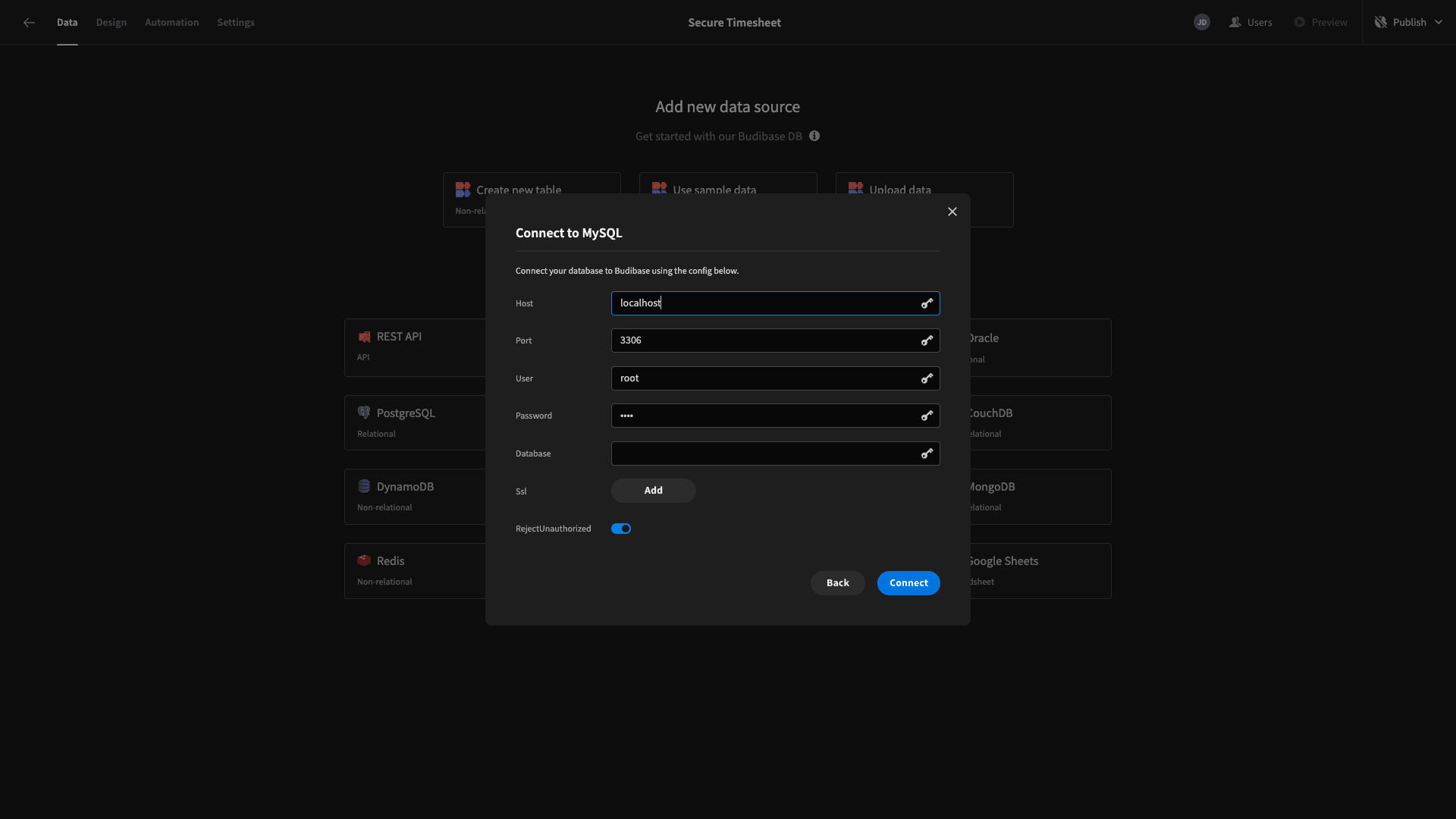
We’re then presented with a list of tables that we can fetch, pulling them into Budibase:
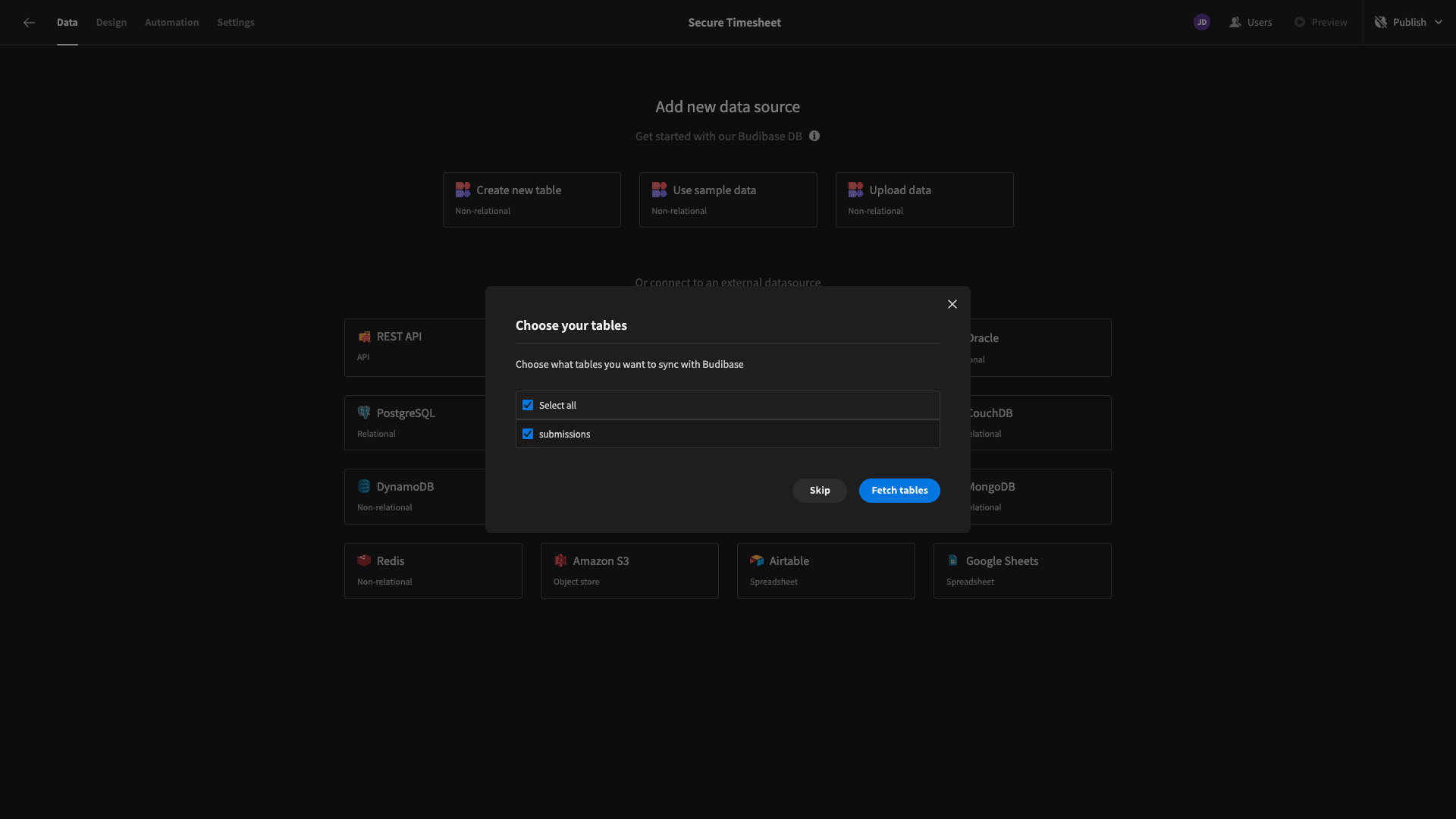
Of course, you may not have a suitable database already. So, here’s a query that you can use to create our submissions table so you can build along with us:
 1CREATE TABLE submissions (
 2
 3  submission_id INT AUTO_INCREMENT PRIMARY KEY,
 4
 5  last_name VARCHAR(255),
 6
 7  first_name VARCHAR(255),
 8
 9  email VARCHAR(255),
10
11  week_beginning DATE CHECK (DAYOFWEEK(week_beginning) = 2), -- Ensures week_beginning is a Monday
12
13  day_of_week ENUM('Monday', 'Tuesday', 'Wednesday', 'Thursday', 'Friday', 'Saturday', 'Sunday'),
14
15  in_hours INT CHECK (in_hours >= 0 AND in_hours <= 23),
16
17  in_mins INT CHECK (in_mins >= 0 AND in_mins <= 59),
18
19  out_hours INT CHECK (out_hours >= 0 AND out_hours <= 23),
20
21  out_mins INT CHECK (out_mins >= 0 AND out_mins <= 59),
22
23  comments VARCHAR(255)
24
25);
Our data model is quite simple. It contains:
- A unique ID,
- Attributes for the employee’s basic details,
- A date field for the Monday of the current week,
- Numerical fields for the hours and minutes that an employee checks in and out,
- And a field for leaving comments.
Here’s another query you can use to populate your table with sample data:
 1INSERT INTO submissions (last_name, first_name, email, week_beginning, day_of_week, in_hours, in_mins, out_hours, out_mins, comments)
 2
 3VALUES
 4
 5  -- Jane's submissions
 6
 7  ('Smith', 'Jane', 'jane.smith@example.com', '2024-01-29', 'Monday', 8, 30, 17, 0, 'Client meetings'),
 8
 9  ('Smith', 'Jane', 'jane.smith@example.com', '2024-01-29', 'Tuesday', 9, 0, 17, 30, 'Project work'),
10
11  ('Smith', 'Jane', 'jane.smith@example.com', '2024-01-29', 'Wednesday', 8, 30, 16, 30, 'Meeting with team'),
12
13  ('Smith', 'Jane', 'jane.smith@example.com', '2024-01-29', 'Thursday', 9, 0, 17, 0, 'Coding tasks'),
14
15  ('Smith', 'Jane', 'jane.smith@example.com', '2024-01-29', 'Friday', 8, 0, 16, 0, 'Client presentation'),
16
17  -- John's submissions
18
19  ('Doe', 'John', 'john.doe@example.com', '2024-01-29', 'Monday', 10, 0, 18, 0, 'Analyzing data'),
20
21  ('Doe', 'John', 'john.doe@example.com', '2024-01-29', 'Wednesday', 9, 0, 16, 0, 'Database design'),
22
23  ('Doe', 'John', 'john.doe@example.com', '2024-01-29', 'Friday', 8, 30, 15, 30, 'Code review');
Here’s what our table will look like in Budibase once we’ve fetched it:
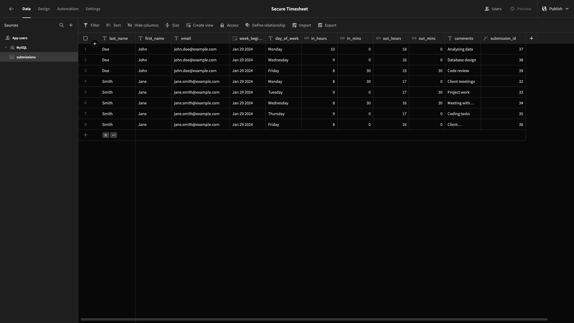
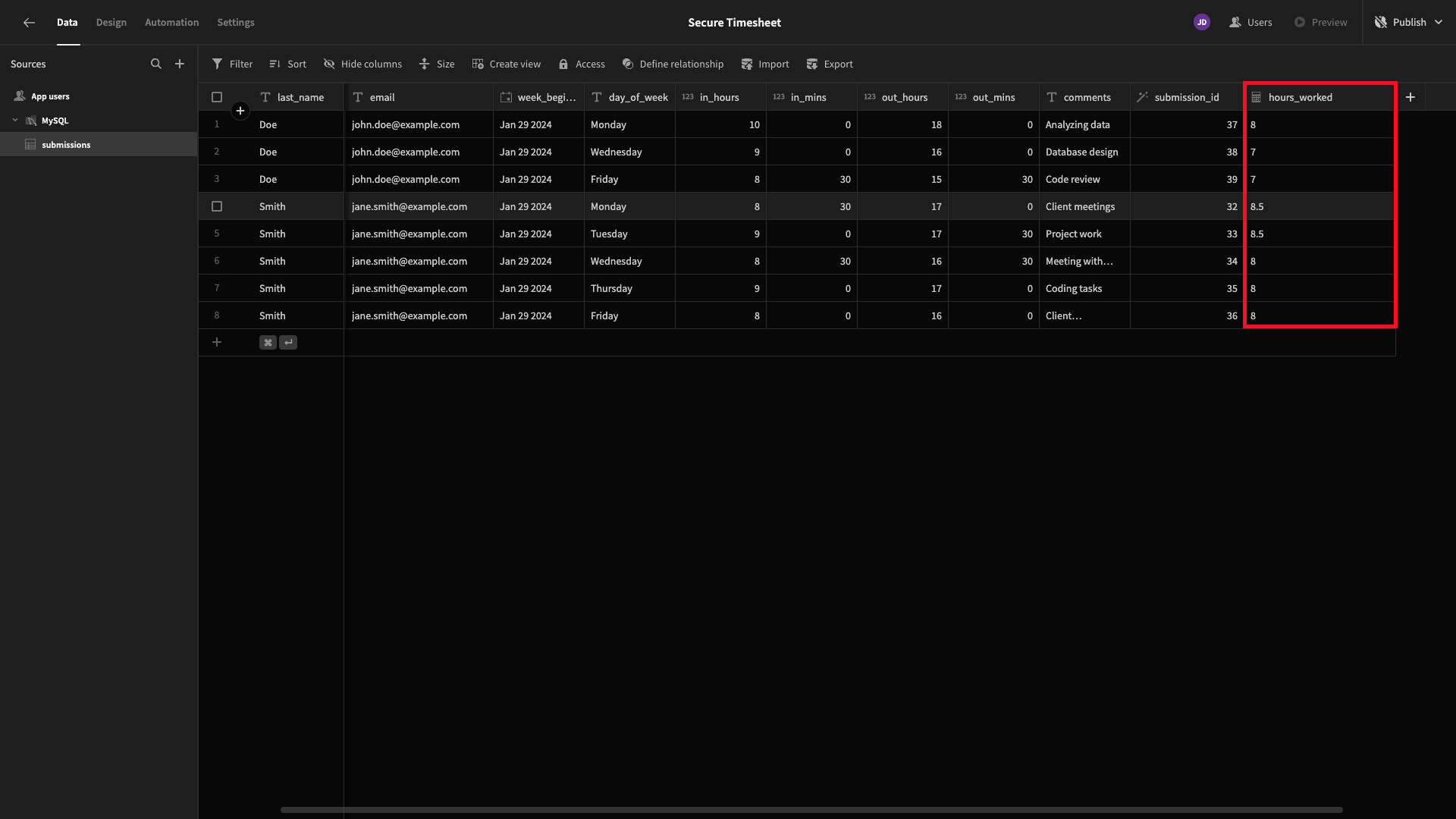
We’re also going to add two more columns to this within Budibase’s data tab. Firstly, we want a formula variable that calculates the number of hours our employees have worked each day - based on the information provided.
We’ll use the plus icon to add a formula variable and call it hours_worked:
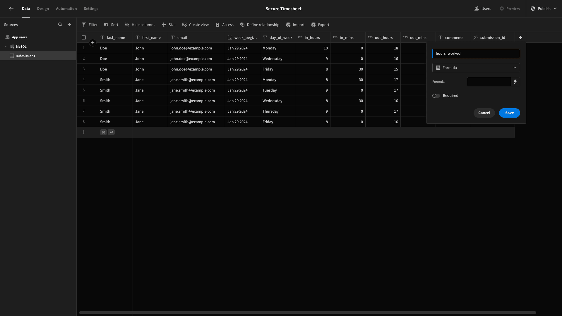
Hit the lightning bolt icon beside the formula field and enter the following JavaScript:
1var hoursWorked = 0;
2
3var inTimeMins = ($("in_hours") * 60) + $("in_mins");
4
5var outTimeMins = ($("out_hours") * 60) + $("out_mins");
6
7hoursWorked = (outTimeMins - inTimeMins) / 60;
8
9return hoursWorked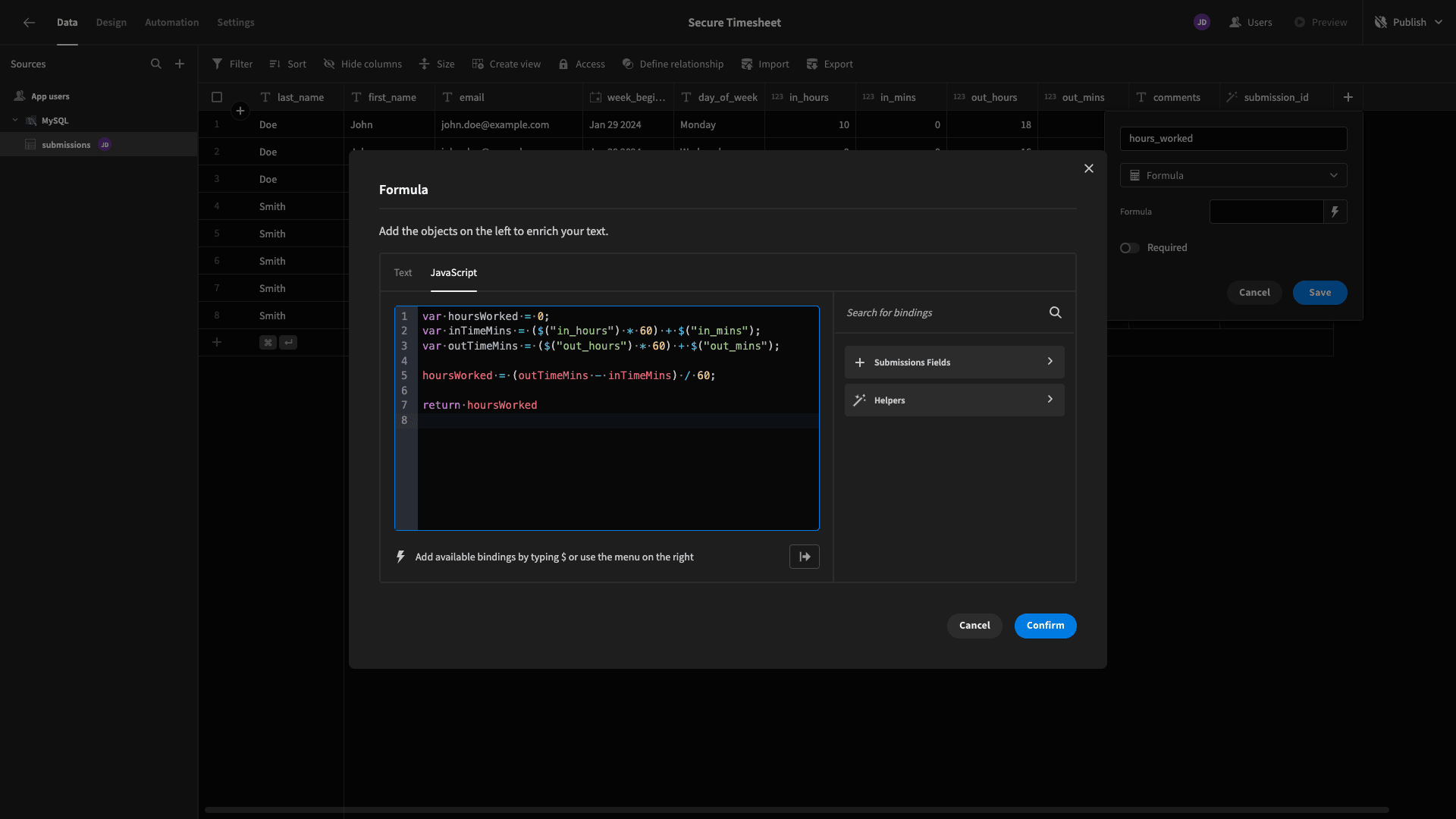
Here’s what this will look like:
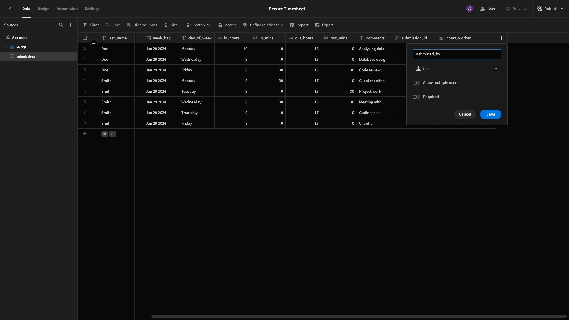
The other field we’re going to add is a User column. This is a special attribute that links our submissions table to the internal Users table within Budibase.
We’re going to use this to record who the timesheet was submitted by. We’ll also use it to auto-populate certain fields and ensure that individual employees are only exposed to their own timesheet data.
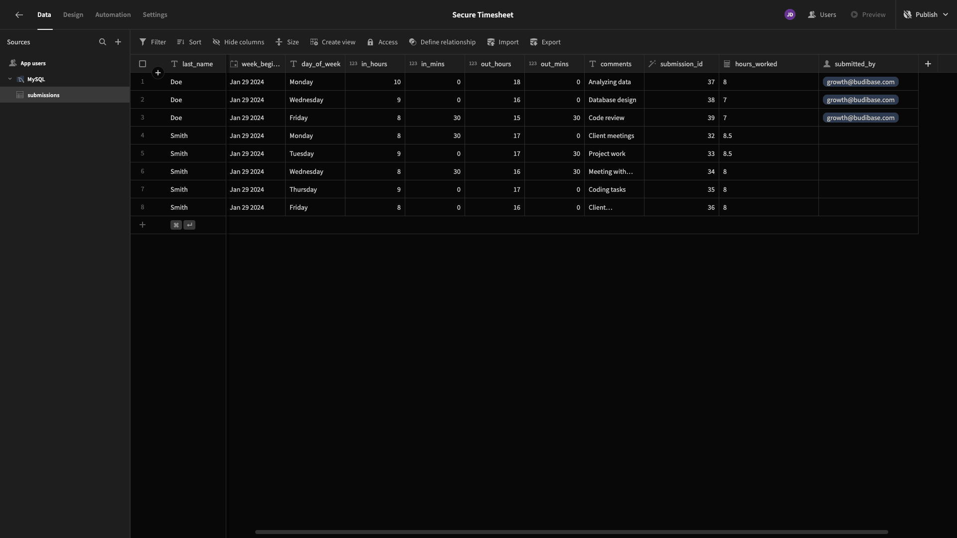
Our Budibase account has its name set to John Doe in the users table, so for testing purposes, we’re assigning ourselves to all of the existing rows with this name:
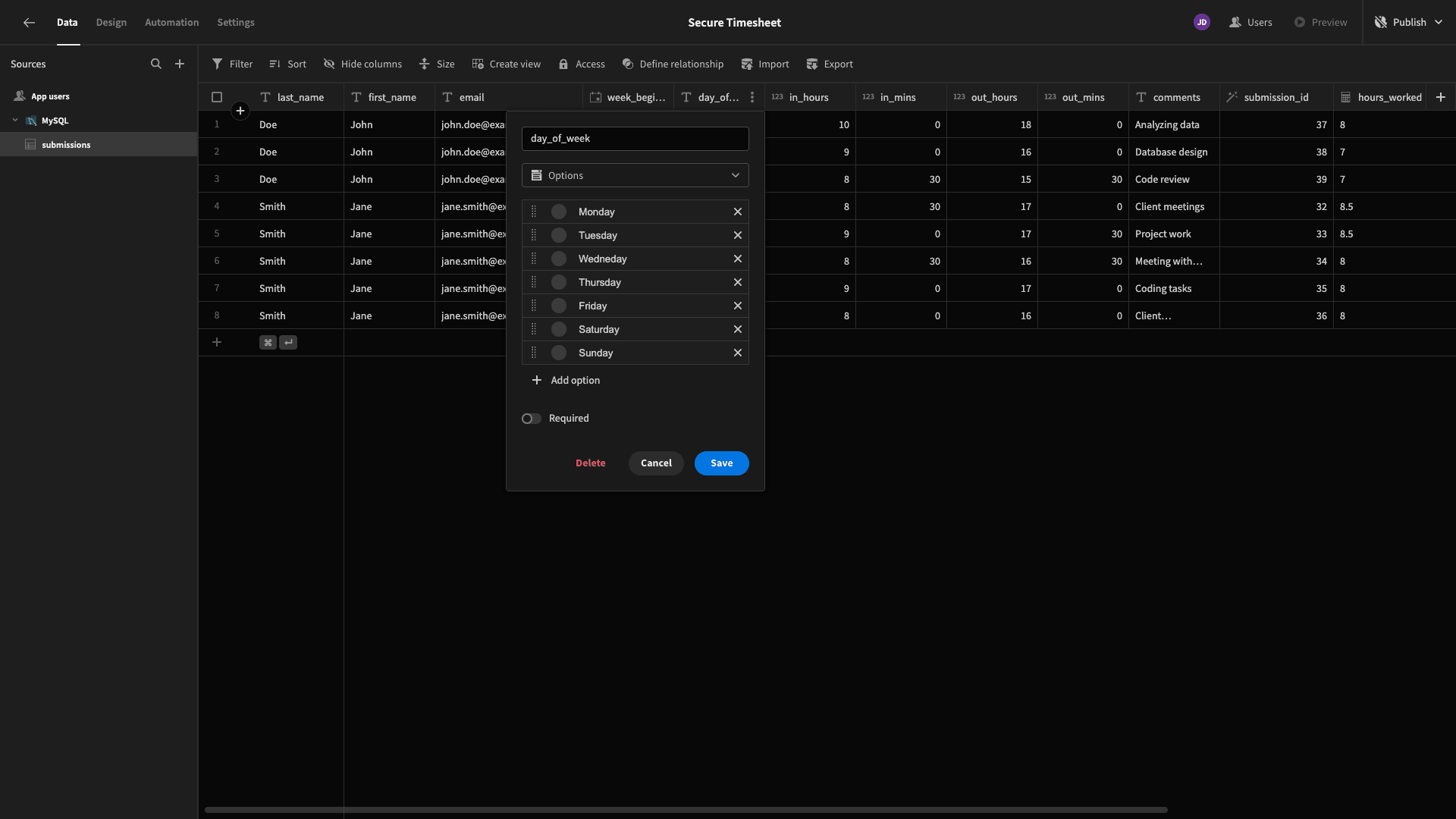
Lastly, when users enter a value for our day_of_week attribute, we’re going to want them to select from a list of options - rather than entering this manually. So, we’re going to change the type for this column from text to options - then input what these are:
That’s our data model completed. Let’s start building some UIs.
2. Building our timesheet form
The most important part of our application will be our timesheet submission form. There are two things that will make this a slightly atypical form:
- Users will be able to submit several database entries at once.
- They’ll only have to enter certain information, with values for the rest of the attributes being auto-populated from context.
Start by heading to the design section of Budibase. We’ll be presented with several options for how we want to create our first screen:
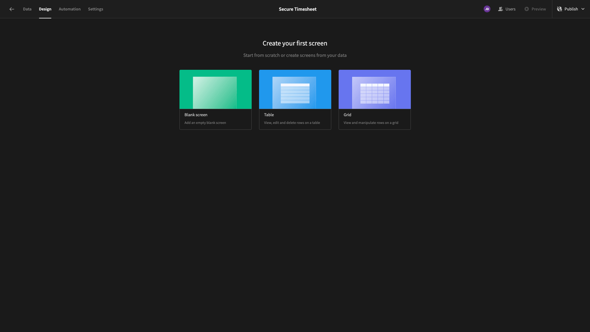
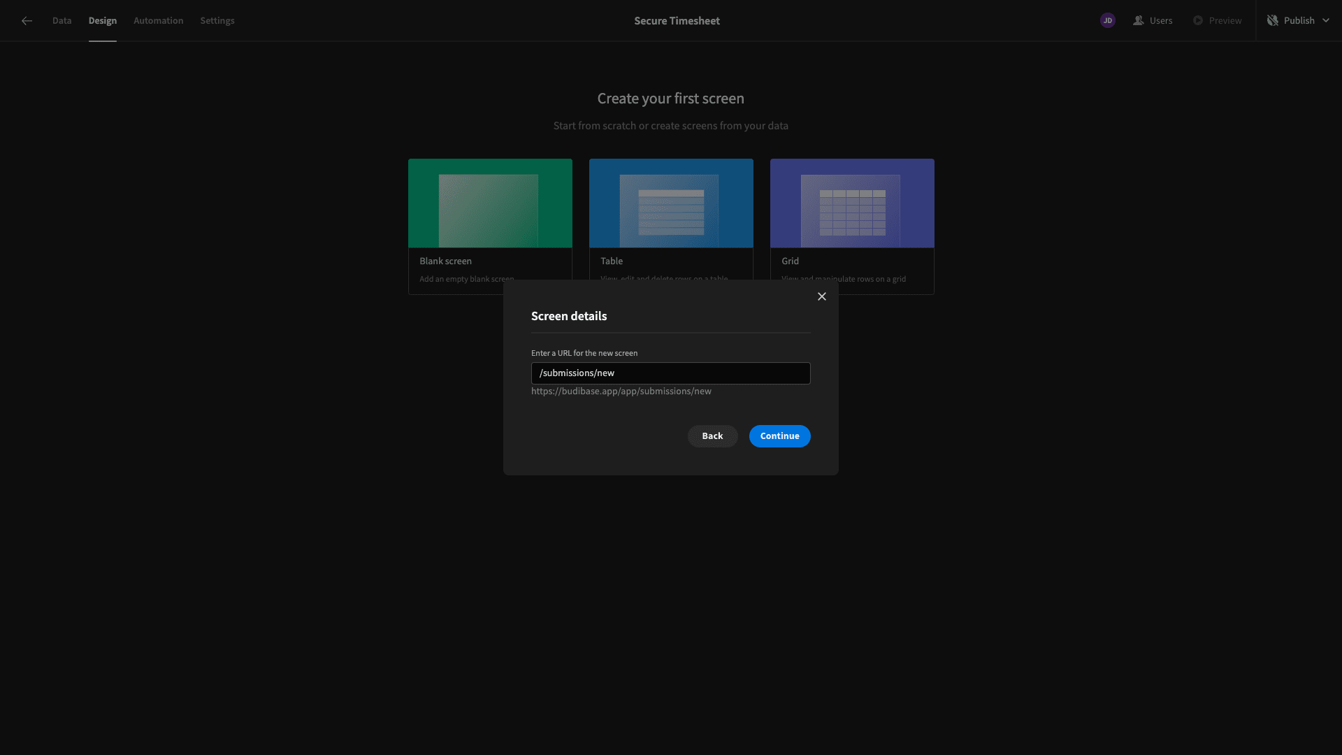
We’re going to create a blank screen. When we select this, we’re prompted to choose a URL extension for our new UI.
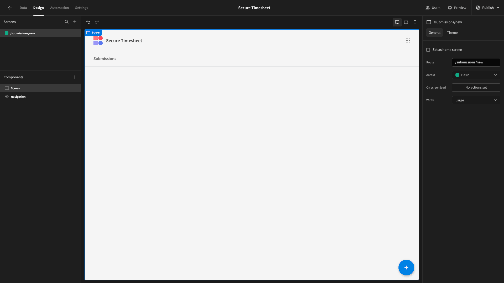
We’re calling ours /submissions/new.
Here’s what this will look like:
We’re going to start by adding a Form Block. This is a preconfigured set of components that generates a form based on the schema of whichever table we point it at:
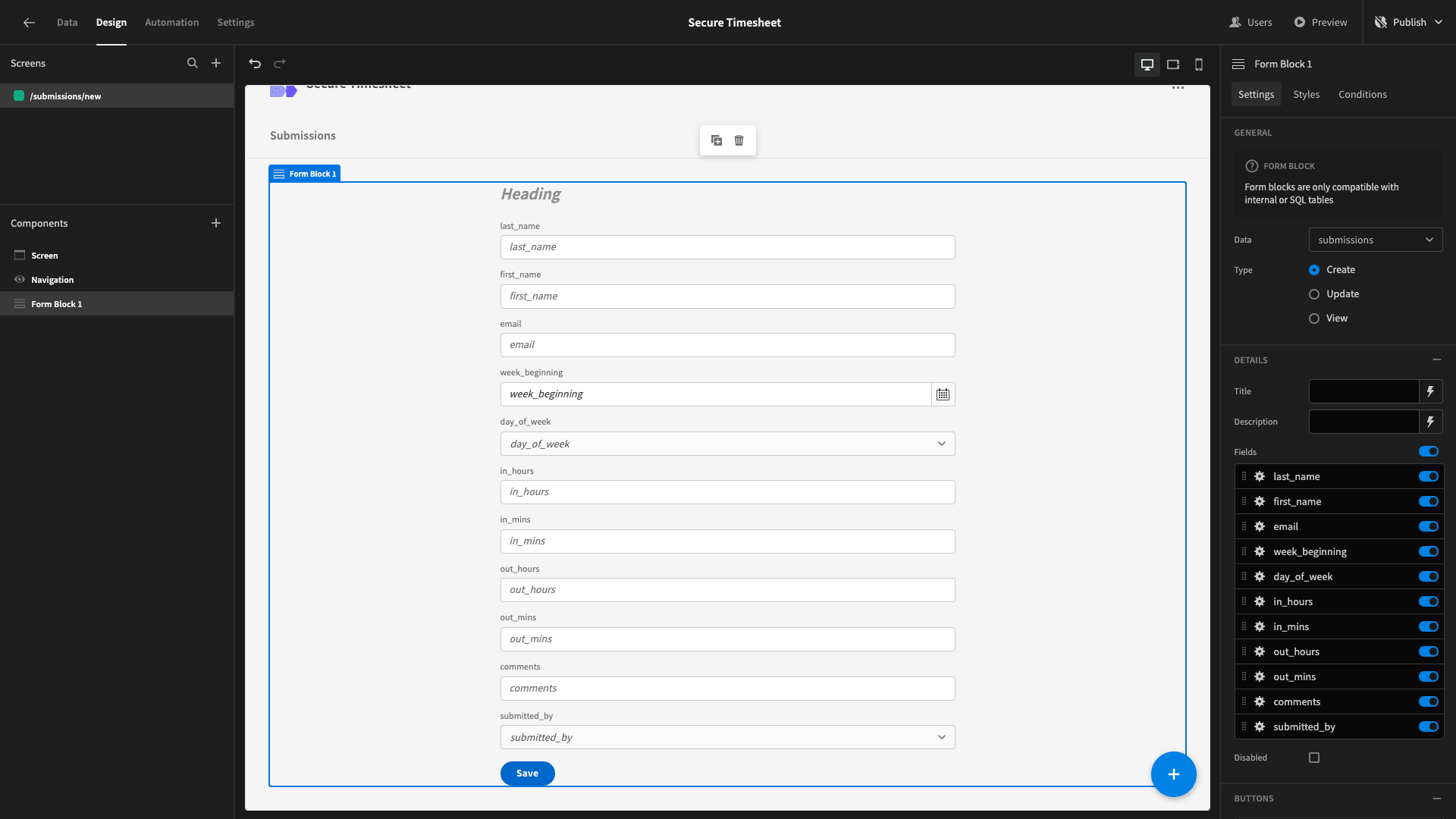
Already, this is a perfectly functional timesheet, but we’re going to make some pretty extensive design changes.
On the right-hand side, we can select which fields we want to include in our form. By default, this is set to present all of the fields in our data model.
We only want to base certain fields on user inputs, so we’re deselecting first_name, last_name, email, week_beginning, and submitted_by. We’ll use contextual data to populate these in our database later.
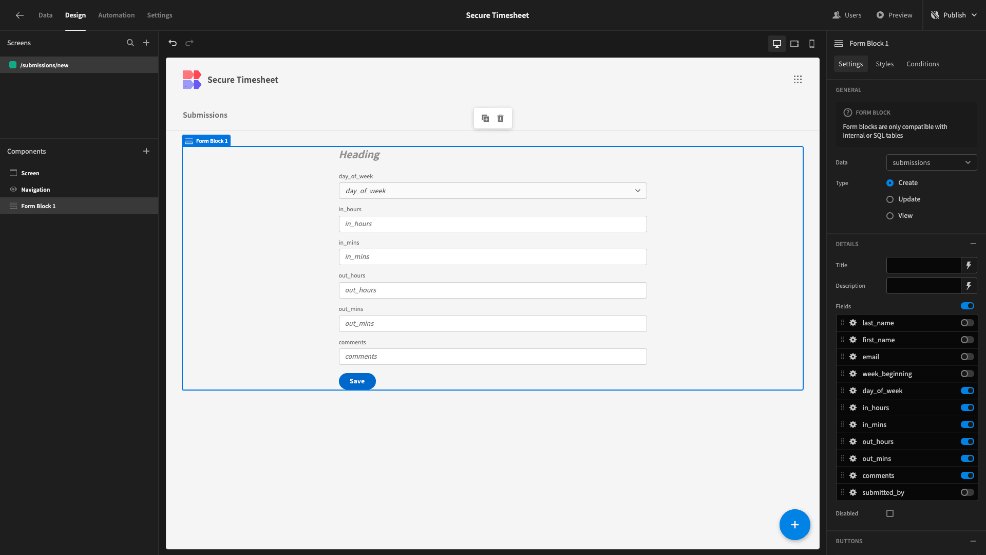
Now, our form is a bit more lightweight. We’ll also give it a title:
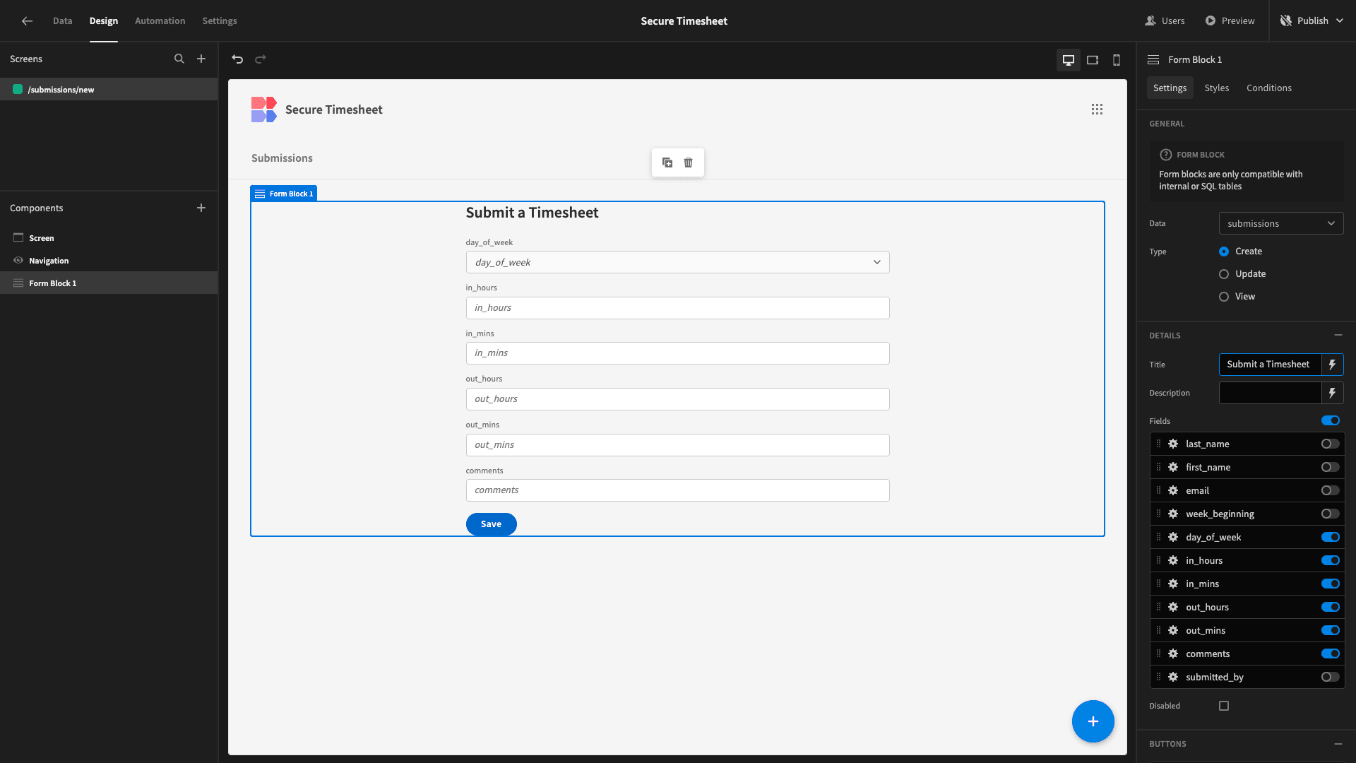
Eventually, we’re going to want users to have the option to fill in these same fields several times for different days - so that they can quickly submit a full week of timesheets.
This will look a bit strange in the current orientation, so we’re going to make some changes to the design of our form.
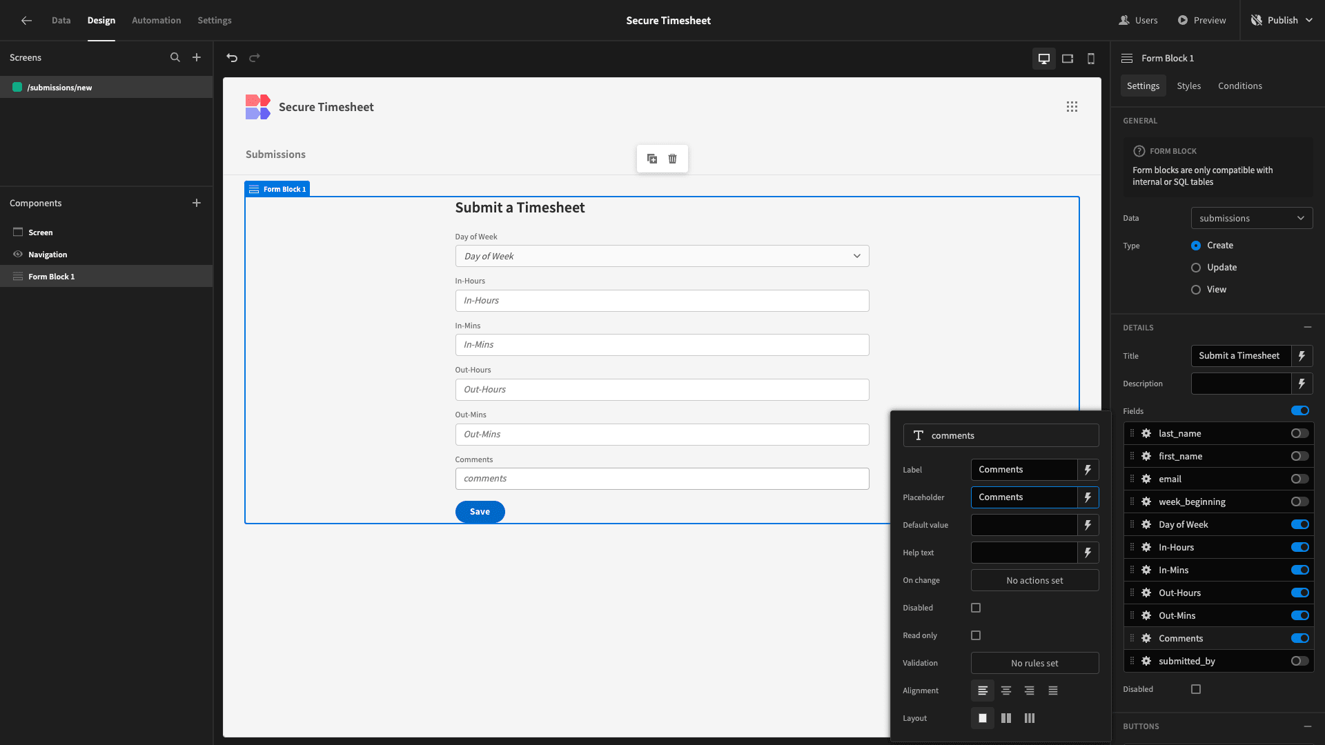
The first thing we’ll do is update the displayed text for each field. Currently, these are displayed as the names of the attributes within our database.
Using the settings for each of our displayed fields, we’re adding capitalization and replacing hyphens with spaces for the labels and placeholder text:
Next, we want to place all of our form fields except for Comments on a single line. To do this, we need to eject our form block, exposing its constituent components:
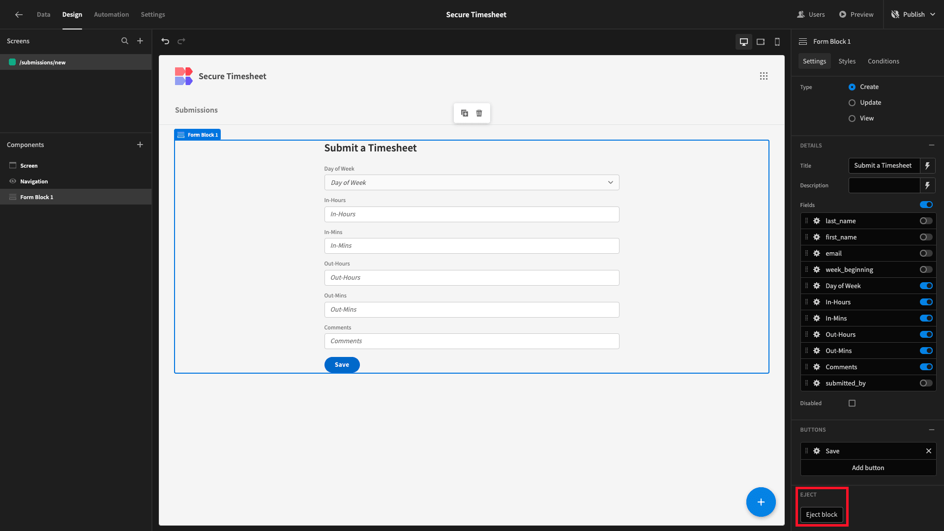
Now, we can configure each of the components that make up our form:
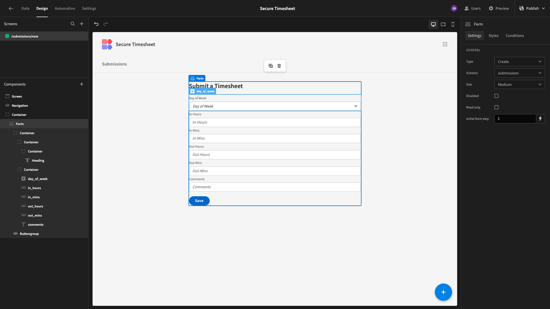
We’re going to make our form a bit wider. By default, it’s set to 600px. Under Styles within the Form component, we’re going to update the width to 800px - giving us a bit more room to play with:
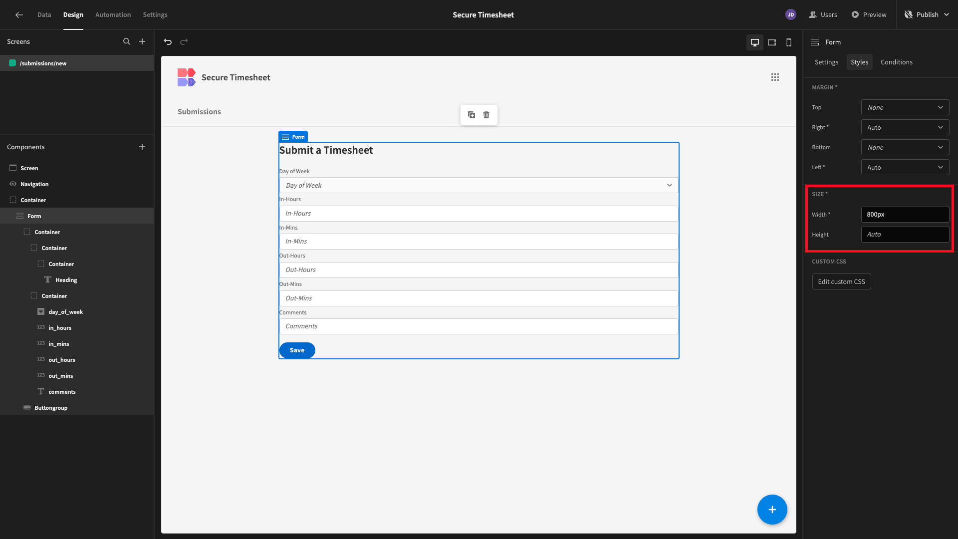
Currently, all of our form fields are nested within a container. We’re going to move the Comments field out of this.
Then, we’ll set the container’s direction to horizontal:
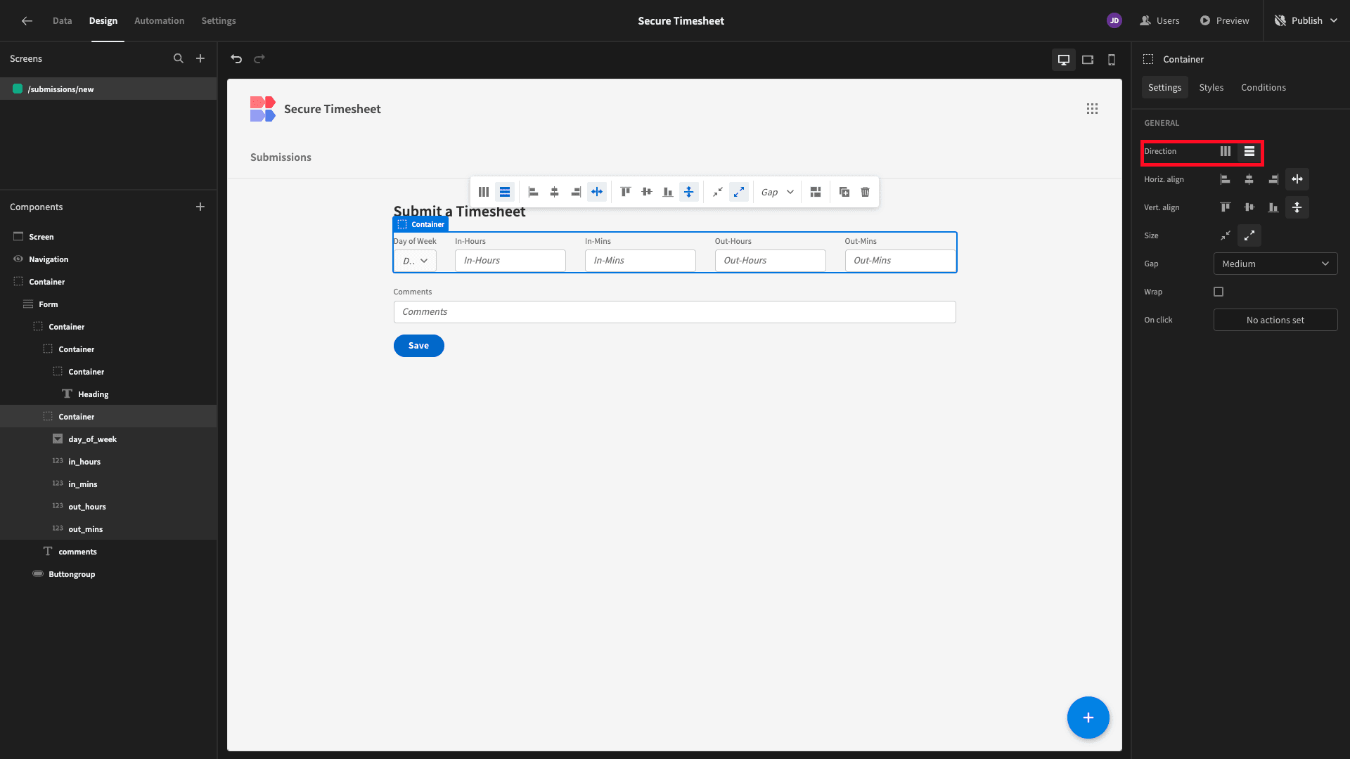
For each of the form fields that are still in the container, we’re going to set the width to 18% - so that they take up equal space, but we’re still leaving a gap between them:
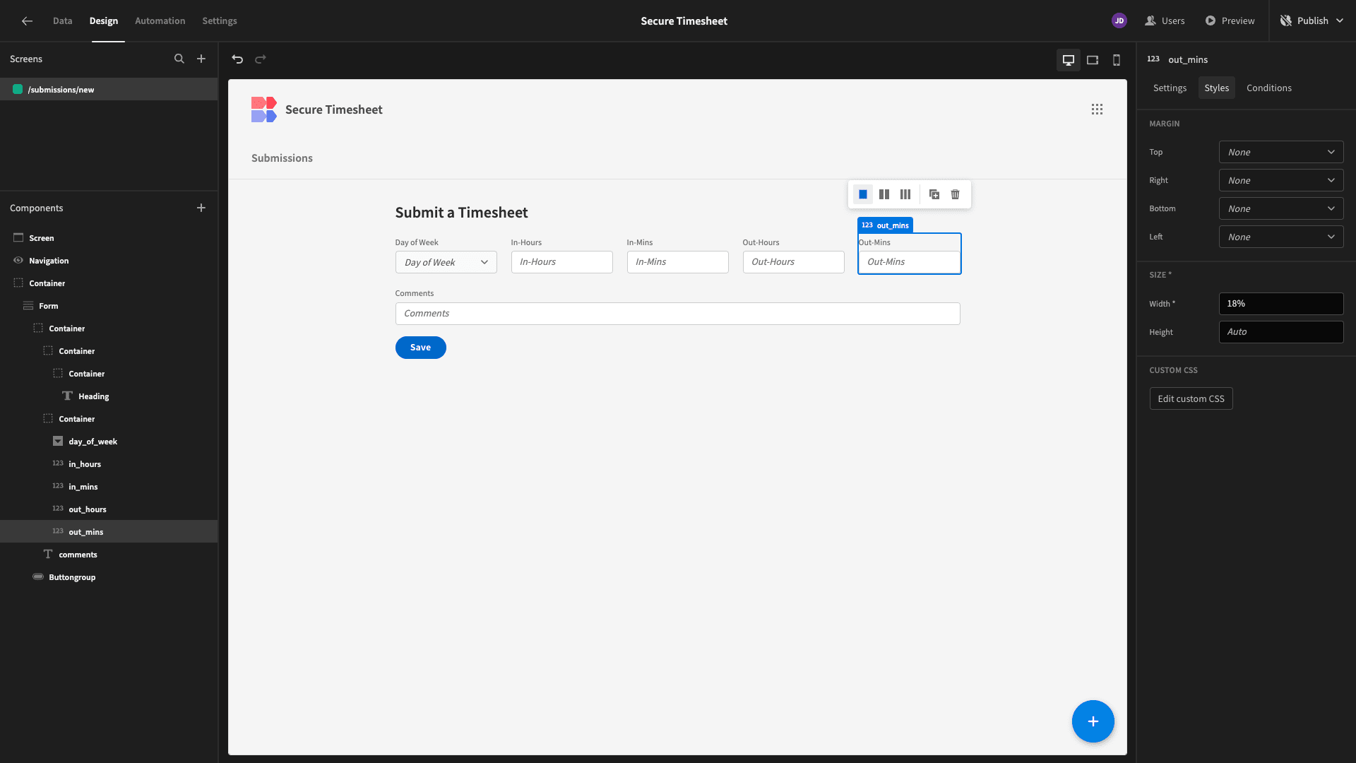
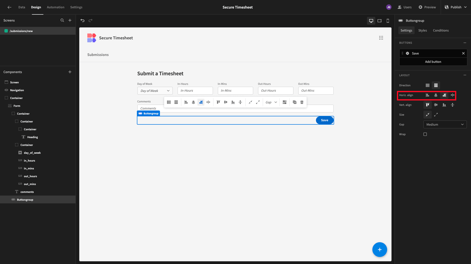
We’ll move our button group component to the right of the screen:
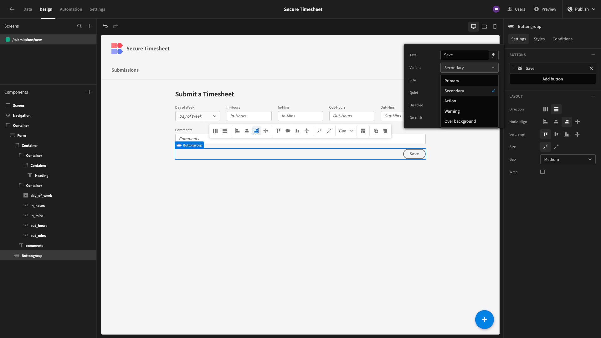
We don’t expect most of our users to add only a single entry when they fill in our form. So, we’ll change the style of our save button to ‘secondary’:
And we’ll add a second button with the display text Save & Add More:
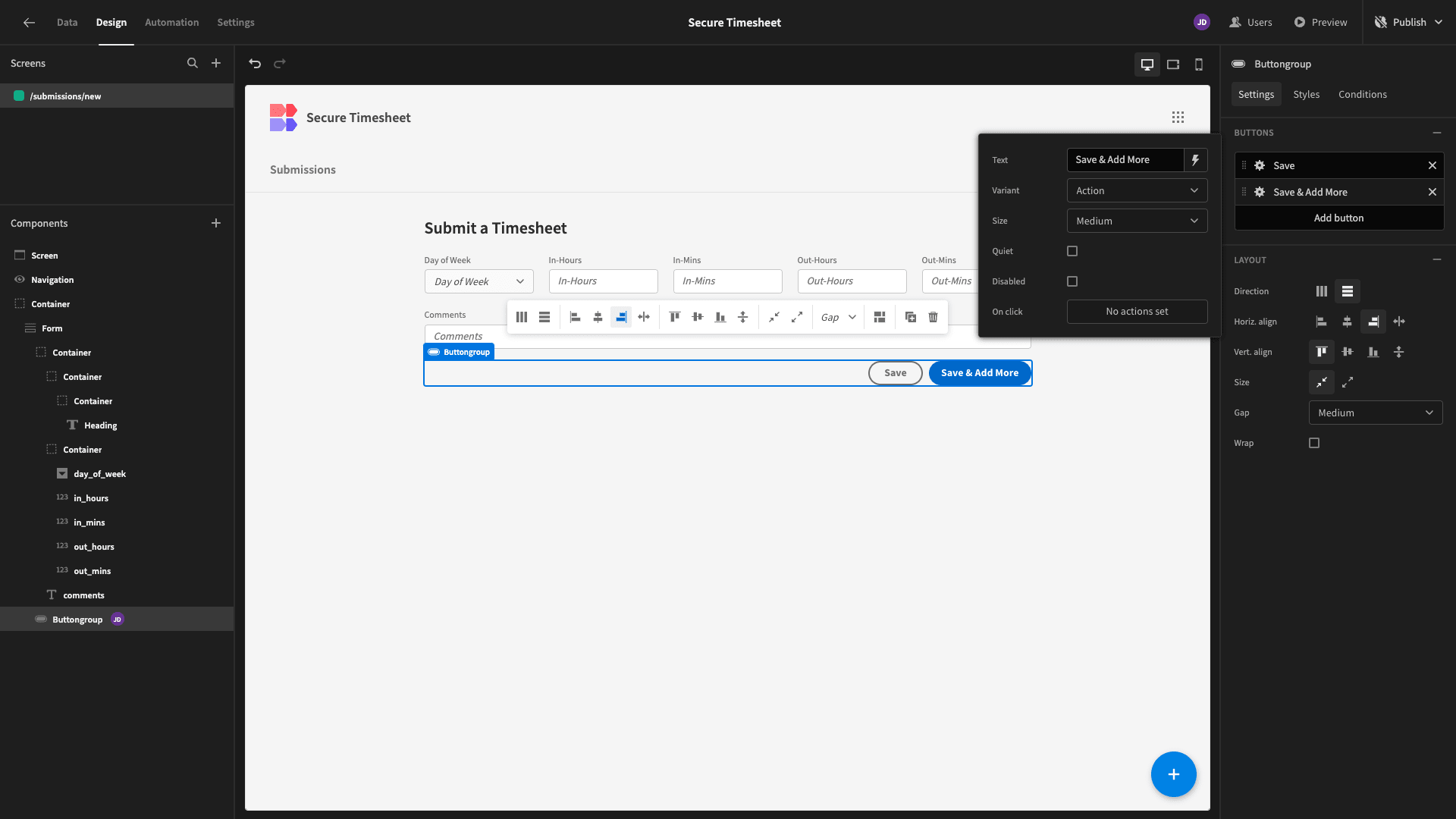
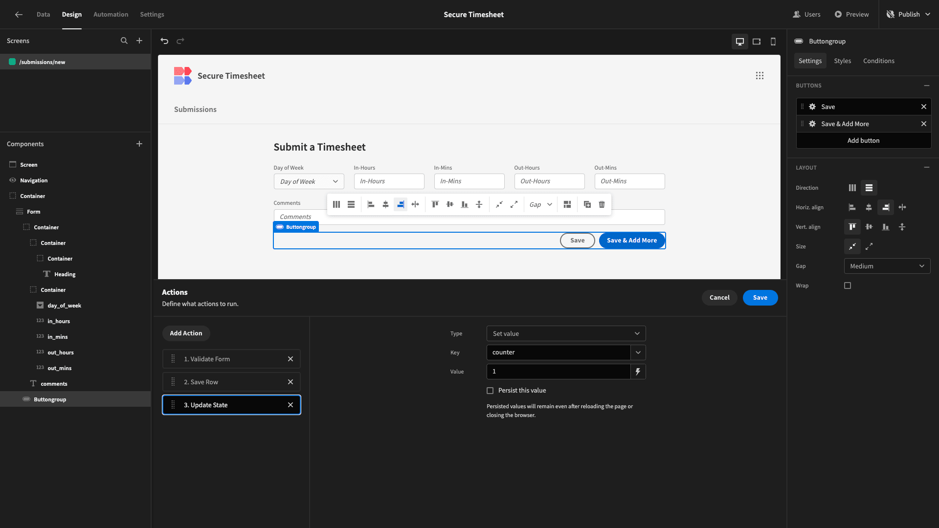
This will do three things:
- Validate our form.
- Save a new row to our database with a combination of user inputs and contextual values.
- Set an app state called ‘counter’ to 1.
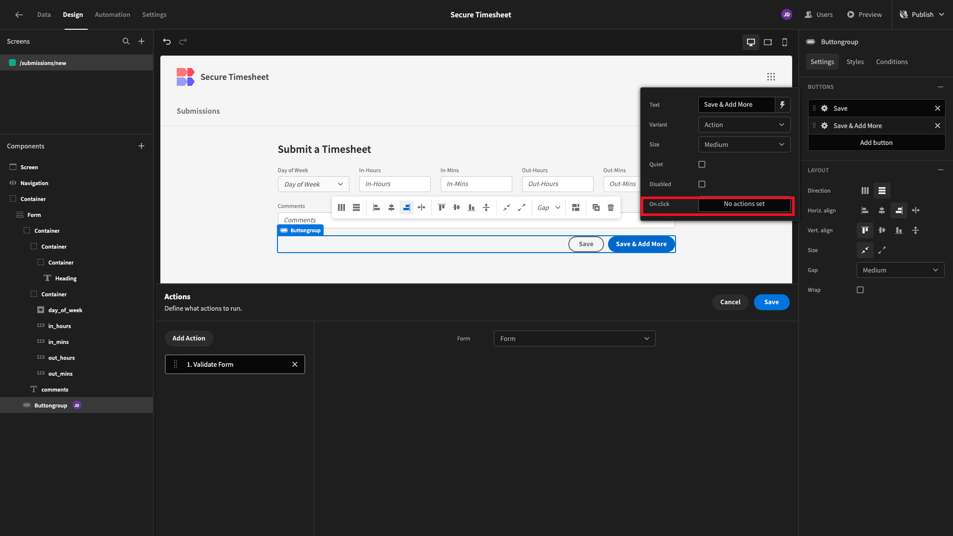
We’ll open the on-click actions drawer and add a validate form step. This will check our user submissions against any rules and constraints that are defined by our database:
Next, we’ll add a Save Row action, setting the data source to our Form and the Table to our database table:
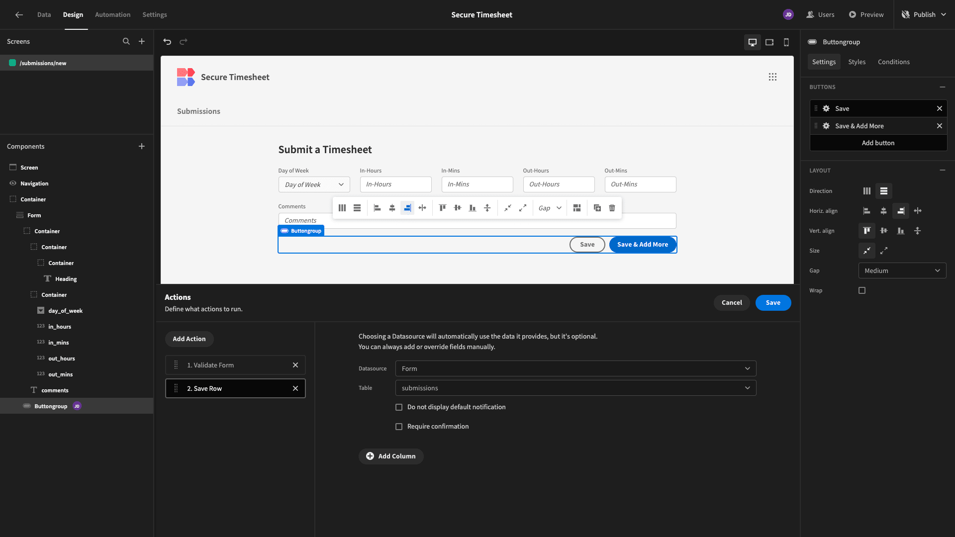
This will save the values that our users have provided, but the attributes for which we haven’t included form fields will be left blank.
Budibase lets us assign values to the other attributes using the Add Column button. We don’t need to do anything for the submission_id attribute, as this is an auto-incrementing number in our database already.
For first_name, last_name, email, and submitted_by attributes, we can use Budibase’s built-in handlebars helpers to populate our table with the current user’s information:
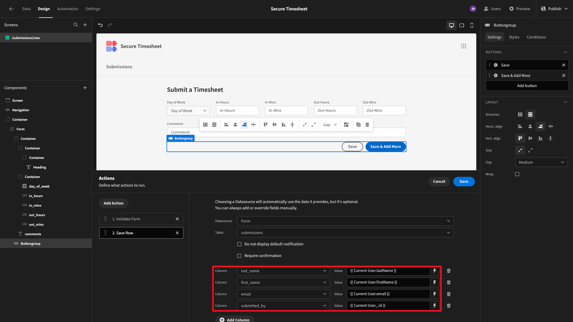
The week_beginning attribute is a little trickier. We want this to be a date representing the Monday at the start of the current week.
This will require a few lines of custom JavaScript, so we’re using the lightning bolt to set the value for this to:
 1const today = new Date();
 2
 3const dayOfWeek = today.getDay();
 4
 5const difference = today.getDate() - dayOfWeek + (dayOfWeek === 0 ? -6 : 1); // Adjust if today is Sunday
 6
 7const mondayOfCurrentWeek = new Date(today.setDate(difference));
 8
 9mondayOfCurrentWeek.setHours(0, 0, 0, 0); // Set time to midnight
10
11return mondayOfCurrentWeek;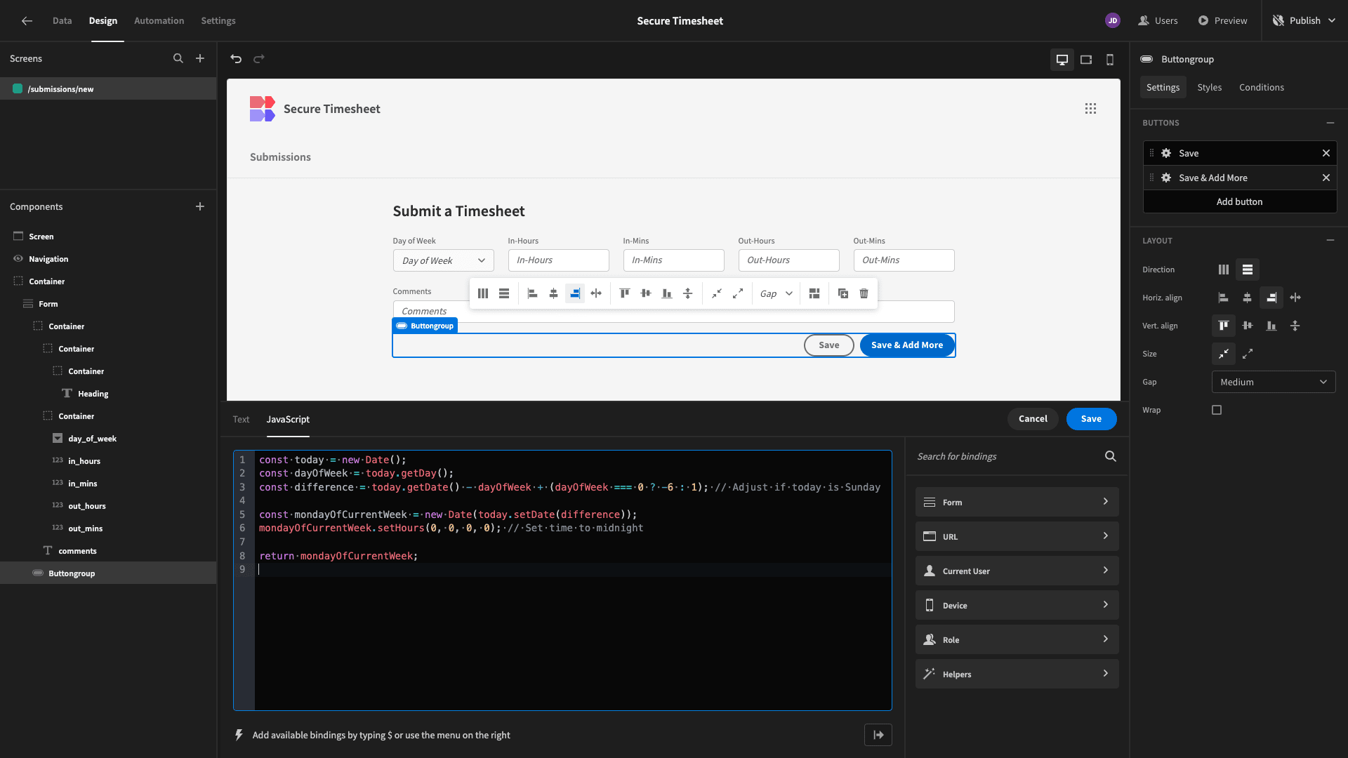
We’ll repeat this process to add the same fields to our other save button, too.
At this point, we can preview our app and confirm that it saves the data that we expect it to:
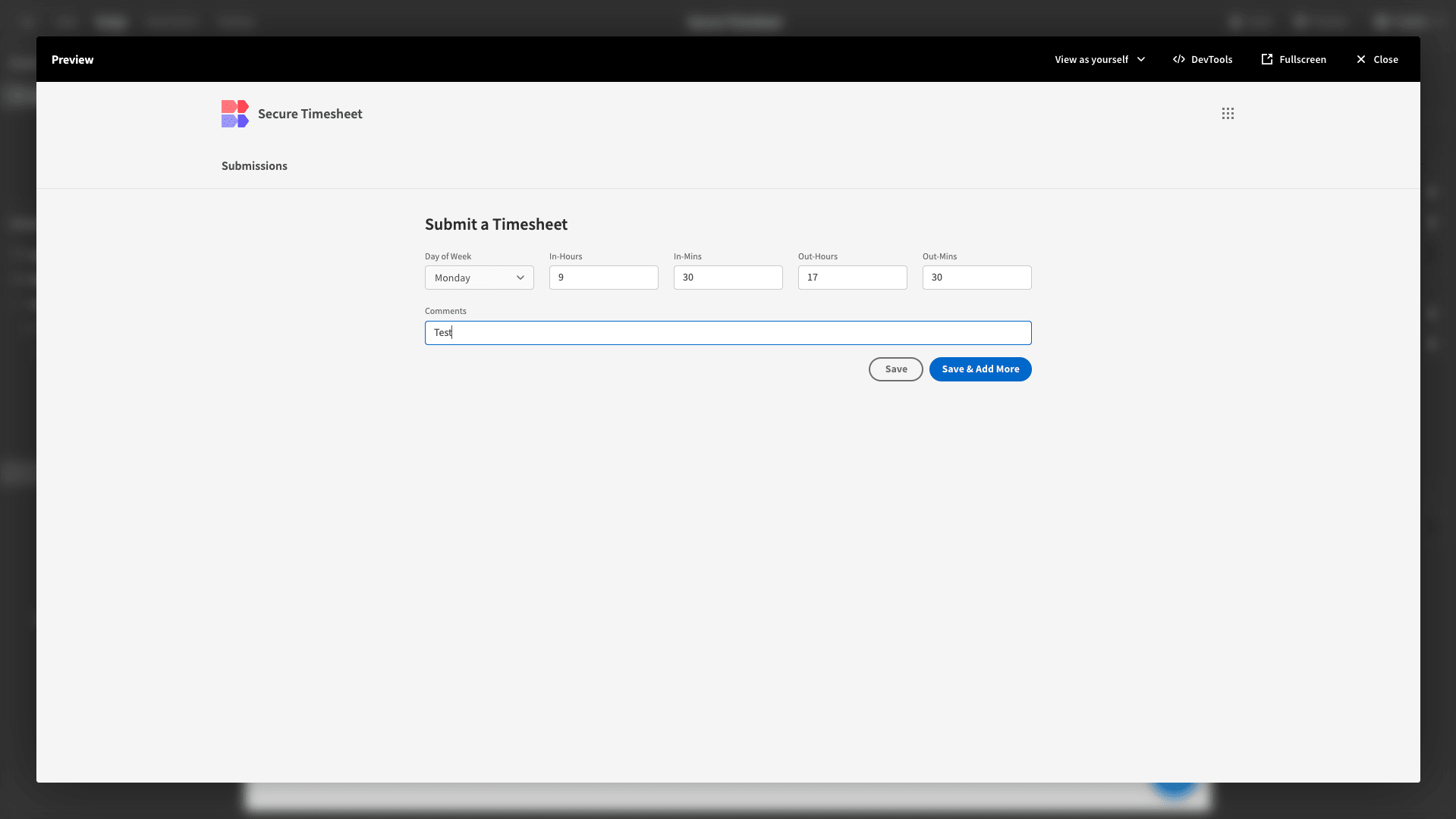
We can see that that’s worked back in the Data section:
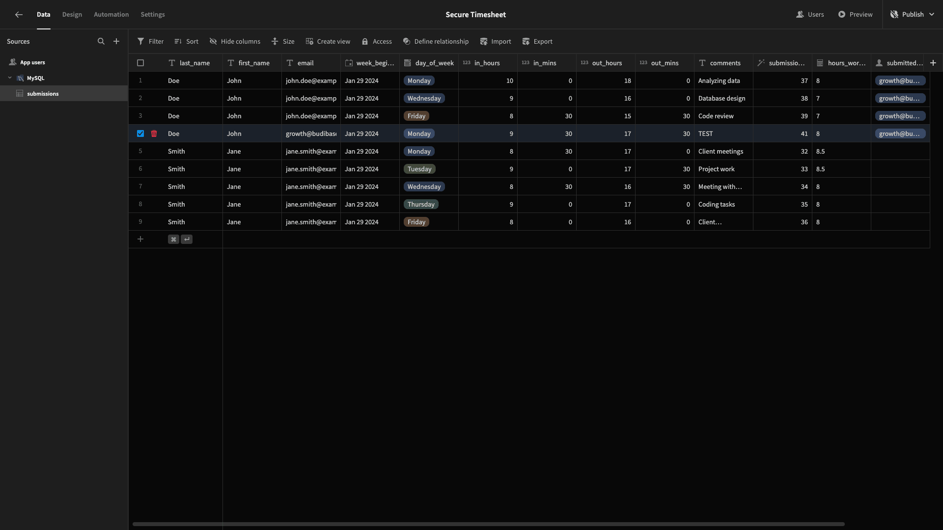
We’ll delete that row, just so things don’t get messy.
The last action we’ll add to our button is called Update State. We’ll set the Key to ‘counter’ and the value to 1:
3. Adding multiple submissions
When we’re finished with this screen, we want our employees to be able to add five separate rows to our data table - one for each day they’ve worked during the current week.
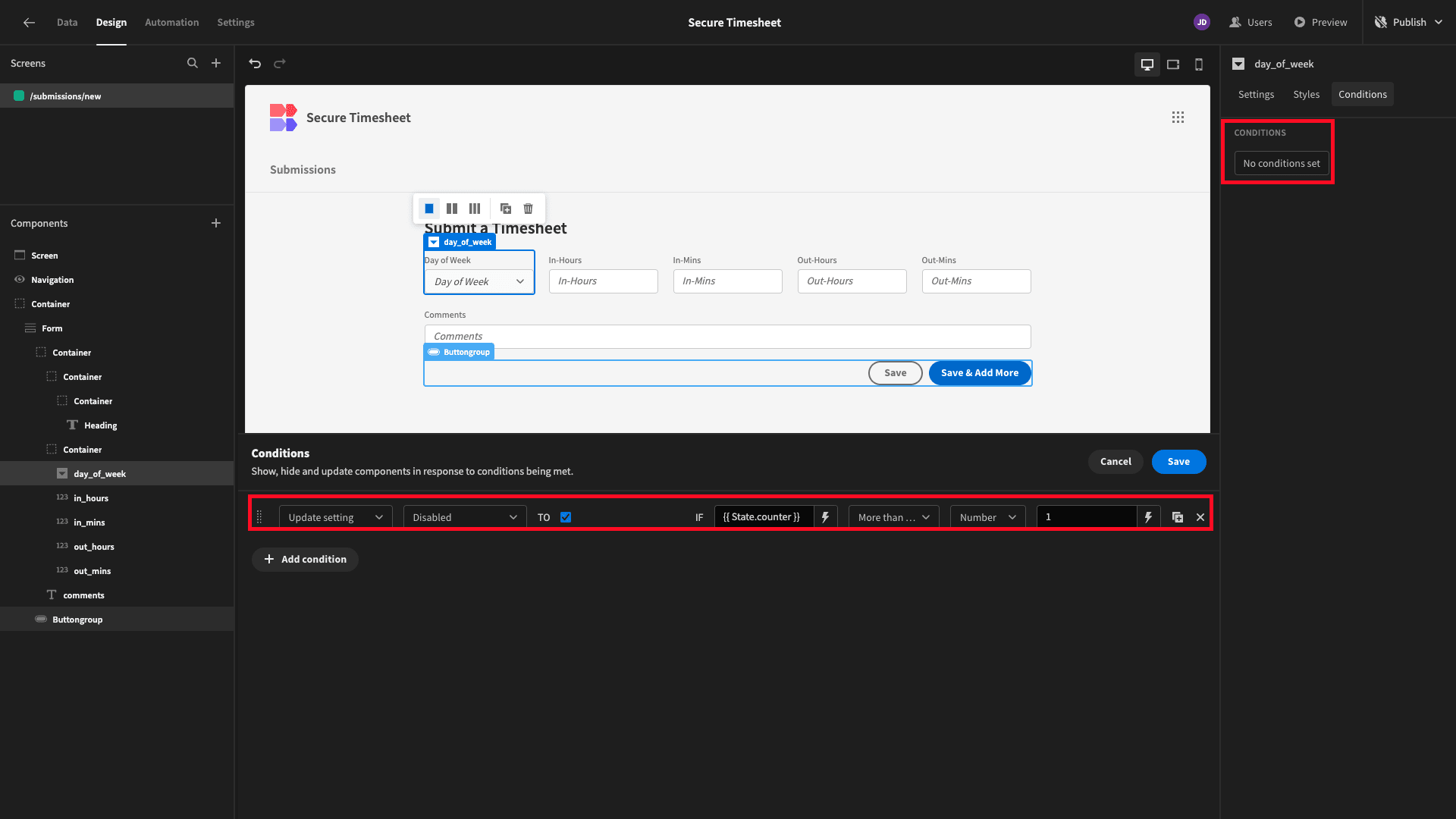
The first thing we’ll do is add a custom conditionality row to each of our fields so that they’re disabled if our Counter state is greater than or equal to 1:
We’ll also add a Screen Load action that sets our counter to 0 every time a user accesses the screen:
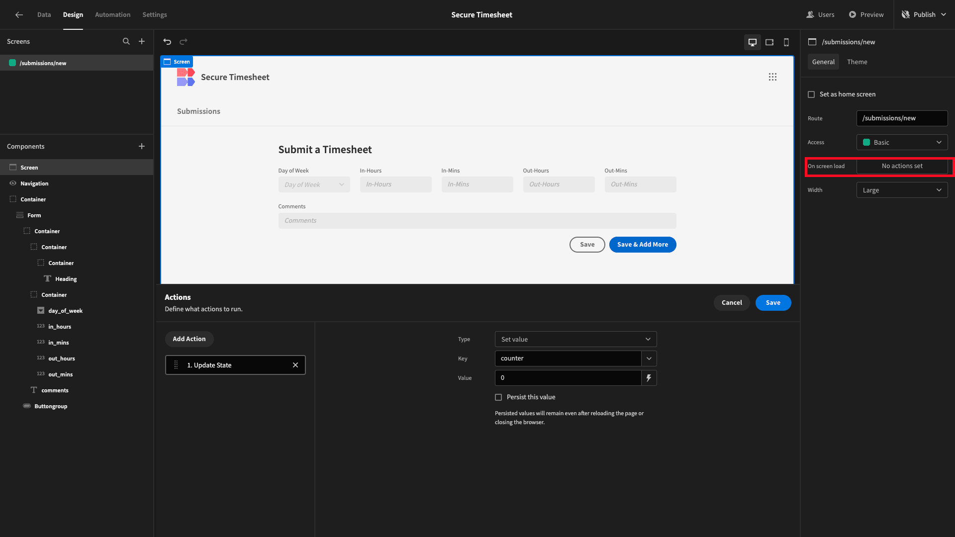
In the Design tab, the fields appear as disabled since there’s no value for our state, but these will appear differently when we preview our app.
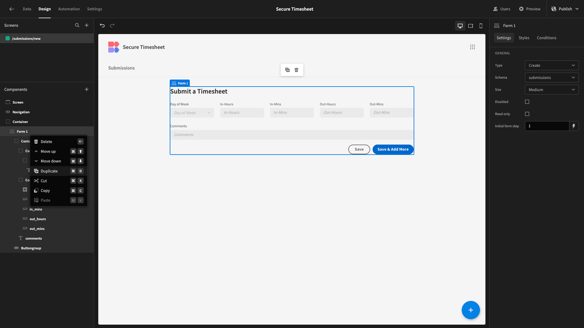
We’ll rename our existing Form component to Form 1 and duplicate the whole thing:
And we’ll delete the container that contains the headline component for our new row:
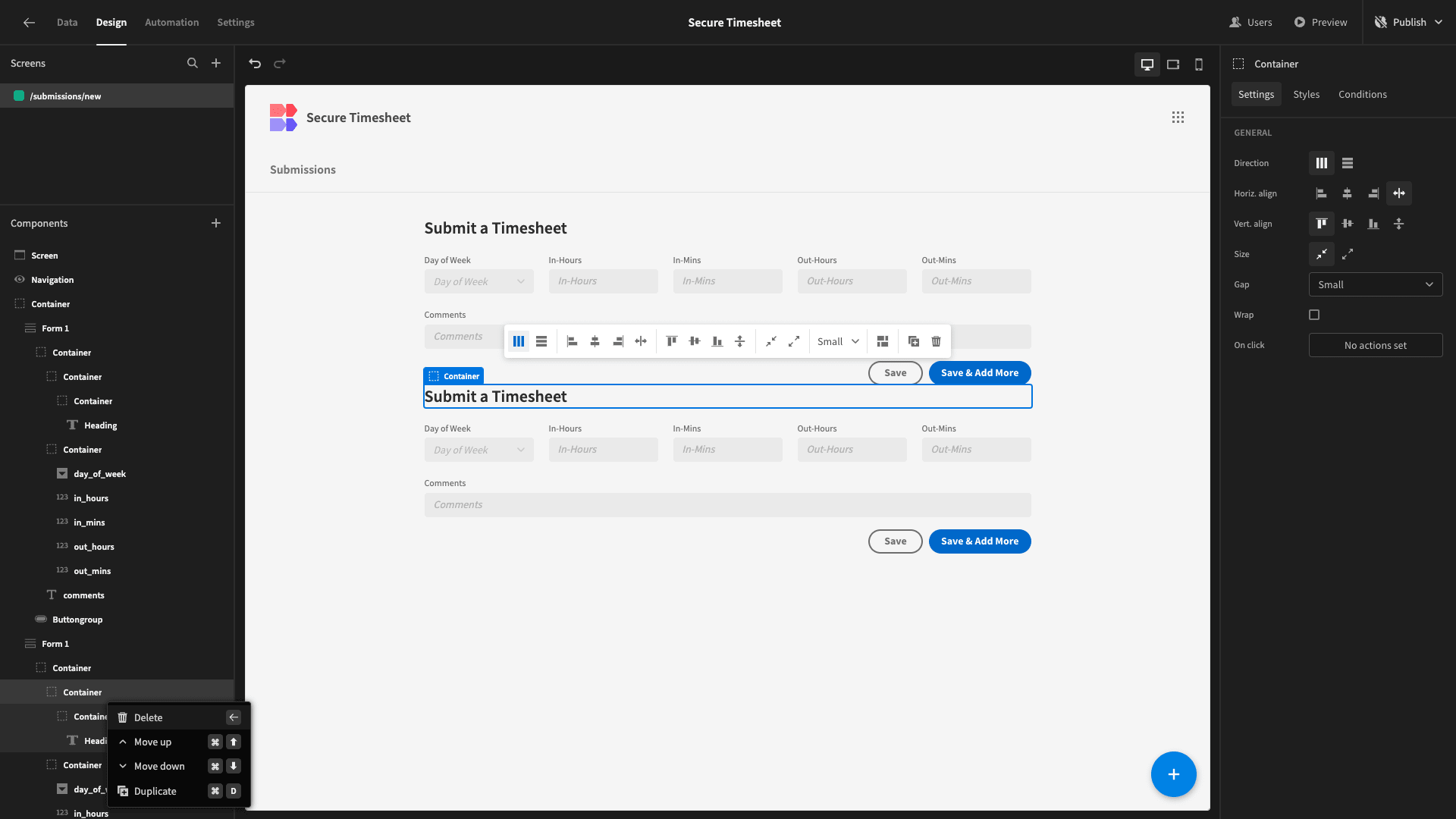
Rename this one Form 2, so that things don’t get confusing.
We need to make two key changes to this new form:
- Updating the conditionality rules on each of our form fields so that they’re disabled when the Counter state is greater than or equal to 2.
- Update our button action to set the Counter state to 2.
Once we’ve done that, we’ll also add a conditionality rule to our Form 2 component so that it’s only displayed if Counter is greater than or equal to 1.
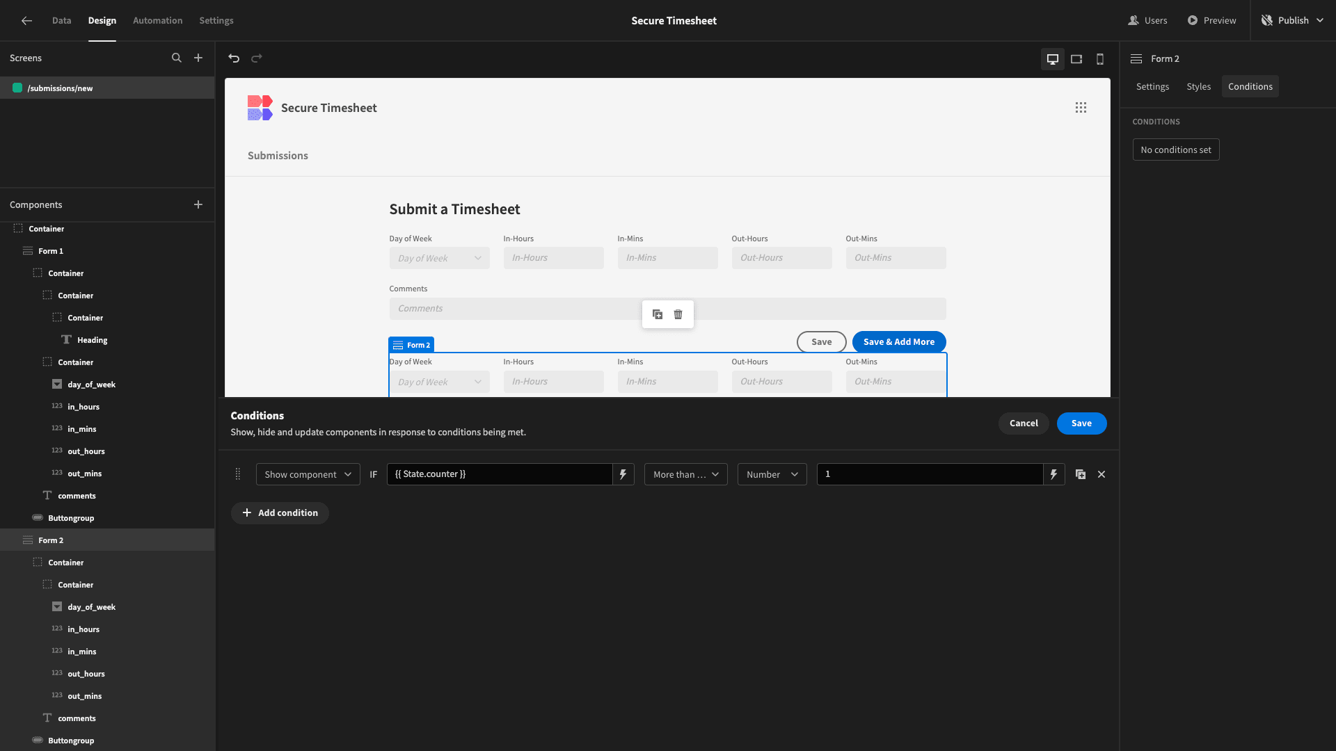
We can confirm that this works by previewing our app and adding a row with our first form:
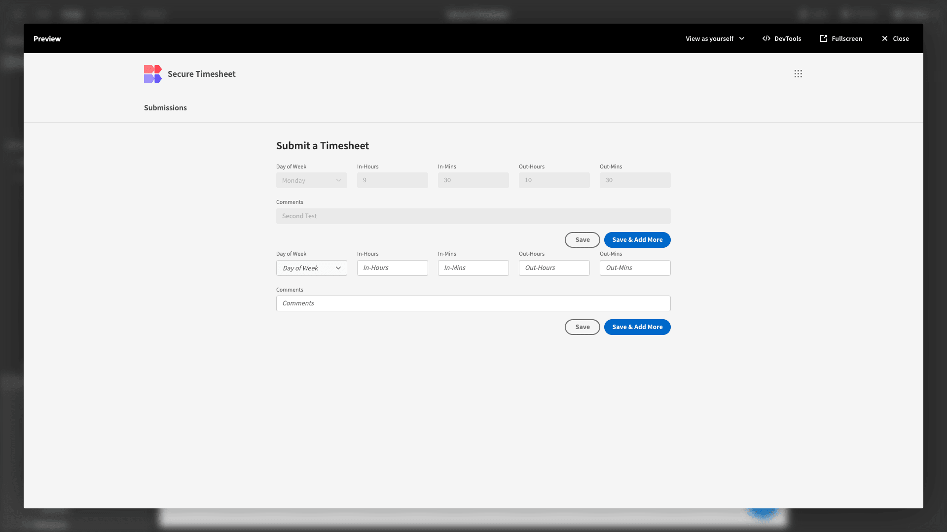
We’ll also add a little bit of margin above Form 2.
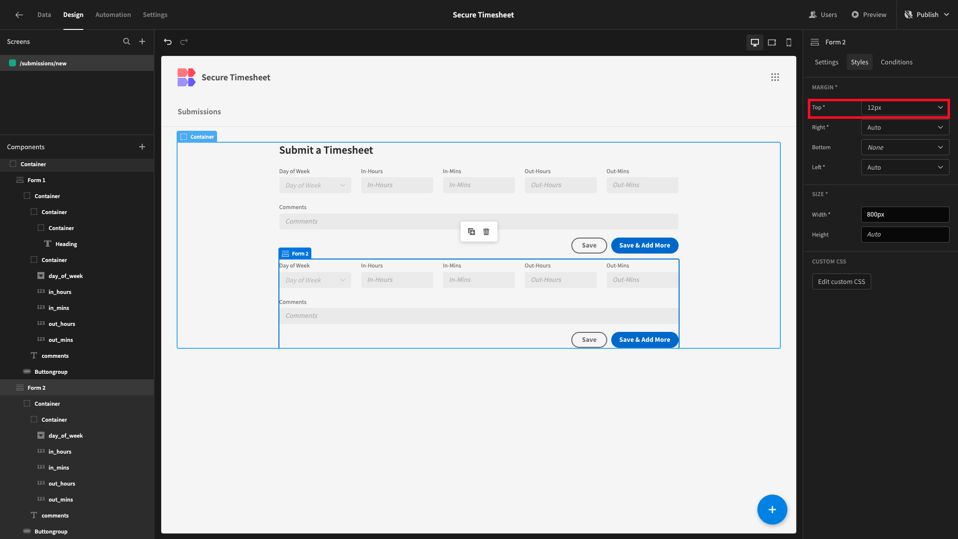
Duplicate this new form and repeat the process of updating your conditionality rules and button actions until you have five distinct Forms, each one appearing when a user hits Save & Add More on the previous form.
Our fifth and final form should only have a single button:
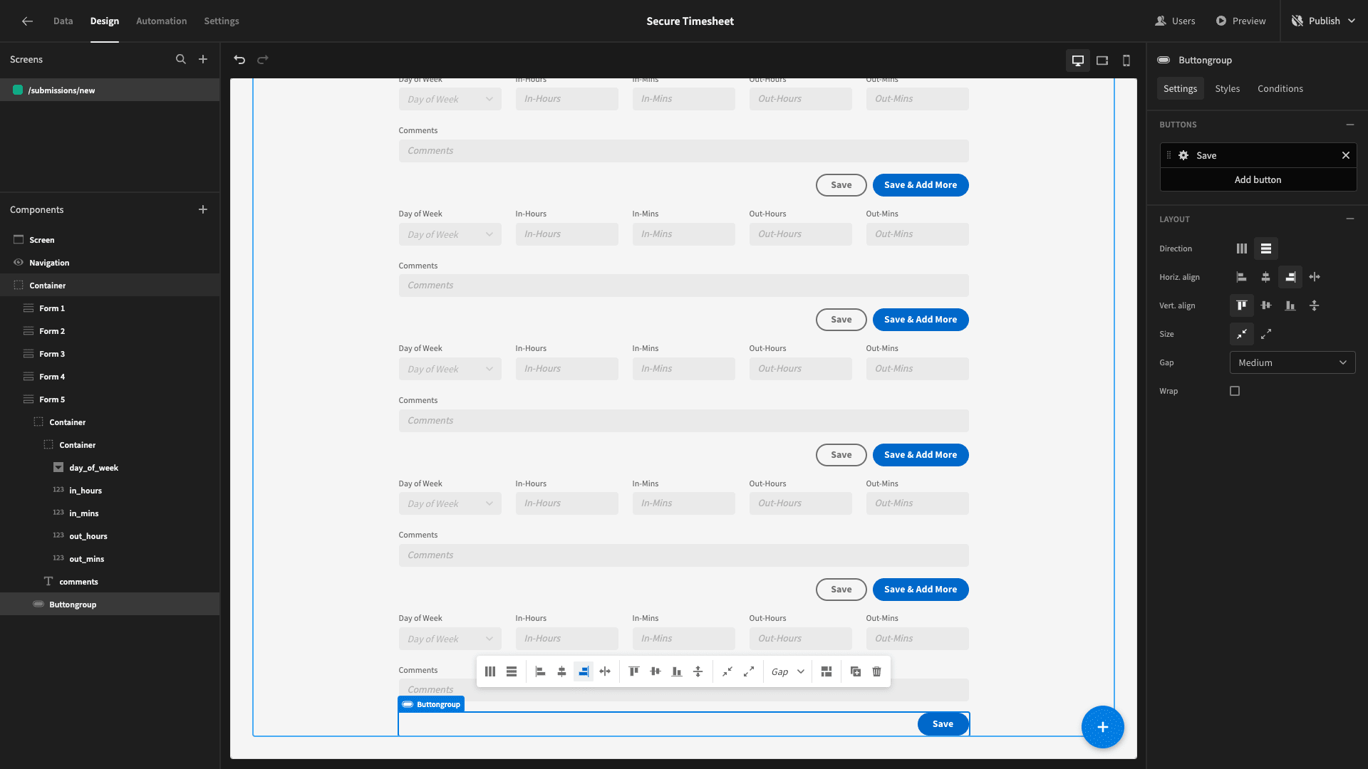
Within this, we’ll replace the Update State action with one that navigates to a screen called /submissions. We’ll be building this in the next step. We’ll add the same action to each of our secondary save buttons, too.
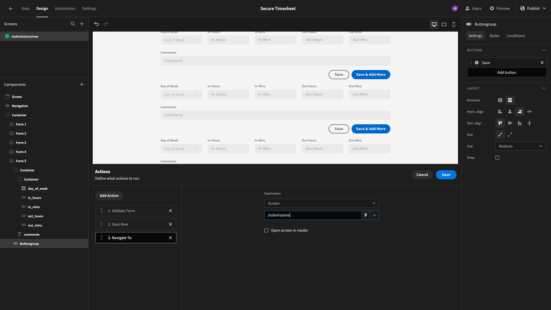
We can also declutter our UI by setting conditions to hide each of our Button Group Components when its respective form becomes disabled.
Here’s how our secure timesheet form will look if a user fills in all five rows:
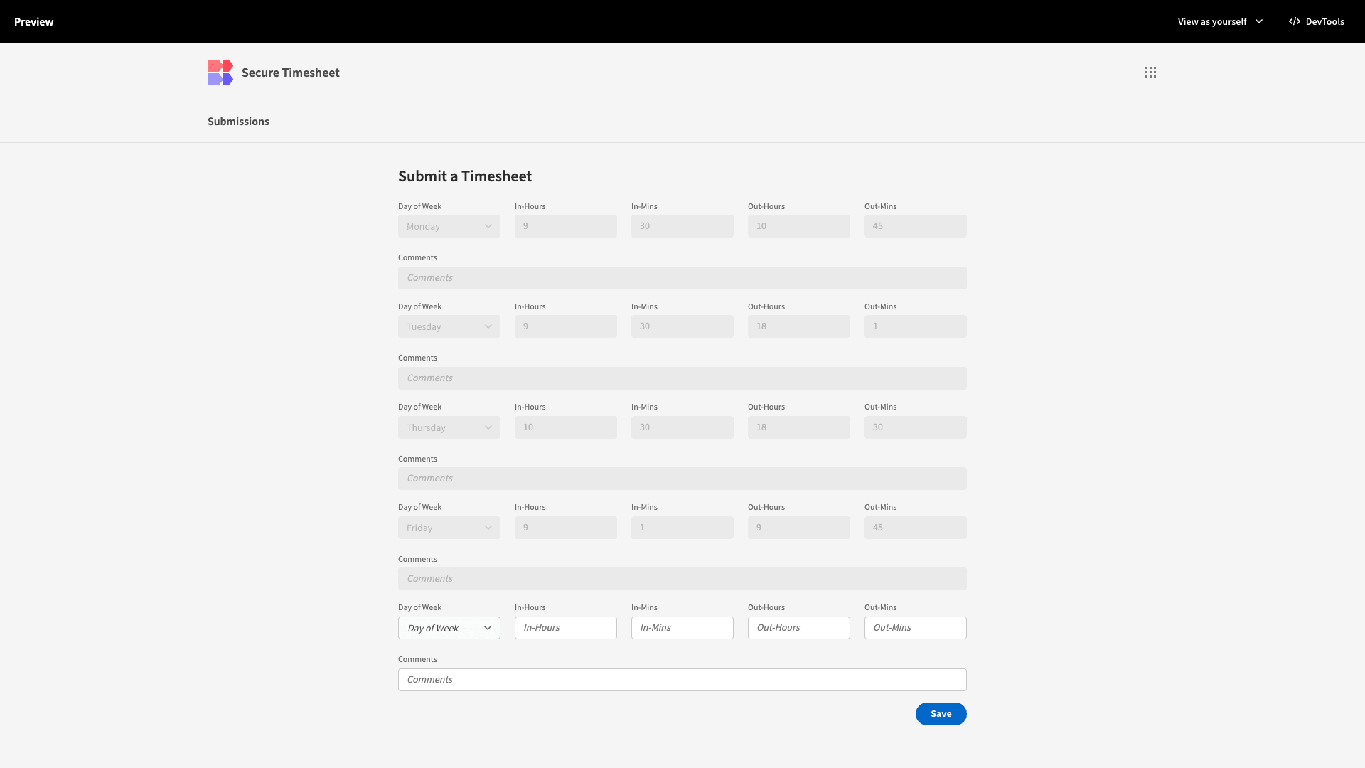
And that’s our form finished!
4. Viewing existing timesheets
Next, we’re going to add a screen where users can view their existing timesheet submissions for the current week.
Add a new screen, this time selecting the Table option instead of starting from scratch. You’ll then be prompted to choose which data source you want to point this at - although our app only has one:
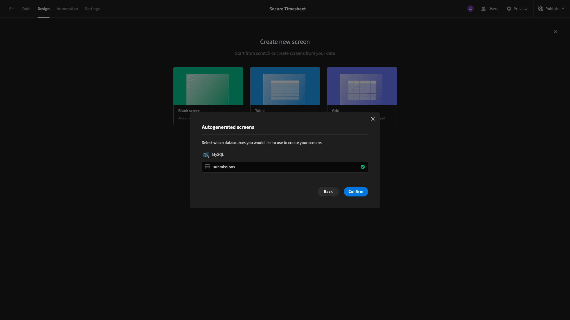
This will automatically be given the path /submissions - so when a user completes our form, they’ll be directed here.
Here’s what’s generated:
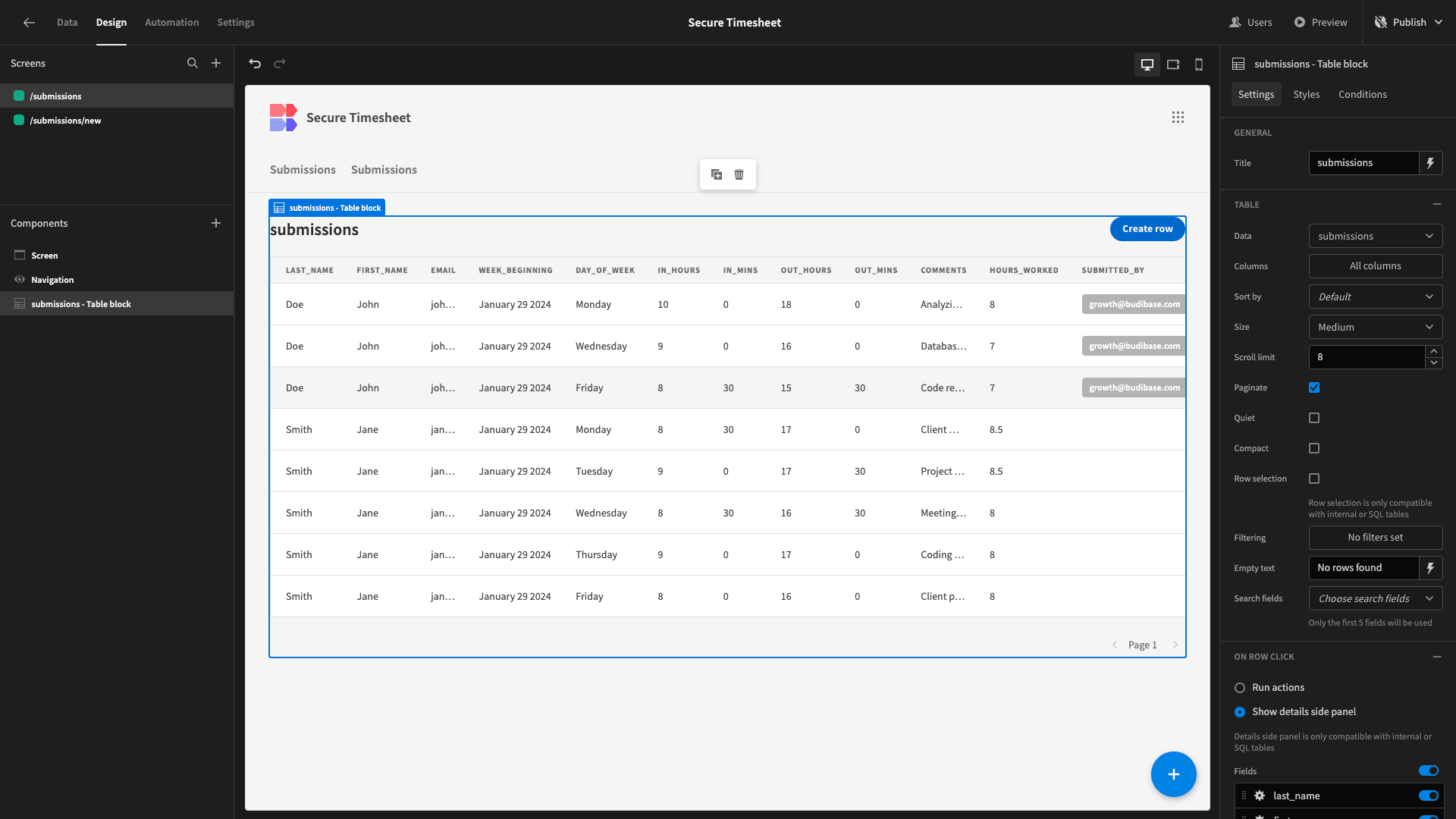
This is a fully functioning CRUD UI. There are side-panel forms where users can create or edit rows - although we’re not going to use these today.
All we want this screen to do is display a record of the current user’s timesheets - and enable them to navigate to the submission form.
We’ll start by adding a navigation action to our button instead of opening the side panel:
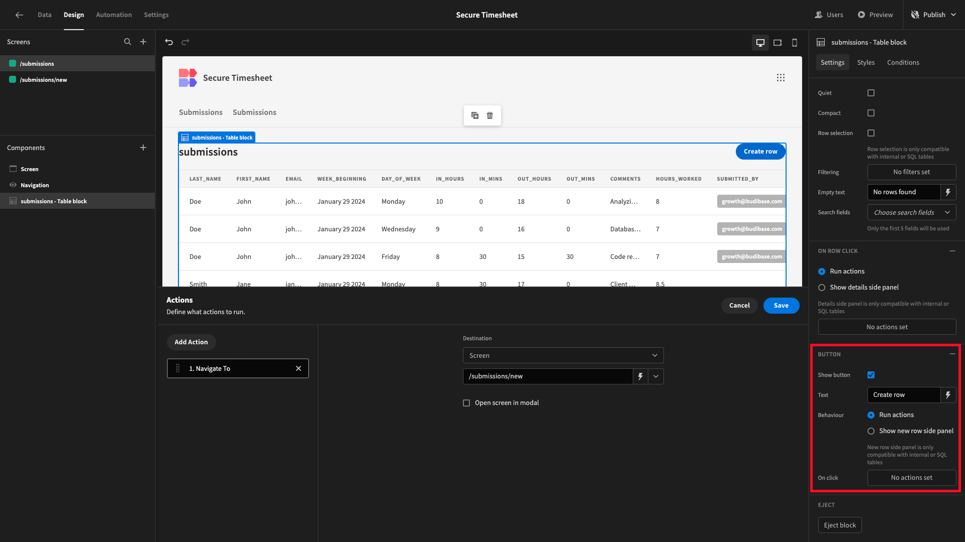
We’ve also set the On Row Click option to Run Actions - without actually setting any actions. This simply disables our Update form side panel, as we don’t want users to edit their own timesheets after the fact.
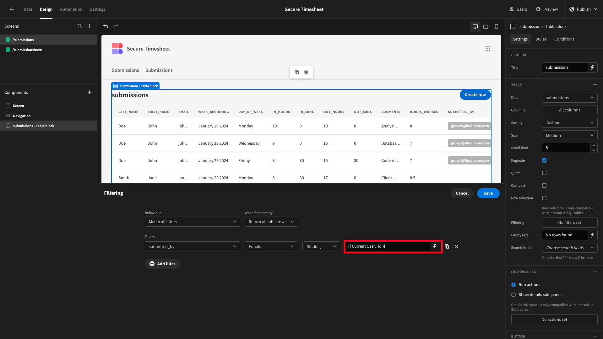
Next, we’re going to add some filter expressions to control which data each user can view.
We’ll open the filters drawer and create a rule so that we only display rows where the submitted_by attribute matches the _id of the current user:
We’ll also capitalize our title:
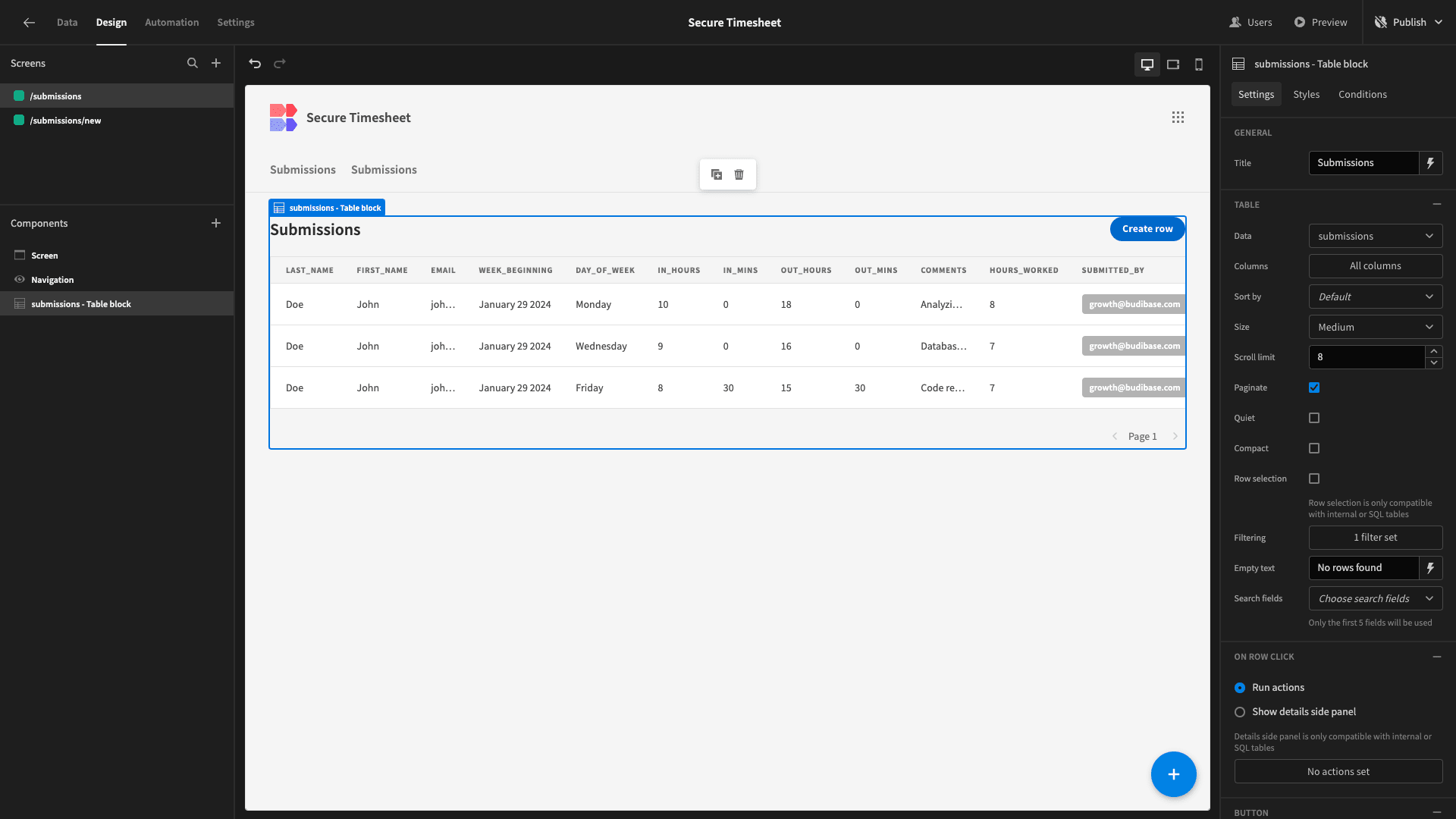
Our table still looks a little bit cluttered. In fact, it’s showing us some slightly redundant information. That is, the user doesn’t need to see their own details on each row.
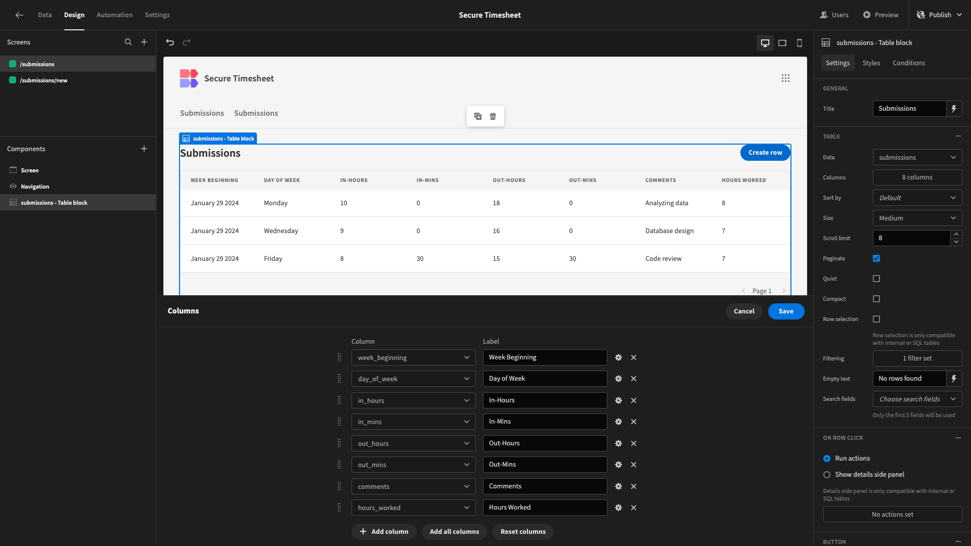
So, in the columns drawer, we’ll remove any attributes that are identical for every row. We’ve also stylized the labels for the remaining columns with spaces and capital letters:
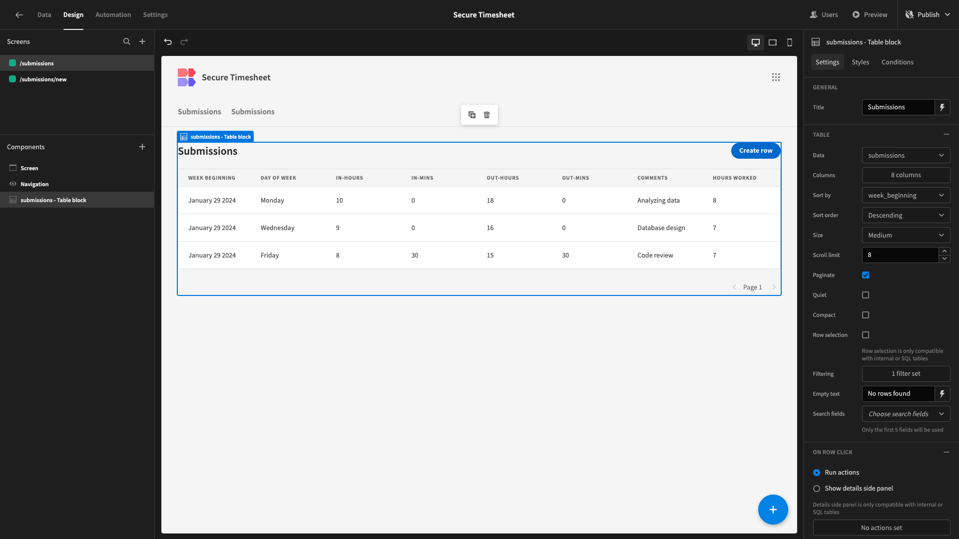
And that’s our screen completed:
5. Design tweaks and publishing
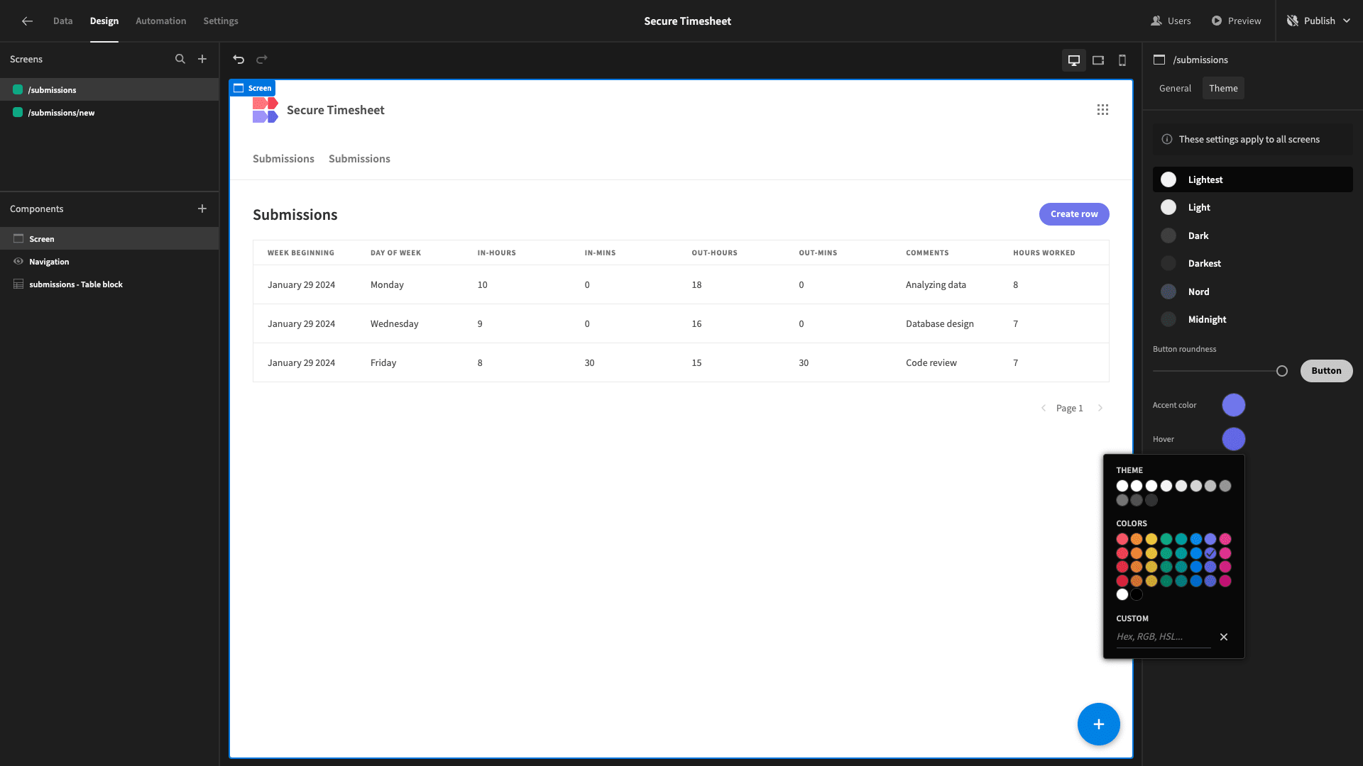
Before we push our app live, we’re going to make a few minor tweaks to its design. Firstly, under Screen and Theme, we’ll adjust the Lightest option:
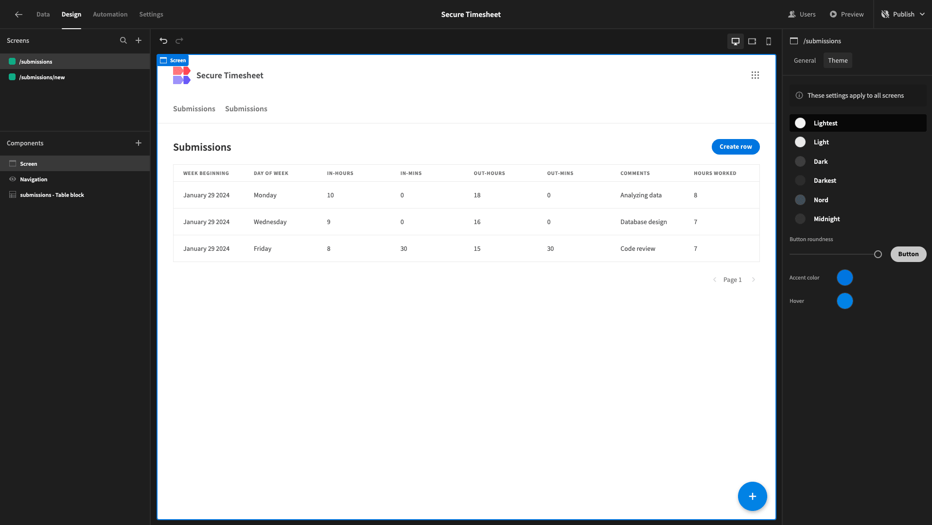
We’ll also update our button colors to purple instead of blue for a little bit more of a distinct feel:
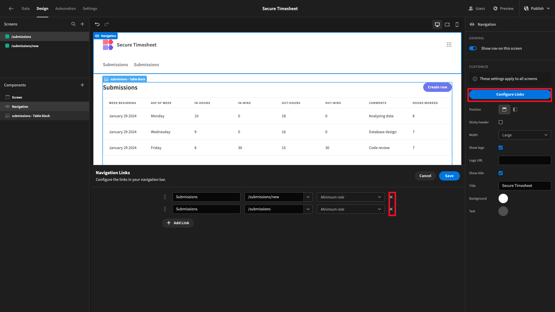
Lastly, hit Configure Links under Navigation. We’re going to remove the links from our nav bar altogether to simplify our UI - since users can already navigate between our two screens with button actions:
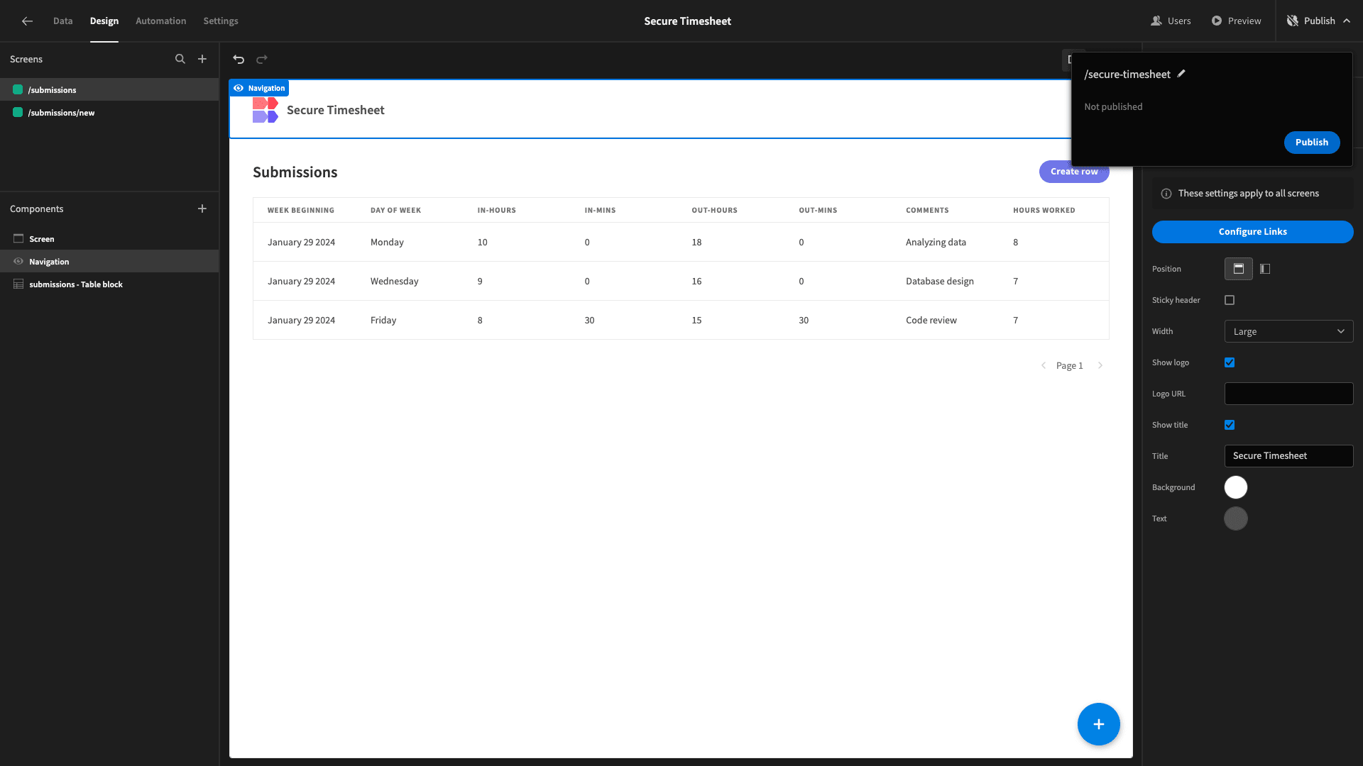
When you’re ready, you can hit publish to push your application live:
Here’s what our completed secure timesheet form will look like:

If you enjoyed this article, check out our guide to building a change request form .