How to Build a Warehouse Dashboard
If you carry physical products - your warehousing solutions are right at the center of your business. Warehouse dashboards provide much-needed visibility into your performance across a huge range of KPIs.
Situations can change quickly - so it’s critical that decision-makers have fast, reliable access to important insights.
Dashboards are the perfect solution for furnishing teams with repeatable reporting - while also eliminating the need for manual analytical work.
Today, we’re going to see how Budibase can be used to build custom dashboards around existing data sources - saving your team hours of development work at the same time.
But first, let’s get a little bit of background.
What is a warehouse dashboard?
A dashboard is a reporting UI that displays pre-configured, real-time reports based on whatever data source we connect it to - usually with a combination of charts, cards, tables, and other display elements.
Additionally, we’ll typically store and use custom queries in order to aggregate and transform our data into the insights we need.
In the case of a warehouse dashboard, this could include data surrounding your inventory, fulfillment, supply chain, sales, returns, breakage, incidents, customer complaints, or other core internal logistical processes.
This could be a combination of historical, current, and projected values.
Ultimately, the goal is to create a resource that decision-makers can access whenever they need it to access the most up-to-date data about your warehouse KPIs.
What are we building?
Our example will be primarily focused on three things:
- Returns.
- Complaints.
- Inventory levels.
You can also check out our previous tutorial on how to build an inventory dashboard.
We’re going to build this around four tables from an existing Postgres database - containing details of our inventory, sales, returns, and complaints.
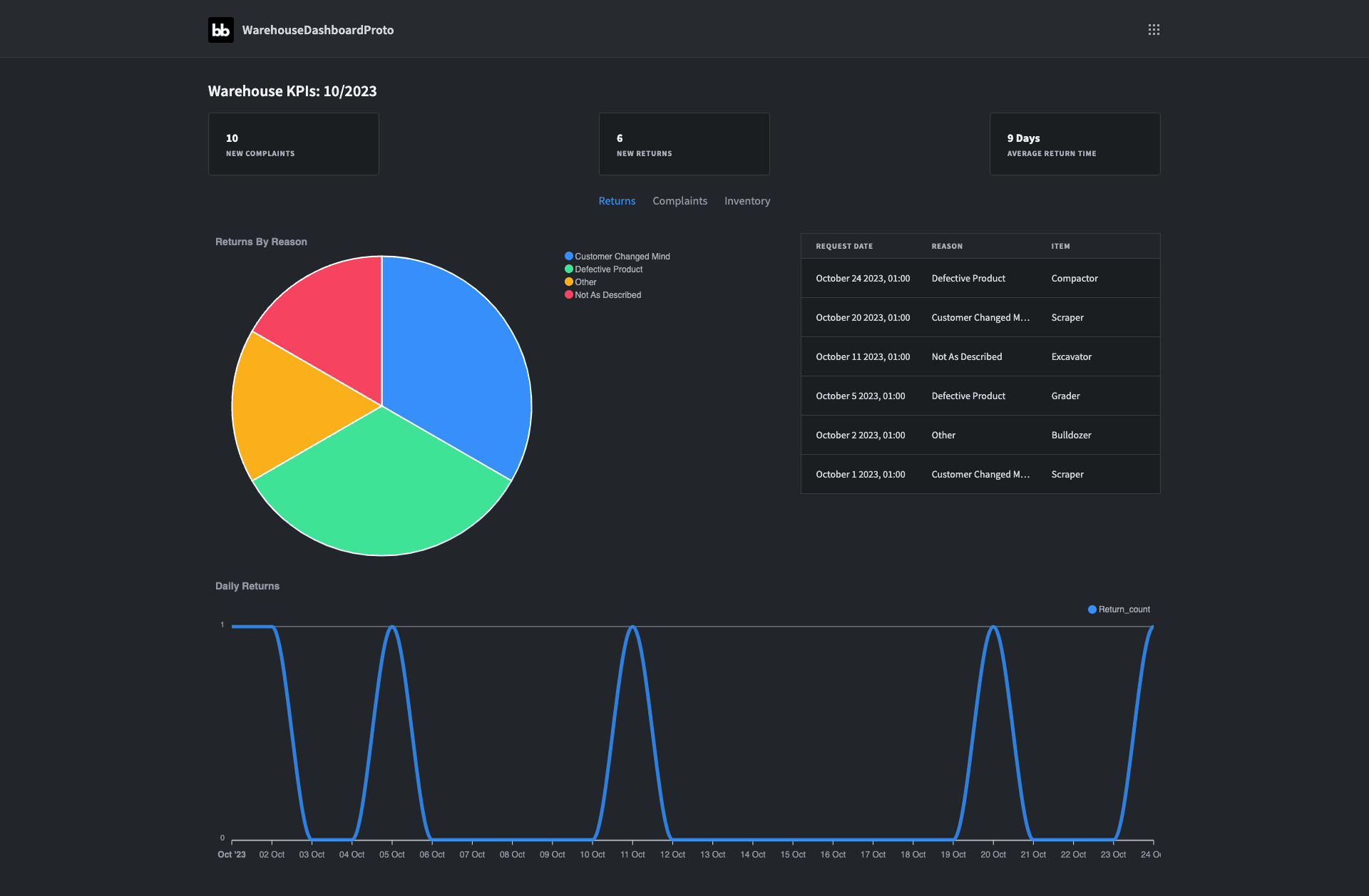
Our warehouse dashboard will be a single-screen app. At the top, we’ll use summary cards to display the current month’s figures on some of our overarching KPIs.
Below this, we’re going to use tabbed containers to enable users to flick between more detailed insights into our returns, customer complaints, and inventory levels.
Here’s what this will look like:
Let’s start building.
How to build a warehouse dashboard in 6 steps
If you haven’t already, go ahead and create a free Budibase account.
1. Create a new Budibase app and configure your data
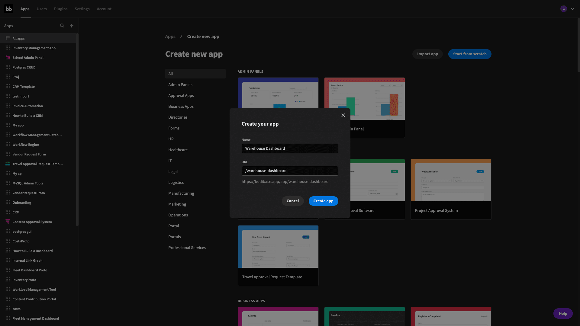
The first thing we need to do is create a new Budibase application. We’re going to start from scratch but we also have the option of importing an existing app or using one of Budibase’s templates.
We’re asked to give our new app a name. This will also be used to populate our URL extension, but we can overwrite that if we need to:
Then we need to choose a data source:
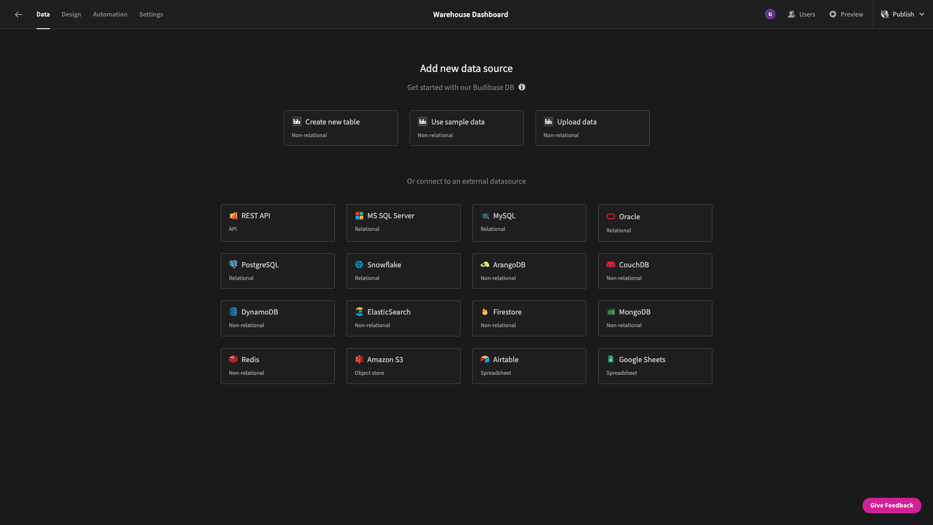
Budibase offers dedicated connectors for a range of SQL and NoSQL databases, alongside Google Sheets, REST, our internal table, and custom data sources. This gives us huge flexibility for creating dashboards with external data.
As we say, we’re going to use an existing PostgreSQL database. When we choose a data source, we’re prompted to enter our credentials on this configuration page:
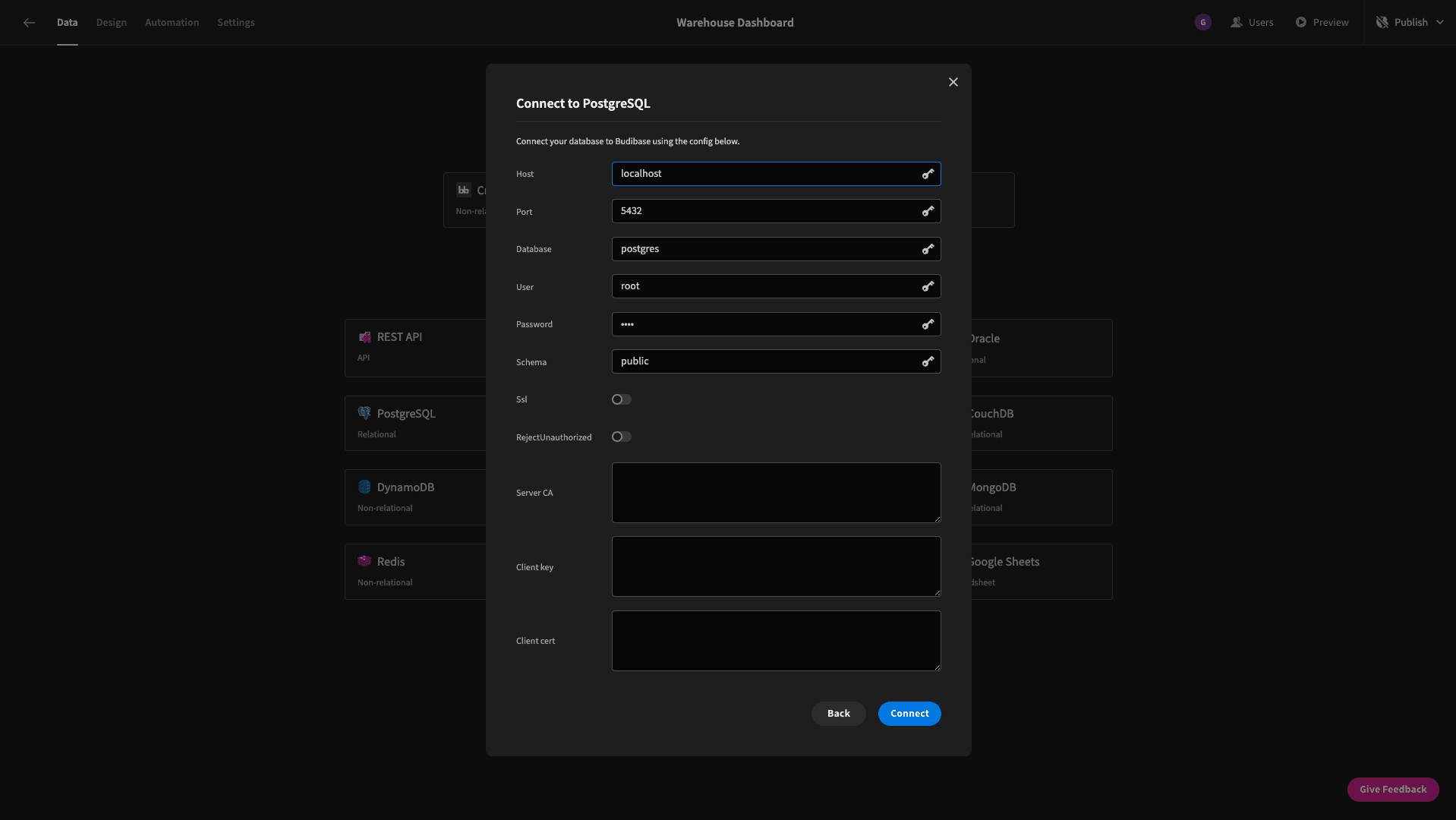
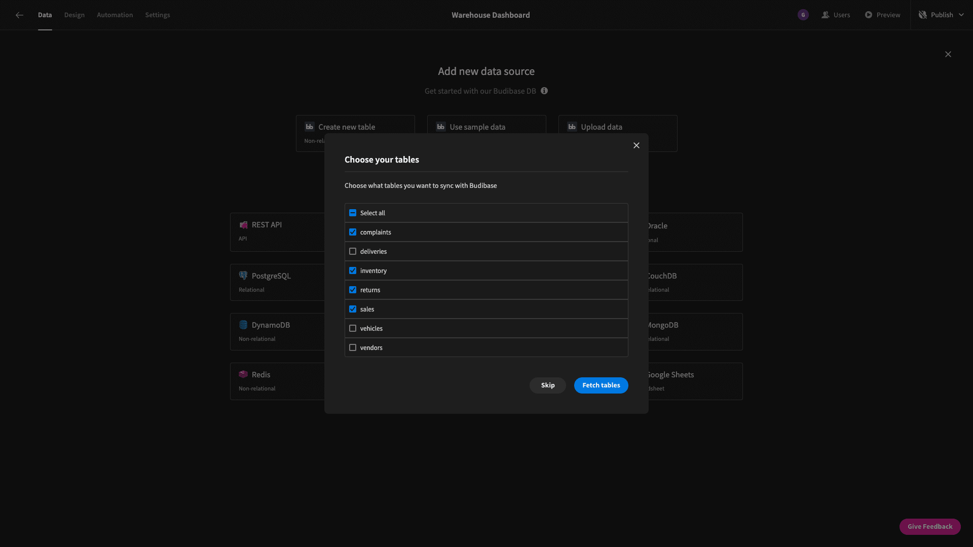
Our database has a bunch of tables - not all of which we need. Budibase gives us the option to choose which tables we want to fetch from a connected database. This will let us use these tables in our warehouse dashboard.
As we said earlier, the ones we want are called inventory, sales, returns, and complaints:
When we fetch a table in Budibase, we can immediately perform full CRUD functionality within the data section. We can even edit the schema here.
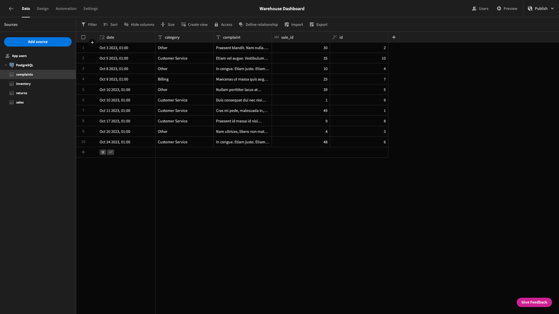
For example, we can add, edit, or delete columns. We could also configure existing relationships - although we’re going to handle this within our SQL syntax instead today.
We do want to make a couple of changes though. There are columns in the complaints and returns table called category and reason, respectively. These are currently text fields, but we want them to be options - just for easier visual recognition in the back end.
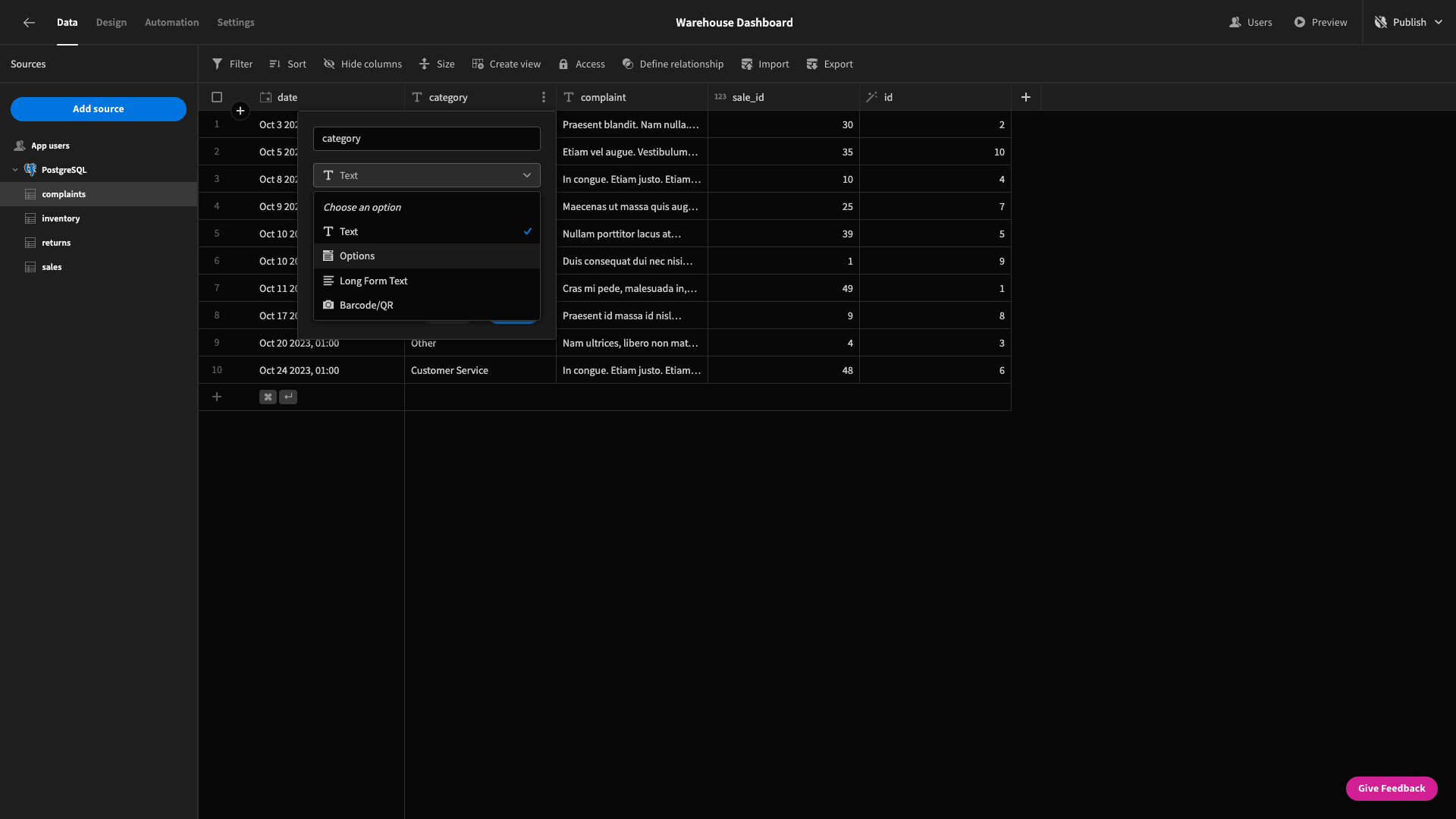
We can then manually input the possible options:
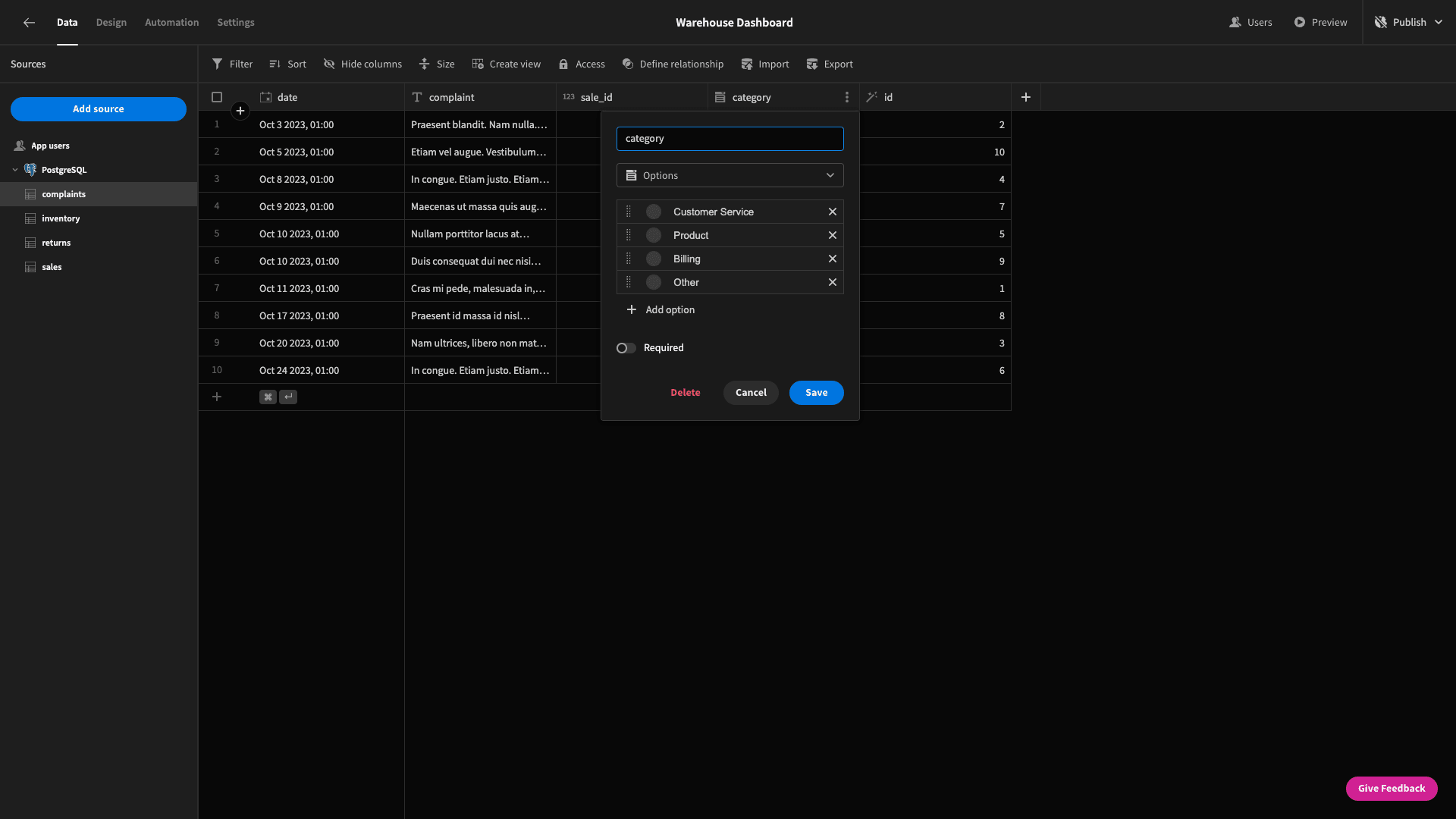
And now we have color-coded entries, for easier recognition:
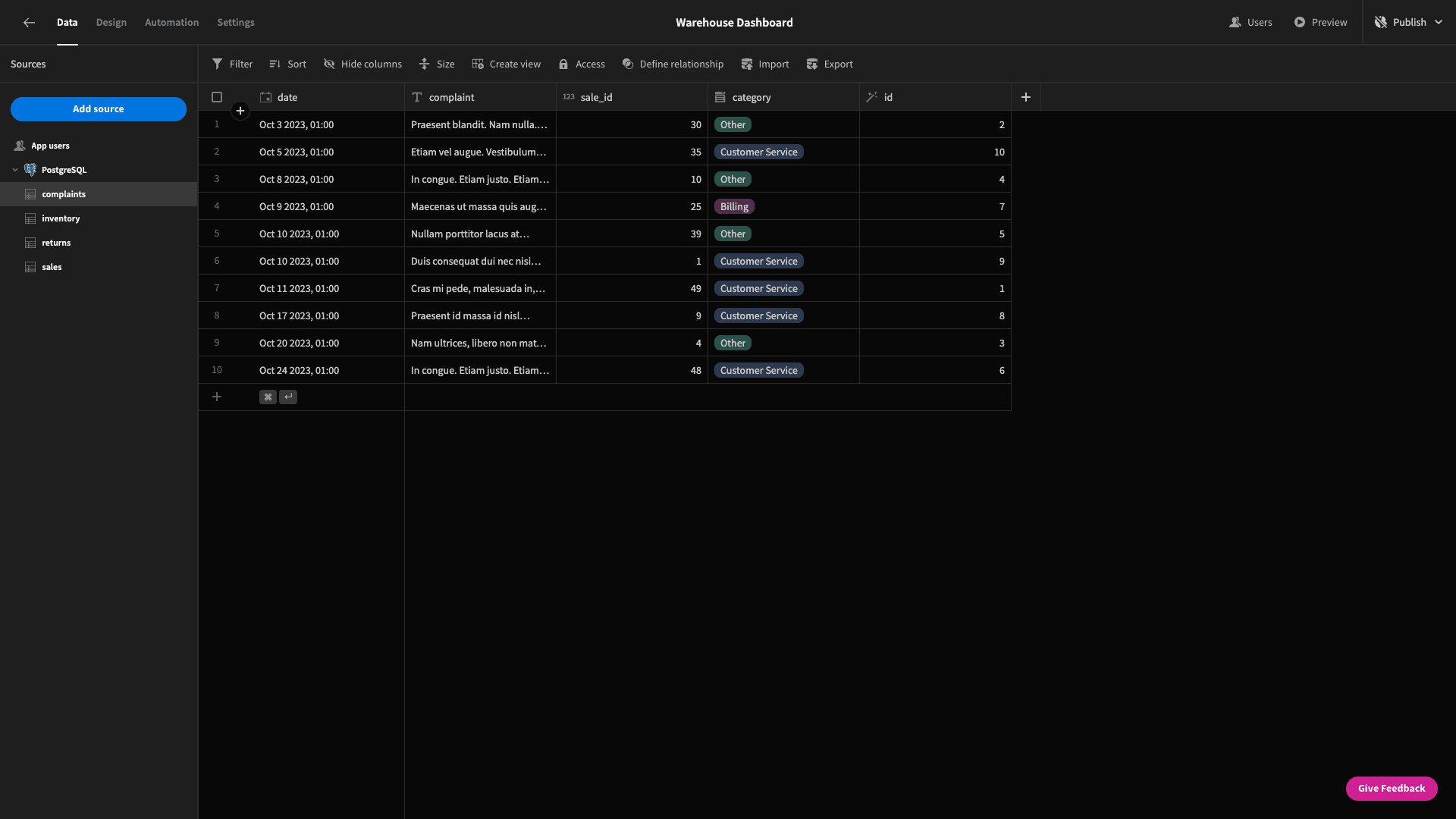
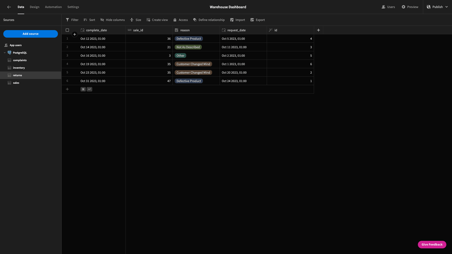
We’ll repeat this step for the reason attribute on the returns table too.
Our inventory table has two numerical columns called quantity and unit_cost. The other change we want to make to our data model is to insert a formula variable to calculate the stock_value for each item in our inventory.
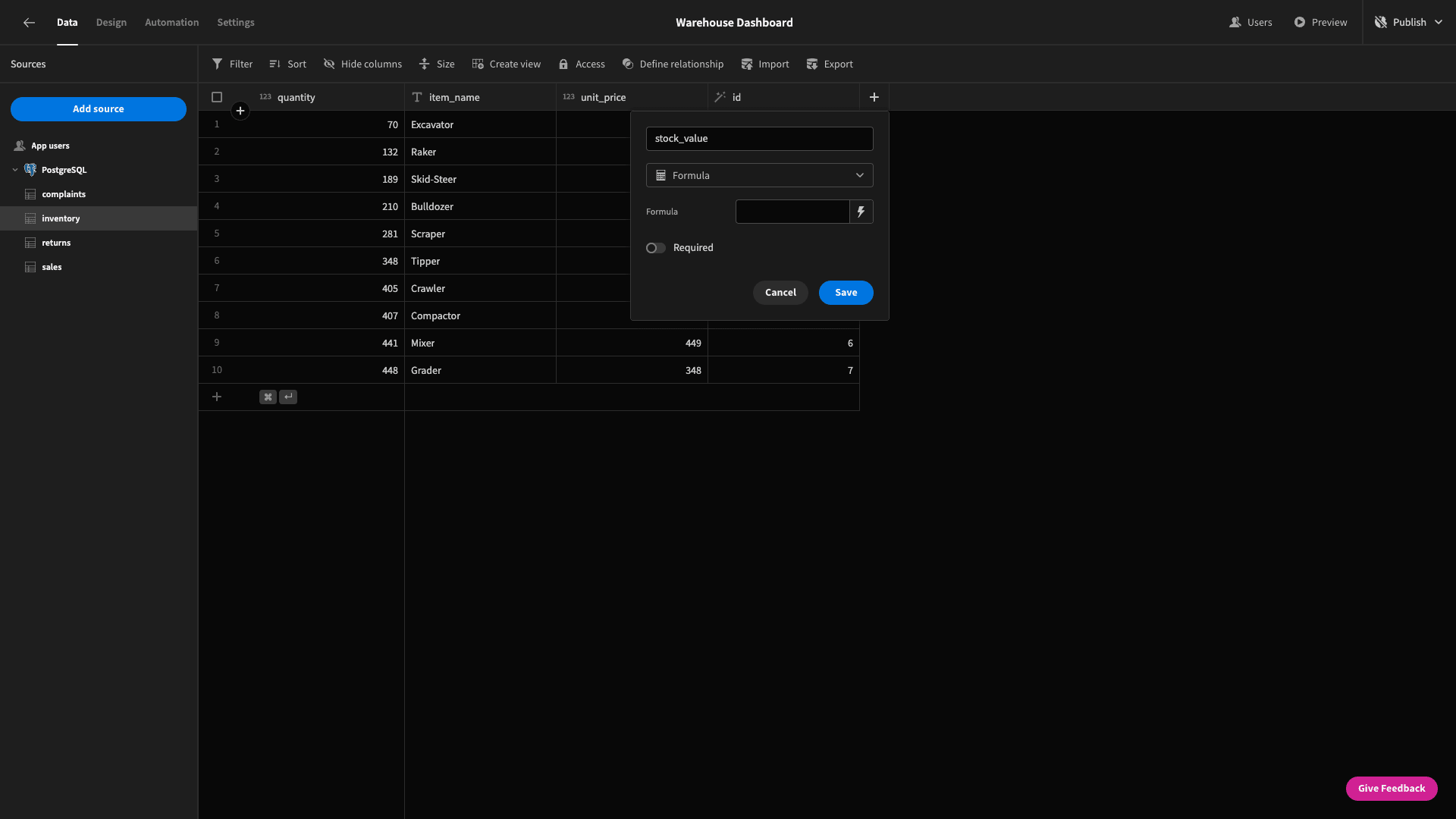
We can insert formulae using handlebars expressions or custom JavaScript. In both cases, we’ll have full access to use all of the other attributes in our column as variables:
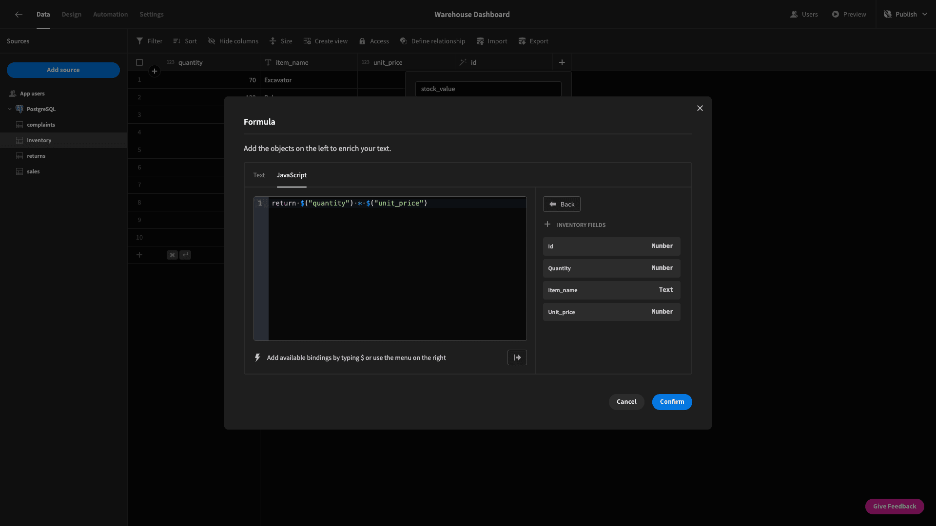
We’re using the following JavaScript:
1return $("quantity") * $("unit_price");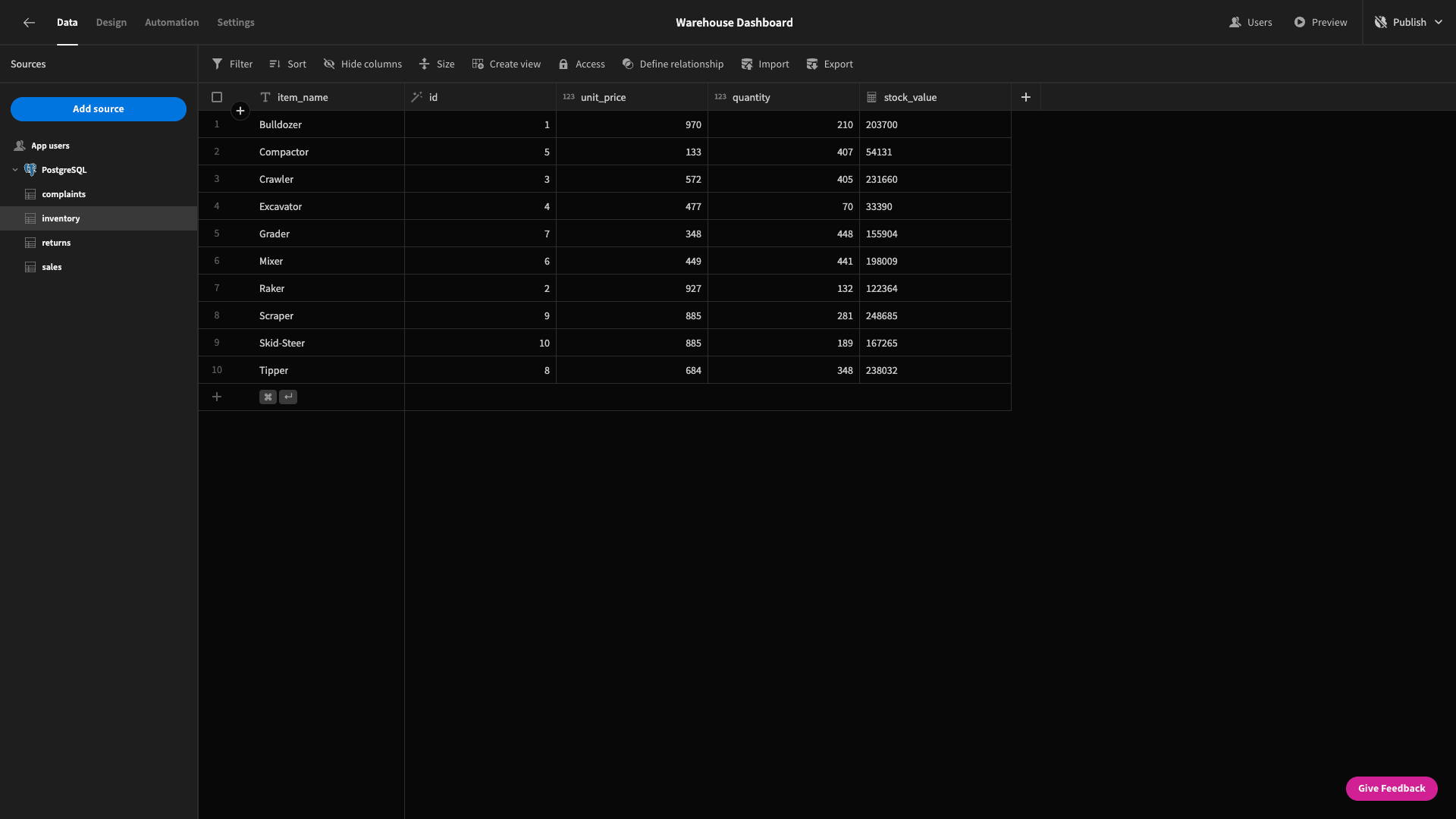
And that’s our data model completed!
2. Summary cards
So, let’s start building our warehouse dashboard UI. Head to the design tab, and create a new blank screen.
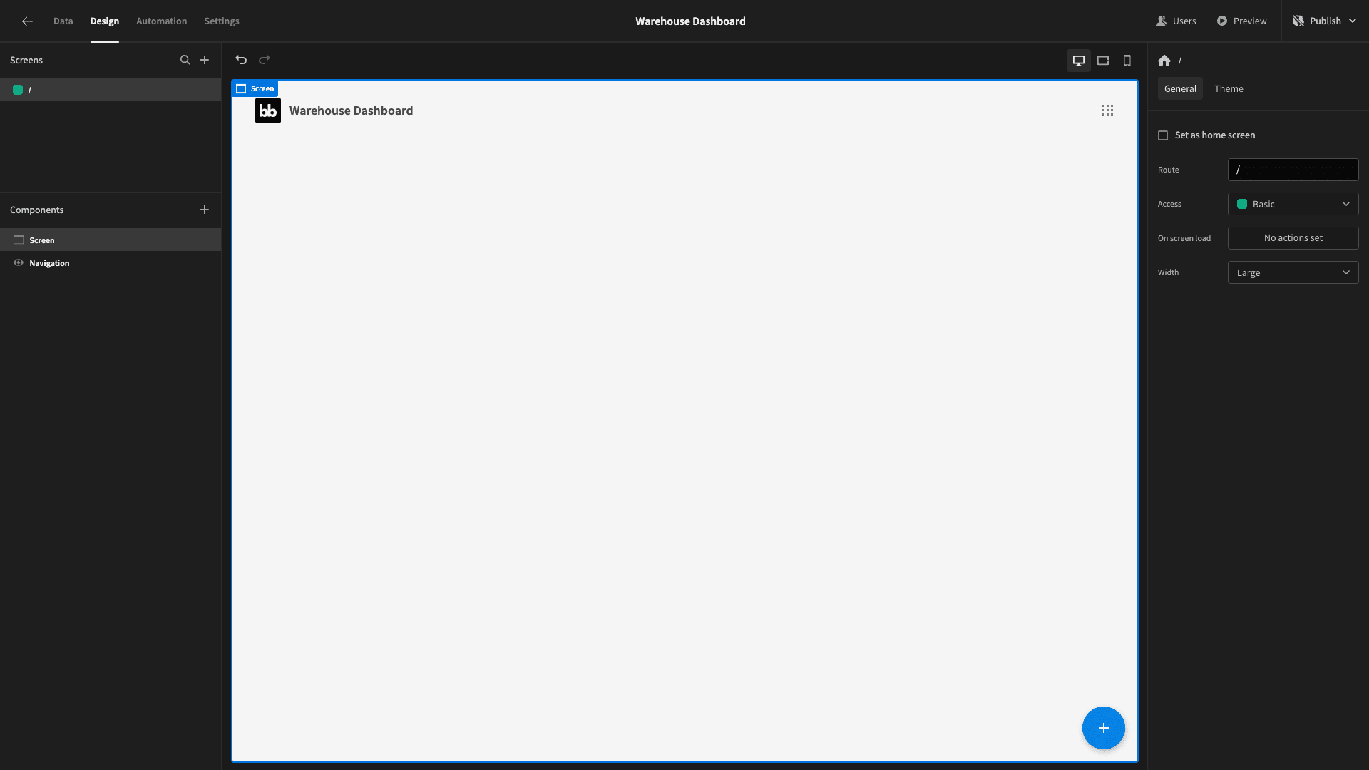
If you recall our screenshot of the finished product from earlier - the first thing we have is a headline that reads Warehouse KPIs: and the current date, formatted as MM/YYYY.
So, add a headline component. We can then use the lightning bolt icon beside its text field to open a bindings drawer:
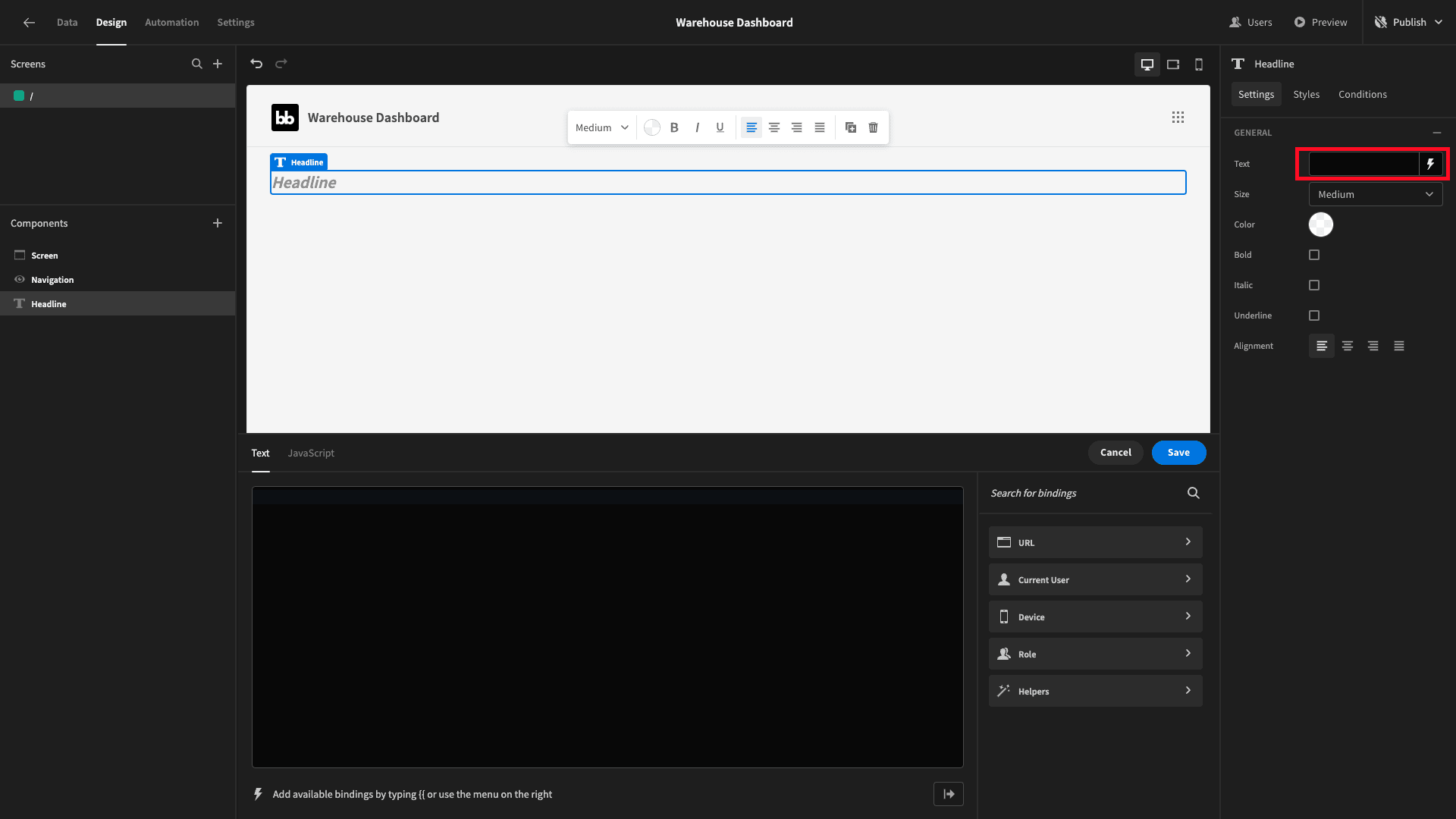
We want to use some JavaScript that will get the current month and year and stylize this into our string:
1const currentDate = new Date();
2
3return "Warehouse KPIs: " + (currentDate.getMonth() + 1) + "/" + currentDate.getFullYear();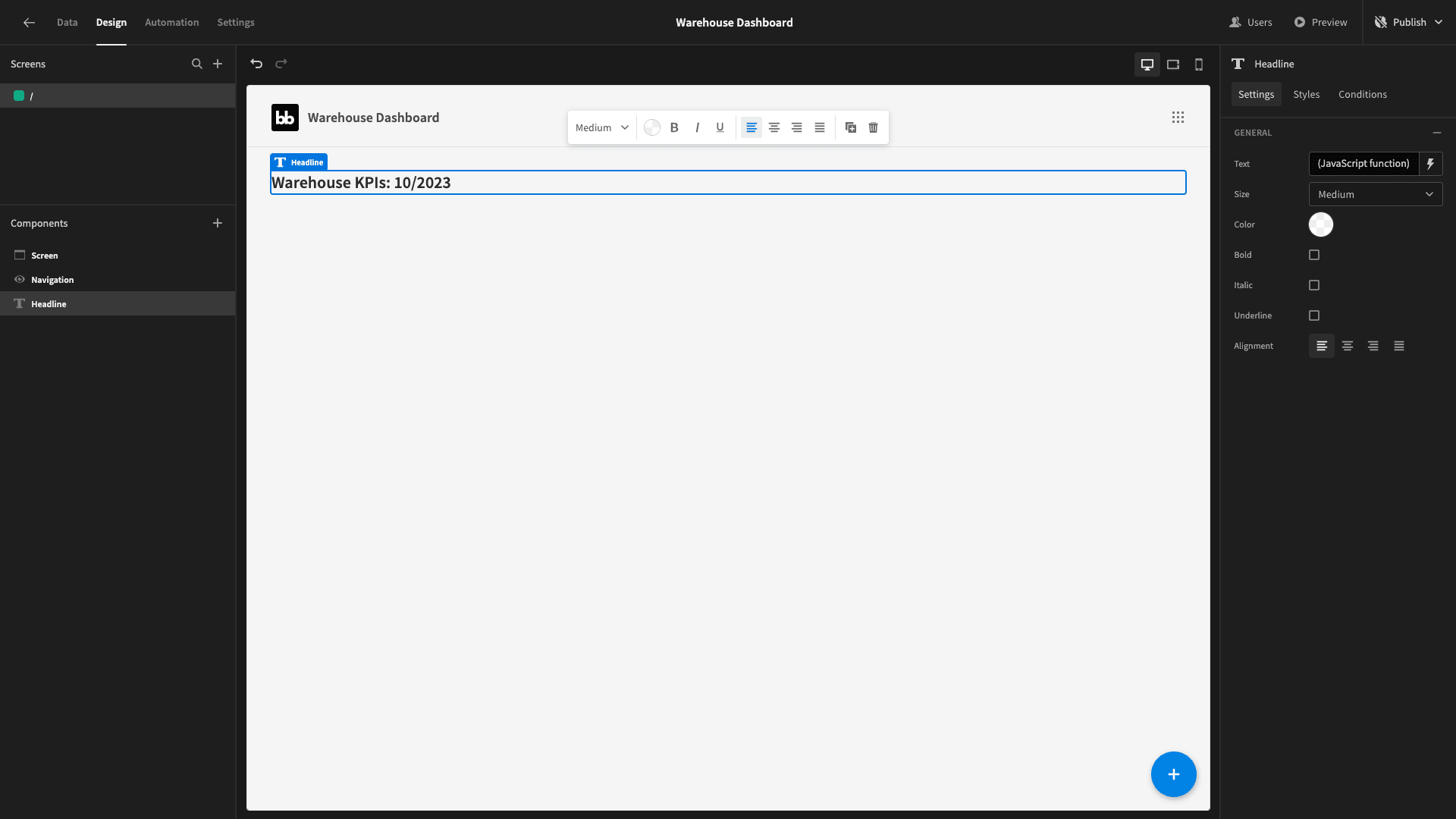
Great!
Beneath this, we’ll place a horizontal container, inside of which we’ll nest three cards blocks:
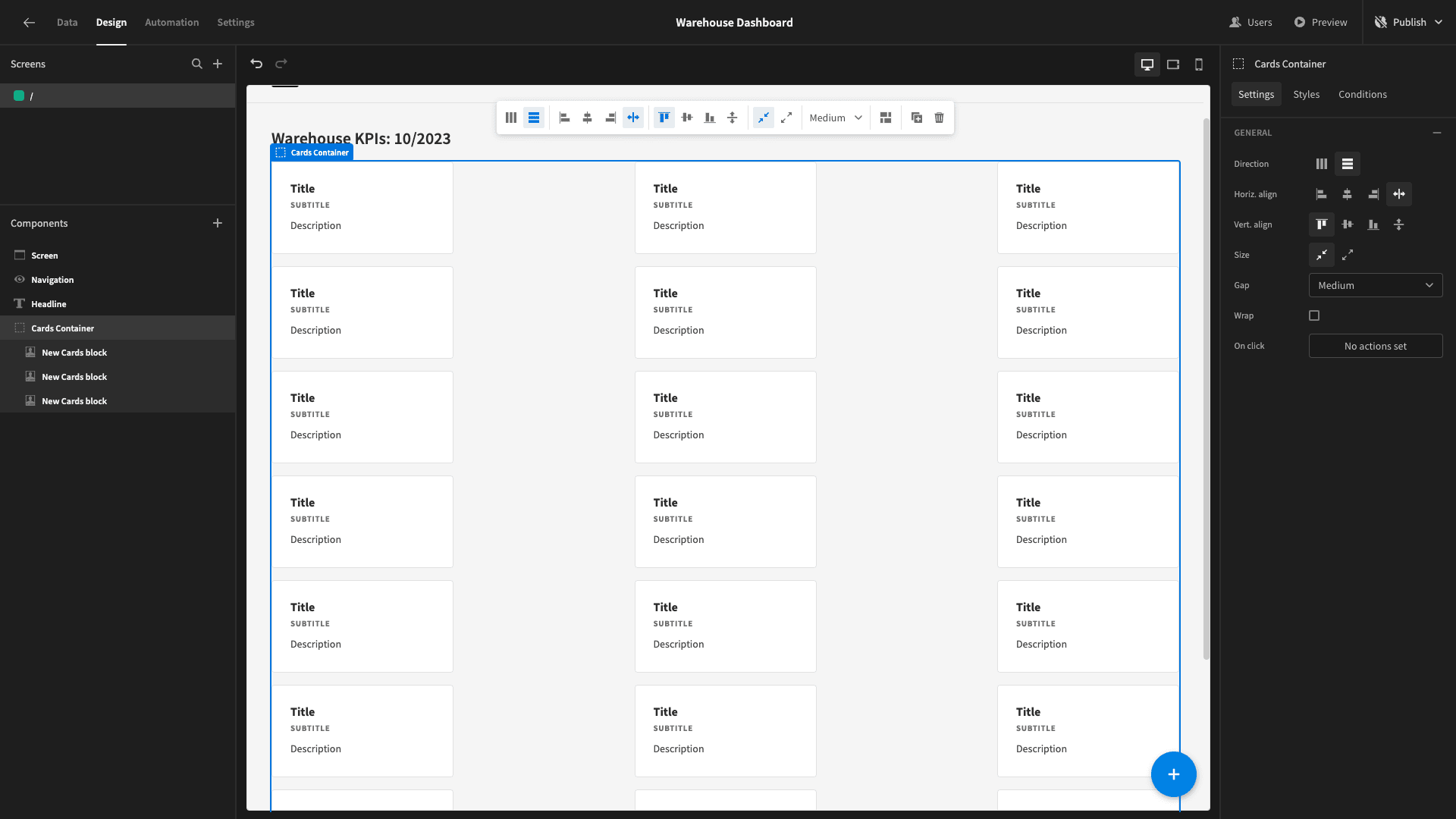
A cards block iterates over whatever data source we point it at and displays the values that we specify for each entry. When we’re done configuring these - each one will display a single card.
These will show the following metrics for the current month:
- The number of complaints we’ve received.
- The number of returns that have been requested.
- The average time between returns being requested and completed, in days.
To achieve this, we’ll need to start writing some custom queries.
We’ll take these one at a time. First, head back to the data section. Under our Postgres data source, we’re going to create a new query:
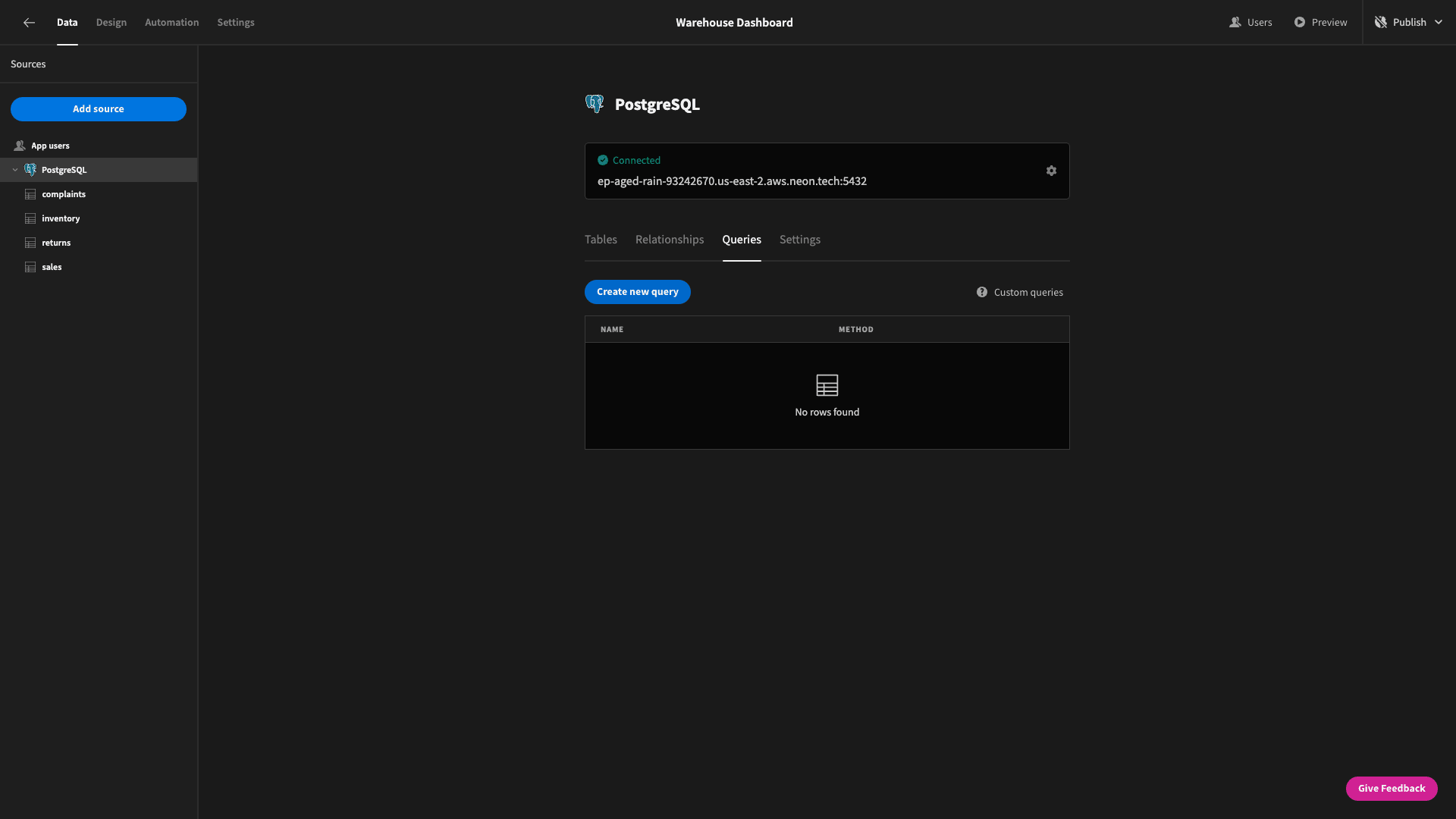
We’ll call this ComplaintsByMonth:

We need to SELECT three things from our complaints table:
- The month, extracted from the date attribute.
- The year, also extracted from date.
- The COUNT of our unique id attributes.
We’ll then group and order these by month and year.
So, our query is:
1SELECT EXTRACT(YEAR FROM c.date) AS year,
2
3 EXTRACT(MONTH FROM c.date) AS month,
4
5 COUNT(c.id) as complaint_count
6
7FROM complaints c
8
9GROUP BY year, month
10
11ORDER BY year, month;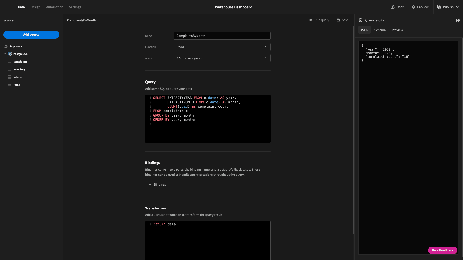
We get back data objects that look like this:
1{
2
3 "year": "2023",
4
5 "month": "10",
6
7 "complaint_count": "10"
8
9}
Hit save and head back to the design section.
We’ll point our first cards block at this new query:
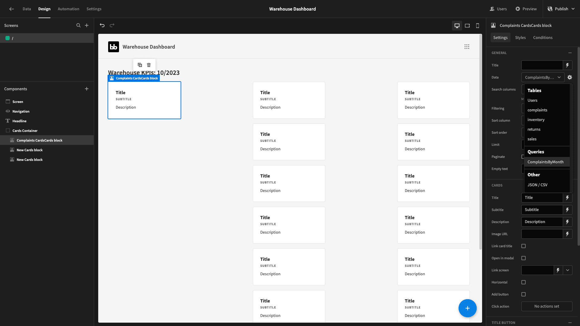
Now, this only shows one card - because our sample data only has a handful of complaints and they were all lodged in October 2023.
To future-proof this, we’ll need to add some filtering to only display the current month’s data.
Open the filter drawer and we’ll add two expressions - one for the month and one for the year.
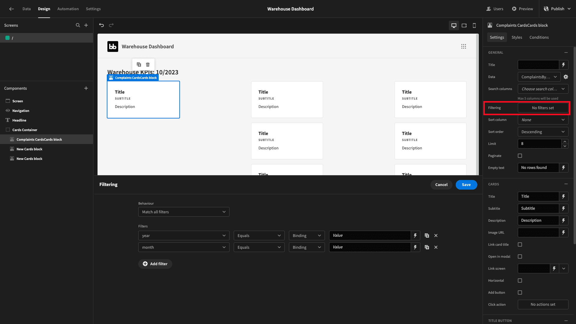
Again, we’re going to use JavaScript for both. So, we’ll set the month to:
1const currentDate = new Date();
2
3return currentDate.getMonth() + 1;
And the year to:
1const currentDate = new Date();
2
3return currentDate.getFullYear;
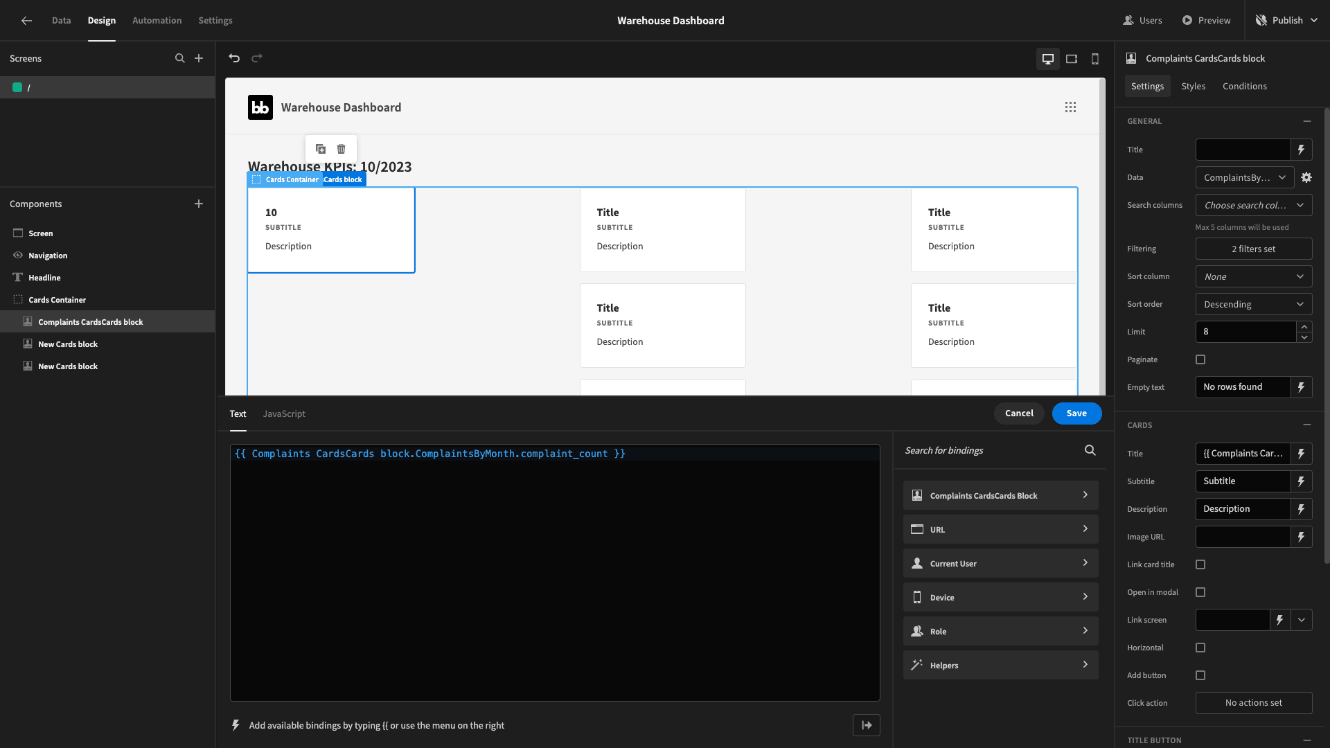
Now, we can start populating our card with values. We’ll use handlebars to bind the title to the complaint_count value from our query response:
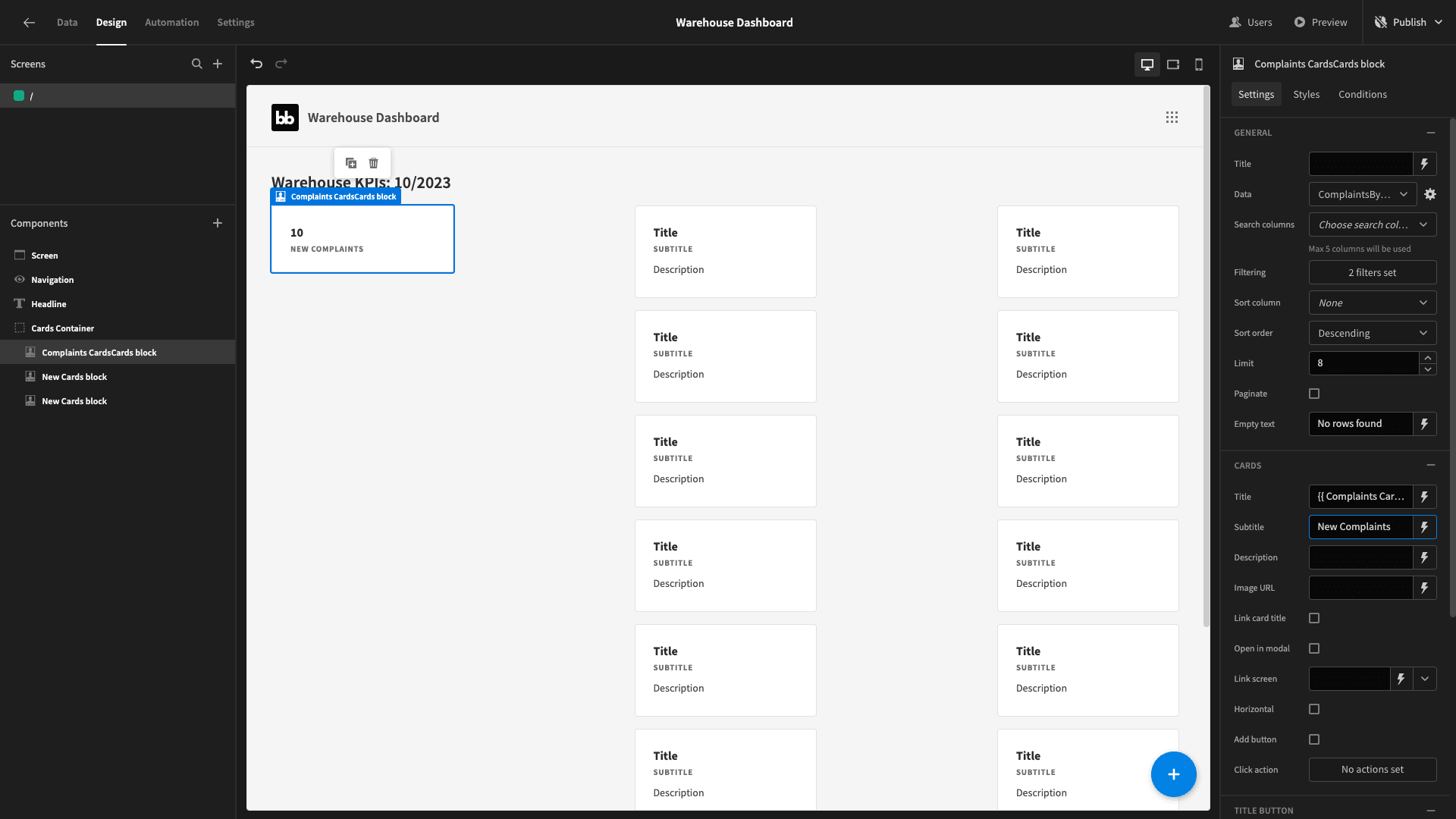
We’ll then add a descriptive subtitle and remove the description entirely:
We’ll repeat a similar process for our remaining two cards.
So, we’ll add another query called ReturnsByMonth. This is going to be very similar to our previous - only based around the returns table instead of complaints:
1SELECT EXTRACT(YEAR FROM r.request_date) AS year,
2
3 EXTRACT(MONTH FROM r.request_date) AS month,
4
5 COUNT(r.id) as returns_count
6
7FROM returns r
8
9GROUP BY year, month
10
11ORDER BY year, month;The response should look like this:
1{
2
3 "year": "2023",
4
5 "month": "10",
6
7 "returns_count": "6"
8
9}
We’ll follow the exact same steps to configure our next card for this query.
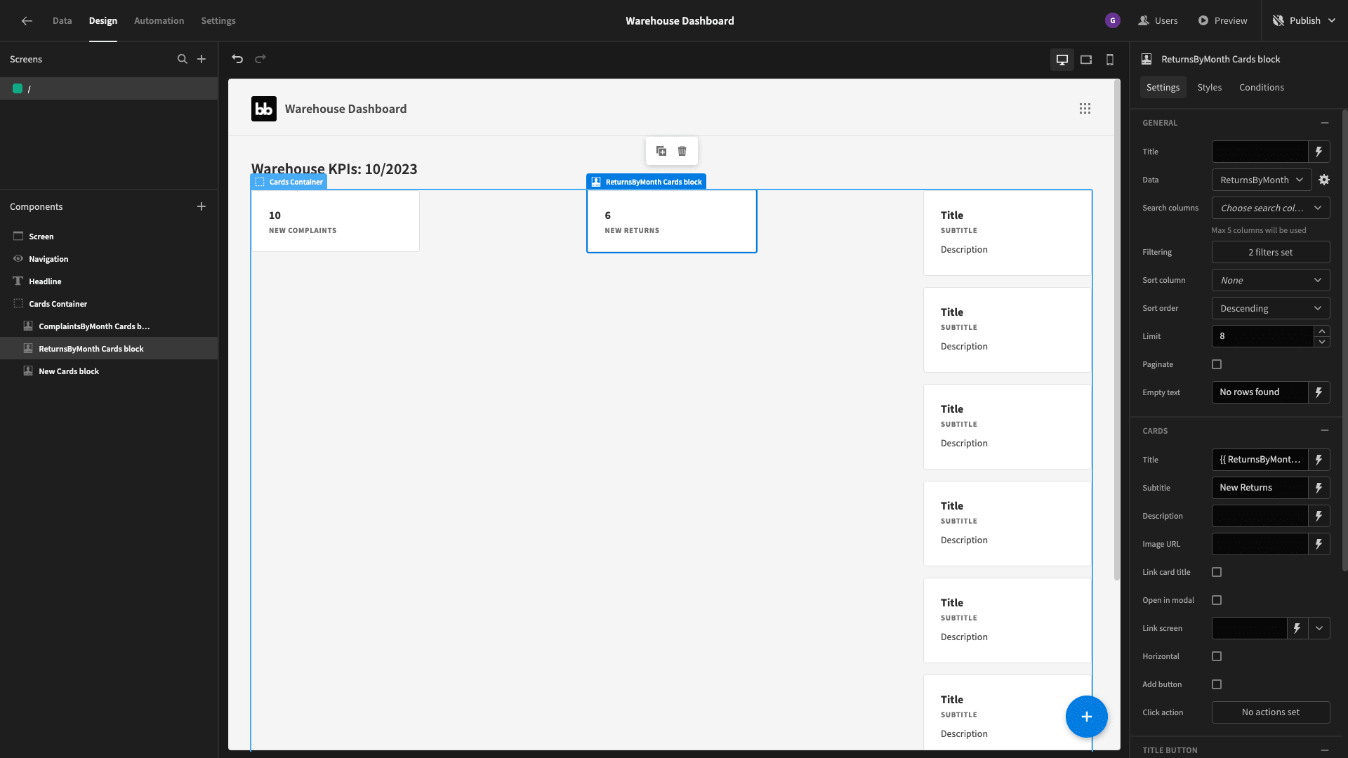
Our third card is a little bit more complex. Create a third query and call it ReturnLeadTime. We’re going to handle the month and year in exactly the same way.
We’re also going to use AVG and DATE_PART expressions to calculate the average difference between the request_date and complete_date attributes for the returns entries relating to each month.
The query is:
 1SELECT
 2
 3 EXTRACT(YEAR FROM request_date) AS year,
 4
 5 EXTRACT(MONTH FROM request_date) AS month,
 6
 7 AVG(DATE_PART('day', complete_date - request_date)) AS average_time_in_days
 8
 9FROM returns
10
11GROUP BY year, month
12
13ORDER BY year, month;
The response should look like this:
1{
2
3 "year": "2023",
4
5 "month": "10",
6
7 "average_time_in_days": 8.666666666666666
8
9}
We’ll point our third card at this query and use the exact same filtering expressions as before:
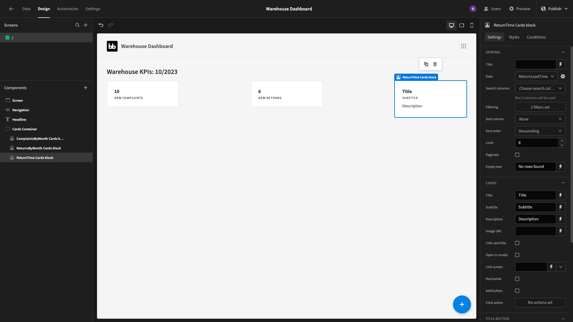
We’re going to stylize our data a little bit. So - this time our title will be the following handlebars expression:
1{{ round ReturnTime Cards block.ReturnLeadTime.average_time_in_days }} DaysAnd we’ll give it a descriptive subtitle too, giving us:

3. Adding tabs
Beneath our summary cards, we want users to be able to navigate between tabs to access more detailed information on each aspect of our warehouse dashboard. We could achieve this natively within Budibase using buttons and conditionality rules.
But, to make life easier, we’re going to use a custom plugin that our community has made.
It’s called Super Tabs.
Check out our plug-ins documentation to learn more about building your own custom components or importing community contributions.
We’ll add our tabs beneath our cards container. We’ve set the size to large and checked the boxes for centered, quiet, compact, and emphasized:
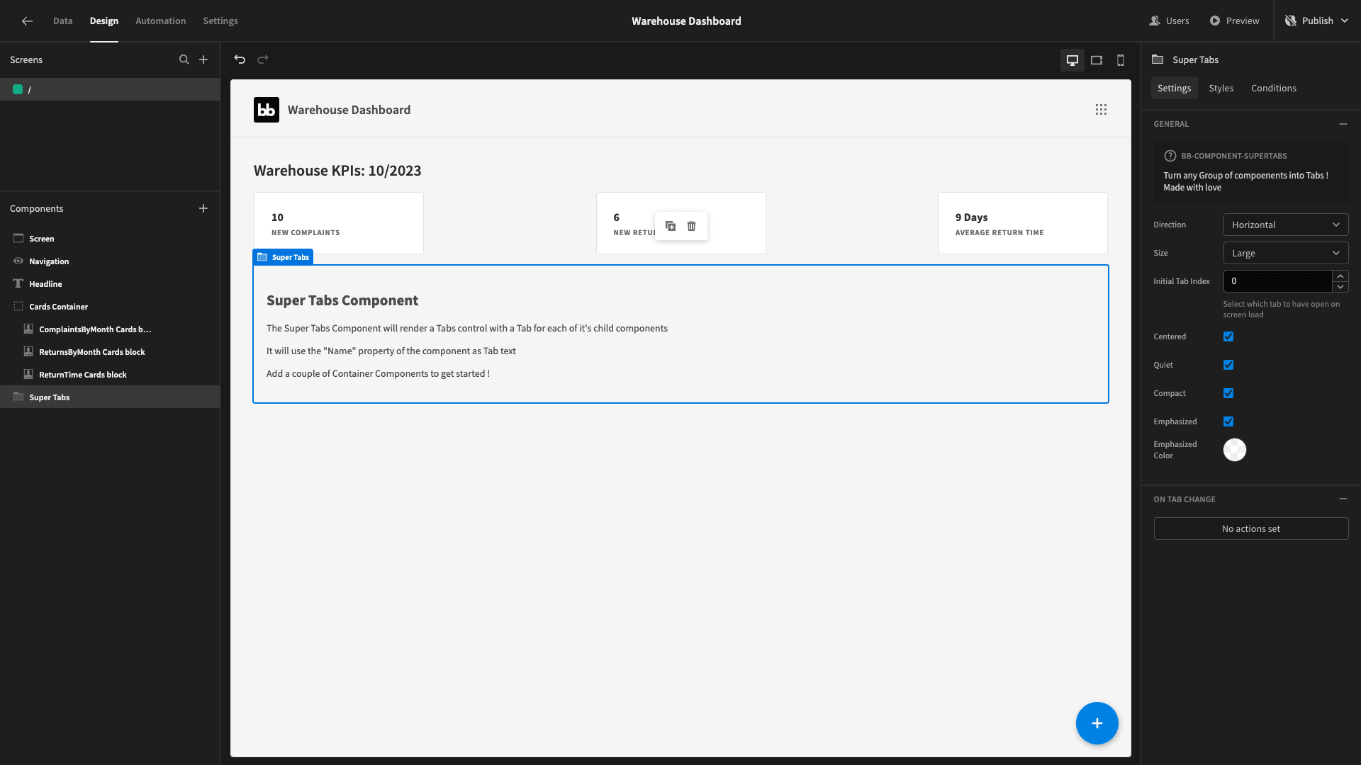
The way this works is that any components nested as immediate children of the super tabs component will have their names displayed as clickable links.
So, we’re going to add three vertical containers - called returns, complaints, and inventory.
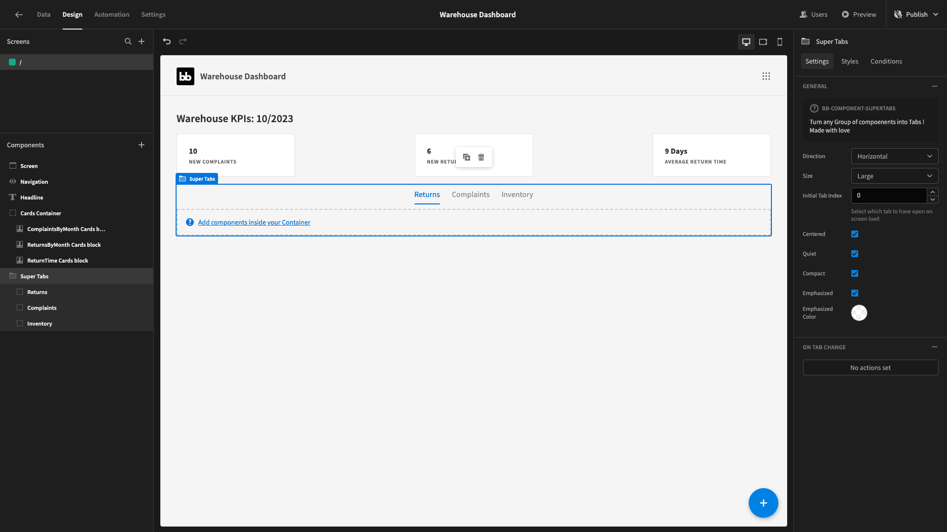
Now, we can start building our more detailed warehouse dashboard reports inside of these containers.
3. Returns reporting
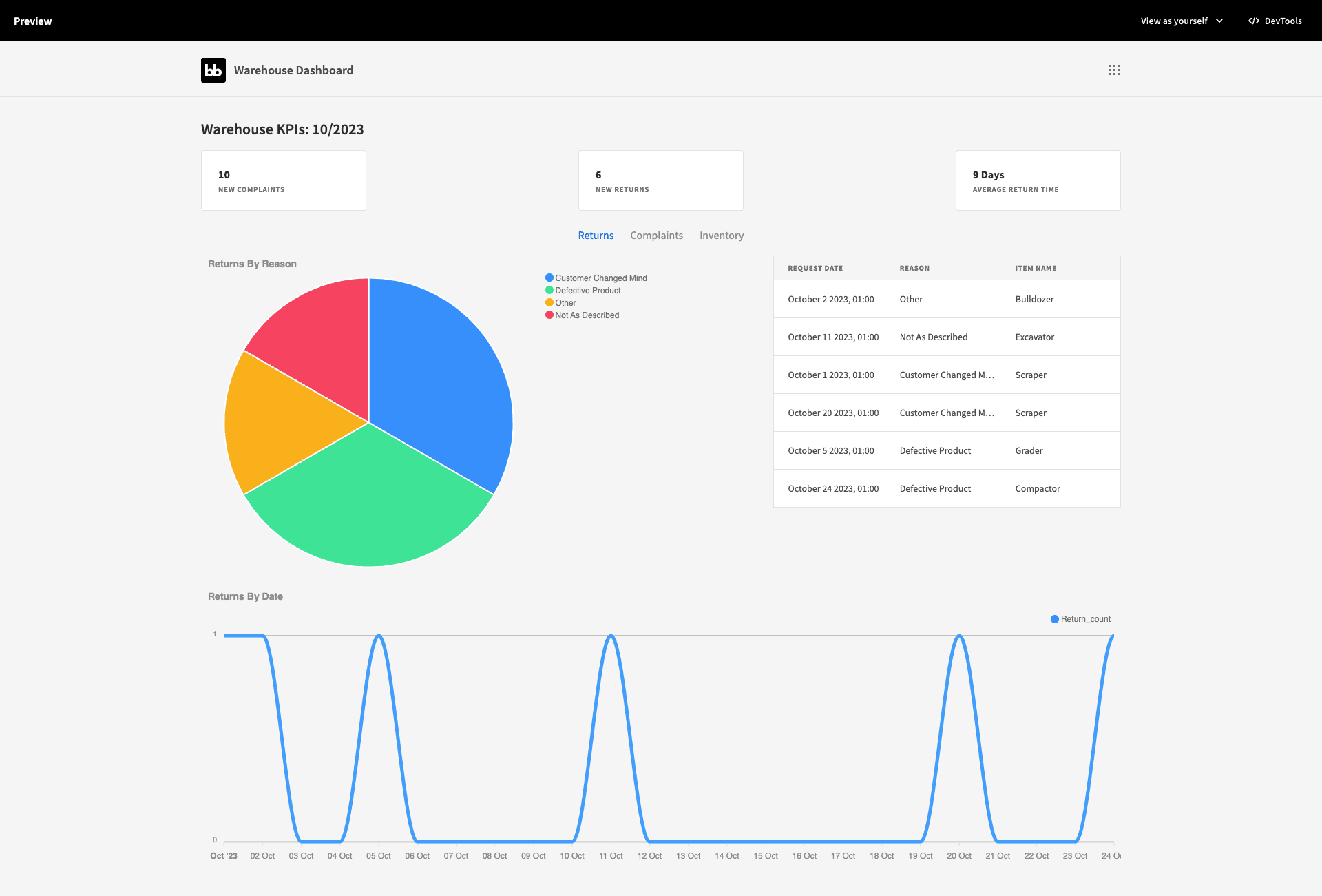
Our returns drill-down will include three things:
- A pie chart displaying the number of returns grouped by reason.
- A table, displaying the details of our most recent returns.
- A line graph showing the number of return requests we receive per day.
We want to display the pie chart and table beside each other - with the line graph below these.
So, we’ll start by nesting a second container within our returns tab - and setting its direction to horizontal:
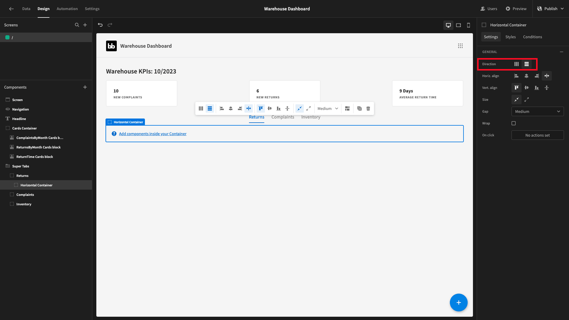
Now, let’s start building our charts.
Pie Chart
We’ll start with our pie chart. Again, this will display the number of returns that we have registered under each of our reason attribute’s options.
To do this, we’ll create a new query called ReturnsByReason. We’ll select the reason attribute and the count of the rows - and GROUP BY reason.
So, the query will be:
1SELECT reason, COUNT(*) as return_count
2
3FROM returns
4
5GROUP BY reason;
The response should look like this:
1{
2
3 "reason": "Customer Changed Mind",
4
5 "return_count": "2"
6
7}
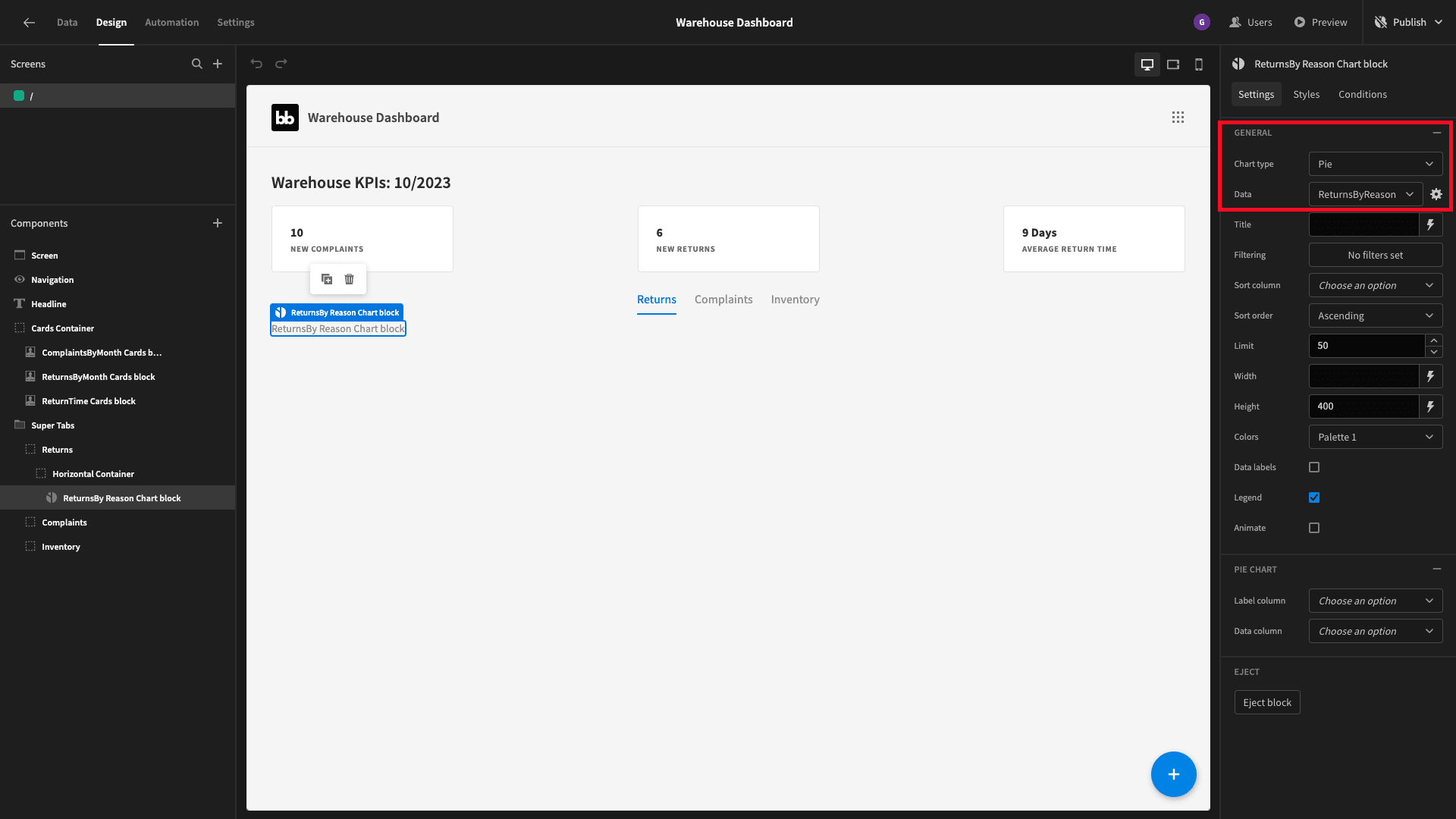
Save that and head back to the design section. Inside we’re going to add a chart block. We’ll set its type to pie and its data to our new query.
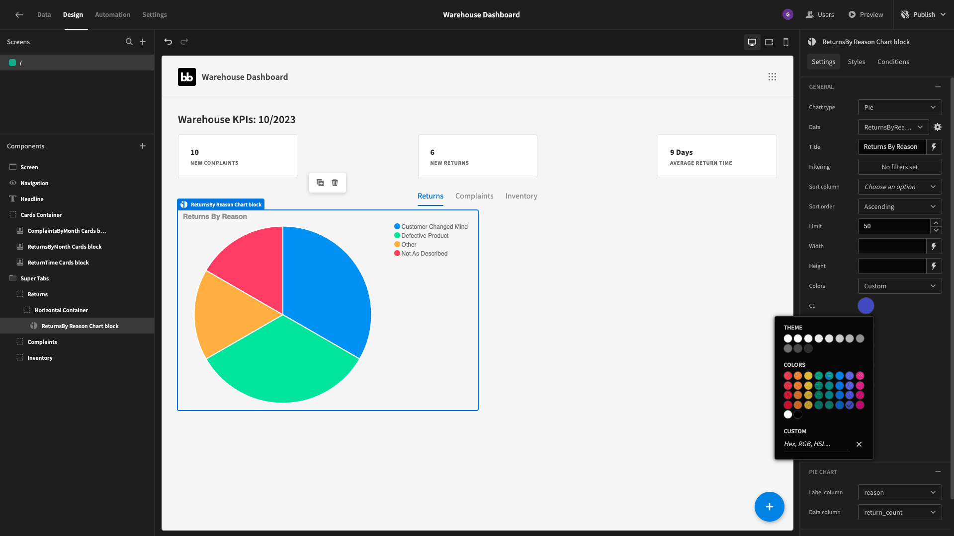
We’ll add a title, set the label column to reason, the data column to return_count, and give it a width of 50%:
We can also set a custom color palette:
Table
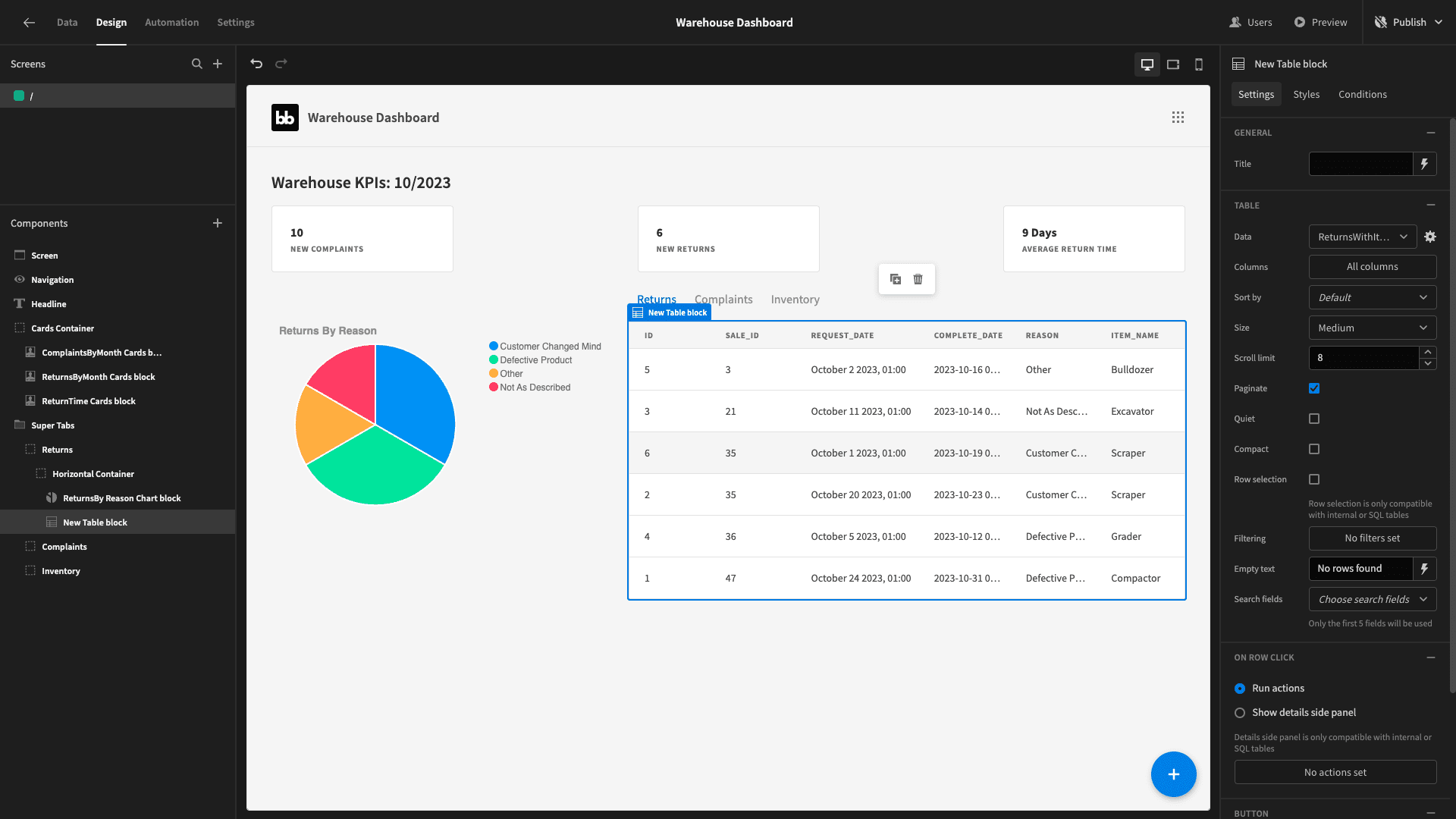
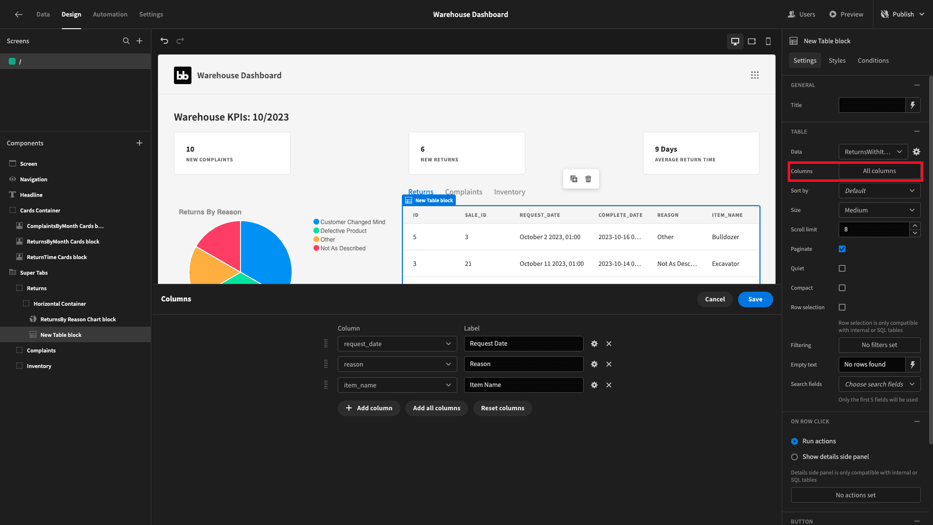
Beside our bar chart - we want a table that displays detailed information of recent returns. Specifically, we want the date, reason, and item_name. When users click on any of these rows, we want to display a side panel with the full details of the return request.
The problem is - our returns table doesn’t include the item_name. However, it does have a sale_id attribute that indicates the original sale that it relates to. The sales table includes the item_name attribute.
We’ll use a join statement in a custom query to retrieve this alongside the relevant details from the returns table.
So, we’ll add a query called ReturnsWithItemName:
1SELECT r.*, s.item_name
2
3FROM returns r
4
5LEFT JOIN sales s ON r.sale_id = s.id
It returns a data object with the following schema:
 1{
 2
 3 "id": 5,
 4
 5 "sale_id": 3,
 6
 7 "request_date": "2023-10-02 00:00:00+00",
 8
 9 "complete_date": "2023-10-16 00:00:00+00",
10
11 "reason": "Other",
12
13 "item_name": "Bulldozer"
14
15}
Beside our pie chart, we’ll add a table block, with its data set to our new query:
We’ll configure this to only show the three columns we actually want:
And we’ll select show details side panel under on-click actions:
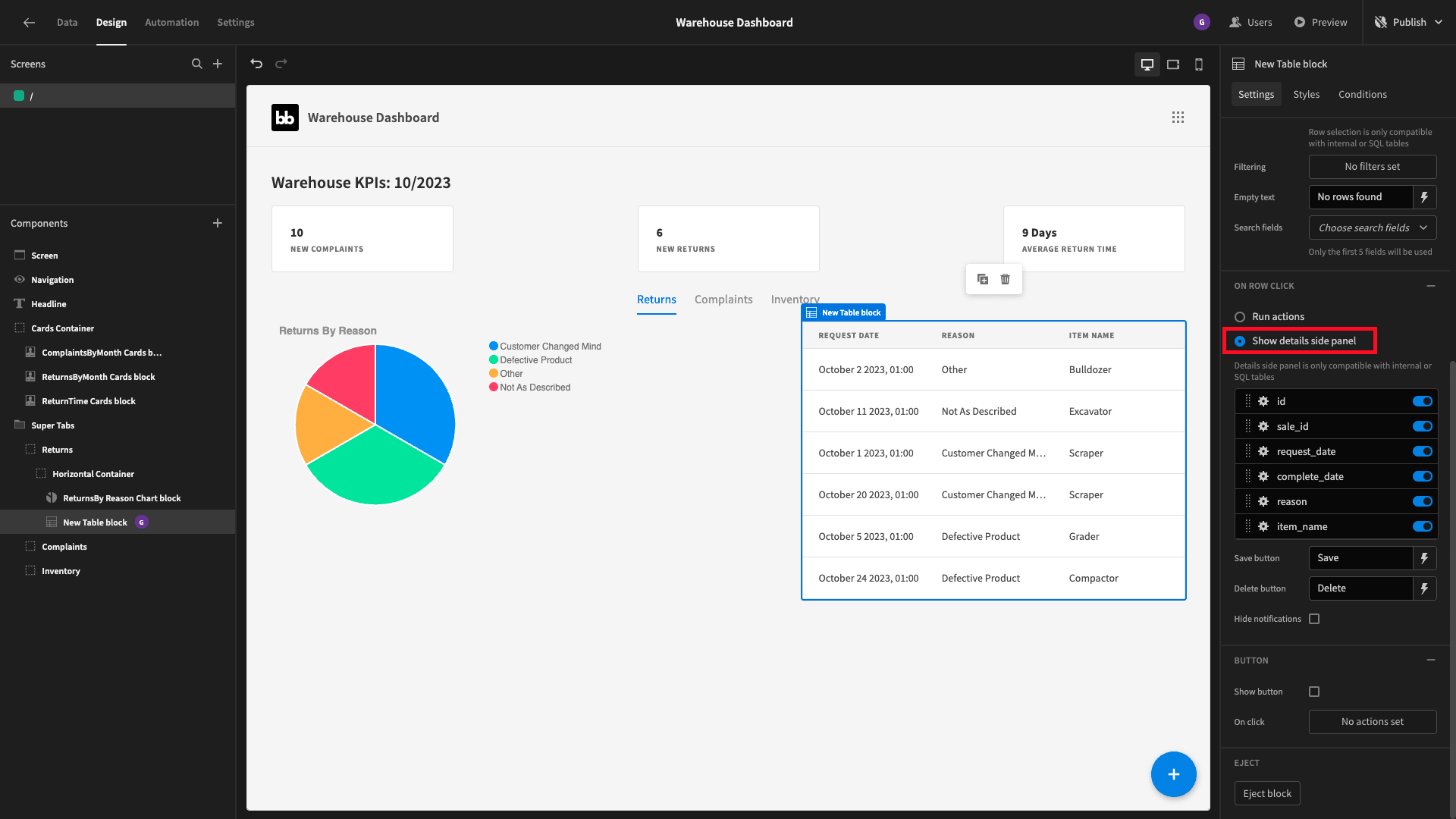
However, this isn’t going to work with our custom query straight out of the box.
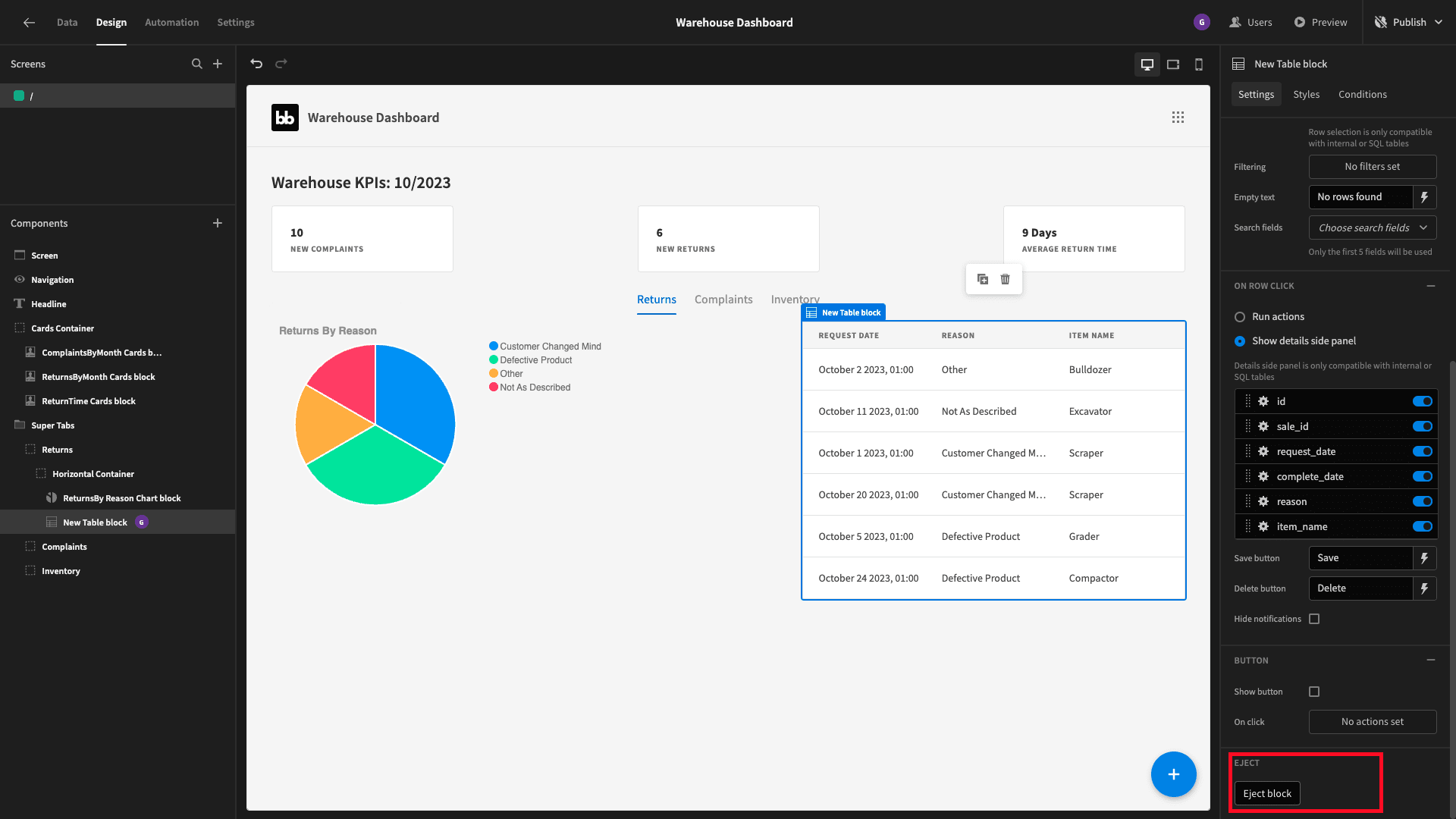
To start configuring it to do what we want, we need to eject our table block to expose all of its underlying components:
Nested inside our table, we now have a component called details side panel. Nested within this, there’s a form block:
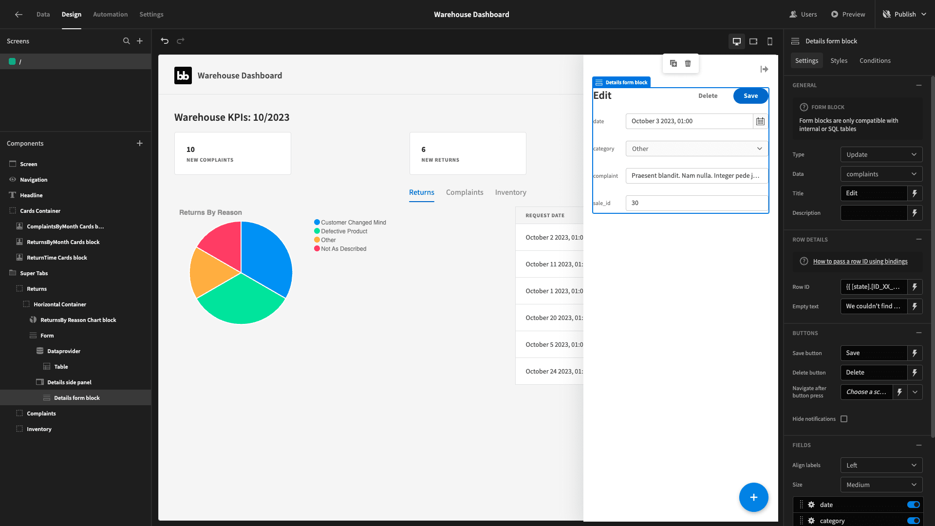
We’ll set its type to view and its field labels to above:
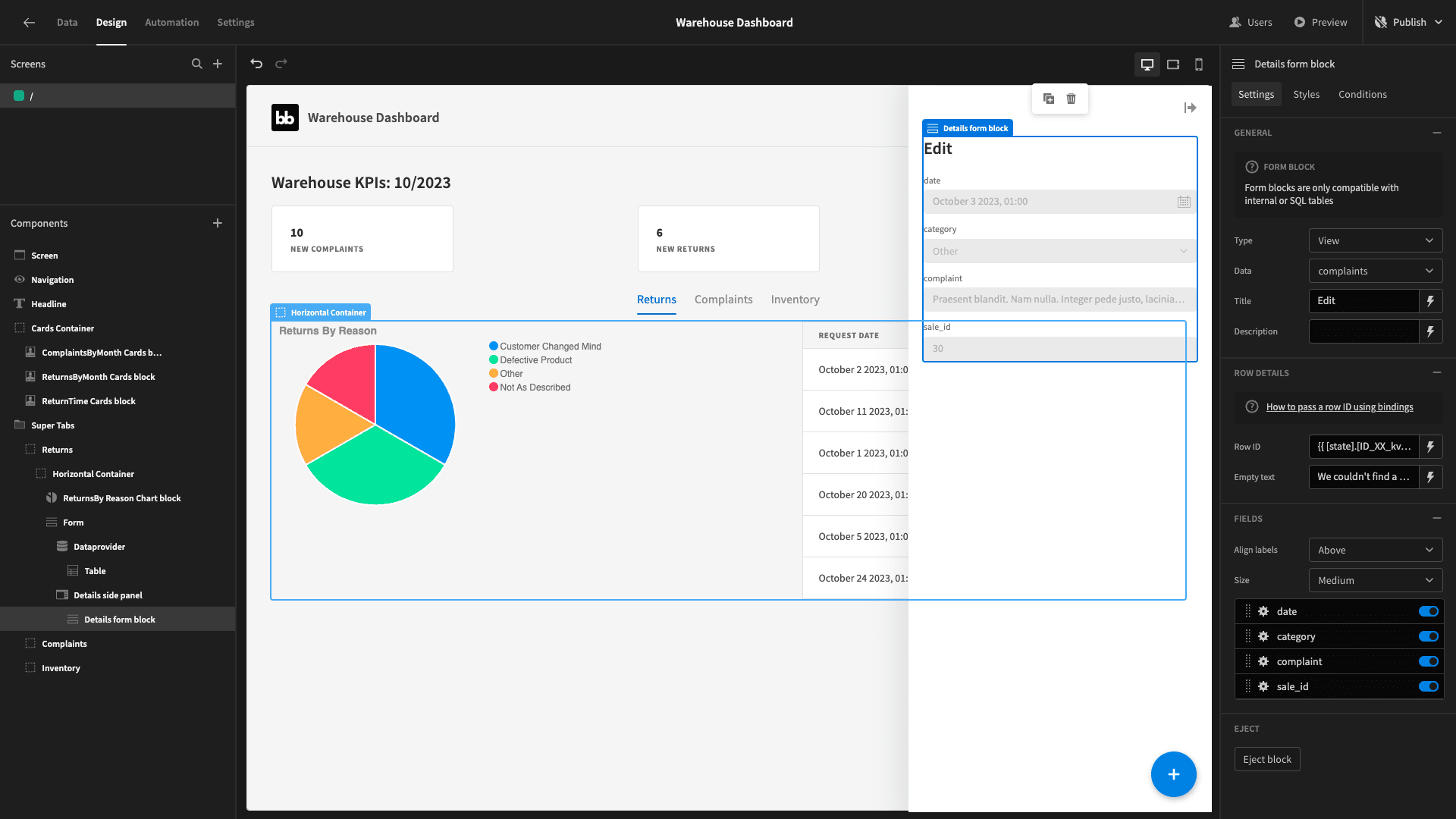
We’ll need to eject this too to access all of its underlying components.
Now, on our table, we want to set an action to open our side panel:
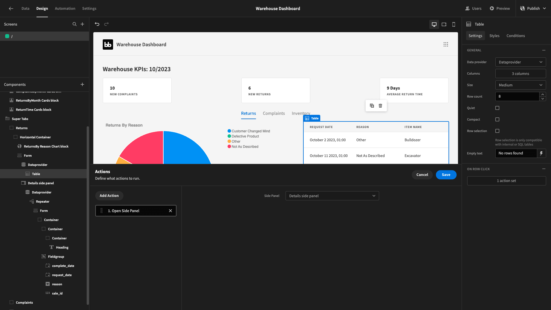
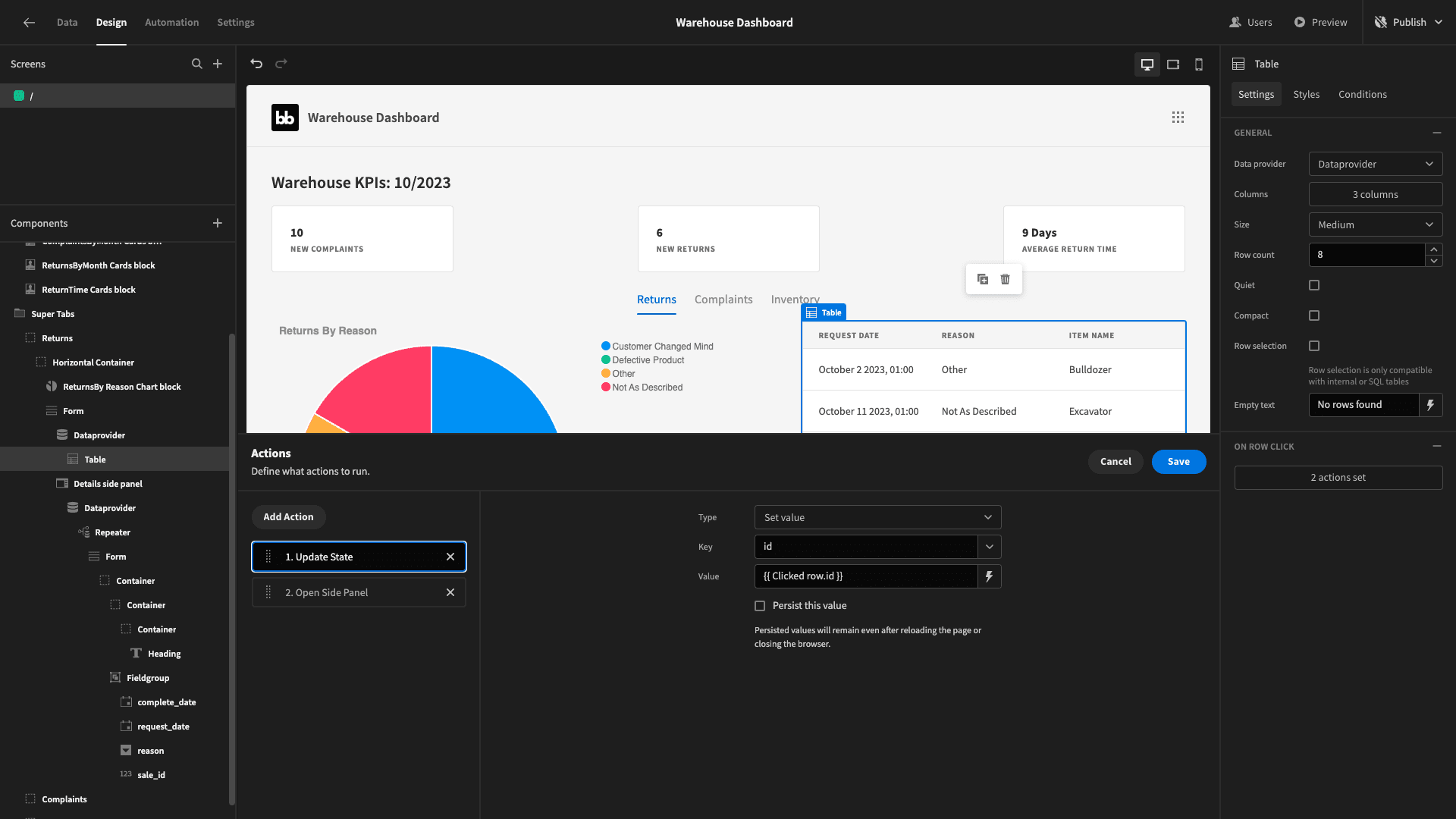
But, we also need some way to filter the form we display to only show the appropriate data for that row. So before this action, we’ll add an update state action, setting a state called id to the id attribute of the clicked row:
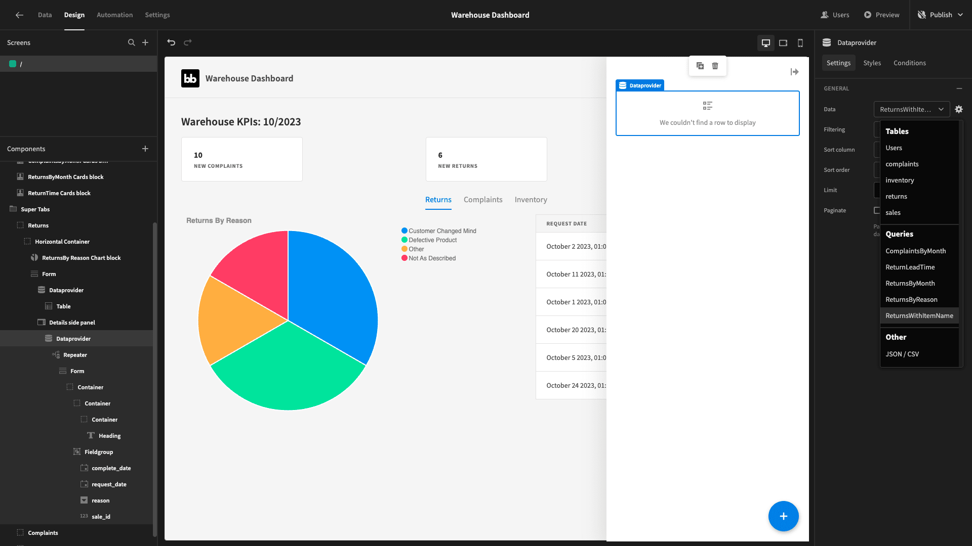
Within the side panel, there’s a component called data provider. Set its data to our ReturnsWithItemName query:
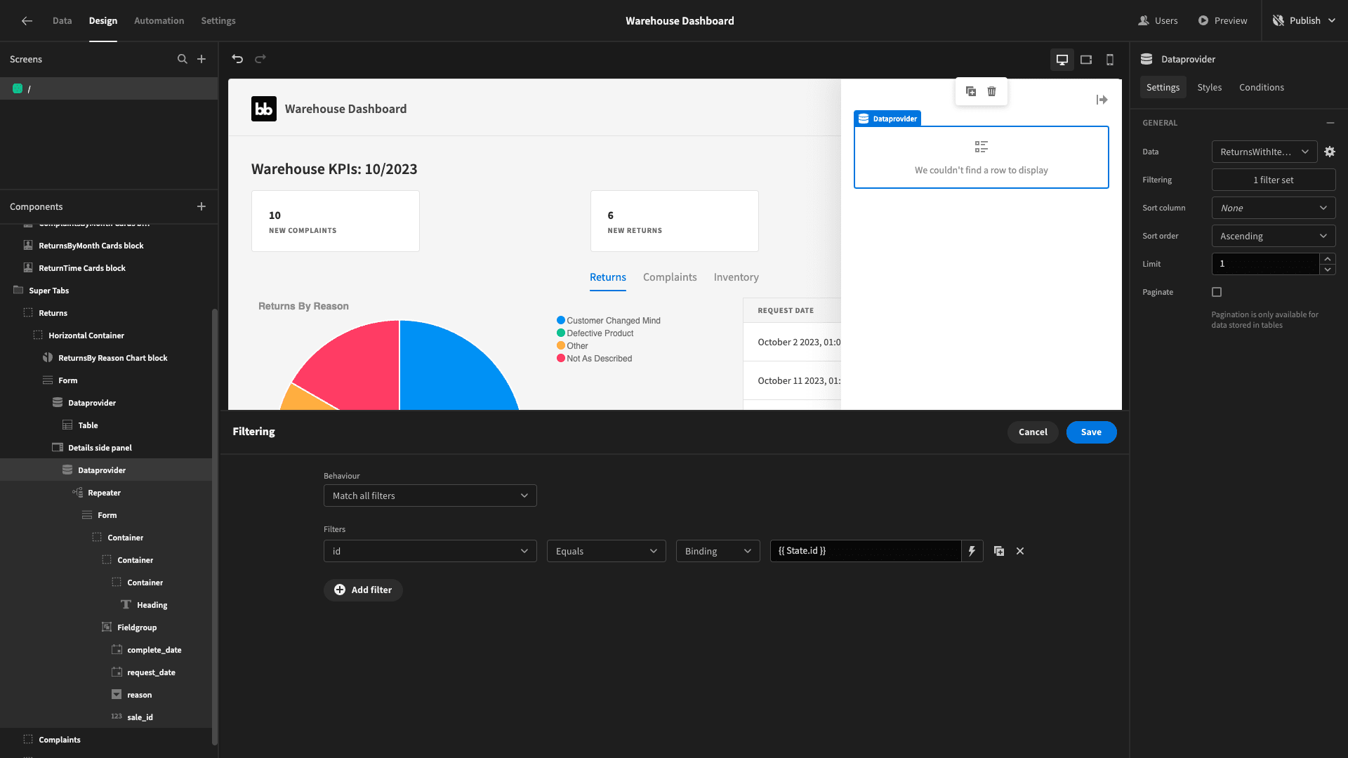
Then we’ll filter for rows where the id attribute matches our id state:
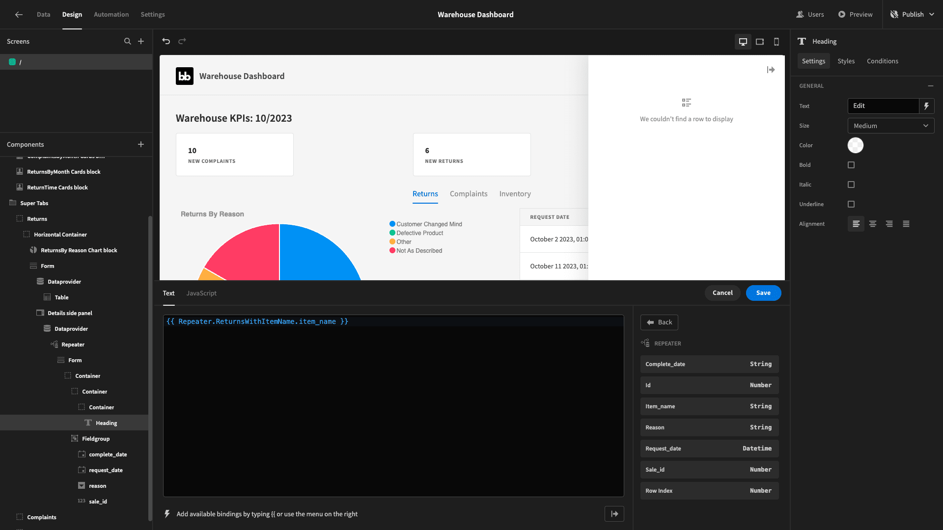
Within this there’s a headline component. We’ll bind this to the item_name output of our repeater component:
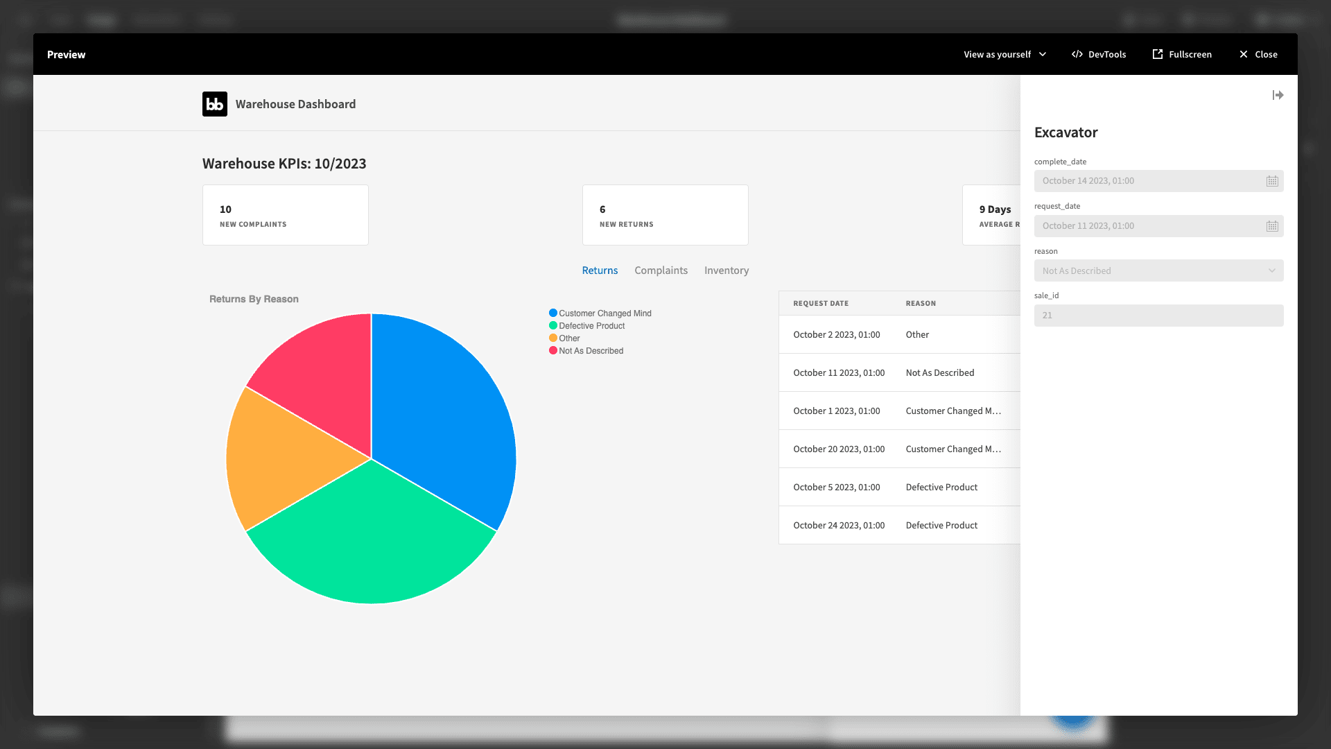
Here’s what the completed form looks like:
Line graph
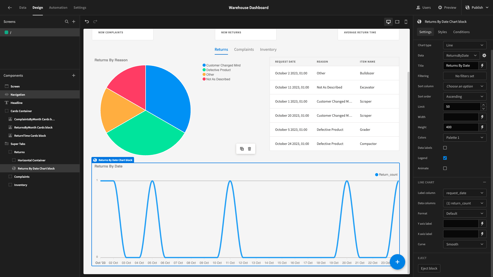
Lastly, beneath our horizontal container, we want a line graph that displays the number of returns that we receive each day.
For this, we’ll need a query which we’ll call ReturnsByDate.
This one will be a little bit more complex. We don’t necessarily have returns for each day - but we want our chart to display these as zero - rather than just leaving them out entirely.
So, we need to start with a common table expression to generate a time series - and then join this to our returns table and SELECT the COUNT of entries for each date.
Our query will be:
 1WITH DateSeries AS (
 2
 3 SELECT generate_series(
 4
 5  (SELECT MIN(request_date) FROM returns),
 6
 7  (SELECT MAX(request_date) FROM returns),
 8
 9  interval '1 day'
10
11 ) AS request_date
12
13)
14
15SELECT ds.request_date, COALESCE(COUNT(r.id), 0) as return_count
16
17FROM DateSeries ds
18
19LEFT JOIN returns r ON ds.request_date = r.request_date
20
21GROUP BY ds.request_date
22
23ORDER BY ds.request_date;
The returned objects look like this:
1{
2
3 "request_date": "2023-10-01 00:00:00+00",
4
5 "return_count": "1"
6
7}
Add another chart block, with the line type - and bind its data to our new query outputs:
Here’s our finished returns report:
4. Complaints reporting
Next, we are going to build a similar report within our complaints tab.
We’ll start by duplicating our horizontal container from the returns tab - and dragging the new one into the complaints tab:
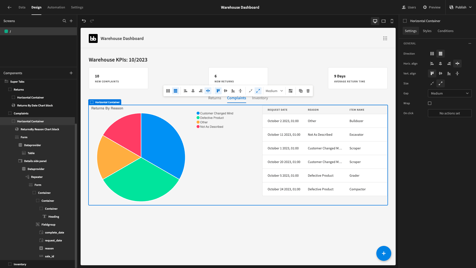
And we can start swapping out the data.
Pie chart
Our new pie chart will be similar to the previous one - except its going to display the number of complaints within each category.
We’ll create a new query called ComplaintsByCategory:
1SELECT category, COUNT(*) as complaint_count
2
3FROM complaints
4
5GROUP BY category;
It returns:
1{
2
3 "category": "Billing",
4
5 "complaint_count": "1"
6
7}
Swap out the data and update the title on the chart:
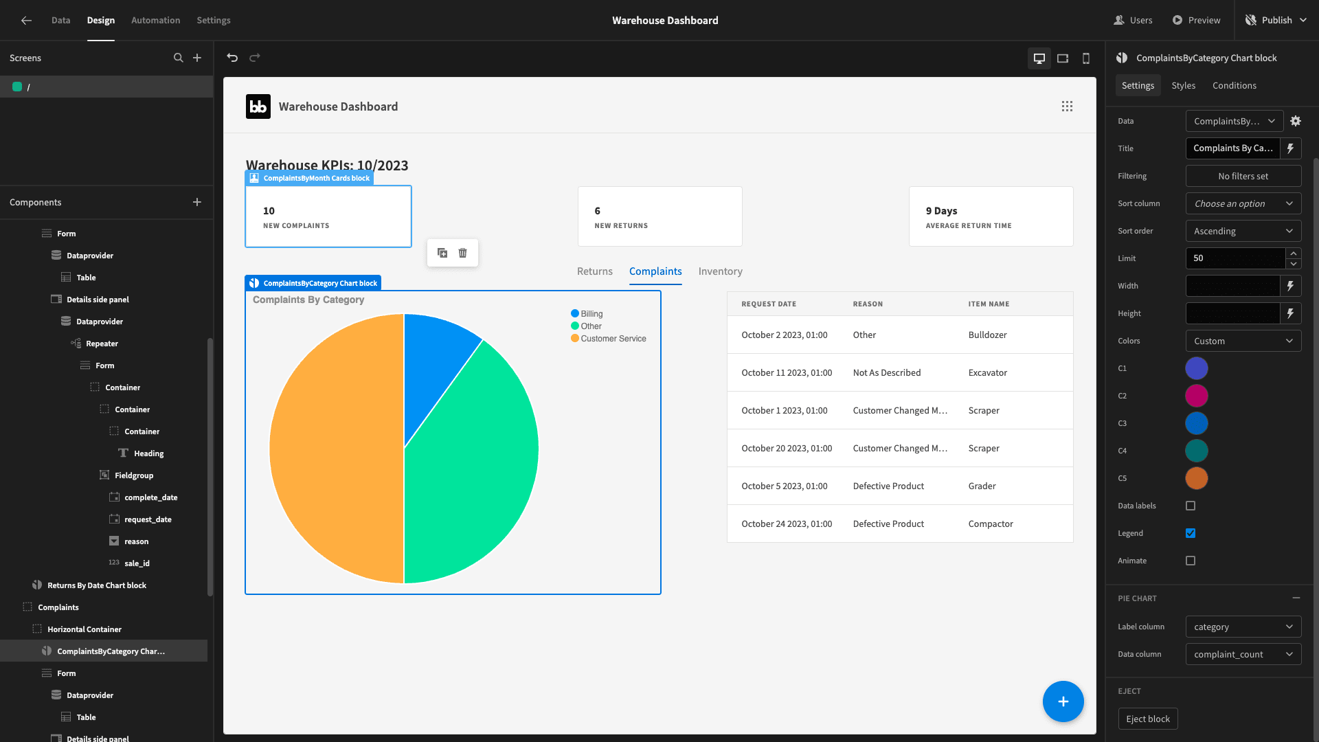
Table
Our table will also be pretty simple to set up. We need a query that returns the details of each complaint with the relevant item_name from its related sales table entry.
We’ll call this ComplaintsWithItemName:
1SELECT c.*, s.item_name
2
3FROM complaints c
4
5LEFT JOIN sales s ON c.sale_id = s.id;
The response is:
 1{
 2
 3 "id": 9,
 4
 5 "sale_id": 1,
 6
 7 "date": "2023-10-10 00:00:00+00",
 8
 9 "category": "Customer Service",
10
11 "complaint": "Duis consequat dui nec nisi volutpat eleifend. Donec ut dolor. Morbi vel lectus in quam fringilla rhoncus.",
12
13 "item_name": "Scraper"
14
15}
Set this as the data for the data provider containing our table. We’ll also set the table’s row limit to 7 and configure our columns like we did before:
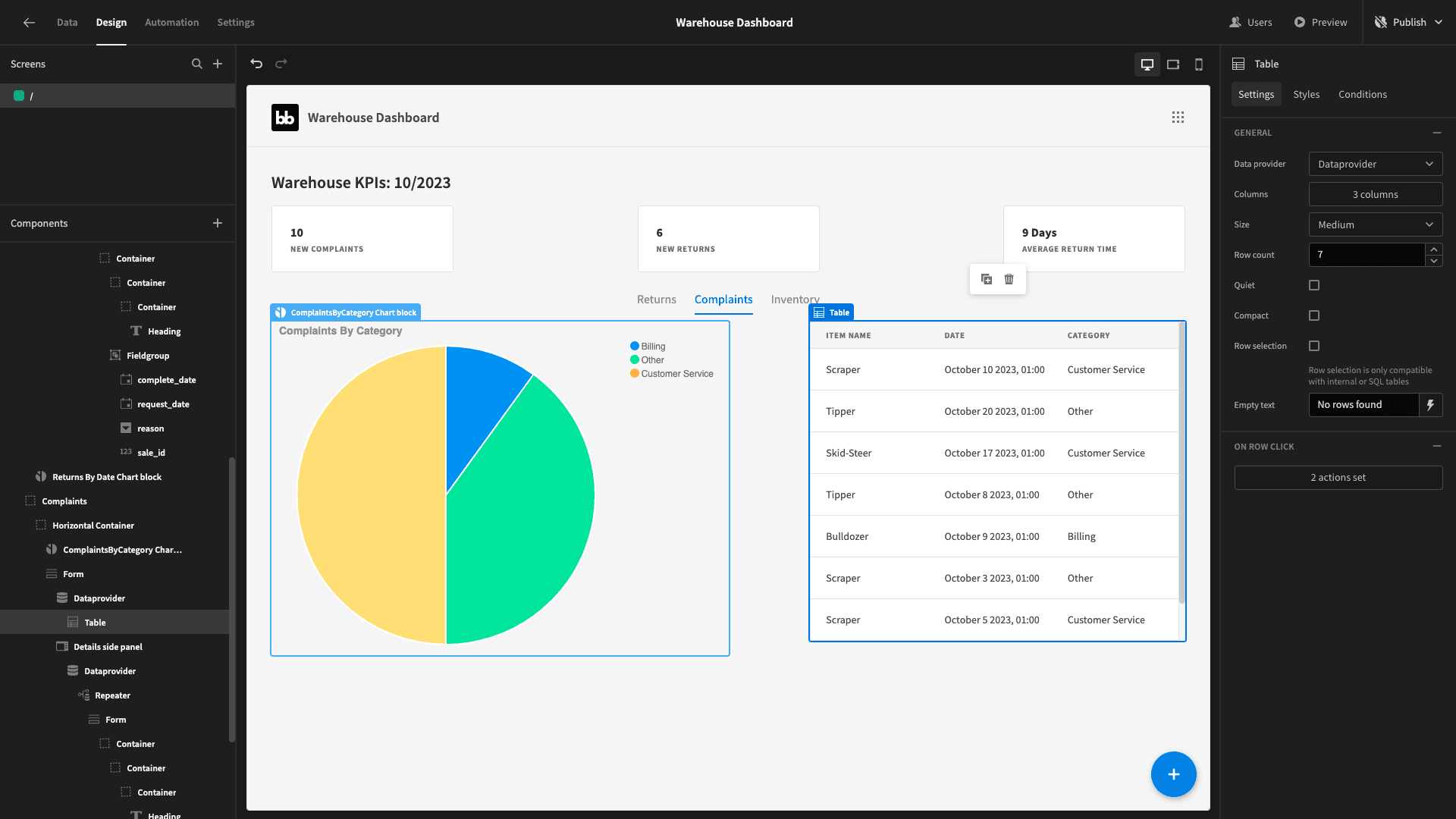
Now, within our details side panel, we need to do the following:
- Change the data provider’s data to ComplaintsByCategory.
- Change the form’s data to complaints.
- Hit Update Form Fields within our Field Group component:
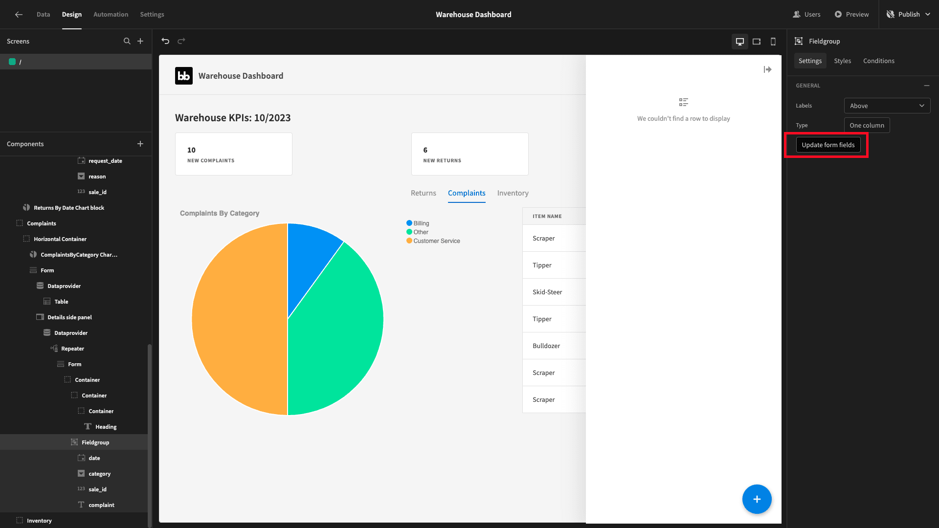
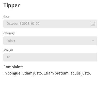
We’ll also delete the text field for our complaint attribute - replacing it with a paragraph with the following binding as its text:
1Complaint:
2
3{{ Repeater.ComplaintsWithItemName.complaint }}
Our new side panel looks like this:
Line graph
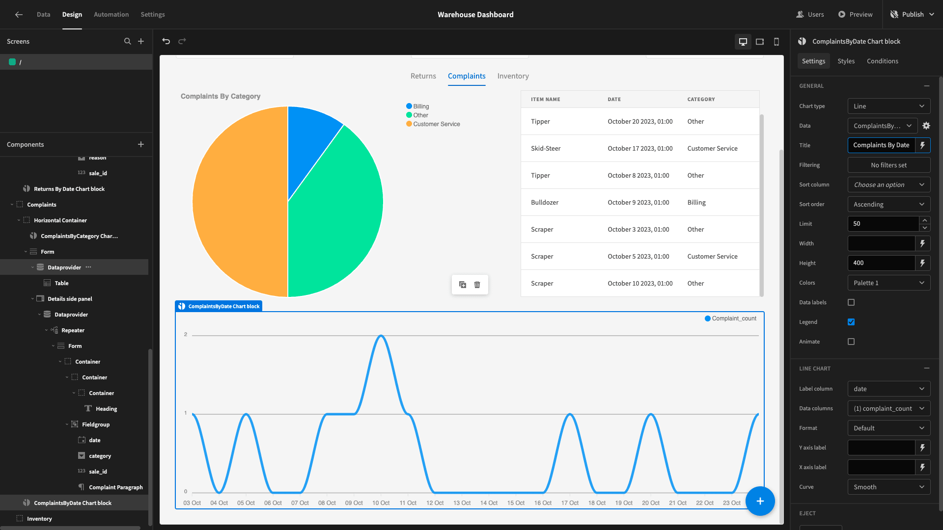
Lastly, we’ll add another line graph below our horizontal container. Just like the returns report - this will return the COUNT of complaints for each day. We’ll generate the days using a CTE.
We’ll call this query ComplaintsByDay:
 1WITH DateSeries AS (
 2
 3 SELECT generate_series(
 4
 5  (SELECT MIN(date) FROM complaints),
 6
 7  (SELECT MAX(date) FROM complaints),
 8
 9  interval '1 day'
10
11 ) AS date
12
13)
14
15SELECT ds.date, COALESCE(COUNT(c.id), 0) as complaint_count
16
17FROM DateSeries ds
18
19LEFT JOIN complaints c ON ds.date = c.date
20
21GROUP BY ds.date
22
23ORDER BY ds.date;
It returns:
1{
2
3 "date": "2023-10-03 00:00:00+00",
4
5 "complaint_count": "1"
6
7}
We’ll bind this to our new chart, giving it a descriptive title as well:
5. Inventory table
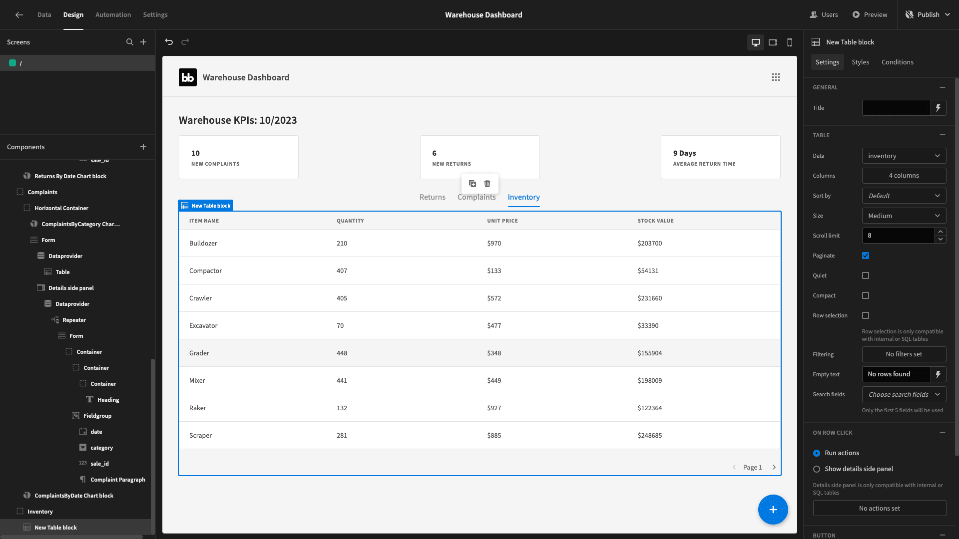
Inside our final tab, we’ll place another table block and set its data to our inventory table:
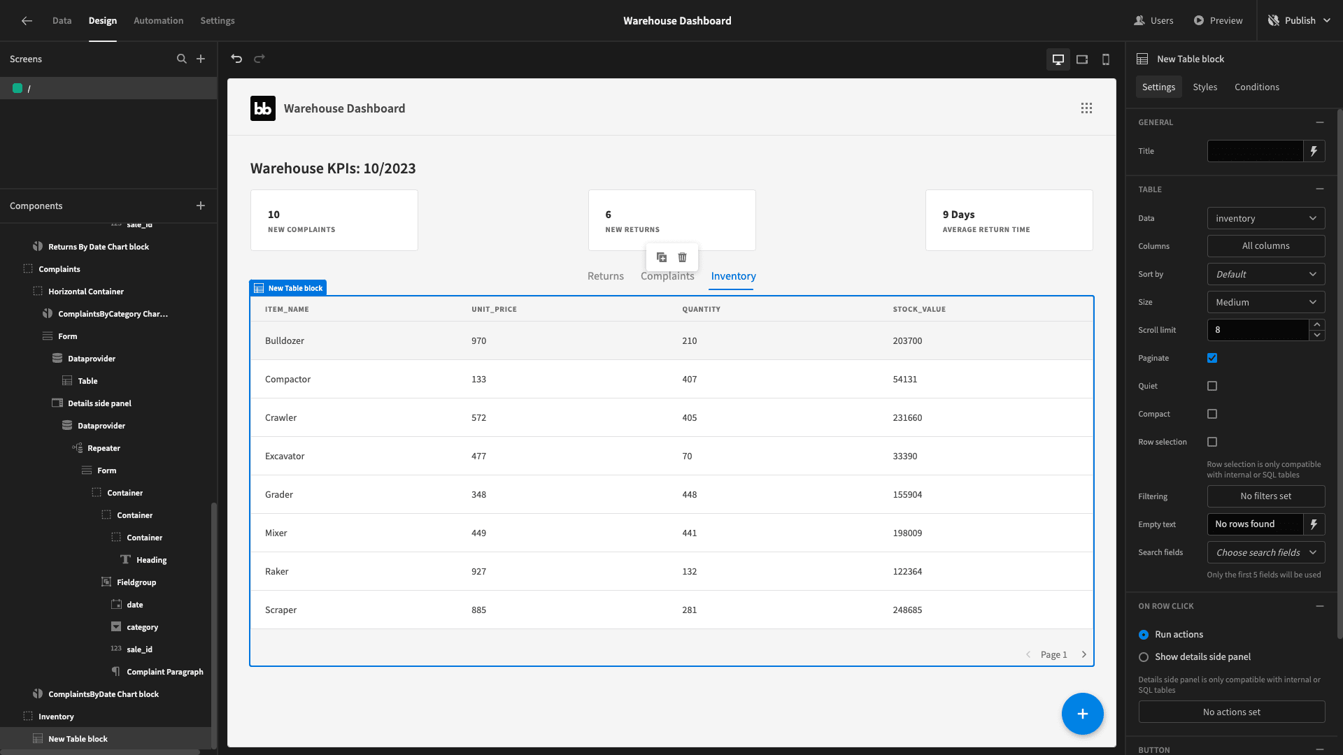
We’re basically going to leave this as-is. We’ll simply change some of the column names to be more attractive for users - as well as reorder the columns.
We’ll also bind the value for the unit_cost and stock_value columns to ${{ value }}:
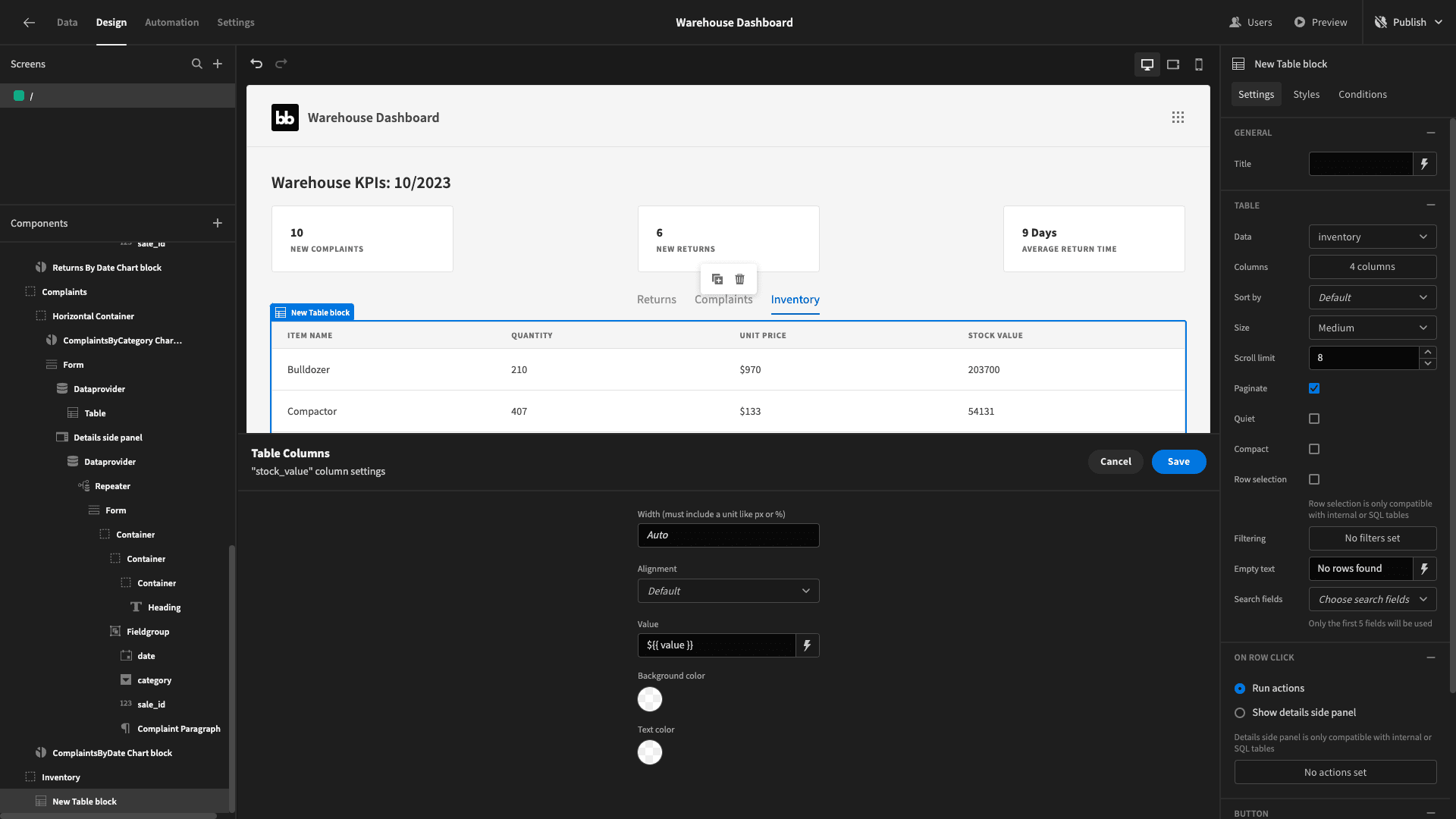
That gives us:
6. Design tweaks and publishing
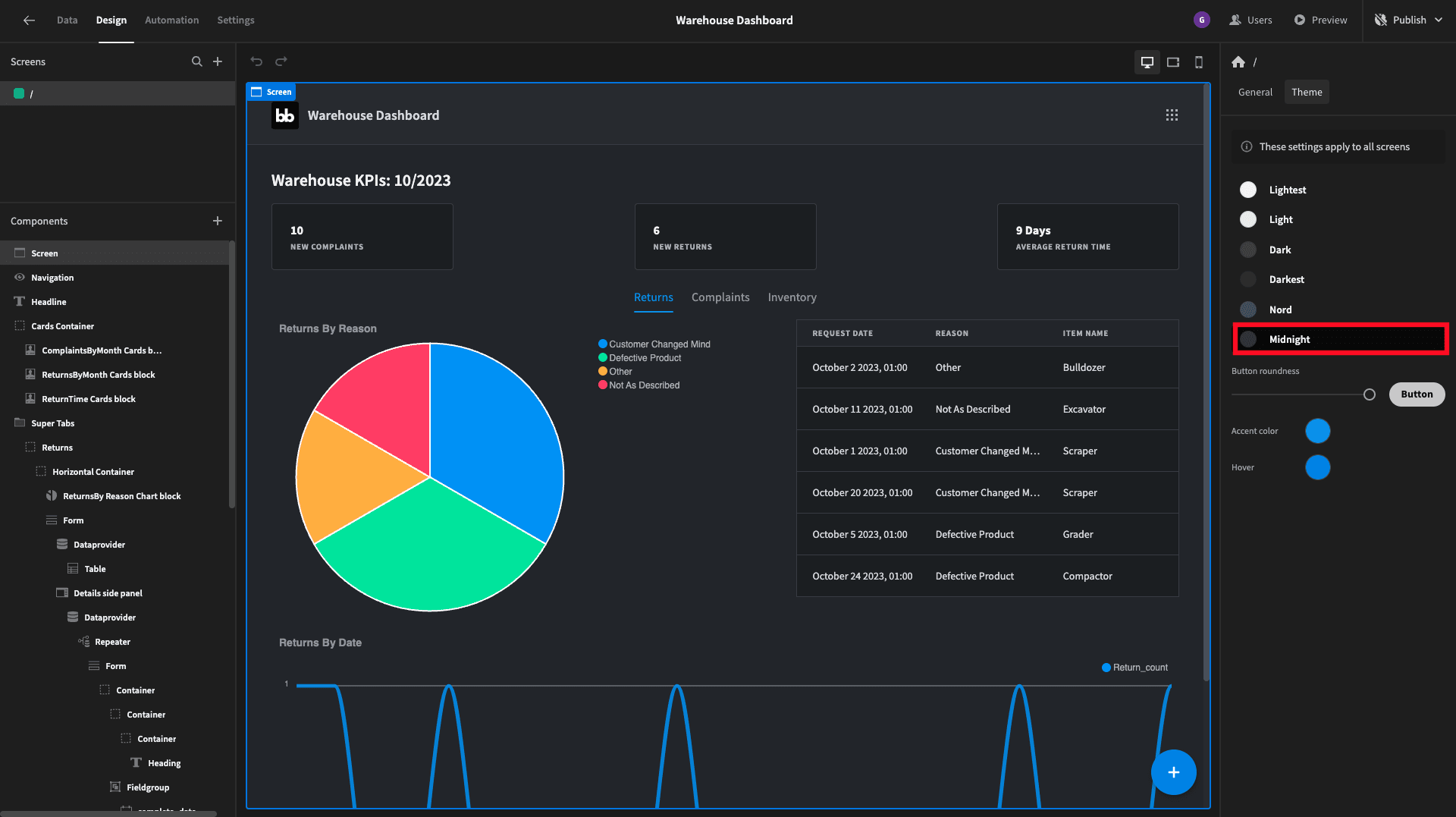
As a finishing touch, we’ll head to the theme menu and select midnight:
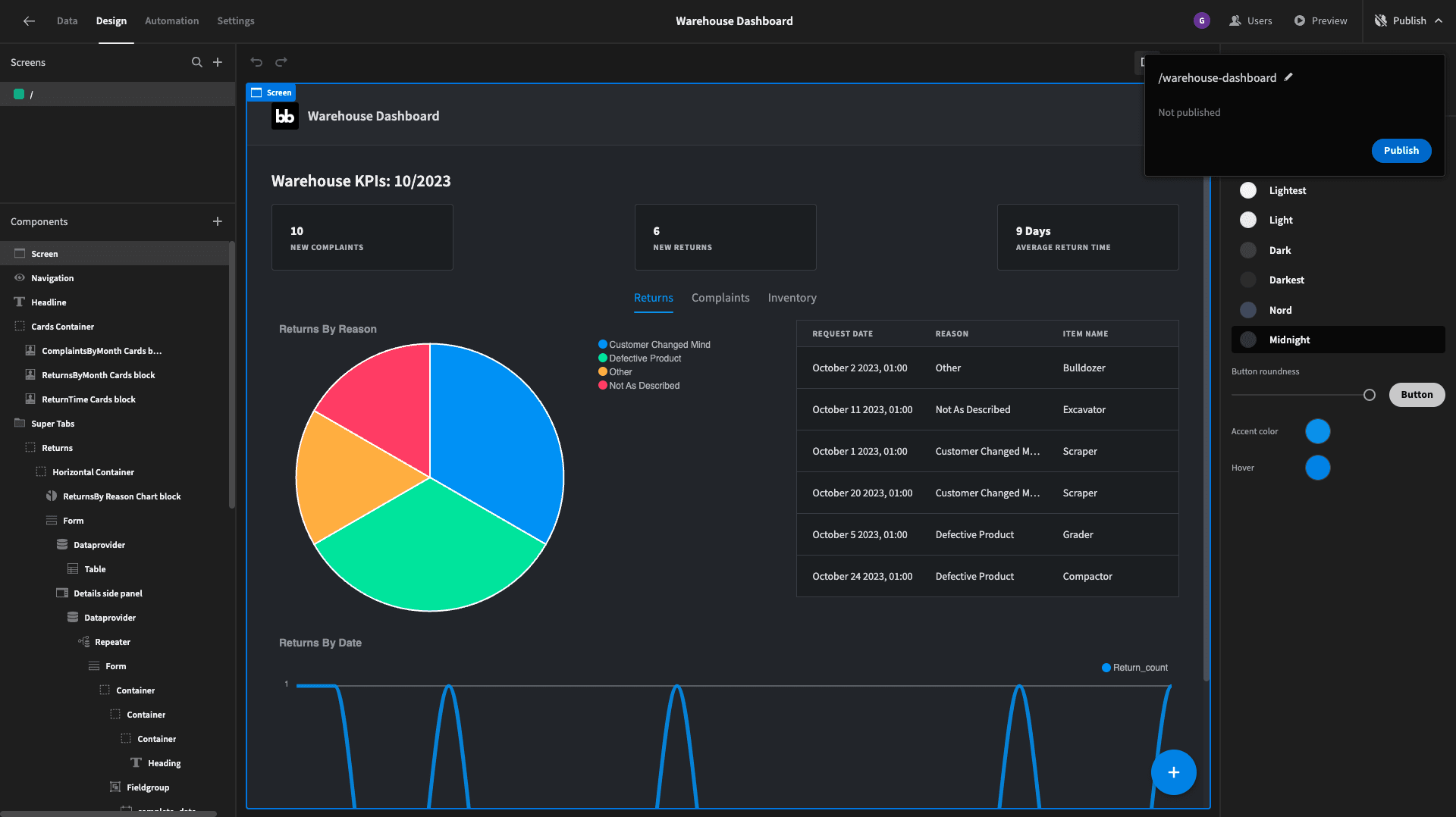
And that’s our warehouse dashboard ready to go live. To deploy it, simply hit publish:
Here’s a reminder of what the finished thing looks like:

If you enjoyed this tutorial, you might also like our guide to building an inventory dashboard .